Home >Web Front-end >CSS Tutorial >How to center in CSS Grid?
How to center in CSS Grid?
- 王林forward
- 2023-08-22 23:13:011486browse
A grid arranges content in a row and column layout. The same goes for CSS grids.
Using Flex for centering in CSS Grid
Set grid items as flexible containers−
display: flex
To center vertically and horizontally, use −
align-items: center;
justify-content: center;
Example
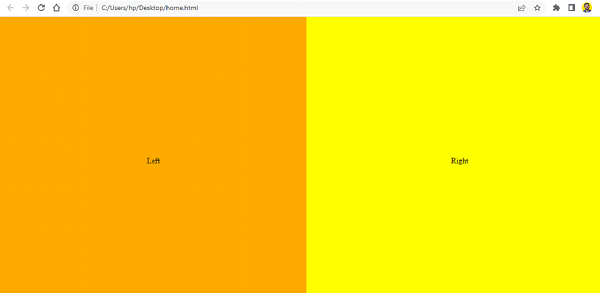
Let’s look at a complete example −
<!DOCTYPE html>
<html>
<head>
   <title>Grid and Flex Example</title>
   <style>
      html,body {
         margin: 0;
         padding: 0;
      }

      .box {
         display: grid;
         grid-template-columns: 1fr 1fr;
         grid-template-rows: 100vh;
      }

      .first,
      .second {
         display: flex;
         align-items: center;
         justify-content: center;
      }

      .first {
         background-color: orange;
      }

      .second {
         background-color: yellow;
      }
   </style>
</head>
<body>
   <div class="box">
      <div class="first">Left</div>
      <div class="second">Right</div>
   </div>
</body>
</html>
Output

Use CSS Grid to achieve centering without using Flex
We can also center without using Flex. We set the grid container to display: grid. When the display attribute is set to grid, the HTML element becomes a grid container -
grid-container {
   display: grid;
   grid-template-columns: 1fr 1fr;
   grid-auto-rows: 150px;
   grid-gap: 20px;
}
Grid items use relative positioning settings -
grid-item {
   position: relative;
   text-align: center;
}
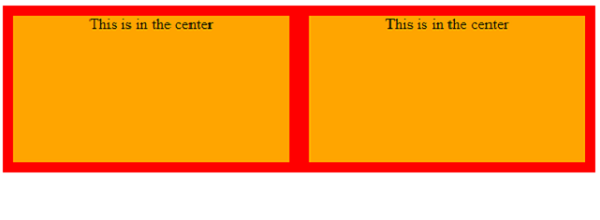
Example
However,
<!DOCTYPE html>
<html>
<head>
   <title>Grid</title>
   <style>
      grid-container {
         display: grid;
         grid-template-columns: 1fr 1fr;
         grid-auto-rows: 150px;
         grid-gap: 20px;
      }

      grid-item {
         position: relative;
         text-align: center;
      }

      grid-container {
         background-color: red;
         padding: 10px;
      }

      grid-item {
         background-color: orange;
      }
   </style>
</head>
<body>
   <grid-container>
      <grid-item>This is in the center</grid-item>
      <grid-item>This is in the center</grid-item>
   </grid-container>
</body>
</html>
Output

The above is the detailed content of How to center in CSS Grid?. For more information, please follow other related articles on the PHP Chinese website!
Statement:
This article is reproduced at:tutorialspoint.com. If there is any infringement, please contact admin@php.cn delete
Previous article:How to use the `:visited` pseudo-class in CSSNext article:How to use the `:visited` pseudo-class in CSS

