Matplotlib
Matplotlib is a drawing tool similar to MATLAB in Python. If you are familiar with MATLAB, you can quickly get started with Matplotlib.
1. Understanding Matploblib
1.1 Figure
Before any drawing, we need a Figure object, which can be understood as we need a drawing board to start drawing.
import matplotlib.pyplot as plt
fig = plt.figure()
1.2 Axes
After having the Figure object, we need axes before drawing. Without axes, there will be no drawing reference, so Axes need to be added. It can also be understood as paper that can actually be used for drawing. The code on
fig = plt.figure()
ax = fig.add_subplot(111)
ax.set(xlim=[0.5, 4.5], ylim=[-2, 8], title='An Example Axes',
       ylabel='Y-Axis', xlabel='X-Axis')
plt.show()
adds an Axes to a picture, and then sets the value range of the X-axis and Y-axis of the Axes (these settings are not mandatory and will be discussed later. These settings), the effect is as shown below:

For the above fig.add_subplot(111) is to add Axes, the explanation of the parameters is in the drawing board Generate an Axes object at the first position of row 1 and column 1 to prepare for painting. Axes can also be generated by fig.add_subplot(2, 2, 1). The first two parameters determine the division of the panel, such as 2, 2 will divide the entire panel into 2 * 2 squares. , the third parameter value range is [1, 2*2] indicating which Axes. As in the following example:
fig = plt.figure()
ax1 = fig.add_subplot(221)
ax2 = fig.add_subplot(222)
ax3 = fig.add_subplot(224)

1.3 Multiple Axes
It can be found that the Axes we added above seem a bit weak, so the following method is provided to generate them all at once All Axes:
fig, axes = plt.subplots(nrows=2, ncols=2)
axes[0,0].set(title='Upper Left')
axes[0,1].set(title='Upper Right')
axes[1,0].set(title='Lower Left')
axes[1,1].set(title='Lower Right')
fig is still the drawing board we are familiar with. axes has become our common access in the form of a two-dimensional array, which is particularly useful when looping drawing.
1.4 Axes Vs .pyplot
I believe many people have seen the following code. It is very simple and easy to understand, but the following drawing method is only suitable for simple drawing and quick drawing. . When dealing with complex drawing work, we still need to use Axes to complete the painting.
plt.plot([1, 2, 3, 4], [10, 20, 25, 30], color='lightblue', linewidth=3)
plt.xlim(0.5, 4.5)
plt.show()
2. Basic drawing 2D
2.1 Line
plot() function draws a series of points and connects them with lines. Take a look at the example:
x = np.linspace(0, np.pi)
y_sin = np.sin(x)
y_cos = np.cos(x)

ax1.plot(x, y_sin)
ax2.plot(x, y_sin, 'go--', linewidth=2, markersize=12)
ax3.plot(x, y_cos, color='red', marker='+', linestyle='dashed')
Paint on the three Axes above. plot, the first two parameters are x-axis and y-axis data. The third parameter of ax2 is MATLAB style drawing, corresponding to the color, marker, and line style on ax3.

In addition, we can draw by keyword parameters, as in the following example:
x = np.linspace(0, 10, 200)
data_obj = {'x': x,
            'y1': 2 * x + 1,
            'y2': 3 * x + 1.2,
            'mean': 0.5 * x * np.cos(2*x) + 2.5 * x + 1.1}

fig, ax = plt.subplots()

#填充两条线之间的颜色
ax.fill_between('x', 'y1', 'y2', color='yellow', data=data_obj)

# Plot the "centerline" with `plot`
ax.plot('x', 'mean', color='black', data=data_obj)

plt.show()
It was found that in the above drawing, only the data part was passed in Strings, these strings correspond to a keyword in data_obj. When drawing in this way, the data corresponding to the keyword will be found in the passed data to draw.

2.2 Scatter plot
Only draw points, but do not connect them with lines.
x = np.arange(10)
y = np.random.randn(10)
plt.scatter(x, y, color='red', marker='+')
plt.show()

2.3 Bar chart
There are two types of bar charts, one is horizontal and the other is vertical, see the example below:
np.random.seed(1)
x = np.arange(5)
y = np.random.randn(5)

fig, axes = plt.subplots(ncols=2, figsize=plt.figaspect(1./2))

vert_bars = axes[0].bar(x, y, color='lightblue', align='center')
horiz_bars = axes[1].barh(x, y, color='lightblue', align='center')
#在水平或者垂直方向上画线
axes[0].axhline(0, color='gray', linewidth=2)
axes[1].axvline(0, color='gray', linewidth=2)
plt.show()

The bar chart also returns an Artists array, corresponding to each bar. For example, the size of the Artists array in the above picture is 5. We can use these Artists to compare the bars. Change the style of the graph, as in the following example:
fig, ax = plt.subplots()
vert_bars = ax.bar(x, y, color='lightblue', align='center')
# We could have also done this with two separate calls to `ax.bar` and numpy boolean indexing.
for bar, height in zip(vert_bars, y):
if height < 0:
bar.set(edgecolor='darkred', color='salmon', linewidth=3)
plt.show()
2.4 Histogram
The histogram is used to count the number or frequency of data occurrences and has a variety of parameters. It can be adjusted, see the example below:
density in the <pre class='brush:php;toolbar:false;'>np.random.seed(19680801)
n_bins = 10
x = np.random.randn(1000, 3)
fig, axes = plt.subplots(nrows=2, ncols=2)
ax0, ax1, ax2, ax3 = axes.flatten()
colors = [&#39;red&#39;, &#39;tan&#39;, &#39;lime&#39;]
ax0.hist(x, n_bins, density=True, histtype=&#39;bar&#39;, color=colors, label=colors)
ax0.legend(prop={&#39;size&#39;: 10})
ax0.set_title(&#39;bars with legend&#39;)
ax1.hist(x, n_bins, density=True, histtype=&#39;barstacked&#39;)
ax1.set_title(&#39;stacked bar&#39;)
ax2.hist(x, histtype=&#39;barstacked&#39;, rwidth=0.9)
ax3.hist(x[:, 0], rwidth=0.9)
ax3.set_title(&#39;different sample sizes&#39;)
fig.tight_layout()
plt.show()</pre> parameter controls whether the Y-axis is probability or quantity, corresponding to the first variable returned. histtype Controls the style of the histogram. The default is "bar". For multiple bars, they will be displayed adjacently as in subgraph 1. "barstacked" means stacked together, as in subgraph 1. 2, 3. rwidth Controls the width, which can leave some gaps. Compare Figures 2 and 3. Figure 4 is when there is only one piece of data.
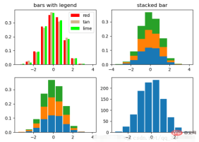
2.5 Pie Chart
labels = 'Frogs', 'Hogs', 'Dogs', 'Logs'
sizes = [15, 30, 45, 10]
explode = (0, 0.1, 0, 0)  # only "explode" the 2nd slice (i.e. 'Hogs')

fig1, (ax1, ax2) = plt.subplots(2)
ax1.pie(sizes, labels=labels, autopct='%1.1f%%', shadow=True)
ax1.axis('equal')
ax2.pie(sizes, autopct='%1.2f%%', shadow=True, startangle=90, explode=explode,
    pctdistance=1.12)
ax2.axis('equal')
ax2.legend(labels=labels, loc='upper right')

plt.show()
The pie chart automatically draws a pie based on the percentage of the data. labels is the label of each block, as shown in subfigure 1. autopct=%1.1f%% means formatted percentage accurate output, explode, highlights certain blocks, different values have different highlighting effects. pctdistance=1.12The distance between the percentage and the center of the circle, the default is 0.6.

2.6 箱形图
为了专注于如何画图,省去数据的处理部分。 data 的 shape 为 (n, ), data2 的 shape 为 (n, 3)。
fig, (ax1, ax2) = plt.subplots(2)
ax1.boxplot(data)
ax2.boxplot(data2, vert=False) #控制方向

2.7 泡泡图
散点图的一种,加入了第三个值 s 可以理解成普通散点,画的是二维,泡泡图体现了Z的大小,如下例:
np.random.seed(19680801)


N = 50
x = np.random.rand(N)
y = np.random.rand(N)
colors = np.random.rand(N)
area = (30 * np.random.rand(N))**2  # 0 to 15 point radii

plt.scatter(x, y, s=area, c=colors, alpha=0.5)
plt.show()

2.8 等高线(轮廓图)
有时候需要描绘边界的时候,就会用到轮廓图,机器学习用的决策边界也常用轮廓图来绘画,见下例:
fig, (ax1, ax2) = plt.subplots(2)
x = np.arange(-5, 5, 0.1)
y = np.arange(-5, 5, 0.1)
xx, yy = np.meshgrid(x, y, sparse=True)
z = np.sin(xx**2 + yy**2) / (xx**2 + yy**2)
ax1.contourf(x, y, z)
ax2.contour(x, y, z)
上面画了两个一样的轮廓图,contourf会填充轮廓线之间的颜色。数据x, y, z通常是具有相同 shape 的二维矩阵。x, y 可以为一维向量,但是必需有 z.shape = (y.n, x.n) ,这里 y.n 和 x.n 分别表示x、y的长度。Z通常表示的是距离X-Y平面的距离,传入X、Y则是控制了绘制等高线的范围。

3 布局、图例说明、边界等
3.1区间上下限
当绘画完成后,会发现X、Y轴的区间是会自动调整的,并不是跟我们传入的X、Y轴数据中的最值相同。为了调整区间我们使用下面的方式:
ax.set_xlim([xmin, xmax])   #设置X轴的区间
ax.set_ylim([ymin, ymax])   #Y轴区间
ax.axis([xmin, xmax, ymin, ymax])   #X、Y轴区间
ax.set_ylim(bottom=-10)     #Y轴下限
ax.set_xlim(right=25)       #X轴上限
具体效果见下例:
x = np.linspace(0, 2*np.pi)
y = np.sin(x)
fig, (ax1, ax2) = plt.subplots(2)
ax1.plot(x, y)
ax2.plot(x, y)
ax2.set_xlim([-1, 6])
ax2.set_ylim([-1, 3])
plt.show()
可以看出修改了区间之后影响了图片显示的效果。

3.2 图例说明
我们如果我们在一个Axes上做多次绘画,那么可能出现分不清哪条线或点所代表的意思。这个时间添加图例说明,就可以解决这个问题了,见下例:
fig, ax = plt.subplots()
ax.plot([1, 2, 3, 4], [10, 20, 25, 30], label='Philadelphia')
ax.plot([1, 2, 3, 4], [30, 23, 13, 4], label='Boston')
ax.scatter([1, 2, 3, 4], [20, 10, 30, 15], label='Point')
ax.set(ylabel='Temperature (deg C)', xlabel='Time', title='A tale of two cities')
ax.legend()
plt.show()

在绘图时传入 label 参数,并最后调用ax.legend()显示体力说明,对于 legend 还是传入参数,控制图例说明显示的位置:
| Location String | Location Code |
|---|---|
| ‘best’ | 0 |
| ‘upper right’ | 1 |
| ‘upper left’ | 2 |
| ‘lower left’ | 3 |
| ‘lower right’ | 4 |
| ‘right’ | 5 |
| ‘center left’ | 6 |
| ‘center right’ | 7 |
| ‘lower center’ | 8 |
| ‘upper center’ | 9 |
| ‘center’ | 10 |
3.3 区间分段
默认情况下,绘图结束之后,Axes 会自动的控制区间的分段。见下例:
data = [('apples', 2), ('oranges', 3), ('peaches', 1)]
fruit, value = zip(*data)

fig, (ax1, ax2) = plt.subplots(2)
x = np.arange(len(fruit))
ax1.bar(x, value, align='center', color='gray')
ax2.bar(x, value, align='center', color='gray')

ax2.set(xticks=x, xticklabels=fruit)

#ax.tick_params(axis='y', direction='inout', length=10) #修改 ticks 的方向以及长度
plt.show()
上面不仅修改了X轴的区间段,并且修改了显示的信息为文本。

3.4 布局
当我们绘画多个子图时,就会有一些美观的问题存在,例如子图之间的间隔,子图与画板的外边间距以及子图的内边距,下面说明这个问题:
fig, axes = plt.subplots(2, 2, figsize=(9, 9))
fig.subplots_adjust(wspace=0.5, hspace=0.3,
                    left=0.125, right=0.9,
                    top=0.9,    bottom=0.1)

#fig.tight_layout() #自动调整布局,使标题之间不重叠
plt.show()通过fig.subplots_adjust()我们修改了子图水平之间的间隔wspace=0.5,垂直方向上的间距hspace=0.3,左边距left=0.125 等等,这里数值都是百分比的。以 [0, 1] 为区间,选择left、right、bottom、top 注意 top 和 right 是 0.9 表示上、右边距为百分之10。不确定如果调整的时候,fig.tight_layout()是一个很好的选择。之前说到了内边距,内边距是子图的,也就是 Axes 对象,所以这样使用 ax.margins(x=0.1, y=0.1),当值传入一个值时,表示同时修改水平和垂直方向的内边距。

观察上面的四个子图,可以发现他们的X、Y的区间是一致的,而且这样显示并不美观,所以可以调整使他们使用一样的X、Y轴:
fig, (ax1, ax2) = plt.subplots(1, 2, sharex=True, sharey=True)
ax1.plot([1, 2, 3, 4], [1, 2, 3, 4])
ax2.plot([3, 4, 5, 6], [6, 5, 4, 3])
plt.show()

3.5 轴相关
改变边界的位置,去掉四周的边框:
fig, ax = plt.subplots()
ax.plot([-2, 2, 3, 4], [-10, 20, 25, 5])
ax.spines['top'].set_visible(False)     #顶边界不可见
ax.xaxis.set_ticks_position('bottom')  # ticks 的位置为下方,分上下的。
ax.spines['right'].set_visible(False)   #右边界不可见
ax.yaxis.set_ticks_position('left')

# "outward"
# 移动左、下边界离 Axes 10 个距离
#ax.spines['bottom'].set_position(('outward', 10))
#ax.spines['left'].set_position(('outward', 10))

# "data"
# 移动左、下边界到 (0, 0) 处相交
ax.spines['bottom'].set_position(('data', 0))
ax.spines['left'].set_position(('data', 0))

# "axes"
# 移动边界,按 Axes 的百分比位置
#ax.spines['bottom'].set_position(('axes', 0.75))
#ax.spines['left'].set_position(('axes', 0.3))

plt.show()

The above is the detailed content of Python Matplotlib basics: common usage and examples. For more information, please follow other related articles on the PHP Chinese website!
 Python: Automation, Scripting, and Task ManagementApr 16, 2025 am 12:14 AM
Python excels in automation, scripting, and task management. 1) Automation: File backup is realized through standard libraries such as os and shutil. 2) Script writing: Use the psutil library to monitor system resources. 3) Task management: Use the schedule library to schedule tasks. Python's ease of use and rich library support makes it the preferred tool in these areas.
 Python and Time: Making the Most of Your Study TimeApr 14, 2025 am 12:02 AM
To maximize the efficiency of learning Python in a limited time, you can use Python's datetime, time, and schedule modules. 1. The datetime module is used to record and plan learning time. 2. The time module helps to set study and rest time. 3. The schedule module automatically arranges weekly learning tasks.
 Python: Games, GUIs, and MoreApr 13, 2025 am 12:14 AM
Python excels in gaming and GUI development. 1) Game development uses Pygame, providing drawing, audio and other functions, which are suitable for creating 2D games. 2) GUI development can choose Tkinter or PyQt. Tkinter is simple and easy to use, PyQt has rich functions and is suitable for professional development.
 Python vs. C : Applications and Use Cases ComparedApr 12, 2025 am 12:01 AM
Python is suitable for data science, web development and automation tasks, while C is suitable for system programming, game development and embedded systems. Python is known for its simplicity and powerful ecosystem, while C is known for its high performance and underlying control capabilities.
 The 2-Hour Python Plan: A Realistic ApproachApr 11, 2025 am 12:04 AM
You can learn basic programming concepts and skills of Python within 2 hours. 1. Learn variables and data types, 2. Master control flow (conditional statements and loops), 3. Understand the definition and use of functions, 4. Quickly get started with Python programming through simple examples and code snippets.
 Python: Exploring Its Primary ApplicationsApr 10, 2025 am 09:41 AM
Python is widely used in the fields of web development, data science, machine learning, automation and scripting. 1) In web development, Django and Flask frameworks simplify the development process. 2) In the fields of data science and machine learning, NumPy, Pandas, Scikit-learn and TensorFlow libraries provide strong support. 3) In terms of automation and scripting, Python is suitable for tasks such as automated testing and system management.
 How Much Python Can You Learn in 2 Hours?Apr 09, 2025 pm 04:33 PM
You can learn the basics of Python within two hours. 1. Learn variables and data types, 2. Master control structures such as if statements and loops, 3. Understand the definition and use of functions. These will help you start writing simple Python programs.
 How to teach computer novice programming basics in project and problem-driven methods within 10 hours?Apr 02, 2025 am 07:18 AM
How to teach computer novice programming basics within 10 hours? If you only have 10 hours to teach computer novice some programming knowledge, what would you choose to teach...


Hot AI Tools

Undresser.AI Undress
AI-powered app for creating realistic nude photos

AI Clothes Remover
Online AI tool for removing clothes from photos.

Undress AI Tool
Undress images for free

Clothoff.io
AI clothes remover

AI Hentai Generator
Generate AI Hentai for free.

Hot Article

Hot Tools

SublimeText3 Chinese version
Chinese version, very easy to use
ZendStudio 13.5.1 Mac
Powerful PHP integrated development environment

Zend Studio 13.0.1
Powerful PHP integrated development environment

MinGW - Minimalist GNU for Windows
This project is in the process of being migrated to osdn.net/projects/mingw, you can continue to follow us there. MinGW: A native Windows port of the GNU Compiler Collection (GCC), freely distributable import libraries and header files for building native Windows applications; includes extensions to the MSVC runtime to support C99 functionality. All MinGW software can run on 64-bit Windows platforms.

Atom editor mac version download
The most popular open source editor


