
Home >Backend Development >Python Tutorial >Share an interesting Python visualization technique
Share an interesting Python visualization technique

- WBOYWBOYWBOYWBOYWBOYWBOYWBOYWBOYWBOYWBOYWBOYWBOYWBforward
- 2023-04-12 08:22:141854browse

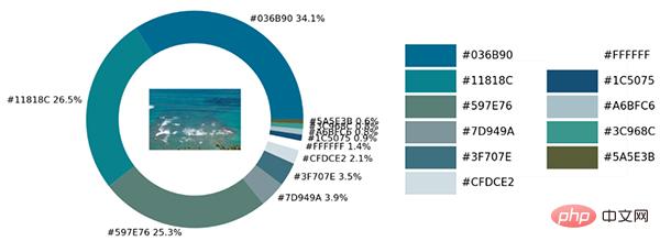
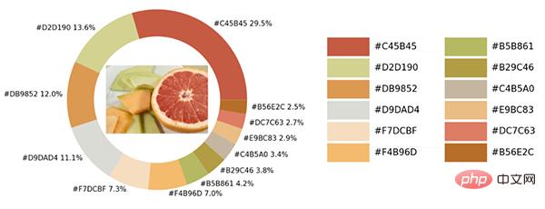
As shown below:

There are various colors in the sample photos. We will use Python to The visualization module and the opencv module identify all the color elements in the picture and add them to the color matching of the visual chart.
Import the module and load the picture
As usual, the first step is to import the module. The module used for visualization is the matplotlib module. We extract the colors from the picture and save them. In the color map table, so to use the colormap module, it also needs to be imported.
import numpy as np
import pandas as pd
import matplotlib.pyplot as plt
import matplotlib.patches as patches
import matplotlib.image as mpimg
from PIL import Image
from matplotlib.offsetbox import OffsetImage, AnnotationBbox
import cv2
import extcolors
from colormap import rgb2hex
Then let’s load the image first. The code is as follows:
input_name = 'test_1.png'
img = plt.imread(input_name)
plt.imshow(img)
plt.axis('off')
plt.show()
output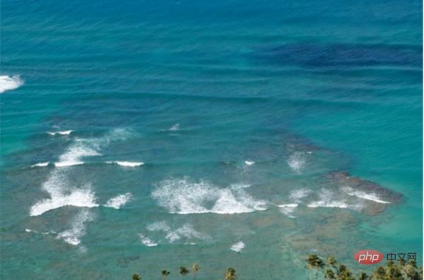
Extract the colors and integrate them into a table
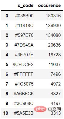
What we call is The extcolors module extracts colors from images. The output result is the color presented in RGB form. The code is as follows:
colors_x = extcolors.extract_from_path(img_url, tolerance=12, limit = 12)
colors_x
output
([((3, 107, 144), 180316),
 ((17, 129, 140), 139930),
 ((89, 126, 118), 134080),
 ((125, 148, 154), 20636),
 ((63, 112, 126), 18728),
 ((207, 220, 226), 11037),
 ((255, 255, 255), 7496),
 ((28, 80, 117), 4972),
 ((166, 191, 198), 4327),
 ((60, 150, 140), 4197),
 ((90, 94, 59), 3313),
 ((56, 66, 39), 1669)],
538200)
We integrate the above results into a DataFrame data set, The code is as follows:
def color_to_df(input_color):
 colors_pre_list = str(input_color).replace('([(', '').split(', (')[0:-1]
 df_rgb = [i.split('), ')[0] + ')' for i in colors_pre_list]
 df_percent = [i.split('), ')[1].replace(')', '') for i in colors_pre_list]
 # 将RGB转换成十六进制的颜色
 df_color_up = [rgb2hex(int(i.split(", ")[0].replace("(", "")),
int(i.split(", ")[1]),
int(i.split(", ")[2].replace(")", ""))) for i in df_rgb]
 df = pd.DataFrame(zip(df_color_up, df_percent), columns=['c_code', 'occurence'])
 return df
We try to call our custom function above and output the result to the DataFrame data set.
df_color = color_to_df(colors_x)
df_color
output
Drawing the chart
The next step is to draw the chart. The matplotlib module is used. The code is as follows :
fig, ax = plt.subplots(figsize=(90,90),dpi=10)
wedges, text = ax.pie(list_precent,
 labels= text_c,
 labeldistance= 1.05,
 colors = list_color,
 textprops={'fontsize': 120, 'color':'black'}
)
plt.setp(wedges, width=0.3)
ax.set_aspect("equal")
fig.set_facecolor('white')
plt.show()
output
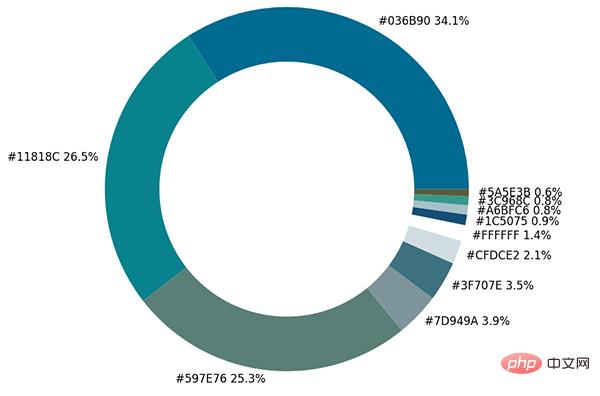
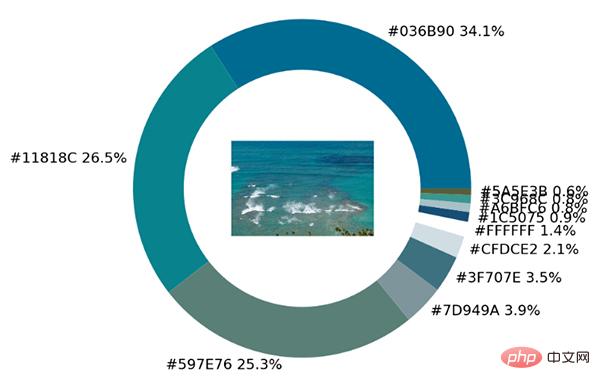
The pie chart shows the proportion of each different color. We further place the original image in the ring. among.
imagebox = OffsetImage(img, zoom=2.3)
ab = AnnotationBbox(imagebox, (0, 0))
ax1.add_artist(ab)
output
Finally make a color palette to list all the different colors in the original image. The code is as follows:
## 调色盘
x_posi, y_posi, y_posi2 = 160, -170, -170
for c in list_color:
 if list_color.index(c) <= 5:
 y_posi += 180
 rect = patches.Rectangle((x_posi, y_posi), 360, 160, facecolor = c)
 ax2.add_patch(rect)
 ax2.text(x = x_posi+400, y = y_posi+100, s = c, fontdict={'fontsize': 190})
 else:
 y_posi2 += 180
 rect = patches.Rectangle((x_posi + 1000, y_posi2), 360, 160, facecolor = c)
 ax2.add_artist(rect)
 ax2.text(x = x_posi+1400, y = y_posi2+100, s = c, fontdict={'fontsize': 190})
ax2.axis('off')
fig.set_facecolor('white')
plt.imshow(bg)
plt.tight_layout()
output
Practical link
This is the actual link. We encapsulate all the above codes into a complete function.
def exact_color(input_image, resize, tolerance, zoom):
 output_width = resize
 img = Image.open(input_image)
 if img.size[0] >= resize:
 wpercent = (output_width/float(img.size[0]))
 hsize = int((float(img.size[1])*float(wpercent)))
 img = img.resize((output_width,hsize), Image.ANTIALIAS)
 resize_name = 'resize_'+ input_image
 img.save(resize_name)
 else:
 resize_name = input_image

 fig.set_facecolor('white')
 ax2.axis('off')
 bg = plt.imread('bg.png')
plt.imshow(bg)
 plt.tight_layout()
 return plt.show()

exact_color('test_2.png', 900, 12, 2.5)
output
The above is the detailed content of Share an interesting Python visualization technique. For more information, please follow other related articles on the PHP Chinese website!