
Excel case sharing: Create a chart with positive and negative numbers (automatic identification of positive and negative numbers)

- 青灯夜游forward
- 2023-01-17 19:39:119259browse
Everyone should often make charts at work, right? I don’t know how you deal with positive and negative numbers. Today I will introduce two methods to you. One is to use ordinary charts, but the original data needs to add auxiliary columns; the other is that higher versions of the software can directly use waterfall charts, which is so convenient. Directly insert the chart, and the positive and negative will be intelligently judged and marked. Different colors and directions, learn it quickly!

#As a white-collar worker in the workplace, if you want a better life, you cannot do it without some special skills. As the saying goes, "Words are not as good as descriptions, and representations are not as good as pictures." 90% of reporting materials in the workplace are presented by PPT charts. The reason is simple because charts can clearly show the trend of a set of data at a glance.
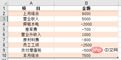
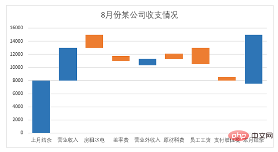
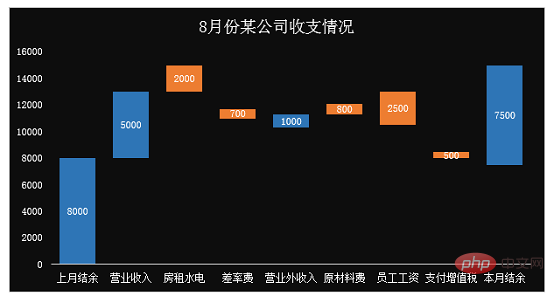
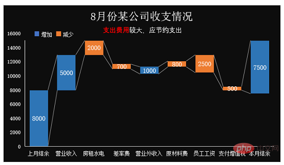
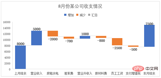
The following table is the income and expenditure details of a company in August, which now need to be expressed in the form of a chart. Let the boss see the company's revenue and expenditure details for August at a glance when he sees the chart.
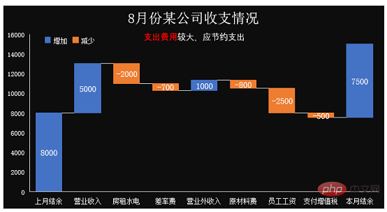
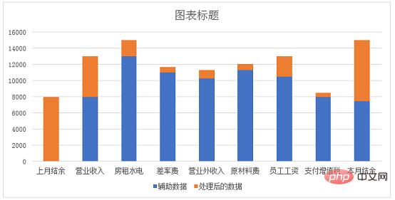
What I will share with you today is to create the company’s monthly income and expenditure charts through Excel stacked charts and Excel waterfall charts respectively. The final effect is as follows:
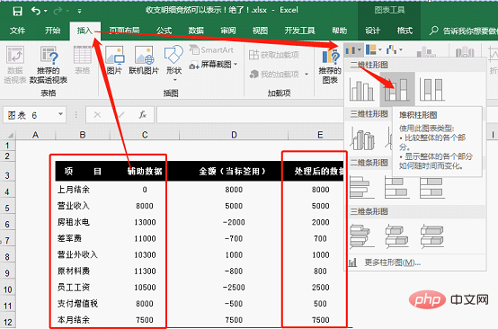
##1. Excel stacked column chart production
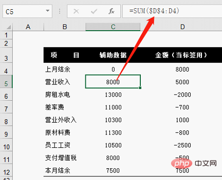
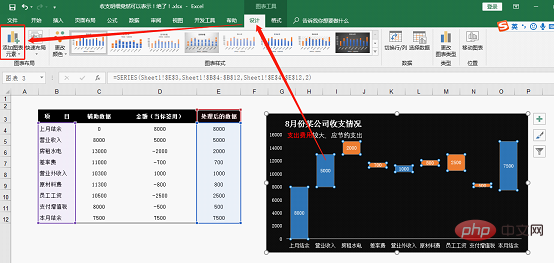
Put the original table Process and add a placeholder auxiliary column, as shown in column C in the figure below. Enter 0 directly into cell C4, enter the cumulative formula into cell C5:=SUM($D$4:D4), double-click to fill in the formula, and note that the summation area starts in cell D4 For absolute reference, you can switch it by pressing the F4 shortcut key, so that the formula will accumulate when it is filled downwards.
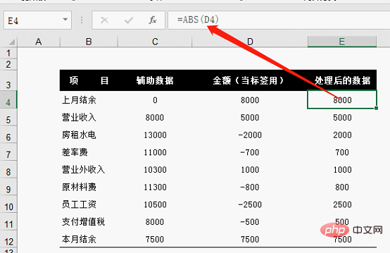
=ABS(D4), double-click the fill handle to fill the formula downward.
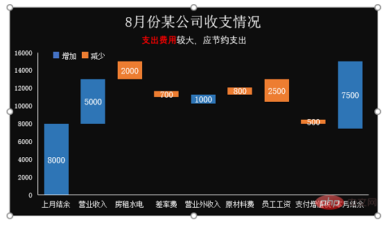
Move the chart title to the center, insert a text box below the title to set a secondary title (generally this sentence should clearly point out the point of view of our drawing, so that people looking at the chart can understand the meaning of the chart at a glance ). Also add blue and orange legend items, marking "increase" and "decrease".
After selecting the histogram, click [Add Chart Element] in the [Design] tab.
Open [Add Chart Element], select [Series Line] in [Line]
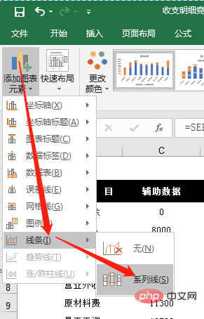
Now you see Line connections appear in the middle of each bar graph.
The above chart is completed by stacked column chart. In fact, in versions after 2013, Excel added waterfall charts. We can also make the above chart through waterfall chart, and the process is relatively simple and easy. Next we will use the waterfall chart in the 2016 version of OFFICE to make a company income and expenditure chart.
2. Waterfall Chart Production
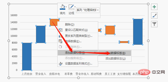
#Select the data in columns B and D in the table, click the chart in [Insert], and click Click [View all charts]. We can see the [Waterfall Chart] at the bottom, click [OK].
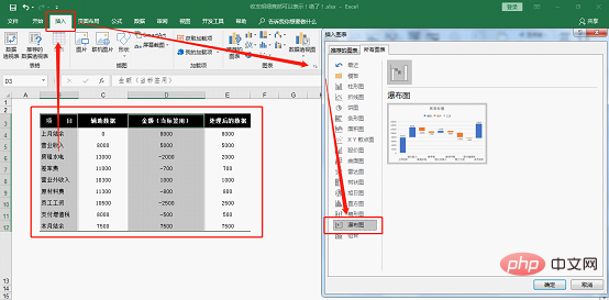
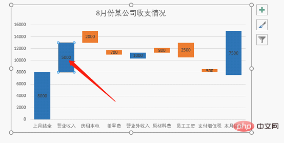
#In the new chart, you can see that the positive and negative numbers in the table are represented by two colors.
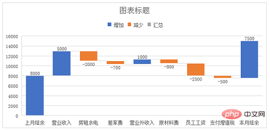
Delete the auxiliary grid lines and adjust the data labels to size 11. Set the chart title to the income and expenses of a company in August.
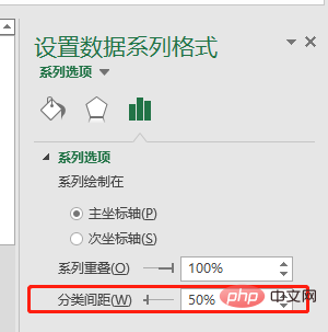
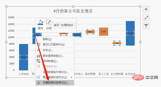
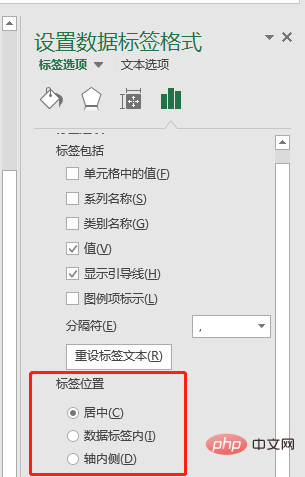
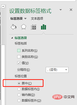
After selecting the data label, right-click and select [Format Data Series], and select Center for label position.
Set the chart background to black and adjust all other text content to white.
At this point I have completed making a chart of the company’s income and expenses through a waterfall chart.
Finally, let’s summarize:
The first way to create a stacked column chart is a bit cumbersome, and you need to add auxiliary columns yourself to achieve the effect.
The second type of waterfall chart production process is simple and easy. You can directly insert the chart, and then set and beautify the title, fill color, font, and font size.
Related learning recommendations: excel tutorial
The above is the detailed content of Excel case sharing: Create a chart with positive and negative numbers (automatic identification of positive and negative numbers). For more information, please follow other related articles on the PHP Chinese website!
Related articles
See more- Application of the automatic calculation tool evaluate() in Excel function learning
- An in-depth analysis of the Excel Tiger Balm screening formula 'INDEX-SMALL-IF-ROW'
- How to quickly export excel return values in Laravel8!
- Let's talk about five little-known functions of Laravel Excel
- Excel Pivot Table Learning: Three Methods of Dynamically Refreshing Data
- Excel function learning lookup function multi-condition matching search application