
Home >Web Front-end >uni-app >Practical guide for configuring tabbar bottom navigation bar in uniapp applet
Practical guide for configuring tabbar bottom navigation bar in uniapp applet

- WBOYWBOYWBOYWBOYWBOYWBOYWBOYWBOYWBOYWBOYWBOYWBOYWBforward
- 2022-09-15 15:33:497168browse
This article brings you relevant knowledge about uniapp. If the tabBar application is a multi-tab application, you can specify the performance of the tab bar through the tabBar configuration item, and the corresponding display when tab switching. Page, let’s take a look at it together, I hope it will be helpful to everyone.

Recommended: "uniapp tutorial"
To configure the bottom navigation bar, you first need to prepare the icons you want to use. Each tab can select two icons, one before selection and one after selection. After that, we will learn how to configure the bottom navigation bar based on the
uniapp official website tabbar configuration items provided by the uniapp official website. Without further ado, let’s go directly to the text.
Text
First of all, let’s take a look at the introduction on the official website:
If the application is a multi-tab application, you can specify the first-level navigation bar and tab through the tabBar configuration item The corresponding page displayed when switching.
Providing tabBar configuration in pages.json is not only to facilitate rapid development of navigation, but more importantly, to improve performance on the App and applet side. On these two platforms, the underlying native engine can directly read the tabBar information configured in pages.json and render native tabs without waiting for the js engine to initialize when starting.
Tips
- When the position is set to top, the icon will not be displayed
- The list in tabBar is an array and can only be configured with at least 2 , up to 5 tabs, tabs are sorted in the order of the array.
- The tabbar may not be rendered in time when switching for the first time. You can pop up a loading first in the onLoad life cycle of each tabbar page.
- The tabbar page is retained in the memory after being displayed once. Switching the tabbar page again will only trigger the onShow of each page, and will not trigger onLoad again.
- The tabbar at the top is currently only supported on WeChat mini programs. If you need to use the top tab, it is recommended not to use the top setting of the tabbar, but to make the top tab yourself. You can refer to hello uni-app->Template->Top Tab.
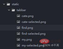
1. First, we prepare the tab icons needed for our project
I have prepared 6 icons here, which are used for switching between 3 tabs (before and after selection) , placed under the tabbar folder under the static folder:
2. Find our pages.json file and configure it
Find the globalStyle location and configure our tabbar below it.
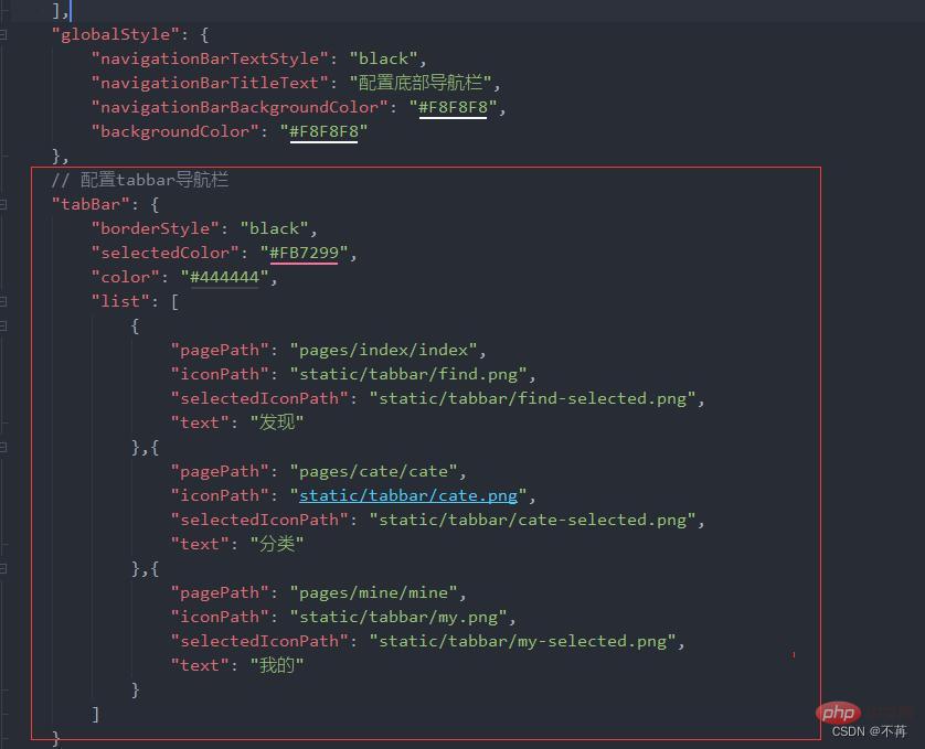
##The code snippet is as follows:
// 配置tabbar导航栏
	"tabBar": {
		"borderStyle": "black",
		"selectedColor": "#FB7299",
		"color": "#444444",
		"list": [
			{
				"pagePath": "pages/index/index",
				"iconPath": "static/tabbar/find.png",
				"selectedIconPath": "static/tabbar/find-selected.png",
				"text": "发现"
			},{
				"pagePath": "pages/cate/cate",
				"iconPath": "static/tabbar/cate.png",
				"selectedIconPath": "static/tabbar/cate-selected.png",
				"text": "分类"
			},{
				"pagePath": "pages/mine/mine",
				"iconPath": "static/tabbar/my.png",
				"selectedIconPath": "static/tabbar/my-selected.png",
				"text": "我的"
			}
		]
	}
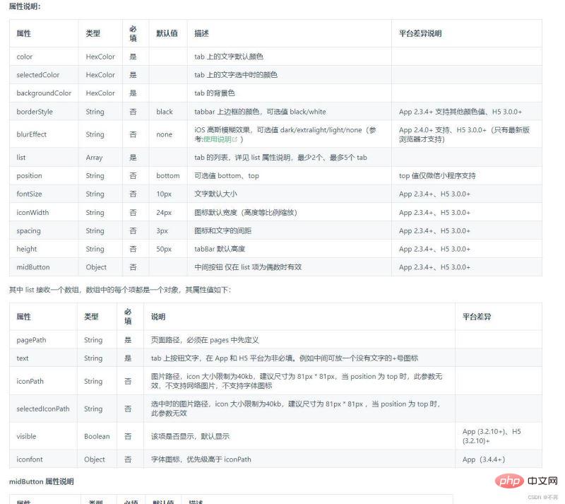
I believe many friends don’t know what these configuration items mean. Attached is a screenshot of the configuration items on the official website. You can also check the official website from the link in the preface. (The ones used in this case They are some of the most basic attributes.)
The code example is as follows: (Some common configuration items I use , you can modify it by yourself)
"pages": [ //pages数组中第一项表示应用启动页,参考:https://uniapp.dcloud.io/collocation/pages
		{
			"path": "pages/index/index",
			"style": {
				"navigationBarTitleText": "配置底部导航栏"
			}
		}
	    ,{
            "path" : "pages/mine/mine",
            "style" :
            {
                "navigationBarTitleText": "我的",
                "enablePullDownRefresh": false
            }

        },
		{
		    "path" : "pages/cate/cate",
		    "style" :
		    {
				// 导航栏标题文字内容
		        "navigationBarTitleText": "分类",
				// 是否开启下拉刷新
		        "enablePullDownRefresh": false
		    }

		}
    ],
	// 默认页面的样式
	"globalStyle": {
		// 导航栏标题颜色及状态栏前景颜色,仅支持 black/white
		"navigationBarTextStyle": "black",
		// 导航栏标题文字内容
		"navigationBarTitleText": "配置底部导航栏",
		// 导航栏背景颜色(同状态栏背景色)
		"navigationBarBackgroundColor": "#55aaff",
		// 下拉显示出来的窗口的背景色
		"backgroundColor": "#ffff7f"
	}
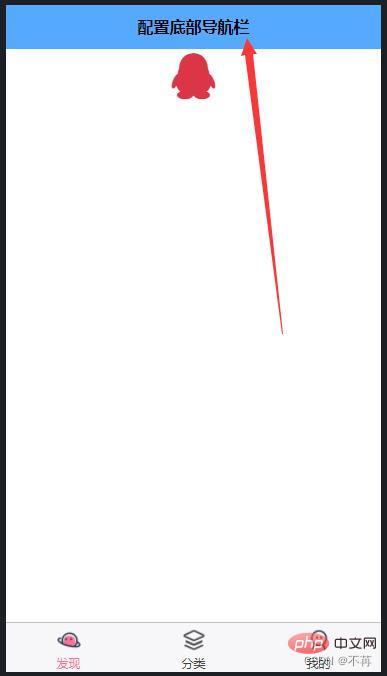
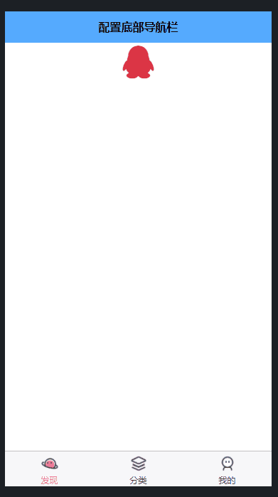
I have written comments on the meaning of some configuration items, and you can take a look at it yourself.4. Let’s take a look Our results (rendering)
uniapp tutorial"
The above is the detailed content of Practical guide for configuring tabbar bottom navigation bar in uniapp applet. For more information, please follow other related articles on the PHP Chinese website!
Related articles
See more- A brief analysis of how to create a pull-up load pull-down refresh component in uniapp
- How to implement live broadcast bypass push in uniapp (step sharing)
- Let you understand uniapp cross-domain issues (detailed examples)
- Use uniapp to develop a simple map navigation
- Let's talk about how to use Uniapp to implement global message prompts and its components