


CSS Text (text) property is used to define the appearance of text, such as text color, aligned text, decorative text, text color, line spacing, etc. This article will take you through the CSS text attribute (Text). I hope it will be helpful to you!

CSS text attribute (Text)
| is used for | property name | CSS version | Browser support | Inheritance | Default value |
|---|---|---|---|---|---|
color | 1are supported. All versions of IE do not support the attribute value "inherit". | yes | not specified | ||
dir attribute of the label).
|
direction | 2Same as above. | yes | ltr | |
hanging-punctuation | 3Safari 10.1 supports, other | does not support. | yesnone | ||
letter-spacing | 1Same as above. | yes | normal | ||
line-height | 1Same as above. | yes | normal | ||
punctuation-trim | 3does not support . | yesnone | |||
text-align | 1are supported. IE all versions | yes | If the direction attribute is ltr, the default value is left; if direction is rtl, it is right. Property value 'inherit' is not supported. | ||
⑦ Horizontal alignment of the last line of text (with direction,text-align attributes). |
text-align-last |
3 | IE11, edge14 are partially supported, FF52 chrome49 opera45 is supported, and safari is not supported. | yes | auto |
| ⑧ Text decoration (line). | text-decoration |
1 | Same as above, and IE, Chrome or Safari do not support the "blink" attribute value. | no | none.(Block element first line) Text indentation amount (blank length). |
| ⑨ Add text emphasis symbols (shape, color, position). | text-emphasis |
3 | IE, Edge does not support it, FF52 safari10.1 supports it, and chrome49 partially supports it. | no | none |
⑩ Space separation method that aligns both ends of the text (with the text-align attribute). |
text-justify |
3 | IE11, edge14 is partially supported, FF55 is supported, and others are not supported. | yes | auto |
⑪ The shadow of the text (affects the decorative line text-decoration). |
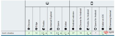
text-shadow |
2 | are supported. Only supported by IE 10 and above. | yes | none |
| Text case conversion. | text-transform |
1 | are supported. All versions of IE do not support the attribute value "inherit". | yes | none |
| ⑫ The outline of the text. | text-outline | 3 | does not support . | yes | none |
⑬ Hide the display when text overflows (matched with overflow,white-space,display properties). |
text-overflow |
3 | are supported, no prefix is required. | no | clip |
| ⑭ Add shadow to text. | text-shadow |
3 | are supported, IE10 supports | yes | none |
| ⑮ Line wrapping rules for text. | text-wrap | 3 | does not support . | yes | normal |
⑯ Rewriting/overwriting of bidirectional text (with direction attribute). |
unicode-bidi |
2 | <br> | ##yes||
| ⑰ Blank and newline processing. | white-space |
1 | are supported. All versions of IE do not support the attribute value "inherit". | yes | normal |
| ⑱ Word line break/line break position (can line break within the word). | word-break |
3 | are supported. IE6 support. | yes | normal |
| ⑲ Split long indivisible words and wrap them to the next line. The word line break position (sentence/line break method). | word-wrap |
3 | all supported, IE6 | yes | normal |
| ⑳ The distance between words/words. | word-spacing |
1 | Same as above | yes | normal |
1. color attribute: the foreground color of the color (the color of text/text decoration/border/current color)
- ⑴ The color of text and border
- Set the color of the text and border of this element. [Recommended learning: css video tutorial]
-
colorProperties- Text/border color properties
-
-
The foreground color of the element:
-
colorSet the ❶ text and ❷ text decoration# of the element The foreground color valueof ## (text-decoration ) and sets the value - of the current color ❸
currentcolor.- Indirect value: currentcolor
can be used as an indirect value for other properties, and is other color properties (such as ❹ border colorborder-color)'sdefault value.
- Indirect value: currentcolor
Color -
- color
The attribute sets the foreground color of an element- =The color of the text : In HTML, what is displayed is the color of the element text and the color of the color border.
- color:green
will set the color of the border and text to green at the same time.Border color: Can be overridden/reset with - border-color
. 
- Set the color of the text and border of this element. [Recommended learning: css video tutorial]

- ⑵
- Raster image
- Not affected by the foreground color
- color
- Raster image
- =
- Bitmap (.jpg
), bitmap, pixel image, simply put, = Image composed of pixels: The smallest unit is composed of pixels - Scaling distortion: There is only point information, which will be distorted when scaling
- Each pixel has its own color, Similar to the pictures on the computer, they are all pixel pictures
- Color blocks: If you enlarge the picture, you will see that the dots turn into small color blocks
- Bitmap (.jpg
- color
- ⑶
- Foreground color and background color
- ①
- Background color
- That’s what you want to do. The background color of the picture
- Default white
Foreground color -
Current composition, lines, fills and other colors.
- , and the foreground color is the color drawn by the brush.
- Background color
⑷
- Syntax of the foreground color attribute
-
- color
- :
color_name|hex_number|rgb_number|inherit;
/* 关键字值 Keyword values */
color: currentcolor;

/* 颜色名称 <named-color> values */
color: red;
color: orange;
color: tan;
color: rebeccapurple;

/* 十六进制颜色 <hex-color> values */
color: #090;
color: #009900;
color: #090a;
color: #009900aa;

/* <rgb> values ,逗号 可以换成空格,但是目前 最好别这么做,兼容性还没那么好*/
color: rgb(34, 12, 64);

/*rgb()中带不透明度值,浏览器支持度不好,用rgba()*/
color: rgb(34, 12, 64, 0.6);
color: rgba(34, 12, 64, 0.6);

color: rgb(34 12 64 / 0.6);
color: rgba(34 12 64 / 0.3);
color: rgb(34.0 12 64 / 60%);
color: rgba(34.6 12 64 / 30%);

/* <hsl> values ,逗号 可以换成空格,但是目前 最好别这么做,兼容性还没那么好*/
color: hsl(30, 100%, 50%);
/*hsl()中带 不透明度值,浏览器支持度不好,用 hsla()*/
color: hsl(30, 100%, 50%, 0.6);
color: hsla(30, 100%, 50%, 0.6);

color: hsl(30 100% 50% / 0.6);
color: hsla(30 100% 50% / 0.6);
color: hsl(30.0 100% 50% / 60%);
color: hsla(30.2 100% 50% / 60%);

/* Global values */
color: inherit;
color: initial;
color: unset;</hsl></rgb></hex-color></named-color>
- :
⑸
- Foreground color
- colorAttribute value
- ①
- Keyword (color name)
- : color_name,
currentColor,transparentThecolor value is the color- of the color name (such as red
- ).
Hex - : hex_number
Color whose color value is a hexadecimal value- (such as #ff0000
- )
rgb Code - : rgb(),
rgba()The color value is the color of the rgb code- color: rgb(34, 12, 64);
##④
: - hsl(),hsla()
color: hsl(30, 100%, 50%);-
color: hsla(30, 100%, 50%, 0.6);
: -
- inherit
Inherits color from parent element.- Note: The value must be a uniform color
. -
It cannot be a gradient value. Gradient color is actually an image, not a color.
- : color_name,
- ①
Default value of text color
-
Depends on the browser
- ⑺
-
Inherited
- yes
 ##
##- 示例1: 把一段文字 设置成Detailed explanation of CSS text properties (Text)的 方法
color {
    width: 600px;
    border: 10px dashed;
    padding: 10px;
    /*把一段文字 设置成Detailed explanation of CSS text properties (Text)的 方法*/
    color: red;
    color: #f00;
    color: #ff0000;
    color: rgb(255,0,0);
    color: rgb(100%,0%,0%);
    color: hsl(0,100%,50%);

    /*设置 半透明的Detailed explanation of CSS text properties (Text) = 不透明值 等于一半的 Detailed explanation of CSS text properties (Text)*/
    color: #ff000080;
    color: rgba(255,0,0,0.5);
    color: hsla(0,100%,50%,0.5);
}
| Detailed explanation of CSS text properties (Text) | 半透明的Detailed explanation of CSS text properties (Text) |
|---|---|
") |
") |
2. direction 属性: 文本/表列/水平溢出的 方向 (文本方向 可用标签的 dir 属性 替代)
- ⑴ 文本/表列/水平溢出的 方向
-
direction属性 设置 文本、表列(table columns) 和 水平溢出 (horizontal overflow)的 方向。-
文本流向: 该属性设置 块级元素的基本 文本方向
- (从左 流向右边,还是从右 流向左边,不改变 相邻文字之间的先后顺序,句号除外.)
- 嵌入方向: 由 unicode-bidi 属性 创建的 嵌入方向。
- 文本/块元素 默认对齐: 设置 文本/块级元素 的默认对齐方式
- 单元格 流动方向: 单元格(表列) 在表行中 流动的方向。
-
文本流向: 该属性设置 块级元素的基本 文本方向
-
- ⑵ 方向属性的 语法
-
direction:ltr|rtl|inherit;
-
/* 关键字值 Keyword values */
direction: ltr;
direction: rtl;

/* 全局通用的属性值 Global values */
direction: inherit;
direction: initial;
direction: unset;
- ⑶
direction方向的 属性值- 文本方向 关键点:从左到右流动 从右到左 继承
- ① 从左到右(默认值):
ltr- 内容 从左向右流动
- 用于 从左到右书写的语言 (英语,汉语 和 大多数的其他语言)。
-
文字先后顺序 不变:
- 注意,改变的是 文本的流向,文字之间的前后顺序,是不会变化的.
- ② 从右到左:
rtl- 内容 从右向左流动。
- 用于 从右向左 书写的语言(如 希伯来语(
Hebrew) 或 阿拉伯语(Arabic) 等)- 不是 所有国家的文字,都是 从左到右的写的,就跟 中国的古文,从上往下写的一样,有的国家的文字方向,是从右到左写的)
- ③ 继承父亲:
inherit- 从父元素 继承
direction属性的值。 - 内容流动 从父元素继承。
- 从父元素 继承
- ⑷ CSS 的
direction属性 和 html 标签的属性dir(标签中)- ① 文本方向 用标签的
dir属性 :- 通常是在 文档中定义的 (例如,使用 HTML 标签的
dir属性),而不是 直接使用direction属性。
- 通常是在 文档中定义的 (例如,使用 HTML 标签的
- ② 单元格 不从表列 继承
direction属性:- 与 HTML中 的
dir属性 不同,direction属性 不是从表列 继承到表单元格的,因为CSS 继承遵循 文档树,而 表单元格 位于行中,而 不是列中。
- 与 HTML中 的
- ③ 搭配使用:
- 要使
direction属性 对 行内元素 有影响,必须unicode-bidi属性的值 设置为embed,override.
- 要使
- ④ 不受
all属性影响:-
direction和unicode-bidi属性: 是唯独的两个 不受all属性 影响的属性。
-
- ① 文本方向 用标签的
⑸
direction的 浏览器支持

- 示例1: 把一段汉字,设置成相反的 从右到左的 方向.
.color {
    width: 450px;
    border: 10px dashed;
    padding: 10px;

    /*设置文本的方向*/
    direction: rtl;
}
| 默认的文本方向: ltr 从左到右 | 设置成 从右到左 direction: rtl; |
|---|---|
 |
 |
- 从最后一行的 句号
。的位置,可以看出- ① 文本的流向: 变成了 从左到右,变成了 从右到左排列
- ② 文字之间的 前后顺序: 并没有改变
- (因为那些 文字从右到左排列的语言,文字之间的顺序,也是不会变的,只是汉语 默认是左到右 书写顺序,所以反流向后 看上去 有点怪)
-
direction: rtl;=<p dir="rtl"> </p>: 两个效果 是一样的,dir: direction 的简写.
- 示例2: 改变 表格中 列的排列顺序
- css
.dirTest {
    border: 1px solid;
    width: 300px;
    direction: rtl;
    background-color: #d0d0d0;
}
.dirTest td, th {
    border: 1px solid;
}
- html
| ①姓名 | ②爱吃的水果名 | ③爱好 |
|---|---|---|
| 小明 | 葡萄 | 乒乓球 |
| 莉莉 | 苹果 | 动漫 |
| 默认方向: 从左到右 | 设置 从右到左 |
|---|---|
 |
 |
- 列的顺序 完全相反: 1,2,3 列,变成了 3,2,1 列
-
等同值:
direction:rtl=<table class="dirTest" dir="rtl"> </table>- 可在标签的
dir属性中设置.
- 可在标签的
3. CSS3 hanging-punctuation 属性: 悬挂标点的 位置和符号 (实验中 属性)
- ⑴ 悬挂标点的 位置和符号:
hanging-punctuation属性,美 /ˌpʌŋktʃuˈeɪʃn/- 指定 标点符号 应挂在 一行文本的开头 还是结尾。
- 悬挂的标点符号 可以放在 行框外。
-
实验中属性:
- 这是一项实验技术
- 在生产中使用之前,请仔细检查 浏览器兼容性表。
- 指定 标点符号 应挂在 一行文本的开头 还是结尾。
- ⑵ 悬挂标点的 语法
hanging-punctuation: none|first|last|allow-end|force-end;
/* 关键字值 Keyword values */
hanging-punctuation: none;
hanging-punctuation: first;
hanging-punctuation: last;
hanging-punctuation: force-end;
hanging-punctuation: allow-end;

/* 两个值 Two keywords */
hanging-punctuation: first force-end;
hanging-punctuation: first allow-end;
hanging-punctuation: first last;
hanging-punctuation: last force-end;
hanging-punctuation: last allow-end;

/* 三个值 Three keywords */
hanging-punctuation: first force-end last;
hanging-punctuation: first allow-end last;

/* 全局值 Global values */
hanging-punctuation: inherit;
hanging-punctuation: initial;
hanging-punctuation: unset;
- ⑶ 悬挂标点的 属性值
- ① 不悬挂标点:
none- 不在 文本首行的开头 或结尾的 行框之外 放置标点符号。
- ② 首行开始 行框外:
first- 元素的 第一个格式化行 开始处的 左括号或左引号 挂起。
- 标点附着在 首行开始边缘之外。
- ③ 末行结尾 行框外:
last- 元素 最后一个格式化行 末尾的 右括号或右引号 挂起。
- 标点附着在 末行结尾边缘之外。
- ④ 对齐不合适 挂起:
allow-end- 如果 行尾的 句号或逗号 在对齐之前 不合适,则挂起。
- ⑤ 行尾的 句号逗号 挂起:
force-end- 行尾的 句号或逗号 挂起。
- ① 不悬挂标点:
- ⑷ 多值
-
hanging-punctuation属性 可被指定 多个值,可以是 一个值,两个值,或者 三个值。 - 1个值: 使用 上面属性值中的 任何一个 关键字值。
- 2 个值: 使用下列其中一项:
-
first搭配last,allow-end,force-end中的一个 -
last搭配first,allow-end,force-end中的一个
-
- 3 个值: 使用下列其中一项:
-
first,allow-end,last -
first,force-end,last
-
-

4. letter-spacing 属性 : 字符间距 (字符之间的 额外空白/空间)
- ⑴ 字符间距/ 字符间的空白
- 定义了在 文本字符框 之间 插入多少空间
- 属性设置 文本字符之间 的间距行为
- 增加或减少 字符间的空白(字符间距)。
-
letter-spacing属性 - 字符间距 属性
-
- 增加或减少 字符间的空白(字符间距)。
- ⑵ 字符和字符框
- 由于 字符字形 通常比其 字符框 要窄
- 指定长度值时 ,会调整 字母之间 通常的间隔。
- ⑶ 字符间距的 语法
-
letter-spacing:normal|length|inherit;
-
/* 关键字值 Keyword value */
letter-spacing: normal;

/* 长度值 <length> values */
letter-spacing: 0.3em;
letter-spacing: 3px;
letter-spacing: .3px;

/* 全局值 Global values */
letter-spacing: inherit;
letter-spacing: initial;
letter-spacing: unset;</length>
- ⑷ 字符间距的 属性值
- 字符间距关键点:标准 长度值 继承
- ① 标准/正常 间距 (默认):
normal- 字符间 没有额外的空间
- 当前字体的 正常字母间距。
-
normal≠0,需要时,浏览器可调整 字符间距:- 与值
0不同,此关键字 允许用户代理 更改字符之间的 空格,以 调整/对齐 文本。
- 与值
- ② 指定 字符额外间距:
length- 字符间的 固定空间
- 指定(除了 字符之间的 默认间距之外的) 额外字符间的 空间。
-
负值: 允许使用 负值,这会让 字符之间 挤得更紧。
- 值可能是负数,但可能存在 特定于实现的限制。
- 用户代理 不会为了 调整文本/对齐文字,而进一步 增加或减少 字符间的空间 (因为间距 设定成固定值了)。
- 值可能是负数,但可能存在 特定于实现的限制。
- ③ 继承父亲:
inherit- 从父元素继承
letter-spacing属性的值。
- 从父元素继承
- ⑸ 字符间距的 默认继承性
- 会被继承
yes
- ⑹ 字符间距 和 可访问性问题
- ① 间距太大/小时, 变得不可读: 较大的 正或负字符间距值 将使单词样式 变得不可读。
- 对于具有 非常大的 正值的 文本
- 字母之间的距离 会非常远,以至于 单词看起来就像 一系列单独的、不连接的字母。
- 对于具有 非常大的 负值的文本
- 字母之间 会重叠到 无法识别单词的程度。
- 对于具有 非常大的 正值的 文本
- ② 根据字体 调整 字符间距:
- 清晰的字母间距 必须根据具体情况 来确定,因为不同的字体 有不同的字符宽度。
- 没有一个值 可以确保 所有字体 自动保持其易读性。
- ① 间距太大/小时, 变得不可读: 较大的 正或负字符间距值 将使单词样式 变得不可读。
⑺ 字符间距
letter-spacing的 浏览器支持

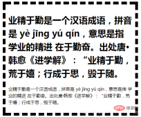
- 示例1: 设置一段文字的 字符之间的间距值
- html
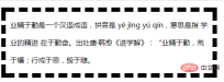
    	<p>
    	    业精于勤是一个汉语成语,拼音是 yè jīng yú qín,意思是指 学业的精进 在于勤奋。出处唐·韩愈《进学解》:“业精于勤,荒于嬉;行成于思,毁于随。
    	</p>
- css
.textTest {
    width: 450px;
    border: 10px dashed;
    padding: 10px;
    /*字符之间的间距*/
    letter-spacing: normal;
}
| 正常间距 (默认值) normal | 增加 0.2em的额外间距 letter-spacing: 0.2em; |
|---|---|
 |
 |
| 减少 0.2em的额外间距 letter-spacing: -0.2em; | 字符间距 不正常的字体(太大/太小) 2em, -0.9em |
 |
 
|
5. line-height 属性: 设置 行高/行间距 (一行多高,影响 行之间的 距离)
- ⑴ 行高/行间距:
line-height属性- ① 属性设置 行框的 高度。
- ❶ 在块级元素上
- 它指定 元素中 行框的最小高度。
- ❷ 对于 非替换的 内联元素
- 它指定 用于 计算 行框高度的 高度。
- ❶ 在块级元素上
- ② 影响 行间距: 会影响 文本行与行 之间的 距离
- 行高 = 一个文字的中间, 到下一行 文字的中间 相差的距离
- (或者 文字底部,到下一行 文字的底部的 距离)
- 所以,行高的变化,也会影响 行距.
-
行距 = 行高
line-height- 字体大小font-size= 行高和字体大小的 差值 - 注意区分 行间距和行距: 行高 = 行间距 ≠行距,行间距 是行高的别称.
-
行距 = 行高
- ① 属性设置 行框的 高度。
-
⑵ 行高、基线、顶线、中线、底线 示例图

- ⑶ 行高/行间距的 语法
-
line-height:normal|number|length|%|inherit;
-
/* 关键字值 Keyword value */
line-height: normal;

/* 无单位值: 字体大小 font-size的倍数  Unitless values: use this number multiplied
by the element's font size */
line-height: 3.5;

/* 长度值 <length> values */
line-height: 3em;

/* 百分比值 <percentage> values */
line-height: 34%;

/* 全局值 Global values */
line-height: inherit;
line-height: initial;
line-height: unset;</percentage></length>
- ⑷ 行高/行间距的 属性值
标准,数字,长度值,百分比,继承。
-
① 正常 行间距(默认):
normal- 设置 正常的行高,取决于 用户代理。
- 默认值: 桌面浏览器(包括 Firefox )使用的默认值 大约为
1.2,这取决于 元素的 字体。
-
② 一个数字(无单位),字体大小的 倍数:
number(等同于 百分比值的简写)- 设置数字,行高 = 数字 x 当前的字体大小
font-size。- 行高和继承问题: 在大多数情况下,这是 设置行高和 避免 继承导致的意外结果的 首选方法。
- 比如,一级标题
h1不继承父元素div的字体大小,段落p却继承 父元素div的字体大小时 - 此时, 容器内,就有两种不同的 字体大小的文本,如果设置一样的行高值,没办法同时满足两个子元素的 行高需要.
- 比如,一级标题
-
优点: 当元素内的 子元素的文本 字体大小
font-size不同时,能设置 相对于 子元素的 当前字体大小的行高.
- 行高和继承问题: 在大多数情况下,这是 设置行高和 避免 继承导致的意外结果的 首选方法。
- 设置数字,行高 = 数字 x 当前的字体大小
-
③ 长度值:
length- 设置 固定的行高。
- 指定的 长度值 用于计算 行框高度。em 单元中 给出的值 可能会产生 意想不到的结果
-
④ 字体大小的 百分比值:
%- 相对于 元素本身的 字体大小
font-size。- 行高 = 百分比 x 元素字体大小
font-size。
- 行高 = 百分比 x 元素字体大小
- 相对于 元素本身的 字体大小
-
⑤ 继承父亲:
inherit- 从父元素继承
line-height属性的值。
- 从父元素继承
不能负值: 行高 不允许 负值,负值会被视作 无效值.
-
默认行高/行间距:
- 在大多数浏览器中默认行高,大约是
-
110%~120%。 -
100%的行间距- 则 上一行的字 紧贴着下一行的字,中间 没有距离。
-
- 在大多数浏览器中默认行高,大约是

- ⑸ 行高和字体大小: 行高
line-heightfont-size时, 将出现 行距为负数的情况,也就是两行文字 将部分重合。

- ⑹ 行高的 继承性
- 会被继承
yes
- ⑺ 行高 和 可访问性问题
-
有助于 视力低下的人:
- 对于 主要段落内容,行高的最小值为
1.5。- 这将 有助于 视力低下的人,以及 有阅读障碍 等认知障碍的人。
- 对于 主要段落内容,行高的最小值为
-
确保行高 按比例缩放:
- 如果 对页面进行缩放 以增加文本大小,则使用 无单位值 纯数字 可确保 行高 按比例缩放。
-
有助于 视力低下的人:
⑻ 行高
line-height的 浏览器支持

- 示例1: 设置一段文字的 行高/行间距 (会影响行距)
.textTest {
    width: 450px;
    border: 10px dashed;
    padding: 10px;

    font-size: 16px;
    line-height: 1.5em;
}
| 默认 文本行高 = normal 值 | 绝对长度值 行高 line-height: 40px; |
|---|---|
 |
 |
| 相对长度值 行高 1.5em = 150% | 不带单位 纯数字 line-height: 1.5; |
 |
 |
-
等同值: 当设置 同一个元素的行高时(内部 没有字体大小不同的 子元素):
1.5=1.5em=150%- 行高 = 数值 x 元素的字体大小
font-size,都是相对于 当前字体大小的 倍数. - 如果不是同一元素的行高,比如,间
- 行高 = 数值 x 元素的字体大小
-
示例2: 纯数字值 (无单位值) 和
em,%相对长度值的区别- 只对最外层的容器
div,进行 行高设置,内部的两个子元素h1,p都不设置行高,看下内部元素的行高变化
- 只对最外层的容器
-
html
-
嵌套关系:
div > h1 | p
-
嵌套关系:
    	<div>
    		<h1 id="业精于勤是一个汉语成语-拼音是-yè-jīng-yú-qín-意思是指-学业的精进-在于勤奋-出处唐-韩愈-进学解-业精于勤-荒于嬉-行成于思-毁于随">业精于勤是一个汉语成语,拼音是 yè jīng yú qín,意思是指 学业的精进 在于勤奋。出处唐·韩愈《进学解》:“业精于勤,荒于嬉;行成于思,毁于随。</h1>
    	    <p>业精于勤是一个汉语成语,拼音是 yè jīng yú qín,意思是指 学业的精进 在于勤奋。出处唐·韩愈《进学解》:“业精于勤,荒于嬉;行成于思,毁于随。</p>
    	</div>
- css
.textTest {
    width: 450px;
    border: 10px dashed;
    padding: 10px;

    font-size: 16px;
}
| 默认 文本行高 = normal 值 | 设置成 绝对长度值时: 25px (h1 的文本 行高太挤) |
|---|---|
 |
 |
| 设置成 相对长度值: 1.5em = 150% | 设置成 纯数字 不带单位: line-height: 1.5; |
 |
 |
- ① Line height with unit:
25px,1.5em= 150%=1.5 x 16px = 24px- is equivalent to applying the same line height value to the two child elements inside
div, even if their font sizes are different
- is equivalent to applying the same line height value to the two child elements inside
- ② Pure numbers without units
- is equivalent to setting the line height of the two sub-elements
h1 and prelative to the font size of the sub-element itself - ##h1
= font size ofh1x line height of1.5 ##p - = font size of
px1.5##Advantages: When the font sizes of child elements within an element are different, the line height - relative to the current font size of the child elements can be set.
6. CSS3 punctuation-trim attribute: Punctuation trimming (no browsers support it) - is equivalent to setting the line height of the two sub-elements
⑴
Punctuation trimming- :
- punctuation-trim Properties
If the punctuation is at the beginning or end of the line,- or is adjacent to another full-width punctuation mark,
- is it correct? Punctuation marks are trimmed.
Punctuation trimmed grammar
-
punctuation-trim: none|start|end|allow-end|adjacent;
- Key points: no trimming, trimming open glyphs, trimming closed glyphs.
- ① No pruning:
- none
-
Do not trim open or close punctuation marks.- ② Trim Open glyph:
-
Trim the punctuation at the end of each line.- ③ Trim closed punctuation marks: end
Trim closed punctuation marks at the end of each line. -
- ④
-
⑤adjacent
7. text-align attribute: Text horizontal alignment
⑴
Text horizontal alignment- :
- text-align
- text-align
- attribute sets the horizontal alignment of the text in the element.
- : Defines how inline content (such as text) is aligned relative to its parent block element.
does not control the alignment of the block element itself, but only controls the alignment of the inline content (text) of the
block element- .
- text-align
- Do not control the last line of text
:Because this line is often of different lengths from other lines, it is not suitable to be controlled together?- Use
- text-align-last Attribute: Specify the horizontal alignment of the last line of text
line box - is aligned to
- 从而设置 块级元素的 文本 的 水平对齐方式。
- attribute sets the horizontal alignment of the text in the element.
- ⑵ 文本水平对齐的 继承性
- 会被继承
yes
- ⑶ 文本水平对齐
text-align的 语法-
text-align:left|right|center|justify|inherit;
-
/* 关键字值 Keyword values */
text-align: left;
text-align: right;
text-align: center;
text-align: justify;
/*下方的属性值 支持度还不好 暂时不用少用*/
text-align: justify-all;
text-align: start;
text-align: end;
text-align: match-parent;

/* 表列中 基于字符的对齐 Character-based alignment in a table column */
text-align: ".";
text-align: "." center;

/* 块对齐值 Block alignment values (非标准语法 Non-standard syntax) */
text-align: -moz-center;
text-align: -webkit-center;

/* 全局值 Global values */
text-align: inherit;
text-align: initial;
text-align: unset;
- ⑷ 文本水平对齐的 属性值
- ① 左对齐(默认值):
left- 把文本 排列到左边。
- 行内内容 对齐到 行框的左边缘。
- 默认值:没有设置
direction:rlt时 的默认值.
- 默认值:没有设置
- ② 右对齐:
right- 把文本排列到右边。
- 行内内容 对齐到 行框的右边缘。
- 设置文本流向 从右到左
direction:rlt时 的默认值.
- 把文本排列到右边。
- ③ 居中对齐:
center- 把文本 排列到中间。
- 行内内容 在行框中 居中。
- 把文本 排列到中间。
- ④ 两端对齐:
justify- 实现 两端对齐 文本效果。
- 除最后一行外,文本的左右边缘 应与 行框的左右边缘 对齐。
- 实现 两端对齐 文本效果。
- ⑤ 继承父亲:
inherit- 从父元素 继承
text-align属性的值。
- 从父元素 继承
- ★ 默认值
-
关联属性: 与方向
direction属性 相关联- 如果
direction属性是ltr,则默认值是left; - 如果
direction是rtl,则为right。
- 如果
-
关联属性: 与方向
- ① 左对齐(默认值):
- ⑸ 文本水平对齐
text-align和direction属性的 关联影响- ① 没有设置 文本水平对齐
text-align的时-
direction属性,文本的流向 会影响 水平对齐的默认值.-
direction:ltr,文本会 左对齐 -
direction:rtl,文本会 右对齐
-
-
- ② 设置 文本水平对齐后
-
direction只会改变 文本的流向,不会再影响 对齐方式.
-
- ① 没有设置 文本水平对齐
⑹ 文本水平对齐
text-align的 浏览器支持

示例1: 设置一段文本的 水平对齐方式
.textTest {
    width: 400px;
    border: 10px dashed;
    padding: 10px;

    font-size: 16px;
    margin: 10px;
}
| 左对齐 text-align:left; | 右对齐 text-align:right; |
|---|---|
 |
 |
| 居中对齐 text-align:center; | 两端对齐 text-align:justify; |
 |
 |
-
示例2: 标准兼容的 方式 : 居中块元素本身 , 而不是居中 块元素的 内联/行内内容(即 文本)
- 将 左右外边距,设置为自动
auto(下方 3 种设置方式,效果等同)- = ❶
margin: auto;= ❷margin: 0 auto; - = ❸
margin-left: auto; margin-right: auto; - 把块元素,放在父元素的 正中间.
- = ❶
- 将 左右外边距,设置为自动
margin: 0 auto;

7.1 CSS3 text-align-last 属性: 文本最后一行 水平对齐方式 (搭配 direction,text-align 属性)
- ⑴ 文本 最后一行的 水平对齐方式:
text-align-last- 描述的是一段文本中 最后一行 在被强制换行之前的 对齐规则。
-
作用对象:
-
vertical-align只对 行内元素、表格单元格元素 生效,不能用于 垂直对齐 块级元素。
-
- ⑵ 文本最后一行的 水平对齐
text-align-last的 语法-
text-align-last:auto | start | end | left | right | center | justify;
-
/* 关键字值 Keyword values */
vertical-align: baseline;
vertical-align: sub;
vertical-align: super;
vertical-align: text-top;
vertical-align: text-bottom;
vertical-align: middle;
vertical-align: top;
vertical-align: bottom;

/* 长度值 <length> values */
vertical-align: 10em;
vertical-align: 4px;

/* 百分比值 <percentage> values */
vertical-align: 20%;

/* 全局值 Global values */
vertical-align: inherit;
vertical-align: initial;
vertical-align: unset;</percentage></length>
- ⑶ 文本最后一行 水平对齐
text-align-last的 属性值- ① 与
text-align关联:auto- 受影响的行 按文本水平对齐
text-align的值 对齐, -
两端对齐除外: 除非 文本水平对齐是 两端对齐
text-align: justify- 在这种情况下,效果与
text-align-last: start是一样的,根据文本的方向 来决定.
- 在这种情况下,效果与
- 受影响的行 按文本水平对齐
- ② 与
direction关联,参考起点:start- 与
direction的设置有关。- ❶ 左对齐:
- 如果文本展示方向 是从左到右
direction :ltr,则 起点在左侧,则是左对齐;
- 如果文本展示方向 是从左到右
- ❷ 右对齐:
- 如果文本展示方向 是从右到左
direction :rtl,则 起点在右侧,则是右对齐。
- 如果文本展示方向 是从右到左
- ❸ 浏览器 默认方向: 如果没有设置
direction,则按照 浏览器文本的 默认显示方向 来确定。
- ❶ 左对齐:
- 与
- ③ 与
direction关联,参考终点:end- 与 上方
start值的 结果相反,是以 终点为参考的.
- 与 上方
- ④ 左对齐:
left- 文本 对齐到 行框的左边缘。
- ⑤ 右对齐:
right- 文本 对齐到 行框的右边缘。
- ⑥ 居中对齐:
center- 文本 在行框中 居中。
- ⑦ 两端对齐:
justify- 最后一行文字的 开头与 行框的 左侧对齐,末尾与右侧对齐。
- 文本应该 将它们的 左右边缘 对齐到 行框的左右内容边缘。
- 最后一行文字的 开头与 行框的 左侧对齐,末尾与右侧对齐。
- ① 与
- ⑷
text-align-last的 浏览器支持需要使用 浏览器前缀
 <br>
<br>
- 示例1: 把一段内容的 文本水平对齐 保持左对齐,改变 文本最后一行的对齐方式
.textTest {
    width: 400px;
    border: 10px dashed;
    padding: 10px;
    margin: 0 auto;
    font-size: 16px;
    /*文本水平对齐*/
    text-align: left;

    /*文本最后一行 水平对齐*/
    text-align-last: auto;
}
| ① 默认显示 | ② text-align-last: auto; |
|---|---|
 |
 |
| ③ 起点对齐 text-align-last: start; | ④ 终点对齐 text-align-last: end; |
 |
 |
| ⑤ 左对齐 text-align-last: left; | ⑥ 右对齐 text-align-last: right; |
 |
 |
| ⑦ 居中对齐 text-align-last: center; | ⑧ 两端对齐 text-align-last: justify; |
 |
 |
7.2 CSS3 text-justify 属性: 文本两端对齐的 空间分隔方式 (搭配 text-align 属性)
- ⑴ 文本两端对齐的 空间分隔方式:
text-justify- 当
text-align: justify时- 即 文本的 水平对齐方式 = 两端对齐 时的 分隔方式。
- 当
- ⑵ 文本两端对齐 分隔方式的 语法
text-justify: auto|inter-word|inter-character|distribute;
text-justify: none;
text-justify: auto;
text-justify: inter-word;
text-justify: inter-character;
text-justify: distribute; /* 已废弃的属性值 Deprecated value */
- ⑶ 文本两端对齐 分隔方式的 属性值
- ① 浏览器 自动决定 (默认值):
auto- 浏览器决定 两端对齐 算法。
- 这种对齐方式 将是 最适合某种语言文字的 排版(例如:英语,中文,日语,韩语等)。
- ② 禁用 两端对齐:
none- 禁用 两端对齐。
- 表现的效果 和没有设置
text-align一样- 当你因为某种原因 需要在已经设置了
text-align的元素上 禁用 两端对齐效果的时候,可以使用. - 谷歌 chrome中没有这个效果,火狐浏览器中 有这个效果.
- 当你因为某种原因 需要在已经设置了
- ③ 调整 单词间距离:
inter-word- 增加/减少 单词间的间隔。
- 在文本中的单词之间 添加空间 来实现行对齐(会改变
word-spacing的值)- 比如 英语或韩语 最适合使用 这个属性值 来用 空格分隔单词 的语言。
- ④ 调整 字符间距离:
inter-character- 通过 在文本中的 字符之间 添加空间 来实现行对齐(会改变
letter-spacing的值)- 比如 日语 最适合使用 这个属性值的语言。
- 通过 在文本中的 字符之间 添加空间 来实现行对齐(会改变
- ⑤ 分散:
distribute(已废弃 属性值)- 美 [dɪ’strɪbjut]
- 散布
- 类似 报纸版面,除了在东亚语系中 最后一行是不齐行的。
- 显示效果与设置了
inter-wrod一致,不提倡使用 这个属性,现在这个属性 或许还能有效果,但那完全是为了 向后兼容而被保留着。
- 显示效果与设置了
- ① 浏览器 自动决定 (默认值):
- ⑷ 文本两端对齐 分隔方式的 浏览器支持
实验中属性,行为可能会发生变化

示例1:给一段文本设置 两端对齐的水平对齐,并设置 两端对齐时 空间的分隔方式
css
.textjustify{
    width: 30%;
    background-color: #d0d0d0;
    padding: 10px;
    border: solid black 2px;
    font-size: 1.2em;

    /*text-align: justify;*/
    /*text-justify:auto;*/
    /*text-justify:none;*/
    /*text-justify:inter-word;*/
    /*text-justify:inter-character;*/
    /*text-justify:distribute;*/

}
- html
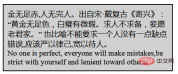
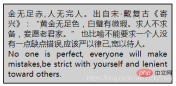
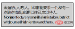
<p>金无足赤,人无完人。出自宋·戴复古《寄兴》:“黄金无足色,白璧有微瑕。求人不求备,妾愿老君家。” 也比喻不能要求一个人没有一点缺点错误,应该严以律己,宽以待人。<br>No one is perfect, everyone will make mistakes,be strict with yourself and lenient toward others.</p>
| 默认 水平对齐 | 水平 两端对齐 text-align: justify; ( 默认= text-justify:auto;) |
|---|---|
 |
 |
| 禁用 两端对齐 text-justify:none; | 调整 单词间距离 inter-word |
 |
 |
| 调整 字符间距离 inter-character | 分散 distribute (已废弃属性值) |
 |
 |
-
文本两端对齐的分隔方式
- 浏览器自动决定
auto,会根据语言 自行进行空间分隔- 所以后面的 调整 单词间距离(英语中),调整字符距离 (汉语中),效果看上去 区别不大.
- 浏览器自动决定
7.3 vertical-align 属性: 垂直对齐方式 (针对 行内元素,表格单元格内容)
- ⑴ 垂直对齐 方式:
vertical-align,美 ['vɝtɪkl]- ① 指定 行内元素(
inline)或 表格单元格(table-cell)元素的 垂直对齐方式。 - ② 在表单元格中
- 垂直对齐属性 会设置 单元格内容的 对齐方式。
- ③ 块级元素的垂直对齐: 不使用
vertical-align.- 可以设置 块的行高 = 高度
- 块中的文字垂直居中:
line-height = height
- ① 指定 行内元素(
- ⑵ 垂直对齐 使用范围
-
vertical-align只对 ❶ 行内级的元素(inline-level elements)、❷ 表格单元格元素 生效:不能用它 垂直对齐 块级元素- ① 行内元素: 将 内联元素的框 垂直对齐到 包含它的 行框中。
- 行内级元素(
inline-level elements):- 内联级元素 按行排列。
- 创建新行: 一旦元素的数量 超过了当前行 所能容纳的数量,就会在当前行下方 创建新行。
-
行框: 所有这些行 都有一个所谓的 行框,它包含 该行的所有内容。
- 不同大小的内容 表示 不同高度的行框。
- 内联级元素 按行排列。
-
display=- ❶
inline - ❷
inline-block- 内联的块元素
- 可以有宽度和高度(可能由它自己的内容定义)以及内边距、边框和外边距。
- ❸
inline-table - 行内/(内联)元素: 基本上是 包装文本的 标签。
- ❶
- 它可以用来 把图片
<img src="/static/imghwm/default1.png" data-src="https://img.php.cn/upload/article/000/000/024/9d73add3df68fbb0ef1e57e016d1f027-51.png?x-oss-process=image/resize,p_40" class="lazy" alt="Detailed explanation of CSS text properties (Text)" >垂直放置在 一行文本中
- 行内级元素(
- ② 表格单元格: 垂直对齐 表格的单元格内容
- ① 行内元素: 将 内联元素的框 垂直对齐到 包含它的 行框中。
-


- ⑶ 垂直对齐的 语法
-
vertical-align:baseline | sub | super | top | text-top | middle | bottom| text-bottom | length | % |inherit;
-
/* Keyword values */
vertical-align: baseline;
vertical-align: sub;
vertical-align: super;
vertical-align: text-top;
vertical-align: text-bottom;
vertical-align: middle;
vertical-align: top;
vertical-align: bottom;

/* <length> values */
vertical-align: 10em;
vertical-align: 4px;

/* <percentage> values */
vertical-align: 20%;

/* Global values */
vertical-align: inherit;
vertical-align: initial;
vertical-align: unset;</percentage></length>
- ⑷ 垂直对齐的 属性值
- Ⅰ.针对 行内元素的值
-
① 相对父元素 的值
- 这些值 使元素相对其父元素 垂直对齐
- ❶ 父元素 基线(默认值) :
baseline- (基线 : 父元素基线)
- 使 元素的基线 与 父元素的基线 对齐。
-
被替换元素的 基线: 一些 被替换元素(如
<textarea></textarea>)的基线 ,没有由 HTML规范指定,这意味着 它们对这个关键字的行为, 在不同的浏览器之间 可能有所不同。
-
被替换元素的 基线: 一些 被替换元素(如
- ❷ 父元素的 下标基线:
sub- (基线 : 父元素 下标基线)
- 使 元素的基线 与 父元素的下标基线 对齐。
- (基线 : 父元素 下标基线)
- ❸ 父元素的 上标基线:
super- (基线 : 父元素 上标基线)
- 使 元素的基线*与 父元素的下标基线 对齐。
- (基线 : 父元素 上标基线)
- ❹ 父元素 文本顶部:
text-top- (顶部 : 父元素 文本顶部)
- 使 元素的顶部 与 父元素的 字体顶部 对齐。
- (顶部 : 父元素 文本顶部)
- ❺ 父元素 文本底部:
text-bottom- (底部 : 父元素 文本底部)
- 使 元素的底部 与 父元素的字体底部 对齐。
- (底部 : 父元素 文本底部)
-
❻ 父元素的 中线:
middle- (中线 : 父元素中线)
使 元素的中部 与 [父元素的基线 + 父元素
x-height(x的高度)的一半] 对齐。
- (中线 : 父元素中线)
- ❼ 父元素的基线 (位移的 指定长度值):
length- (基线 : 父元素基线)
- 使 元素的基线 对齐到 父元素的基线之上的 给定长度。可以是 负数。
- (基线 : 父元素基线)
- ❽ 父元素基线 (位移的 行高的 指定百分比值):
%- (基线 : 父元素基线,行高百分比)
- 使用 “
line-height” 属性的百分比值 来排列此元素。
- 使用 “
- 使 元素的基线 对齐到 父元素的基线之上的 给定百分比
- 该百分比值 是 行高
line-height属性的 百分比。
- 该百分比值 是 行高
- 负值: 默认向上位移, 负值表示 方向相反, 向下位移.
- (基线 : 父元素基线,行高百分比)
- ❼ 父元素的基线 (位移的 指定长度值):
-
② 相对行的 值
- 下列值 使元素 相对整行 垂直对齐:
- ❶ 整行的顶部:
top- (顶部 : 整行的顶部)
- 把元素的顶端 与行中 最高元素的顶端 对齐
- 使 元素 及其后代元素的顶部 与 整行的顶部 对齐
- ❷ 整行的底部:
bottom- (底部 : 整行的底部)
- 把元素的底端 与行中 最低的元素的 底端对齐。
- 使 元素 及其后代元素的底部 与 整行的底部 对齐。
- 对于 没有基线的元素,则使用 外边距的下边缘 代替。
-
③ 属性值 的正负
- 允许指定 负长度值和百分比值。
- 使元素 降低 位置而 不是升高。
- 允许指定 负长度值和百分比值。
-
- Ⅱ. 针对 表格 单元格内容 的值
- ① 单元格 基线相互对齐:
baseline(以及sub,super,text-top,text-bottom,<length></length>,<percentage></percentage>)- (单元格基线 : 单元格基线)
- 使 单元格的基线,与 (该行中 所有 以基线对齐的) 其它单元格的基线 对齐。
- 将 单元格的基线 与 (基线对齐的行中的) 所有 其他单元格的基线 对齐。
- (单元格基线 : 单元格基线)
- ② 行的顶部 对齐:
top- (内边距框的顶部 : 行的顶部)
- 使 单元格的 内边距的 上边缘/顶部 与 该行的顶部 对齐。
- (内边距框的顶部 : 行的顶部)
- ③ 行的居中 对齐:
middle- 使 单元格 内边距框 在该行内 居中对齐。
- ④ 行的底部 对齐:
bottom- (内边距框的底部 : 行的底部)
- 使 单元格内边距的下边缘/底部 与 该行底部 对齐。
- (内边距框的底部 : 行的底部)
- ⑤ 可以负值: 可以是负数。
- ① 单元格 基线相互对齐:

- ⑸ 文字基线
- 像西文字母 坐在基线(小写字母
x的下边缘)上一样, - 汉字和标点符号 也都坐在 汉字基线上。
-
汉字基线
- 比汉字字面的 下边缘要高。
-
基线: (
baseline)是- 西文字体设计与排版的概念
- 源自 西文字母的 主体底部 对齐的位置。
-
汉字基线
- 像西文字母 坐在基线(小写字母
-
super- superscript
- 英 ['suːpəskrɪpt; 'sjuː-]
- adj. 标在上方的
- n. 上标
- superscript
⑹ 垂直对齐
vertical-align的 浏览器支持

- 示例1: 将 内联元素的框 垂直对齐到 包含它
- css
.verticalTest{
	width: 700px;
	text-decoration: underline overline;
	font-size: 1.5em;
	/*line-height = font-size x 1.5 = 1.5em x 1.5 = 1.5 x 16 x 1.5*/
	line-height: 1.5em;
	background-color: #d0d0d0;
	padding: 10px;

	border: 2px solid green;


}
.verticalTest img{
	/* 10px/16px = 0.625 */
	margin-right: 0.625em;

}
- html
    <p>
        baseline:
        <img  src="/static/imghwm/default1.png" data-src="https://mdn.mozillademos.org/files/15189/star.png" class="lazy" alt="Detailed explanation of CSS text properties (Text)" >
        sub:
        <img  src="/static/imghwm/default1.png" data-src="https://mdn.mozillademos.org/files/15189/star.png" class="lazy" alt="Detailed explanation of CSS text properties (Text)" >
        super:
        <img  src="/static/imghwm/default1.png" data-src="https://mdn.mozillademos.org/files/15189/star.png" class="lazy" alt="Detailed explanation of CSS text properties (Text)" >
        text-top:
        <img  src="/static/imghwm/default1.png" data-src="https://mdn.mozillademos.org/files/15189/star.png" class="lazy" alt="Detailed explanation of CSS text properties (Text)" >
        text-bottom:
        <img  src="/static/imghwm/default1.png" data-src="https://mdn.mozillademos.org/files/15189/star.png" class="lazy" alt="Detailed explanation of CSS text properties (Text)" >
        middle:
        <img  src="/static/imghwm/default1.png" data-src="https://mdn.mozillademos.org/files/15189/star.png" class="lazy" alt="Detailed explanation of CSS text properties (Text)" >
    </p>

    <p>
        0px:(基线重叠)= baseline
        <img  src="/static/imghwm/default1.png" data-src="https://mdn.mozillademos.org/files/15189/star.png" class="lazy" alt="Detailed explanation of CSS text properties (Text)" >
        10px (父元素 基线上方10px)
        <img  src="/static/imghwm/default1.png" data-src="https://mdn.mozillademos.org/files/15189/star.png" class="lazy" alt="Detailed explanation of CSS text properties (Text)" >
        0.5em:
        <img  src="/static/imghwm/default1.png" data-src="https://mdn.mozillademos.org/files/15189/star.png" class="lazy" alt="Detailed explanation of CSS text properties (Text)" >
        -0.5em:
        <img  src="/static/imghwm/default1.png" data-src="https://mdn.mozillademos.org/files/15189/star.png" class="lazy" alt="Detailed explanation of CSS text properties (Text)" >5
        0%:
        <img  src="/static/imghwm/default1.png" data-src="https://mdn.mozillademos.org/files/15189/star.png" class="lazy" alt="Detailed explanation of CSS text properties (Text)" >
        -50%:
        <img  src="/static/imghwm/default1.png" data-src="https://mdn.mozillademos.org/files/15189/star.png" class="lazy" alt="Detailed explanation of CSS text properties (Text)" >

    </p>

    <p>
    	top:
        <img  src="/static/imghwm/default1.png" data-src="https://mdn.mozillademos.org/files/15189/star.png" class="lazy" alt="Detailed explanation of CSS text properties (Text)" >
    	bottom:
        <img  src="/static/imghwm/default1.png" data-src="https://mdn.mozillademos.org/files/15189/star.png" class="lazy" alt="Detailed explanation of CSS text properties (Text)" >

    </p>

- 示例2: 设置 表格单元格内容的 垂直对齐
- css
.verticalTable{
	width: 50%;
}
table.verticalTable ,.verticalTable th,.verticalTable td{
	border: 1px solid green;
}
.verticalTable td{
	padding: 10px;
	background-color: #d0d0d0;
}
- html
<!-- 表格单元格内容的 垂直对齐 -->
| 基线对齐 | 行的顶部 | 居中 | 行的底部 | 一段文字(未设置垂直对齐) |
|---|---|---|---|---|
| baseline | top | middle | bottom | 自知之明, 是一个汉语成语,读音为 zì zhī zhī míng,指了解自己的情况,能正确认识自己的 长处与短处。 出自《老子》。 |

8. text-decoration 属性: 文本 装饰(线)
- ⑴ 文本装饰(线): 设置文本上 装饰线的外观
使用
text-decoration属性, 文本装饰 属性-
① 文本修饰的颜色
- 由 前景色(含 文本颜色)"
color" 属性设置。 - 由颜色属性决定,和字体一个颜色
- 由 前景色(含 文本颜色)"
-
② 后代元素会继承 装饰线: 如果后代元素 没有自己的装饰,祖先元素上 设置的装饰会 “延伸”到 后代元素中。
- 这意味着,如果元素 指定了 文本装饰,则子元素 不能删除装饰。
-
③ 简写属性:
text-decoration属性是一种 简写属性,并且可以使用 普通属性三个值中的任何一个。- 普通属性 如下:
-
text-decoration-line- 装饰线的位置: 文本修饰的位置, 如下划线
underline,删除线line-through
- 装饰线的位置: 文本修饰的位置, 如下划线
-
text-decoration-color- 装饰线的颜色
-
text-decoration-style- 装饰线的样式, 如波浪线
wavy,实线solid,虚线dashed
- 装饰线的样式, 如波浪线
- ⑵ 文本装饰的 语法
-
text-decoration:none|underline|overline|line-through|blink|inherit;
-
|| ||
- ⑶ 文本装饰
text-decoration的 属性值 (不做简写属性时,只表示 装饰线的位置)- 关键点:无装饰、上划线、贯穿线、下划线、闪烁、继承。
- ① 无装饰线(默认值) :
none- 无装饰,只有文本。
- ② 下划线:
underline- 定义 文本下的 一条线。
- ③ 上划线:
overline- 定义 文本上的 一条线。
- ④ 贯穿线(删除线):
line-through- 定义 穿过文本下的一条线。
- ⑤ 闪烁:
blink- 定义 闪烁的文本。
- ⑥ 继承父亲:
inherit- 从父元素继承
text-decoration属性的 值。
- 从父元素继承
-
做简写属性时:
text-decoration可以同时设置 装饰线的位置,样式 和 颜色.
- ⑷ 文本装饰
text-decoration的 浏览器支持IE ,Edge,不支持
text-decoration为简写

- 示例1: 装饰线的继承性,会被后代继承,并且无法 被后代元素覆盖
- css
.textdec {
	/*给文本 添加下划线*/
    text-decoration: underline;
    width: 30%;
    background-color: #d0d0d0;
    padding: 10px;
    line-height: 1.5em;
}
.textdec strong {
	/*取消强调文本的下划线*/
    text-decoration: none;
    color: green;
}
- html
    <p>
        <strong>少壮不努力,老大徒伤悲。</strong>意思是,年轻力壮的时候 不奋发图强,到了老年 再悲伤也没用了。出处,《乐府诗集·长歌行》
    </p>

- ① 下划线的 继承性: 由上图可见,子元素
strong设置了 无下划线- 因为父元素 设置了 下划线,子元素
strong这里 仍然 显示下划线,不能取消 从父元素继承的 装饰线,并且装饰线 都是黑色的.
- 因为父元素 设置了 下划线,子元素
- ② 两个 装饰线:
-
strong {text-decoration: overline;}将导致第二次装饰 出现在“一些强调词”上,而且上划线颜色 是子元素 单独设置的字体颜色. - 可以添加一个装饰线
-
- 可以在子元素中 再添加一次 装饰线,会变成子元素的颜色.
- 不是父元素的黑色了,变成了子元素的绿色

- 示例2: 同时指定 一段文字的 装饰线的 位置,样式 和 颜色
- css
.decline{
    background-color: #d0d0d0;
    text-decoration:underline wavy #008000;

/*	text-decoration-line: underline;
	text-decoration-style:wavy;
	text-decoration-color: green;*/


}
- html
    <p>
    	<del>纸上得来终觉浅,</del>绝知此事要躬行。
    </p>
-
text-decoration:underline wavy #008000;属性值 前后顺序 不影响.<br>

8.1 text-decoration-line: 文本 装饰线的位置 (上 中 下)
- ⑴ 文本装饰线的 位置:
text-decorator-line设置用于元素中的文本的 装饰类型(即 文本装饰线类型 )。- (如下划线 或上划线)
-
多值: 文本装饰线 位置
text-decorator-line属性 被指定为none、一个或多个 空格 分隔的 值。
- ⑵ 装饰线位置的 语法
-
text-decoration-line:none | [ underline || overline || line-through || blink ]
-
/* 单个 关键字值 Single keyword */
text-decoration-line: none;
text-decoration-line: underline;
text-decoration-line: overline;
text-decoration-line: line-through;
text-decoration-line: blink;

/* 多个 关键字值,同时指定几条装饰线 Multiple keywords */
text-decoration-line: underline overline;               /* Two decoration lines */
text-decoration-line: overline underline line-through;  /* Multiple decoration lines */

/* 全局值  Global values */
text-decoration-line: inherit;
text-decoration-line: initial;
text-decoration-line: unset;
- ⑶ 文本装饰线的 属性值
- ① 无装饰线:
none- 没有文本装饰,没有装饰线
- ② 下划线:
underline- 每一行文字 下面 都有一条 装饰线。
- ③ 上划线:
overline- 每行文字 上面 都有一条 装饰线。
- ④ 删除线(贯穿线):
line-through- 每行文字 中间 都有一条 装饰线。
- ⑤ 文本闪烁:
blink(已弃用的 属性值)- 文本闪烁(在可见和不可见之间交替)。符合规范的用户代理可能根本不会闪烁文本。这个值不赞成CSS动画。
- ① 无装饰线:
- ⑷ 装饰线位置的 浏览器支持
- 都不支持
blink的属性值 需要使用 浏览器前缀
- 都不支持
 <br>
<br>
- 示例1: 给一段文字 添加装饰线
- css
.decline{
    background-color: #d0d0d0;
	text-decoration-line: overline;
	/*text-decoration-line: line-through;*/
	/*text-decoration-line: underline;*/
	/*text-decoration-line: blink;*/

}
- html
    <p>
    	纸上得来终觉浅,绝知此事要躬行。
    </p>
| 上划线 overline | 删除线(贯穿线) line-through |
|---|---|
 |
 |
| 下划线 underline | 闪烁 (无任何效果,blink 属性值浏览器不支持) |
 |
 |
8.2 text-decoration-style: 文本 装饰线的 样式
- ⑴ 装饰线的样式:
text-decoration-style - 用于设置由
text-decoration-line设定的 线的样式。-
同一装饰线 不能设置 不同样式:
- 线的样式 会应用到 所有被
text-decoration-line设定的线,不能为 其中的每条线 设置 不同的样式。
- 线的样式 会应用到 所有被
-
语义化的标签:
- 如果 设定的修饰效果 具有特定的语义,例如 删除线, 意味着 某些文本被删除了,开发者 最好使用 有语义的 HTML 标签来表达,比如
<del></del>或<s></s>标签 - 因为浏览器 有时可能会 屏蔽某些样式,但语义化的标签 则不会出现这样的问题。
- 如果 设定的修饰效果 具有特定的语义,例如 删除线, 意味着 某些文本被删除了,开发者 最好使用 有语义的 HTML 标签来表达,比如
-
简写属性: 当要设置 装饰线的 修饰属性时,用
text-decoration简写属性 会比分别写多个属性 更方便。
-
同一装饰线 不能设置 不同样式:
- ⑵ 装饰线样式的 语法
-
text-decoration-style:solid | double | dotted | dashed | wavy
-
/* 关键字值 Keyword values */
text-decoration-style: solid;
text-decoration-style: double;
text-decoration-style: dotted;
text-decoration-style: dashed;
text-decoration-style: wavy;

/* 全局值 Global values */
text-decoration-style: inherit;
text-decoration-style: initial;
text-decoration-style: unset;
- ⑶ 装饰线样式的 属性值
-
实线:
solid- 画一条实线。
-
双实线:
double- 画一条双实线。
-
点虚线:
dotted- 画一条点划线。
-
虚线:
dashed- 画一条虚线。
-
波浪线:
wavy, 美 /ˈweɪvi/- 画一条波浪线。
-
不画线:
-moz-none(尚未标准化)- 不画线。亦可用
text-decoration-line: none替代。
- 不画线。亦可用
-
实线:
- ⑷ 装饰线样式的 浏览器支持
IE 不支持, 其他浏览器 需要 浏览器前缀

- 示例1: 给一段文字添加 不同的装饰线样式
- css
.decline{
    background-color: #d0d0d0;
	text-decoration-line: underline;
	text-decoration-style:double;
	/*text-decoration-style:dotted;*/
	/*text-decoration-style:dashed;*/
	/*text-decoration-style:wavy;*/

}
| 双实线 double | 点虚线 dotted |
|---|---|
 |
 |
| 直虚线 dashed | 波浪线 wavy |
 |
 |
8.3 text-decoration-color: 文本 装饰线的 颜色
- ⑴ 文本装饰线的 颜色:
text-decoration-color- 用于设置 文本修饰线的 颜色。
- 应用范围: 被指定的颜色 会作用到 该属性值 有效范围内的 所有装饰线上。
-
设置 不同装饰线 不同颜色的方法
- 没有直接的机制 为每种线型 指定唯一的颜色,不过可以通过 嵌套元素的方法 来实现这种效果
- 用
text-decoration-line属性 为每个元素 应用一种线型,再用text-decoration-color指定线的颜色。
- 用于设置 文本修饰线的 颜色。
- ⑵ 装饰线颜色的 语法和属性值
-
text-decoration-color:<rgb> | <rgba> | <hsl> | <hsla> | <hex-color> | <named-color> | currentcolor | <deprecated-system-color></deprecated-system-color></named-color></hex-color></hsla></hsl></rgba></rgb> - 合法颜色值 都可以使用.<br>
-
- 示例1: 给一段文字 添加不同颜色的 装饰线
- css
.decline{
    background-color: #d0d0d0;
	text-decoration-line: underline;
	text-decoration-style:wavy;
	text-decoration-color: green;


}

.decline del{
	text-decoration-line: line-through;
	text-decoration-color:red;


}
- html
    <p>
    	<del>纸上得来终觉浅,</del>绝知此事要躬行。
    </p>

9. CSS3 text-emphasis 属性: 添加 文本强调符号
- ⑴ 给文本 添加强调符号:
text-emphasis美 ['ɛmfəsɪs] , 强调将强调标记 应用于文本(空格 和 控制字符除外)。
-
简写属性
text-emphasis:- 在一个声明中 同时设置 文本强调的样式和颜色
-
text-emphasis-style和text-emphasis-color。- 所以, 文本强调
text-emphasis不会重置text-emphasis-position位置 的值
- 所以, 文本强调
- ⑵ 强调符号的大小
- 和 ruby 符号一样,强调符号的大小 大约是 字体大小的
50%. -
影响行高: 当前的行距 不足以显示 强调符号时,文本强调
text-emphasis可能会 影响行高。
- 和 ruby 符号一样,强调符号的大小 大约是 字体大小的
- ⑶ 文本强调适合的 字体
- Adobe 的 “
Kenten Generic OpenType Font” 是一个适合 强调标记的字体 - 它专门为 强调标记设计。
- Adobe 的 “
- ⑷ 文本强调的语法
text-emphasis: || ;
/* 初始值 Initial value */
text-emphasis: none; /* No emphasis marks */

/* 字符串值 <string> value */
text-emphasis: 'x';
text-emphasis: '点';
text-emphasis: '\25B2';
text-emphasis: '*' #555;
text-emphasis: 'foo'; /* 不应使用。它可以仅被计算为“f” 或呈现为“f” Should NOT use. It may be computed to or rendered as 'f' only */

/* 关键字值 Keywords value */
text-emphasis: filled;
text-emphasis: open;
text-emphasis: filled sesame;
text-emphasis: open sesame;

/* 关键词值 与 颜色 相结合 Keywords value combined with a color */
text-emphasis: filled sesame #555;

/* 全局值 Global values */
text-emphasis: inherit;
text-emphasis: initial;
text-emphasis: unset;</string>
- ⑸ 文本强调
text-emphasis的属性值-
没有强调符号:
none- 没有 文本强调符号.
- Ⅰ. 空心实心
- ① 实心的(填充纯色):
filled- 形状填充了纯色. 既没有
filled,也没有open时,这是默认值.
- 形状填充了纯色. 既没有
- ② 空心的:
open- 形状是 空心的。
- ① 实心的(填充纯色):
- Ⅱ. 强调符号的形状
- ① 小点/小圆圈:
dot- 显示 小圆圈 作为标记。
- 实心点
filled dot:•(U+2022) - 空心点 :
◦(U+25E6).
- 实心点
- 显示 小圆圈 作为标记。
- ② 大点/大圆圈:
circle- 显示 大圆圈 作为标记。
- 实心圆圈:
●(U+25CF) - 空心圆圈:
○(U+25CB). - 这是 水平书写模式下的 默认形状.
- ③ 实心/空心 双圆圈:
double-circle- 显示 双圆圈 作为标记。
- 实心双圆圈
◉(U+25C9), - 空心双圆圈:
◎(U+25CE).
- 实心双圆圈
- 显示 双圆圈 作为标记。
- ④ 实心/空心 三角形:
triangle- 将 三角形 显示为标记。
- 实心三角形:
▲(U+25B2) - 空心三角形:
△(U+25B3).
- 实心三角形:
- 将 三角形 显示为标记。
- ⑤ 芝麻符号:
sesame- 将 芝麻样式 显示为标记。
- (类似 顿号的样式,像是芝麻的种子, 没找到正规表达方式,简记 芝麻符号)
- 实心芝麻符号:
﹅(U+FE45), - 空心芝麻符号:
﹆(U+FE46).
- 实心芝麻符号:
- (类似 顿号的样式,像是芝麻的种子, 没找到正规表达方式,简记 芝麻符号)
- 这是在 没有其他形状的情况下,垂直书写模式的 默认形状.
- 将 芝麻样式 显示为标记。
- ⑥ 指定 字符串:
<string></string>- 将 给定的字符串 显示为标记。
-
仅限一个字符: 不应该在
<string></string>中 指定一个以上的字符. - 用户代理 可以截断或忽略 由多个字符 组成的字串。
- ① 小点/小圆圈:
- Ⅲ. 颜色:
<color></color>- 定义 强调符号的颜色。
- 如果没有颜色,则默认为
currentColor。
-
没有强调符号:
- ⑹ 文本强调
text-emphasis和 文本装饰线text-decoration的区别-
text-decoration文本装饰线 属性 不会继承,并且指定的装饰线 将应用于整个元素。 -
text-emphasis文本强调 会继承,这意味着 可以为后代 更改强调标记。
-
- ⑺ 文本强调的 浏览器支持
需要浏览器前缀

示例 1: 给一段文字 添加文本强调符号
css
.textemphasis{
    width: 35%;
    /*background-color: #d0d0d0;*/
    padding: 10px;
    border: solid black 2px;
    font-size: 1.2em;
}
.textemphasis strong{
	-webkit-text-emphasis-position:under;
	-webkit-text-emphasis:dot;
	-webkit-text-emphasis:open dot;
	/*-webkit-text-emphasis:circle;*/
	/*-webkit-text-emphasis:open circle;*/
	/*-webkit-text-emphasis:double-circle;*/
	/*-webkit-text-emphasis:open double-circle;*/
	/*-webkit-text-emphasis:triangle;*/
	/*-webkit-text-emphasis:open triangle;*/
	/*-webkit-text-emphasis:sesame;*/
	/*-webkit-text-emphasis:open sesame;*/

	/*指定字符串 作为文本强调的符号*/
	/*-webkit-text-emphasis:"z";*/
	/*-webkit-text-emphasis:"x";*/
	/*-webkit-text-emphasis:"大";*/

    /*同时设置 空心/实心/强调符号/颜色*/
	/*-webkit-text-emphasis: circle open;*/
	/*-webkit-text-emphasis: circle open red;*/


}
- html
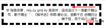
        <p>
        	<strong>取其精华,去其糟粕。</strong>是一个汉语成语,读音qǔ qí jīng huá qù qí zāo pò意思是吸取事物中最好的东西,舍弃事物中坏的,无用的东西。
        </p>
| 小点: dot = filled dot | 小圆圈: open dot |
|---|---|
 |
 |
| 大点: circle | 大圆圈: open circle |
 |
 |
| 实心 双圆圈: double-circle | 空心 双圆圈: open double-circle |
 |
 |
| 实心 三角形: triangle | 空心 三角形: open triangle |
 |
 |
| 实心 芝麻符: sesame | 空心 芝麻符: open sesame |
 |
 |
| 指定为 英文字符: "z" | 指定为 汉字: "大" |
 |
 |
| 默认 颜色/位置:circle | 指定 颜色/位置: circle open red |
 |
 |
-
① 默认的位置: 汉语中,不指定位置,文本强调符号的位置 默认 在上方
② 默认: 实心的.
-
③ 指定字符 不能指定空心/实心:
- 无效值:
-webkit-text-emphasis:open "z";,会直接跳过.
- 无效值:
视觉效果的 区别: 文本小的时候,有些 相同 文本强调符号 区别看起来不明显.
9.1 text-emphasis-style 属性: 文本强调符号的 样式/形状
- ⑴ 文本强调符号的 样式/形状:
text-emphasis-style- 属性 设置 强调标记的外观/形状。
-
设置和重置: 还可以使用 文本强调的简写
text-emphasis来 设置和重置。
- ⑵ 文本强调 形状样式的 语法
-
text-emphasis-style:none | [ [ filled | open ] || [ dot | circle | double-circle | triangle | sesame ] ] | <string></string>;
-
/* 初始值 Initial value */
text-emphasis-style: none; /* 没有强调符号 No emphasis marks */

/*  值 value */
text-emphasis-style: 'x';
text-emphasis-style: '点';
text-emphasis-style: '\25B2';
text-emphasis-style: '*';
text-emphasis-style: 'foo'; /* 不应使用。它可以仅被计算为“f”或呈现为“f” Should NOT use. It may be computed to or rendered as 'f' only */

/* 关键字值 Keywords value */
text-emphasis-style: filled;
text-emphasis-style: open;
text-emphasis-style: filled sesame;
text-emphasis-style: open sesame;

/* 全局值  Global values */
text-emphasis-style: inherit;
text-emphasis-style: initial;
text-emphasis-style: unset;
-
⑶ 文本强调 形状样式的 属性值**
- Ⅰ. 空心实心
- ① 实心的(填充纯色):
filled- 形状填充了纯色. 既没有
filled,也没有open时,这是默认值.
- 形状填充了纯色. 既没有
- ② 空心的:
open- 形状是 空心的。
- ① 实心的(填充纯色):
- Ⅱ. 强调符号的形状
- ① 小点/小圆圈:
dot- 显示 小圆圈 作为标记。
- 实心点
filled dot:•(U+2022) - 空心点 :
◦(U+25E6).
- 实心点
- 显示 小圆圈 作为标记。
- ② 大点/大圆圈:
circle- 显示 大圆圈 作为标记。
- 实心圆圈:
●(U+25CF) - 空心圆圈:
○(U+25CB). - 这是 水平书写模式下的 默认形状.
- ③ 实心/空心 双圆圈:
double-circle- 显示 双圆圈 作为标记。
- 实心双圆圈
◉(U+25C9), - 空心双圆圈:
◎(U+25CE).
- 实心双圆圈
- 显示 双圆圈 作为标记。
- ④ 实心/空心 三角形:
triangle- 将 三角形 显示为标记。
- 实心三角形:
▲(U+25B2) - 空心三角形:
△(U+25B3).
- 实心三角形:
- 将 三角形 显示为标记。
- ⑤ 芝麻符号:
sesame- 将 芝麻样式 显示为标记。
- (类似 顿号的样式,像是芝麻的种子, 没找到正规表达方式,简记 芝麻符号)
- 实心芝麻符号:
﹅(U+FE45), - 空心芝麻符号:
﹆(U+FE46).
- 实心芝麻符号:
- (类似 顿号的样式,像是芝麻的种子, 没找到正规表达方式,简记 芝麻符号)
- 这是在 没有其他形状的情况下,垂直书写模式的 默认形状.
- 将 芝麻样式 显示为标记。
- ⑥ 指定 字符串:
<string></string>- 将 给定的字符串 显示为标记。
-
仅限一个字符: 不应该在
<string></string>中 指定一个以上的字符. - 用户代理 可以截断或忽略 由多个字符 组成的字串。
- ① 小点/小圆圈:
- Ⅰ. 空心实心
- ⑷ 文本强调符号的形状的 浏览器支持
需要使用 浏览器前缀

9.2 text-emphasis-color 属性: 文本强调符号的 颜色
- ⑴ 文本强调符号的 颜色:
text-emphasis-color- 属性 设置 强调标记的颜色。
- 还可以使用文本强调简写
text-emphasis设置此值。
- ⑵ 文本强调符号的 颜色的 语法
text-emphasis-color: <rgb> | <rgba> | <hsl> | <hsla> | <hex-color> | <named-color> | currentcolor | <deprecated-system-color>;</deprecated-system-color></named-color></hex-color></hsla></hsl></rgba></rgb>
/* 初始值 Initial value */
text-emphasis-color: currentColor;

/* 合法颜色值 <color> */
text-emphasis-color: #555;
text-emphasis-color: blue;
text-emphasis-color: rgba(90, 200, 160, 0.8);
text-emphasis-color: transparent;

/* 全局值 Global values */
text-emphasis-color: inherit;
text-emphasis-color: initial;
text-emphasis-color: unset;</color>
- ⑶ 文本强调符号的颜色的 浏览器支持
需要 浏览器前缀

9.3 text-emphasis-position: 文本强调符号的 位置
- ⑴ 文本强调符号的 位置:
text-emphasis-position- 属性 设置 强调符号的位置。
- 影响行高: 像 ruby 文本一样,如果 没有足够的空间 放置强调标记,行高就会增加。
- ⑵ 文本强调符号的 位置的 语法
text-emphasis-position: [ over | under ] && [ right | left ];
/* 初始值 Initial value */
text-emphasis-position: over right;

/* 关键字值 Keywords value */
text-emphasis-position: over left;
text-emphasis-position: under right;
text-emphasis-position: under left;

text-emphasis-position: left over;
text-emphasis-position: right under;
text-emphasis-position: left under;

/* 全局值 Global values */
text-emphasis-position: inherit;
text-emphasis-position: initial;
text-emphasis-position: unset;
- ⑶ 文本强调符号的位置的 属性值
- 针对 不同的书写模式,设置上下,或左右.
- ① 上方:
over- 在水平书写模式下, 在文本上方 画上标记。
- ② 下方:
under- 在水平书写模式下,在文字下方 画上记号。
- ③ 右边:
right- 在垂直书写模式下,在文本右侧 绘制标记。
- ④ 左边:
left- 在垂直书写模式下,在文本的左侧 绘制标记。
- ⑷ 文本强调标记/符号的 首选位置
- 文本强调标记的首选位置 取决于语言。
- 日语中,偏向于 右方,上方
- 汉语中,偏向于 右方,下方
- 几种语言的 文本强调符号的 偏向位置.
| 语言 | 文本强调符号的首选位置 | ||||
|---|---|---|---|---|---|
| 水平 书写模式 | 垂直 书写模式 | <br> | |||
| ① 日语 | 上方 over |  |
右边 right |  |
<br> |
| ② 韩语 | <br> | ||||
| ③ 蒙古语 | <br> | ||||
| ④ 汉语 | 下方 under |  |
右边 right | <br> | |
- ⑸ 文本强调标记/符号的位置的 浏览器支持
需要 浏览器前缀

10. text-indent 属性: (块元素 首行) 文本的 缩进量 (空白长度)
- ⑴ 块元素 首行文本前面的缩进量(空白长度):
text-indent, 美 /ɪn’dɛnt/- 定义 一个块元素 首行文本内容之前的 缩进量。
- 设置 文本块中 首行文本的缩进。
- 属性设置 块中的 第一个内容行的 空白空间长度(缩进)。
- 常用于 建立 一个 “标签页”效果。
- ⑵ 文本缩进的 语法
text-indent:length|%|inherit;
/* 长度值 <length> values */
text-indent: 3mm;
text-indent: 40px;

/* 百分比值 相对于 包含自身的元素的 宽度 <percentage> value
   relative to the containing block width */
text-indent: 15%;

/* 关键字值 目前尚未标准化 不要使用 Keyword values */
text-indent: 5em each-line;
text-indent: 5em hanging;
text-indent: 5em hanging each-line;

/* 全局值 Global values */
text-indent: inherit;
text-indent: initial;
text-indent: unset;</percentage></length>
- ⑶ 文本缩进的 属性值: 装饰线的 颜色
- ① 长度值:
length- 使用固定的
<length></length>长度值 来指定 文本的缩进。- 定义 固定的缩进。
- 允许使用 负值。
- 默认值:
0。
- 使用固定的
- ② 父元素宽度 百分比值:
%- 基于 父元素的宽度 的百分比的 缩进。
- ③ 继承父亲:
inherit- 继承属性值
- 从父元素 继承
text-indent属性的值。
- ④ 缩进每一行:
each-line(实验中属性,尚未标准化)- 文本缩进 会影响第一行,以及使用
<br>强制断行后的 第一行。
- 文本缩进 会影响第一行,以及使用
- ⑤ 反转缩进(类似 悬挂效果):
hanging(实验中属性,尚未标准化)- 该值会对所有的行 进行反转缩进:除了第一行之外的所有的行 都会被缩进,看起来就像第一行 设置了一个负的缩进值。
- ① 长度值:
- ⑷ 文本缩进的 负值
- 允许使用负值。
-
悬挂缩进: 如果使用负值,那么首行 会被缩进到 左边。
- 允许指定 负值,这会产生一种“悬挂缩进”的效果。
⑸ 文本缩进的 浏览器支持

- 示例1: 对一段文字 进行文本缩进
- css
.textindent {
    width: 40%;
    background-color: #d0d0d0;
    padding: 10px;

    /*设置文本缩进*/
    text-indent: 50px;
/*  text-indent: 3em;
    text-indent: -2em;
    text-indent: 10%;*/

}
- html
    <p>
    	“<strong>勿以恶小而为之,勿以善小而不为。</strong>惟贤惟德,能服于人。” 劝人要进德修业,有所作为。不要因为好事小 而不做,更不能因为坏事小 而去做。小善积多了,就成为利天下的大善,而小恶积多了则 “足以乱国家”。
    </p>
文本不设置缩进时的 默认样式

| 绝对值缩进 50px | 相对值缩进 3em |
|---|---|
 |
 |
| 负值缩进 (悬挂缩进) -2em | 百分比缩进 10% |
 |
 |
11. CSS3 text-outline attribute: text outline (no browser supports it)
- ⑴ Browser support for text outline
- Currently mainstream browsers do not support the
text-outlineattribute.- Set text outline.
-
text-outlineProperties - Text outline properties
-
- Set text outline.
- Currently mainstream browsers do not support the
- ##⑵
- Syntax of text outline
- text-outline: thickness blur color
;
- text-outline: thickness blur color
- Attribute value of text outline
-
①Thickness.
- thickness
- Required.
- The thickness of the outline.
- blur
- Optional. The blur radius of the outline.
- color
- Required. The color of the outline.
- thickness
⑴
- Display when text overflows
- : text-overflow
When the text overflows the container, how to display the overflow content.- You can cut it, display ellipsis (’…’) or display a custom string.
- ⑵ 文本溢出显示
text-overflow属性的适用对象-
块级元素的内容: 只对那些 在块级元素中 溢出的内容 有效
- 方向: 且 溢出的内容 必须要 与块级元素 内联(inline)方向一致,即 行尾(行的 左端/右端)的溢出行为
- (如:内容在盒子的 下方溢出。此时就 不会生效)。
-
块级元素的内容: 只对那些 在块级元素中 溢出的内容 有效
- ⑶ 文本溢出显示
text-overflow和 文本溢出 的关系- 文本溢出属性 不会 强制 文本溢出 的发生。
-
文本溢出 搭配的属性:
- 要使 文本溢出 它的容器,必须设置 搭配 其他的 CSS属性:溢出和空白
overflow,white-space,如 ↓
- 要使 文本溢出 它的容器,必须设置 搭配 其他的 CSS属性:溢出和空白
overflow: hidden;white-space: nowrap;
- ⑷ 文本溢出的 情况:
- 当其因为某种原因 而无法换行(例子:设置了
white-space:nowrap) - 一个单词 因为太长 而不能合理地被安置(fit)。
- 当其因为某种原因 而无法换行(例子:设置了
- ⑸ 文本溢出的 语法
text-overflow: [ clip | ellipsis | <string> ]{1,2};</string>
/* 行尾的 溢出行为  Overflow behavior at line end
   Right end if ltr, left end if rtl */
text-overflow: clip;
text-overflow: ellipsis;
text-overflow: "…";
text-overflow: fade;
text-overflow: fade(10px);
text-overflow: fade(5%);

/* 溢出 在左端|在右端的行为 ,方向性 没有影响 Overflow behavior at left end | at right end
   Directionality has no influence */
text-overflow: clip ellipsis;
text-overflow: "…" "…";
text-overflow: fade clip;
text-overflow: fade(10px) fade(10px);
text-overflow: fade(5%) fade(5%);

/* 全局值 Global values */
text-overflow: inherit;
text-overflow: initial;
text-overflow: unset;
- ⑹ 文本溢出的 属性值
- ① 裁剪 (默认值):
clip- 裁剪文本。
-
文本溢出的 截断位置: 一般在 容器的极限处 进行截断。
- 即 将溢出的文本 裁剪掉, 因此在字符的中间 可能会发生截断。
- 为了能在两个字符过渡处 截断,必须使用 一个空字符串值 (
'')
- ② 省略号:
ellipsis- [ɪ’lɪpsɪs]
- 显示 省略符号 = 被修剪的文本。
- “用一个省略号 (’
…’,U+2026 HORIZONTAL ELLIPSIS)来表示 被截断的文本”。- 减少 显示的文本: 省略号 被添加在 内容区域中,因此 会减少显示的文本。
- 省略号 也可能被截断: 如果空间太小到 连省略号都容纳不下,那么这个省略号 也会被截断。
- ③ 指定 字符串:
string- 使用 给定的字符串 来代表 被修剪的文本。
- 字符串
<string></string>= 被截断的文本。- 字符串内容 将被添加在 内容区域中,所以会 减少 显示出的文本。
- 如果空间太小到 连字符串 都容纳不下,那么这个字符串 也会被截断。
- ① 裁剪 (默认值):
-
裁剪处 显示空白: 如果想在 裁剪处 显示空白符,可以使用 (
'').
- ⑺ 多值
- 可以使用 1个或 2个值 指定 文本溢出的 属性值。
-
1 个值: 给定一个值
- 它将指定 行尾 的溢出行为
- (从左到右的文本的 右端,从右到左的文本的 左端)。
-
2 个值: 给定两个值
- 第一个: 指定 行左端 溢出行为
- 第二个: 指定 行右端 溢出行为。
-
每个值 被指定为:
- 其中一个关键字值:
clip,ellipsis,fade - 字符串
<string>.</string> -
fade()函数
- 其中一个关键字值:
- ⑻
overflow和text-overflow的区别- ①
overflow-
针对 所有数据: 是针对容器内 所有的数据 溢出的 统一处理方式,
- 容器内的存储的是 文本/图片, 还是其他的数据 统一取值;
-
hidden隐藏 -
scroll滚动条显示 -
visible溢出显示
-
- 容器内的存储的是 文本/图片, 还是其他的数据 统一取值;
-
针对 所有数据: 是针对容器内 所有的数据 溢出的 统一处理方式,
- ②
text-overflow- 针对 溢出的文本: 是专门针对 盒子内的 文本溢出 时的处理方式
- 搭配属性: 必须设置
overflow:hidden,只有这样text-overflow才有效 -
text-overflow的属性值 是建立在 有隐藏的溢出内容 的基础上- 显示在容器内: 隐藏的溢出内容的 替代符号 都是在容器内显示的,作为文本内容的一部分
- ①
- ⑼ 使用注意事项
- 当设置了 文本溢出显示,却没有效果时 ,要注意 搭配下方的属性
width: 100%;  /*也可以是固定值、min-width这些*/
white-space: nowrap;  /*强制文本不能换行*/
overflow: hidden;  /*隐藏溢出内容*/
text-overflow: ellipsis;
-
必须是块元素:
- 如果是
<a></a>、<span></span>这种 行内元素,必须加上display: block成为块元素- 行内元素的默认宽度 就是文字的宽度 且无法设置
width.
- 行内元素的默认宽度 就是文字的宽度 且无法设置
- 如果是
- ⑽ 文本溢出显示的 浏览器支持
- 需要 浏览器前缀
- IE 8 提供了带有 浏览器前缀的版本,
-ms-text-overflow,和text-overflow作用相同。但是并不推荐这样使用。 - Opera 9 和 10 要求带有 浏览器前缀
-o-text-overflow。
- IE 8 提供了带有 浏览器前缀的版本,
倒数四个 都是实验中属性,支持度也很差
- 需要 浏览器前缀

- 示例1: 给一段文字 设置溢出 和 溢出时的显示
- css
.textjoverflow{
    width: 30%;
    background-color: #d0d0d0;
    padding: 10px;
    border: solid black 2px;
    font-size: 1.2em;

    /*设置不换行,才会有文本溢出*/
    white-space: nowrap;
    /*设置 overflow 溢出隐藏,文本溢出显示 才有效*/
    overflow: hidden;
    text-overflow: clip;
    /*text-overflow: ellipsis;*/
    /*目前不支持 指定字符串 所以此值无效*/
    /*text-overflow: "";*/

    /*direction: rtl;*/
}
- html
<p>金无足赤,人无完人。“黄金无足色,白璧有微瑕。求人不求备,妾愿老君家。” <br>No one is perfect, everyone will make mistakes.</p>
| 默认显示 | 不允许换行时的 默认溢出显示 |
|---|---|
 |
 |
| 溢出文本 被隐藏 overflow: hidden; | 隐藏的溢出文本 被裁剪 (默认值) text-overflow: clip; |
 |
 |
| 隐藏的溢出文本 = 省略号 text-overflow: ellipsis; | 文本流向 从右向左 direction: rtl; (行尾溢出) |
 |
 |
- 让文本溢出时的显示
text-overflow有效的 前提- ① 必须是 块元素的 文本内容:
display: block,行内元素不可以 - ② 必须 有文本溢出,比如,设置不换行:
white-space: nowrap; - ③ 溢出的文本,必须是 隐藏的:
overflow: hidden; - → 最后 设置 隐藏的溢出文本的 显示 :
text-overflow才会有效.
- ① 必须是 块元素的 文本内容:
13. text-transform 属性: 文本 大小写转换
- ⑴ 文本 大小写 转换:
text-transform, 美 /trænsˈfɔːrm/- 控制 文本的大小写。
- 它可以用于 使文本显示为 全大写 或 全小写,也可单独 对每一个单词 进行操作。
- 控制 文本的大小写。
- ⑵ 特定语言的映射
-
text-transform属性考虑到 特定于语言的 案例映射规则,如以下所示:- 在土耳其语言中
- 特定词汇的 2 种
i: Turkish (tr), Azerbaijani (az), Crimean Tatar (crh), Volga Tatar (tt), and Bashkir (ba),有两种i,带点和不带点,两个大小写配对-
i/İ和ı/I.
-
- 特定词汇的 2 种
- 在德语中
- German (de),
ß的大写 变成SS
- German (de),
- 在荷兰语中
- Dutch (nl),
ij变成IJ,即使只设置 首字母大写text-transform: capitalize
- Dutch (nl),
- 在希腊语中
- Greek (el),当整个单词 都是大写时,元音就 失去了它们的重音
ά/Α, (ή/Ή除外). - 同样,在第一个元音上 有重音的双元音 会失去重音,而在第二个元音上 有重音
άι/ΑΪ
- Greek (el),当整个单词 都是大写时,元音就 失去了它们的重音
- 在爱尔兰语中
- Irish (ga),小写字母sigma 有两种形式:
σandς -
ς仅在西格玛 终止一个单词时使用 - 大写西格玛
Σ转化成 小写西格玛时text-transform: lowercase,浏览器 需要根据上下文 选择正确的小写形式。
- Irish (ga),小写字母sigma 有两种形式:
- 在土耳其语言中
-
- ⑶ 文本大小写转换的 语法
-
text-transform:none|capitalize|uppercase|lowercase|inherit;
-
/* 关键字值 Keyword values */
text-transform: none;
text-transform: capitalize;
text-transform: uppercase;
text-transform: lowercase;
text-transform: full-width;
text-transform: full-size-kana;

/* 全局值 Global values */
text-transform: inherit;
text-transform: initial;
text-transform: unset;
- ⑷ 文本大小写转换的 属性值
- 关键点:不转换、首字母大写(每个单词)、全部大写、全部小写、继承。
- ① 不转换大小写 (默认值):
none- 不转换文本的大小写。
- 这个关键字 阻止所有字符的大小写 被转换。
- 字符 保持不变(它们保留 元素文本中 写入的原始大小写)。
- 不转换文本的大小写。
- ② 首字母大写:
capitalize- 美 /ˈkæpɪtəlaɪz/
- 文本中的 每个单词 以大写字母开头。
- 将每个单词的第一个字母 转换为大写的关键字。
- 首字母之外的 原始大小写: 其他字符 保持不变(它们保留 元素文本中 写入的原始大小写)。
- 被忽略的 开头符号: 字母是Unicode字符集 或者 数字里定义的字符 ;因此单词开头的 任何标点符号或者特殊符号 将会被忽略。
- ③ 全大写:
uppercase- 美 /'ʌpɚ,kes/
- 仅有 大写字母。
- 这个关键字 强制所有字符 被转换为大写。
- ④ 全小写:
lowercase- 美 /'loɚ,kes/
- 无大写字母,仅有小写字母。
- 这个关键字 强制所有字符 被转换为小写。
- ⑤ 继承父亲:
inherit- 从父元素继承
text-transform属性的值。
- 从父元素继承
- ① 不转换大小写 (默认值):
- 关键点:不转换、首字母大写(每个单词)、全部大写、全部小写、继承。
- ⑸ 连字符单词的 首字母大写
- 随浏览器而改变
- 例如,文本 “
w3-school” 可以用两种方式显示:- “
W3-school” 和 “W3-School”。
- “
- CSS 并没有规定 哪一种是正确的,所以这两种 都是可以的。
- 示例1: 将一段文字,进行大小写转换
- css
.texttransform{
    width: 35%;
    background-color: #d0d0d0;
    padding: 10px;
    font-weight: bold;
    font-size: 1.2em;

    /*改变文本的大小写*/
    /*text-transform:capitalize;*/
    /*text-transform:uppercase;*/
    /*text-transform:lowercase;*/
}
- html
<p>金无足赤,人无完人。<br>No one is perfect, everyone will make mistakes.</p>
| 默认样式 | 首字母大写 capitalize |
|---|---|
 |
 |
| 全大写 uppercase | 全小写 lowercase |
 |
 |
14. CSS3 text-shadow 属性: 文本的阴影 (含 装饰线 text-decoration)
- ⑴ 文本的阴影:
text-shadow- 为 文字 和 文本装饰线
text-decoration添加阴影
- 为 文字 和 文本装饰线

- ⑵ 文本阴影的语法
-
text-shadow:h-shadow v-shadow blur color;
-
/* x 偏移量 offset-x | y 偏移量 offset-y | 模糊半径 blur-radius | 颜色 color */
text-shadow: 1px 1px 2px black;

/* color | offset-x | offset-y | blur-radius */
text-shadow: #fc0 1px 0 10px;

/* offset-x | offset-y | color */
text-shadow: 5px 5px #558abb;

/* color | offset-x | offset-y */
text-shadow: white 2px 5px;

/* offset-x | offset-y
/* 使用默认的 颜色和模糊半径 */
text-shadow: 5px 10px;

/* 全局值 Global values */
text-shadow: inherit;
text-shadow: initial;
text-shadow: unset;
- ⑶ 文本阴影的 属性值
-
正值:右下方,负值:左上方
- 关键点:水平阴影,垂直阴影,模糊距离,阴影颜色
-
① 水平阴影 偏移量(必需):
h-shadow- 水平阴影的 位置。
- 允许负值。
- 这些长度值 指定阴影 相对文字的 偏移量。
-
<offset-x></offset-x>指定 水平偏移量 - 负值: 若是 负值则 阴影位于 文字左边。
- 允许负值。
- 水平阴影的 位置。
-
② 垂直阴影 偏移量( 必需):
v-shadow- 垂直阴影的 位置。
- 允许负值。
-
<offset-y></offset-y>指定 垂直偏移量 - 负值: 若是负值 则阴影位于文字上面。
- 如果水平和垂直偏移量 均为
0,则 阴影位于文字 正后方
-
- 允许负值。
- 垂直阴影的 位置。
-
③ 模糊距离:
blur- 可选。模糊的距离。
- 这是 长度值
<length></length>值。-
默认值: 如果没有指定,则默认为
0。 - 值越大,模糊半径 越大,阴影也就 越大越淡(wider and lighter)。
-
默认值: 如果没有指定,则默认为
-
④ 阴影颜色:
color- 可选。阴影的颜色。
-
阴影颜色的位置: 可以在 偏移量之前 或之后指定。
- 如果 没有指定颜色,则使用
UA(用户代理)自行选择的颜色。 - 如果想确保 跨浏览器的一致性,请明确地 指定一种颜色.
- 如果 没有指定颜色,则使用
-
- ⑷ 多个阴影: 可以设置 多个阴影
- 用 逗号
,分隔 的 阴影列表 -
每个阴影的 组成
- 由元素 在 X和Y方向的 偏移量、模糊半径 和 颜色值 组成。
- 省略的长度:
0。
-
每个阴影的 属性值
-
长度值+颜色值: 有两个或三个 长度值 和 一个可选的 颜色值 进行规定。
- ① 前两个 长度
<length></length>参数- 是以“文字中心”为原点的 坐标轴
- x轴 偏移量
<offset-x></offset-x> - y轴 偏移量
<offset-y></offset-y>的值;
- ② 如果有第三个 长度值
<length></length>参数- 则第三个数值 为形成阴影效果的 半径的数值
<blur-radius></blur-radius>。
- 则第三个数值 为形成阴影效果的 半径的数值
- ① 前两个 长度
-
长度值+颜色值: 有两个或三个 长度值 和 一个可选的 颜色值 进行规定。
- 用 逗号
-
⑸ 阴影 应用顺序: 当所给的阴影 大于 1 个时,阴影应用的顺序 为 从前到后
- 第一个指定的阴影: 在顶部.
-
⑹ 文本阴影 适用的伪元素:
- 这个属性 同时适用于
::first-line以及::first-letter伪元素.
- 这个属性 同时适用于
- ⑺ 文本的阴影的 浏览器支持
- 出于 性能考虑,Opera 最多支持
6-9个文本阴影。模糊半径 限制为100px。 - 如果
<color></color>值 未指定,那么 Firefox 将使用元素的color属性值。 IE 10 才开始支持
- 出于 性能考虑,Opera 最多支持
- 示例1: 给一段文字设置 文本的阴影
- css
.textshadow{
    width: 40%;
    background-color: #d0d0d0;
    padding: 10px;
    font-weight: bold;
    font-size: 1.5em;

    text-shadow:3px 3px green ;
}
- html
<p>海纳百川,有容乃大;壁立千仞,无欲则刚。</p>
| 设置 水平和垂直阴影 text-shadow:3px 3px; | 设置指定颜色的 水平和垂直阴影 |
|---|---|
 |
 |
| 设置 带模糊距离的 x,y 阴影偏移量 text-shadow:3px 3px 1px green; | 加大模糊半径 text-shadow:3px 3px 10px green; |
 |
 |
| x 阴影偏移量 负值 (向左偏移) | y 阴影偏移量 负值 (向上偏移) |
 |
 |
- ① 不设置 文本阴影颜色
- 文本阴影颜色 = 文本的颜色
- ② 同时设置: x,y 阴影偏移量 必须同时设置,只设置一个 没效果,没阴影.
- 无效值:
text-shadow:3px green; - 有效值:
text-shadow:3px 3px green;
- 无效值:
- ③ 文本的装饰线 也会出现阴影

15. CSS3 text-wrap 属性: 文本换行 (浏览器 都不支持)
- ⑴ 文本换行的 浏览器支持
- 目前主流浏览器 都不支持
text-wrap属性。- 设置文本的换行规则。
-
text-wrap属性 - 文本换行 属性
-
- 设置文本的换行规则。
- 目前主流浏览器 都不支持
- ⑵ 文本换行的 语法
-
text-wrap: normal|none|unrestricted|suppress;
-
- ⑶ 文本换行的 属性值
- 关键点:允许的换行点 不换行 任意处换行 压缩换行
- ① 允许的换行点。
- normal
- 只在允许的换行点 进行换行。
- ② 不换行。
- none
- 不换行。
- 元素无法容纳的文本 会溢出。
- ③ 任意处换行。
- unrestricted
- 美 [,ʌnrɪ’strɪktɪd]
- 无限制的,自由的。
- 在任意两个字符间 换行。
- ④ 压缩换行。
- suppress
- 美 [sə’prɛs]
- 压缩 元素中的换行。
- 浏览器只在行中 没有其他有效换行点时 进行换行。
16. unicode-bidi 属性: 双向文本的 重写/覆盖 (搭配 direction 属性)
- ⑴ 双向文本的 重写/覆盖
- ① 搭配属性:
unicode-bidi属性和direction属性搭配, 决定 如何处理文档中 的 双向文本 (双向文本 处理)。- 例如,如果一个内容块 同时包含 从左到右 和 从右到左 的文本
-
浏览器使用算法: 那么用户代理 使用复杂的
Unicode统一码算法 来决定 如何显示文本。
- ② 覆盖 浏览器算法:
unicode-bidi属性 覆盖了 这个Unicode统一码算法,允许开发人员 控制文本嵌入。 - ③ 不受
all属性影响:unicode-bidi与direction是仅有的两个 不受all属性 影响的属性。
- ① 搭配属性:
- ⑵ 双向文本重写的 语法
-
unicode-bidi:normal | embed | isolate | bidi-override | isolate-override | plaintext;
-
/* 关键字值 Keyword values */
unicode-bidi: normal;
unicode-bidi: embed;
unicode-bidi: isolate;
unicode-bidi: bidi-override;
unicode-bidi: isolate-override;
unicode-bidi: plaintext;
/* 全局值 Global values */
unicode-bidi: inherit;
unicode-bidi: initial;
unicode-bidi: unset;
- ⑶ 双向文本重写
unicode-bidi的 属性值- ① 不嵌入,不覆盖/重写:
normal- 相对于 双向算法:
- 元素不提供 额外的嵌入级别
- 对于内联元素: 隐式重新排序 可以 跨元素边界 进行
- 无嵌入层,不改顺序: 不使用 附加的嵌入层面,原来是什么顺序 就使用什么顺序(默认)
- 相对于 双向算法:
- ② 嵌入,不覆盖/重写:
embed-
内联元素
- 打开与 双向算法相关的 附加嵌入级别。
-
嵌入层的方向: 由方向
direction属性给出。-
有嵌入层,隐式重排序:
direction属性的值 指定嵌入层的方向,在对象内部 进行 隐式 重排序
-
有嵌入层,隐式重排序:
-
内联元素
- ③ 按照方向 严格覆盖/重写:
bidi-override-
内联元素
- 将创建一个覆盖
-
块容器元素
- 为 不在 另一个块容器元素内 的 内联级 (行内)后代 创建覆盖。
- 即 在元素内部,根据 方向
direction属性 严格 按顺序 重新排序;- 不仅文本的流向 会变化,连相邻文字之间的先后顺序,也会变化.
- 忽略了 双向算法的隐式部分。
-
There is an embedded layer, strict reorderingCreate an additional embedded layer, strictly reordered according to the value of the
directionattribute
-
内联元素
- 3 new attribute values: The browser support for the following attribute values is not very good and requires browser prefix
- ④
isolate- Calculate the directionality of the container of the element: This keyword indicates that the directionality of the container of the element should be calculated without considering the content of the element.
-
Isolated from sibling elements:
- Therefore, this element is isolated from its sibling elements.
- Its container element treats it as one or more images when applying its bidirectional resolution algorithm.
- ⑤
isolate-override- Apply the
isolationkeyword's isolation behavior to surrounding content - Apply the
bidi-overridekeyword's override Behavior applies to internal content
- Apply the
- ⑥
plaintext- Causes the element's directionality calculation to not take into account the value of its parent bidirectional state or direction
directionattribute. -
Directional calculation: It is calculated using the
P2andP3rules of theUnicodebidirectional algorithm. - Allows the display of data that has been formatted using tools using the
Unicodebidirectional algorithm.
- Causes the element's directionality calculation to not take into account the value of its parent bidirectional state or direction
- ① 不嵌入,不覆盖/重写:
- ⑷ Bidirectional text rewriting
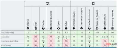
unicode-bidibrowser supportThe support for the latest 3 attribute values is not good, so use the prefix
- ##Example 1: With the direction direction
attribute, set thenormal, embed, bidi-overrideattribute value for a piece of text respectively.When the text flow direction is from left to right:- direction: ltr;
- , set the above three values respectively, and the text does not change.
When the text flow direction is from right to left:direction: rtl; - , set the above three values respectively, the text changes as follows:
- , set the above three values respectively, and the text does not change.
| When the text flows from right to left: direction: rtl; (with normal value) | ||||||||||||||||||||||||||||||||||||||||||||||||||||||||||||||||||||
|---|---|---|---|---|---|---|---|---|---|---|---|---|---|---|---|---|---|---|---|---|---|---|---|---|---|---|---|---|---|---|---|---|---|---|---|---|---|---|---|---|---|---|---|---|---|---|---|---|---|---|---|---|---|---|---|---|---|---|---|---|---|---|---|---|---|---|---|---|
 |
 | ##Embed, do not rewrite/override unicode-bidi: embed;|||||||||||||||||||||||||||||||||||||||||||||||||||||||||||||||||||
 |
 |


| 默认显示 = word-break: normal; | 任意处断行(可单词内断行) word-break: break-all; |
|---|---|
 |
 |
| 不能单词内断行 (中日韩 不断行) word-break: keep-all; | 单词处断行 = = word-break: normal; |
 
|
 
|
18. CSS3 word-wrap / overflow-wrap 属性: 单词 断行时的 断行位置 (断句/断行 方式)
-
⑴ 单词 断行时的 断行方式 :
word-wrap属性- 用来说明 当一个 不能被分开的字符串 太长 而不能填充其容器时,
- 防止溢出: 为防止 其溢出,浏览器 是否允许 这样的单词 中断换行。
- 允许 长单词或 URL 地址 换行到下一行。
- 防止溢出: 为防止 其溢出,浏览器 是否允许 这样的单词 中断换行。
- 用来说明 当一个 不能被分开的字符串 太长 而不能填充其容器时,
-
⑵ 重命名和别名:
- 重命名:
word-wrap属性 原本属于微软的 一个私有属性- 在 CSS3 现在的 文本规范草案中 , 已经被重名为
overflow-wrap。
- 在 CSS3 现在的 文本规范草案中 , 已经被重名为
- 别名:
word-wrap现在被当作overflow-wrap的 “别名”。- 稳定的谷歌 Chrome 和 Opera 浏览器版本 支持这种新语法。
- 优先使用
word-wrap属性名,目前 浏览器支持度更好些.
- 重命名:
- ⑶ 单词 换行/断行方式 语法
word-wrap: normal | break-word | anywhere;
/* 关键字值 Keyword values */
overflow-wrap: normal;
overflow-wrap: break-word;
overflow-wrap: anywhere;

/* 全局值 Global values */
overflow-wrap: inherit;
overflow-wrap: initial;
overflow-wrap: unset;
- ⑷ 单词 换行/断行方式 属性值
- ① 断点处 换行 (默认值):
normal- 只在 允许的断字点 换行
- (浏览器 保持默认处理)。
- 表示 在正常的 单词结束处 换行。
- 可能会出现 文本溢出.
- ② (溢出的)长单词/长中文句子 强制分割:
break-word- 如果行内 没有多余的地方 容纳该单词到结尾,则那些正常的 不能被分割的单词 会被强制 分割换行。
- 切断单词,在单词内部 进行换行。
- 在长单词,长中文句子 或 URL 地址 内部 进行换行。
- 不会出现 文本溢出.
- 切断单词,在单词内部 进行换行。
- 如果行内 没有多余的地方 容纳该单词到结尾,则那些正常的 不能被分割的单词 会被强制 分割换行。
- ③ 任意处断行(防溢出):
anywhere(浏览器支持度 很差,不要使用)- 为了 防止溢出,如果行中 没有其他可接受的断点,则可能在任何点上 中断一个原本不可中断的字符串(如 长单词或URL)。
- 在断点处 没有插入 任何连字符。
- ① 断点处 换行 (默认值):
- ⑸
word-break和word-wrap的 区别 .-
word单词 的概念- 中文中, 一个字 就相当于一个单词,
- 英文中, 要有一个空格 才将他们分割为 一个单词;
-
word-break强调的是: 能否 单词内的断句,范围是 全部文本. -
word-wrap强调的是: 单词内 断句方式,范围是 需要断句的文本. -
长单词 强行断句
- ①
word-wrap:break-word与word-break:break-all共同点:- 都能把 长单词 强行断句
- 都不会出现 长单词/长中文句子的 文本溢出.
- ② 不同点: 会不会 开始一个新行
-
word-wrap:break-word: 会 先起一个新行 来放置长单词,新的行 还是放不下这个长单词 则会对长单词 进行强制断句; -
word-break:break-all: 不会 把长单词 放在一个新行里,当这一行 放不下的时候 就直接 强制断句了。
-
- ①
-
- ⑹ 浏览器支持
- 使用
word-wrap名称, 比overflow-wrap属性名 浏览器支持度更好 anywhere属性值 不要使用,支持度很差
- 使用

- 示例1: 给一段文字 设置 断行 和 单词断行时的方式
- css
.wordbreak{
    width: 20%;
    background-color: #d0d0d0;
    padding: 10px;
    border: solid black 2px;
    font-size: 1.2em;

    /*单词换行处 设置*/
    /*word-break: normal;*/
    /*word-break: break-all;*/
    /*word-break: keep-all;*/
    /*word-break: break-word;*/


}

.wordwrap{

    /*单词 断行位置*/
	/*word-wrap: normal;*/
    /*word-wrap: break-word;*/

}
- html
<p>金无足赤,人无完人。出自宋·戴复古《寄兴》:“黄金无足色,白璧有微瑕。求人不求备,妾愿老君家。” 也比喻不能要求一个人没有一点缺点错误,应该严以律己,宽以待人。<br> No one is perfect, everyone will make mistakes,be strict with yourself and lenient toward others.Nooneisperfecteveryonewillmakemistakes</p>
-
默认显示 =
word-break: normal;=word-wrap: normal;

| 可词内断行 word-break: break-all; | 长单词 强制断行 word-wrap: break-word; |
|---|---|
 |
 |
| 不允许 词内断行 word-break: keep-all; | 同时设置 不允许 词内断行 word-break: keep-all; 和 强制长单词 断行 word-wrap: break-word; |
 |
 |
- ① 同时设置 词内断行
word-break: break-all;和 长单词 强制断行word-wrap: break-word;- 显示效果 是词内断行的效果,因为 范围是全文,包含了长单词断行,而且,该断行的 都断行/换行了,不需要 再进行 长单词 强制断行设置了.
- ② 同时设置 不允许 词内断行
word-break: keep-all;和 强制长单词 断行word-wrap: break-word;- 两个效果都有,因为 不允许词内断行,可能会 造成文本溢出,有需要进行 长单词强制断行的地方
19. word-spacing 属性: 单词/字 之间的 距离
- ⑴ 单词之间的距离:
word-spacing属性- 增加或减少 单词之间的 空白/间隔距离(即 字间隔)。
- 汉字: 汉字之间没有空格的时候 不受影响,有空格 会受影响.
- 设置元素中 字之间 插入多少空白符。
- 设置 单词之间 和 标签之间 的 空间长度。
- “字” 的定义: 为 由 空白符包围的 一个字符串。
- 设置 单词之间 和 标签之间 的 空间长度。
- 增加或减少 单词之间的 空白/间隔距离(即 字间隔)。
- ⑵ 单词/字间距的 语法
word-spacing:normal|<length> | <percentage>|inherit;</percentage></length>
/* 关键字值 Keyword value */
word-spacing: normal;

/* 长度值 <length> values */
word-spacing: 3px;
word-spacing: 0.3em;

/* 百分比值 <percentage> values */
word-spacing: 50%;
word-spacing: 200%;

/* 全局值 Global values */
word-spacing: inherit;
word-spacing: initial;
word-spacing: unset;</percentage></length>
- ⑶ 单词/字间距的 属性值
- ① 默认 单词间距(默认值) :
normal- 正常的 单词间距,由 当前字体 或 浏览器 定义。
- 定义 单词间的 标准空间。
- 不改变单词间的间距 =
word-spacing: 0;
- 正常的 单词间距,由 当前字体 或 浏览器 定义。
- ② 额外 单词间距: 长度值:
length- 通过 指定具体的额外间距 来增加字体的 单词间距。
- 单词间的 固定空间。
- 设置为 固定的间距。
- 通过 指定具体的额外间距 来增加字体的 单词间距。
- ③ 额外 单词间距: 百分比值:
<percentage></percentage>(浏览器支持度很差,勿用)- 通过 指定 受影响字符的宽度 的百分比 的方式 来增加的间距。
- ④ 继承父亲:
inherit- 从父元素 继承
word-spacing属性的值。
- 从父元素 继承
-
负值: 让字/单词之间 挤得更紧,缩短 单词/字 之间的距离
- 将单词间距 设置为负值,
- ① 默认 单词间距(默认值) :
⑷ 单词/字间距的 浏览器支持

- 示例1: 给一段文字 设置 单词之间的距离
- css
.wordspace {
    width: 25%;
    background-color: #d0d0d0;
    padding: 10px;
    border: solid black 2px;
    font-size: 1.1em;

    /*设置单词/字 之间的距离*/
    word-spacing: normal;
    /*word-spacing:4px;*/
    /*word-spacing:-4px;*/
    /*word-spacing:1em;*/
    /*word-spacing:-1em;*/
    /*百分比值 目前各大主流浏览器 不支持*/
    /*word-spacing:10%;*/
}
- html
    <p>金无 足赤,人无 完人。比喻 不能要求一个人 没有一点缺点错误,应该 严以律己,宽以待人。
        <br>No one is perfect, everyone will make mistakes,be strict with yourself and lenient toward others.</p>
-
默认样式 =
word-spacing: normal;- 在一些汉字中 刻意地 添加了一些空格,观察是否 受
word-spacing的影响
- 在一些汉字中 刻意地 添加了一些空格,观察是否 受

| 单词/字间距 增加 word-spacing:4px; | 单词/字间距 减少 word-spacing:-4px; |
|---|---|
 |
 |
| 单词/字间距 增加 word-spacing:1em; | 单词/字间距 减少 word-spacing:-1em; |
 |
 |
- 对汉字的影响: 汉字之间 有空格时,也会受影响,没有空格 则不会受影响.
-
可访问性 问题
- 不可读: 较大的正或负 单词/字间距值 将使 句子不可读。
- ① 对于具有非常大的正数值的文本
- 单词之间的距离 将非常远,以至于它将 不再显示为一个句子。
- ② 对于带有较大负值的文本
- 单词之间会 相互重叠,以至于无法识别 每个单词的开头和结尾。
- ① 对于具有非常大的正数值的文本
- 不同字体 不同单词间距: 清晰的字间距 必须根据具体情况 来确定,因为不同的字体 有不同的 字符宽度。
- 没有一个值 可以确保所有字体 自动保持其易读性。
- 不可读: 较大的正或负 单词/字间距值 将使 句子不可读。
20. white-space 属性: 空白和换行的 处理
- ⑴ 空白和换行的 处理:
white-space属性- 设置如何处理 元素内的空白和换行。
- 设置 建立布局过程中 如何处理元素中的空白符。
- 值
pre-wrap和pre-line是 CSS 2.1 中新增的。
- 值
- ⑵ 空白/换行处理的 语法
white-space:normal|nowrap |pre|pre-line||pre-wrap| inherit;
/* 关键字值 Keyword values */
white-space: normal;
white-space: nowrap;
white-space: pre;
white-space: pre-wrap;
white-space: pre-line;
white-space: break-spaces;

/* 全局值 Global values */
white-space: inherit;
white-space: initial;
white-space: unset;
- ⑶ 空白/换行处理的 属性值
- ① 浏览器 自动处理 (默认值):
normal- 连续的空白符: 会被合并。
- 换行符: 会被 当作空白符 来处理。
- 填充行框 需要换行时,会换行。
- ② 不换行:
nowrap- 连续的空白符: 会被合并。
- 文本内的换行: 无效,不换行。
- 文本会在 同一行上显示,直到遇到 换行
<br>标签 为止。
- 文本会在 同一行上显示,直到遇到 换行
- ③ 保留空白/换行 = 预格式:
pre- 连续的空白符: 会被保留。
- 换行: 只在 遇到换行符 和 使用
<br>元素时 才会换行。 - 行为方式: 类似 HTML 中的 预格式化
<pre class="brush:php;toolbar:false"></pre>标签。
- ④ 预格式+自动换行:
pre-wrap- 保留 空白符序列,正常地 进行换行。
- 连续的空白符: 会被保留。
- 在 遇到 换行符,
<br>元素,填充行框 需要换行时,会换行
- 保留 空白符序列,正常地 进行换行。
- ⑤ 保留换行+自动换行:
pre-line- 合并 空白符序列,保留 换行符。
- 连续的空白符: 会被合并。
- 在 遇到 换行符,
<br>元素,填充行框 需要换行时,会换行
- 合并 空白符序列,保留 换行符。
- ⑥
break-spaces- 与
pre-wrap的行为 相同,除了:- 任何保留的空白序列 总是占用空间,包括 在行尾。
- 每个 保留的空格字符后 都存在换行机会,包括 空格字符 之间。
- 这样保留的空间 占用空间 而不会挂起,从而 影响盒子的 固有尺寸(最小内容大小 和 最大内容大小)。
- 与
- ⑦ 继承父亲:
inherit- 从父元素继承
white-space属性的值。
- 从父元素继承
- ① 浏览器 自动处理 (默认值):
- ⑷
white-space属性值 之间的区别
| 属性值 | 换行 | 空格和制表符 | 自动换行 | 行尾空格 |
|---|---|---|---|---|
normal |
合并 | 合并 | 自动换行 | 删除 |
nowrap |
合并 | 合并 | 不自动换行 | 删除 |
pre |
保留 | 保留 | 不自动换行 | 保留 |
pre-wrap |
保留 | 保留 | 自动换行 | Hang |
pre-line |
保留 | 合并 | 自动换行 | 删除 |
break-spaces |
保留 | 保留 | 自动换行 | Wrap 保留的空格字符后 都存在换行机会 |
-
① 默认值
normal和nowrap的区别- 都会合并 空格/制表符 和 换行
-
normal还可以 在文本需要换行时,自动换行,nowrap则不可以自动换行,没有<br>换行标签,就只能是一行.
-
②
pre和pre-wrap的 区别- 都会保留 空格/制表符 和换行
- 但
pre-wrap增加了 自动换行, 可以 在文本需要换行时,自动换行,pre则不可以.
-
③
pre和pre-line的 区别- 都会 保留换行
-
pre-line不保留空格,且增加了 自动换行
-
④ 不换行
nowrap和 预格式pre的共同点- 都 不能自动换行
⑸ 空白/换行处理的 浏览器支持

- 示例1: 对一段文字中的 空白和换行 进行处理
- css
.whitespace{
	width: 25%;
    background-color: #d0d0d0;
    padding: 10px;
    border: solid black 2px;
    font-size: 1.1em;

    white-space:normal;
    white-space:nowrap;
    white-space:pre;
    white-space:pre-wrap;
    white-space:pre-line;
    /*white-space:break-space;*/

}
- html
    <p>
        <strong>                《题乌江亭》      </strong>
                                唐代·杜牧
        <b>胜败兵家事不期,包羞忍耻是男儿。</b>
        <b>江东子弟多才俊,卷土重来未可知。</b>
        <br>
        译文: 胜败乃是兵家常事,难以事前预料。能够忍辱负重,才是真正男儿。
        西楚霸王啊,江东子弟人才济济,若能重整旗鼓卷土杀回,楚汉相争,谁输谁赢还很难说。
    </p>
- 默认样式 =
white-space:normal;

| 不换行 white-space:nowrap; | 预格式 保留空格和换行 white-space:pre; |
|---|---|
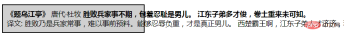 |
 |
| 预格式+自动换行 white-space:pre-wrap; | 只保留换行+自动换行 white-space:pre-line; |
 |
 |
(学习视频分享:web前端入门)
The above is the detailed content of Detailed explanation of CSS text properties (Text). For more information, please follow other related articles on the PHP Chinese website!

 Simulating Mouse MovementApr 22, 2025 am 11:45 AM
If you've ever had to display an interactive animation during a live talk or a class, then you may know that it's not always easy to interact with your slides
 Powering Search With Astro Actions and Fuse.jsApr 22, 2025 am 11:41 AM
With Astro, we can generate most of our site during our build, but have a small bit of server-side code that can handle search functionality using something like Fuse.js. In this demo, we’ll use Fuse to search through a set of personal “bookmarks” th
 Undefined: The Third Boolean ValueApr 22, 2025 am 11:38 AM
I wanted to implement a notification message in one of my projects, similar to what you’d see in Google Docs while a document is saving. In other words, a
 In Defense of the Ternary StatementApr 22, 2025 am 11:25 AM
Some months ago I was on Hacker News (as one does) and I ran across a (now deleted) article about not using if statements. If you’re new to this idea (like I
 Using the Web Speech API for Multilingual TranslationsApr 22, 2025 am 11:23 AM
Since the early days of science fiction, we have fantasized about machines that talk to us. Today it is commonplace. Even so, the technology for making
 Jetpack Gutenberg BlocksApr 22, 2025 am 11:20 AM
I remember when Gutenberg was released into core, because I was at WordCamp US that day. A number of months have gone by now, so I imagine more and more of us
 Creating a Reusable Pagination Component in VueApr 22, 2025 am 11:17 AM
The idea behind most of web applications is to fetch data from the database and present it to the user in the best possible way. When we deal with data there
 Using 'box shadows' and clip-path togetherApr 22, 2025 am 11:13 AM
Let's do a little step-by-step of a situation where you can't quite do what seems to make sense, but you can still get it done with CSS trickery. In this


Hot AI Tools

Undresser.AI Undress
AI-powered app for creating realistic nude photos

AI Clothes Remover
Online AI tool for removing clothes from photos.

Undress AI Tool
Undress images for free

Clothoff.io
AI clothes remover

Video Face Swap
Swap faces in any video effortlessly with our completely free AI face swap tool!

Hot Article
Hot Tools

Atom editor mac version download
The most popular open source editor

SublimeText3 Linux new version
SublimeText3 Linux latest version

mPDF
mPDF is a PHP library that can generate PDF files from UTF-8 encoded HTML. The original author, Ian Back, wrote mPDF to output PDF files "on the fly" from his website and handle different languages. It is slower than original scripts like HTML2FPDF and produces larger files when using Unicode fonts, but supports CSS styles etc. and has a lot of enhancements. Supports almost all languages, including RTL (Arabic and Hebrew) and CJK (Chinese, Japanese and Korean). Supports nested block-level elements (such as P, DIV),

Zend Studio 13.0.1
Powerful PHP integrated development environment

SecLists
SecLists is the ultimate security tester's companion. It is a collection of various types of lists that are frequently used during security assessments, all in one place. SecLists helps make security testing more efficient and productive by conveniently providing all the lists a security tester might need. List types include usernames, passwords, URLs, fuzzing payloads, sensitive data patterns, web shells, and more. The tester can simply pull this repository onto a new test machine and he will have access to every type of list he needs.

