This article brings you relevant knowledge about css, which mainly introduces the issues related to the box model and floating. The essence of web page layout is to place the box model through css layout. Then put the required elements in the appropriate position. Let’s take a look at it. I hope it will be helpful to everyone.

(Learning video sharing: css video tutorial, html video tutorial)
Box model
The essence of web page layout is to place the box model in the appropriate position through css layout, and then add the required elements
1. Box Model
Box Model It consists of element content, inner margin, outer margin, and border
Standard box model
2. Box border (border)
border : border-width || border-style || border-color
| Attribute | Function |
|---|---|
| Define the border Thickness, unit px | |
| Definition of border style | |
| Definition Border color |
Border style
##none: No border- solid: Solid border
- dashed:dotted border
- dotted:dotted border
- Separately set the style of one side of the border
border-top-style:样式; border-top-width:宽度;border-top-color:颜色;border-top:宽度 样式 颜色;bottom,left,right
And so on
By
cellspacing=0The cell distance is 0, but the distance between two cells Overlapping borders will make the borders thicker. Use the css attribute <pre class="brush:php;toolbar:false">table{border-collapse:collapse}</pre> to merge the borders without making them thicker.
border-radius:length;/*length 可以数字也可以百分比*/
The square box will become thicker. It is circular, and rectangles usually use half the height
3. Padding
The spacing between the border and the content
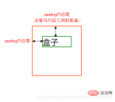
| Function | |
|---|---|
| Left padding | |
| Padding-right | |
| Padding-top | |
| Lower padding |
| Meaning | |
|---|---|
| padding: top, bottom, left and right padding | |
| padding: up, down, left and right | |
| padding: up, left, right, down | |
| padding: top right, bottom left (clockwise) |
- Width
-
Element Height = content height padding border (Height is the content height)
Height -
Element Width = content width padding border (Width is the content width)
The actual size of the box = the width and height of the content padding border
4. Margin (margin)
The margin is the control between the box and the box Distance
| Function | |
|---|---|
| Left margin | |
| Right margin | |
| Top margin | |
| Bottom margin |
| 值 | 描述 |
|---|---|
| h-shadow | 必需,水平阴影,负值在左边 |
| v-shadow | 必需,垂直阴影,负值在下 |
| blur | 可选,模糊距离 |
| spread | 可选,阴影尺寸 |
| color | 可选,阴影颜色 |
| inset | 可选,内阴影 |
注意
水平垂直阴影必须,其余可以省略,外阴影(outset)默认不写
p {
	box-shadow:0 15px 20px rgba(0,0,0,.5)
}
浮动
1. 浮动是什么
css布局的三种机制
1. 普通
- 块级元素独占一行,由上到下排列
- 行内元素从左到右依次排列,父元素换行
2. 浮动
使得盒子浮动起来。让多个块级盒子一行展示
3. 定位
将盒子定位于浏览器中的某一位置
2. 浮动使用
通过浮动可以使得多个p水平排列一行,且之间没有空白缝隙,实现左右对齐,最早使用于图片,实现文字环绕效果
选择器 {float: 值;}
| 属性值 | 描述 |
|---|---|
| none | 不浮动(默认) |
| left | 元素向左浮动 |
| right | 元素向右浮动 |
注意
浮动托标使用浮动后,元素会脱离标准流,后续的标准流会移动至浮动盒子底下,浮动元素会“漂浮”

浮动会改变 元素display属性,任何元素都可以浮动,浮动元素相互紧靠,父级宽度装不下时,多出盒子调至下一行
浮动与标准流搭配
给浮动元素添加一个标准流父亲,在子元素使用浮动,从而较少对其他标准流的影响
3. 浮动与其他盒子关系
浮动元素与父盒子关系
子盒子会与父盒子对齐,但不会与边框重叠,也不会超过父盒子的内边距
浮动元素与兄弟盒子关系
浮动元素只会影响当前以及后面的标准流盒子
如果一个盒子里面有多个子盒子,如果其中一个盒子浮动了,其他兄弟也应该浮动。防止引起问题
4.清除浮动
很多子元素浮动后,父元素很难直接给出高度,最后父级盒子高度为0,对于以后的标准流盒子会有影响,对于标准流,子盒子会撑开盒子,而浮动不会。
清除就是为了消除浮动布局对于后续排版影响,主要是解决父元素高度为0的问题
选择器 {clear: 属性值;}
| 属性值 | 描述 |
|---|---|
| left | 不允许左侧有浮动元素(消除左侧浮动影响) |
| right | 不允许右侧有浮动元素(消除右侧浮动影响) |
| both | 同时清除左右浮动元素 |
额外标签法
是W3C推荐的做法是通过在浮动元素末尾添加一个空的标签例如 <p></p>,或则其他标签br等亦可。
优点: 通俗易懂,书写方便
- 缺点: 添加许多无意义的标签,结构化较差。
父级添加overflow属性
overflow : hidden|auto|scroll
缺点: 内容增多时候容易造成不会自动换行导致内容被隐藏掉,无法显示需要溢出的元素。
使用after为元素清除浮动
:after方式是额外标签升级方式
.clearfix:after{
	content:""; display:block;height: 0;clear:both; visibility: hidden;
}

.clearfix {*zoom: 1;}
- 优点: 符合闭合浮动思想 结构语义化正确
- 缺点: 由于IE6-7不支持:after,使用 zoom:1触发 hasLayout。
双伪元素
.clearfix:before,.clearfix:after {
  content:"";
  display:table;
}
.clearfix:after {
 clear:both;
}
.clearfix {
  *zoom:1;
}
The above is the detailed content of Summary of the use of CSS standard box model and floating. For more information, please follow other related articles on the PHP Chinese website!
 Two Images and an API: Everything We Need for Recoloring ProductsApr 15, 2025 am 11:27 AM
I recently found a solution to dynamically update the color of any product image. So with just one of a product, we can colorize it in different ways to show
 Weekly Platform News: Impact of Third-Party Code, Passive Mixed Content, Countries with the Slowest ConnectionsApr 15, 2025 am 11:19 AM
In this week's roundup, Lighthouse sheds light on third-party scripts, insecure resources will get blocked on secure sites, and many country connection speeds
 Options for Hosting Your Own Non-JavaScript-Based AnalyticsApr 15, 2025 am 11:09 AM
There are loads of analytics platforms to help you track visitor and usage data on your sites. Perhaps most notably Google Analytics, which is widely used
 It's All In the Head: Managing the Document Head of a React Powered Site With React HelmetApr 15, 2025 am 11:01 AM
The document head might not be the most glamorous part of a website, but what goes into it is arguably just as important to the success of your website as its
 What is super() in JavaScript?Apr 15, 2025 am 10:59 AM
What's happening when you see some JavaScript that calls super()?.In a child class, you use super() to call its parent’s constructor and super. to access its
 Comparing the Different Types of Native JavaScript PopupsApr 15, 2025 am 10:48 AM
JavaScript has a variety of built-in popup APIs that display special UI for user interaction. Famously:
 Why Are Accessible Websites so Hard to Build?Apr 15, 2025 am 10:45 AM
I was chatting with some front-end folks the other day about why so many companies struggle at making accessible websites. Why are accessible websites so hard
 The `hidden` Attribute is Visibly WeakApr 15, 2025 am 10:43 AM
There is an HTML attribute that does exactly what you think it should do:


Hot AI Tools

Undresser.AI Undress
AI-powered app for creating realistic nude photos

AI Clothes Remover
Online AI tool for removing clothes from photos.

Undress AI Tool
Undress images for free

Clothoff.io
AI clothes remover

AI Hentai Generator
Generate AI Hentai for free.

Hot Article

Hot Tools

SAP NetWeaver Server Adapter for Eclipse
Integrate Eclipse with SAP NetWeaver application server.

mPDF
mPDF is a PHP library that can generate PDF files from UTF-8 encoded HTML. The original author, Ian Back, wrote mPDF to output PDF files "on the fly" from his website and handle different languages. It is slower than original scripts like HTML2FPDF and produces larger files when using Unicode fonts, but supports CSS styles etc. and has a lot of enhancements. Supports almost all languages, including RTL (Arabic and Hebrew) and CJK (Chinese, Japanese and Korean). Supports nested block-level elements (such as P, DIV),

Dreamweaver Mac version
Visual web development tools

ZendStudio 13.5.1 Mac
Powerful PHP integrated development environment

MinGW - Minimalist GNU for Windows
This project is in the process of being migrated to osdn.net/projects/mingw, you can continue to follow us there. MinGW: A native Windows port of the GNU Compiler Collection (GCC), freely distributable import libraries and header files for building native Windows applications; includes extensions to the MSVC runtime to support C99 functionality. All MinGW software can run on 64-bit Windows platforms.


