
 TopicsexcelLearning Excel charts through cases, let's talk about how to draw a graduated cylinder column chart
Learning Excel charts through cases, let's talk about how to draw a graduated cylinder column chart

In the previous article "Excel chart learning: Creating a multi-series and multi-condition histogram with target values", we learned how to make a multi-series and multi-condition histogram. Today we will share another Excel chart tutorial and talk about a graduated cylinder-style chart case making tutorial, which can be said to express information clearly at a glance.

What kind of chart can be called a good chart? I think at least people who look at the chart can understand the meaning of your chart at a glance without having to look at the original data. On this basis, we will do a good job in color matching and layout , and such a chart will be good!
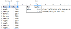
The following table shows the sales completion status of an agent’s marketing and sales department. It includes the amount of sales completed and the amount of target planned sales. We need to make this information into a concise and easy-to-understand Excel chart for work reporting.


Right-click the newly added column bar, select [Change Chart Type], set the new series chart type to a line chart and click OK. (There is no "Combination" function in the old version of excel, just click "Line Chart")

Note: If the following figure appears, the original two bar charts If the series overlap is not 100%, you need to manually right-click and reset.

5. Select the line chart in the figure, right-click, select [Format Data Series], and set the line color through [Fill and Line]
It is colorless. Open the [Mark] option and set the data marker points to a built-in circle with a size of 25.

#Set the fill color of the marker points to blue, and the color is basically consistent with the histogram. The border color is set to white to create a hierarchical relationship with the histogram.
The effect is as follows:

6. Right-click the circled part in the picture above and select [Add Data Label】. Then select the added data, right-click, select [Set Data Label Format], and select Center for the label position.
Set the font size to 14 and mark it red and bold.
7. Right-click the abscissa axis, click [Set Coordinate Format], select the shadow in [Effect], and select the
appropriate preview mode .

Select the Y-axis tick mark, auxiliary grid lines, and series legend in sequence, and press delete to delete. Then add the title content, and under the "Home" tab, set the title color to black and bold in the "Font Group", set the font size to 16, and add a border.

Summary: In this example, we used the style of a chemical measuring cylinder to make a histogram, and at the same time set the line chart to a circular float, so that we can clearly see each Group completion status and overall ranking. Through the "Graduating Cylinder" chart, we can visually see the distance between each group and the target sales.
Key points for making this picture
1. After inserting two sets of data into a column chart and setting the series to 100% overlap, the two series will completely overlap. The above effect can be achieved by setting the color.
2. After inserting a line chart with data markers, hide the lines, retain the marker points, and set the marker points to circles. Cleverly convert the discount chart into a circular chart, and then match the entire histogram, like a marked floating ball on the horizontal surface!
In fact, we can also set the colors of column bars and floating balls to gradients. You can try it yourself and the charts will become more vivid!
Related learning recommendations: excel tutorial
The above is the detailed content of Learning Excel charts through cases, let's talk about how to draw a graduated cylinder column chart. For more information, please follow other related articles on the PHP Chinese website!

 MEDIAN formula in Excel - practical examplesApr 11, 2025 pm 12:08 PM
This tutorial explains how to calculate the median of numerical data in Excel using the MEDIAN function. The median, a key measure of central tendency, identifies the middle value in a dataset, offering a more robust representation of central tenden
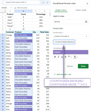 Google Spreadsheet COUNTIF function with formula examplesApr 11, 2025 pm 12:03 PM
Master Google Sheets COUNTIF: A Comprehensive Guide This guide explores the versatile COUNTIF function in Google Sheets, demonstrating its applications beyond simple cell counting. We'll cover various scenarios, from exact and partial matches to han
 Excel shared workbook: How to share Excel file for multiple usersApr 11, 2025 am 11:58 AM
This tutorial provides a comprehensive guide to sharing Excel workbooks, covering various methods, access control, and conflict resolution. Modern Excel versions (2010, 2013, 2016, and later) simplify collaborative editing, eliminating the need to m
 How to convert Excel to JPG - save .xls or .xlsx as image fileApr 11, 2025 am 11:31 AM
This tutorial explores various methods for converting .xls files to .jpg images, encompassing both built-in Windows tools and free online converters. Need to create a presentation, share spreadsheet data securely, or design a document? Converting yo
 Excel names and named ranges: how to define and use in formulasApr 11, 2025 am 11:13 AM
This tutorial clarifies the function of Excel names and demonstrates how to define names for cells, ranges, constants, or formulas. It also covers editing, filtering, and deleting defined names. Excel names, while incredibly useful, are often overlo
 Standard deviation Excel: functions and formula examplesApr 11, 2025 am 11:01 AM
This tutorial clarifies the distinction between standard deviation and standard error of the mean, guiding you on the optimal Excel functions for standard deviation calculations. In descriptive statistics, the mean and standard deviation are intrinsi
 Square root in Excel: SQRT function and other waysApr 11, 2025 am 10:34 AM
This Excel tutorial demonstrates how to calculate square roots and nth roots. Finding the square root is a common mathematical operation, and Excel offers several methods. Methods for Calculating Square Roots in Excel: Using the SQRT Function: The
 Google Sheets basics: Learn how to work with Google SpreadsheetsApr 11, 2025 am 10:23 AM
Unlock the Power of Google Sheets: A Beginner's Guide This tutorial introduces the fundamentals of Google Sheets, a powerful and versatile alternative to MS Excel. Learn how to effortlessly manage spreadsheets, leverage key features, and collaborate


Hot AI Tools

Undresser.AI Undress
AI-powered app for creating realistic nude photos

AI Clothes Remover
Online AI tool for removing clothes from photos.

Undress AI Tool
Undress images for free

Clothoff.io
AI clothes remover

Video Face Swap
Swap faces in any video effortlessly with our completely free AI face swap tool!

Hot Article
Hot Tools

Notepad++7.3.1
Easy-to-use and free code editor

Dreamweaver Mac version
Visual web development tools

ZendStudio 13.5.1 Mac
Powerful PHP integrated development environment

SAP NetWeaver Server Adapter for Eclipse
Integrate Eclipse with SAP NetWeaver application server.

DVWA
Damn Vulnerable Web App (DVWA) is a PHP/MySQL web application that is very vulnerable. Its main goals are to be an aid for security professionals to test their skills and tools in a legal environment, to help web developers better understand the process of securing web applications, and to help teachers/students teach/learn in a classroom environment Web application security. The goal of DVWA is to practice some of the most common web vulnerabilities through a simple and straightforward interface, with varying degrees of difficulty. Please note that this software

