Detailed graphic explanation of Excel's line chart
- WBOYWBOYWBOYWBOYWBOYWBOYWBOYWBOYWBOYWBOYWBOYWBOYWBforward
- 2022-05-07 11:28:0910756browse
This article brings you relevant knowledge about excel, which mainly introduces related issues about line charts. Let’s take a look at how to apply them based on some examples. I hope it will be helpful to everyone. help.

Related learning recommendations: excel tutorial
Today we share a small but large line chart.
The picture below shows the data on newly confirmed cases of COVID-19 in Italy, the United States, Spain and Germany during a certain period of time (data source: Sina News).

Next we use these data to create a line chart to show the trend of new cases in each country:

The operation steps are as follows:
Step 1
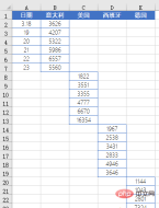
First, construct the chart data source as shown below:

Step 2
Select the cell range B1:E25 and insert a line chart with data markers.

Step 3
Set the horizontal axis data source and select the cell range A2:A25.

Step 4
Click the legend item and press the Delete key to delete it. Click the horizontal grid line and press the Delete key to delete it.
Click the chart element button in the upper right corner to add vertical grid lines.

Step 5
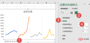
Double-click the horizontal axis, set the horizontal axis format, and set the tick mark interval to 6 (6 days of data)

Step 6
Set the horizontal axis line color, tick mark color and plot area border color.

Step 7
Insert a text box to simulate a label, enter "Italy", then set the text box alignment to center alignment, and then set to borderless , no fill color.

Click the border of the text box, hold down the Ctrl key and drag in order to copy the text box, and change the text in the text box to "United States", " Spain” and “Germany”.

Step 8
Hold down the Shift key, click each text box in turn to select it, and then set the alignment to vertical center and horizontal distributed.

Step 9
Set the filling effect of each line chart series data point in turn.

Step 10
Click the chart, press the Ctrl A key combination, select the chart and all text boxes, right-click the mouse, and combine.

Finally add the chart title and perform simple beautification. A line chart that can display multiple data at the same time is completed:

Related learning recommendations: excel tutorial
The above is the detailed content of Detailed graphic explanation of Excel's line chart. For more information, please follow other related articles on the PHP Chinese website!

