Home >Web Front-end >Front-end Q&A >What is the usage of media media query in css3
What is the usage of media media query in css3
- WBOYWBOYWBOYWBOYWBOYWBOYWBOYWBOYWBOYWBOYWBOYWBOYWBOriginal
- 2022-04-28 15:45:222232browse
In CSS3, media media queries are used to define different styles for different media types or devices. Different styles can be set for different screen sizes or resolutions. The syntax is "@media not|only media Type and (...){CSS style code}".

The operating environment of this tutorial: Windows 10 system, CSS3&&HTML5 version, Dell G3 computer.
What is the usage of media media query in css3
Using @media query, you can define different styles for different media types.
@media can set different styles for different screen sizes, especially if you need to set up a responsive page, @media is very useful.
When you reset the browser size, the page will also be re-rendered based on the width and height of the browser.
Media queries can be used to check many things, such as:
The width and height of the viewport
The width and height of the device Height
Orientation (Is the phone or tablet in landscape or portrait mode?)
Resolution
The syntax is
@media not|only mediatype and (mediafeature and|or|not mediafeature) {
  CSS-Code;
}
not, only and the meaning of the and keyword:
not: The not keyword is the meaning of the entire media query anyway.
only: The only keyword prevents older browsers that do not support media queries with media attributes from applying the specified style. It has no impact on modern browsers.
and: The and keyword groups a media property with a media type or other media property.
They are all optional. However, if you use not or only, you must also specify the media type.
You can also use different style sheets for different media, like this:
<link rel="stylesheet" media="screen and (min-width: 900px)" href="widescreen.css">
<link rel="stylesheet" media="screen and (max-width: 600px)" href="smallscreen.css">
The example is as follows:
<!DOCTYPE html>
<html>
<head>
<meta http-equiv="Content-Type" content="text/html; charset=utf-8"/>
<style>
body {
background-color:lightgreen;
}
@media screen and (max-width: 300px) {
body {
background-color:lightblue;
}
}
</style>
</head>
<body>
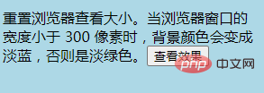
<p>重置浏览器查看大小。当浏览器窗口的宽度小于 300 像素时,背景颜色会变成淡蓝,否则是淡绿色。<input type="button" onclick="resize_window()" value="查看效果"></p>
<SCRIPT>
<!--
function resize_window() {
window.open ('http://www.runoob.com/try/demo_source/trycss3_media_example1.htm','newwindow','height=299,width=299,top=0,left=0,toolbar=no,menubar=no,scrollbars=no, resizable=no,location=no, status=no')
}
//写成一行
-->
</SCRIPT>
</body>
</html>Output result:


(Learning video sharing: css video tutorial)
The above is the detailed content of What is the usage of media media query in css3. For more information, please follow other related articles on the PHP Chinese website!

