Home >Web Front-end >Front-end Q&A >What attribute can achieve scaling effect in css3
What attribute can achieve scaling effect in css3
- 青灯夜游Original
- 2022-04-25 15:51:332149browse
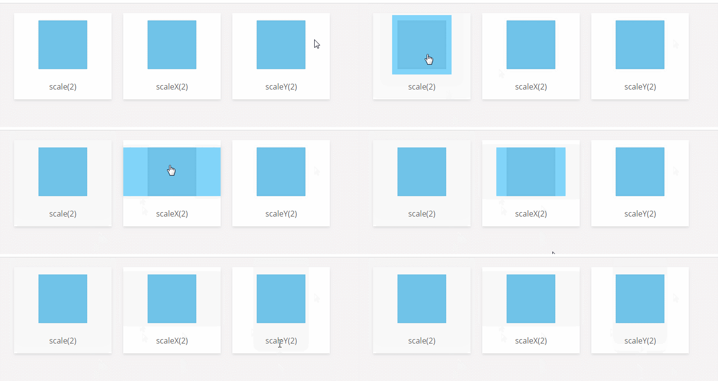
The transform attribute can be used to achieve scaling effects in CSS3. The transform attribute can be used with the scaleX() function to achieve a horizontal scaling effect, with the scaleY() function to achieve a vertical scaling effect, and with the "scale(x,y)" function to achieve simultaneous horizontal and vertical scaling.

The operating environment of this tutorial: Windows 7 system, CSS3&&HTML5 version, Dell G3 computer.
The transform attribute can be used to achieve scaling effects in CSS3.
The transform attribute applies a 2D or 3D transformation to the element. This property allows you to rotate, scale, move, tilt, etc. the element.
The transform attribute and the scaling method can scale the element according to the center origin.
css3 scaling method has three situations:
(1) scaleX(x): The element only scales horizontally (X-axis scaling);
(2) scaleY(y): The element is scaled only in the vertical direction (Y-axis scaling);
(3) scale(x,y): The element is scaled in the horizontal and vertical directions at the same time (the X-axis and Y-axis are scaled at the same time) ;
1, scaleX(x)
Syntax:
transform:scaleX(x)
Description:
x means that the element is along the horizontal direction ( X-axis) The zoom factor. If it is greater than 1, it means zooming in; if it is less than 1, it means zooming out.
It will be easy to understand if you think about the concept of multiples.
2, scaleY(y)
Syntax:
transform:scaleY(y)
Description:
y means that the element is along the vertical direction (Y Axis) The zoom factor. If it is greater than 1, it means zooming in; if it is less than 1, it means zooming out.
3. scale(x,y)
Syntax:
transform:scale(x,y)
Description:
x means that the element is along the horizontal direction (X-axis) scaling factor, y represents the scaling factor of the element along the vertical direction (Y-axis).
Note that Y is an optional parameter. If the Y value is not set, it means that the scaling factors in the X and Y directions are the same (magnifying the same factor at the same time).
Example:
<!DOCTYPE html>
<html>
<head>
<title>CSS3缩放scale()用法</title>
<style type="text/css">
*,
*:after,
*:before {
box-sizing: border-box;
}
body {
background: #F5F3F4;
margin: 0;
padding: 10px;
font-family: 'Open Sans', sans-serif;
text-align: center;
}
h1 {
color: #4c4c4c;
font-weight: 600;
border-bottom: 1px solid #ccc;
}
h2,
h4 {
font-weight: 400;
color: #4d4d4d;
}
.card {
display: inline-block;
margin: 10px;
background: #fff;
padding: 15px;
min-width: 200px;
box-shadow: 0 3px 5px #ddd;
color: #555;
}
.card .box {
width: 100px;
height: 100px;
margin: auto;
background: #ddd;
cursor: pointer;
box-shadow: 0 0 5px #ccc inset;
}
.card .box .fill {
width: 100px;
height: 100px;
position: relative;
background: #03A9F4;
opacity: .5;
box-shadow: 0 0 5px #ccc;
-webkit-transition: 0.3s;
transition: 0.3s;
}
.card p {
margin: 25px 0 0;
}
.scale:hover .fill {
-webkit-transform: scale(2, 2);
transform: scale(2, 2);
}
.scaleX:hover .fill {
-webkit-transform: scaleX(2);
transform: scaleX(2);
}
.scaleY:hover .fill {
-webkit-transform: scaleY(2);
transform: scaleY(2);
}
</style>
</head>
<body>
<!-- scale-->
<div class="card">
<div class="box scale">
<div class="fill"></div>
</div>
<p>scale(2)</p>
</div>
<div class="card">
<div class="box scaleX">
<div class="fill"></div>
</div>
<p>scaleX(2) </p>
</div>
<div class="card">
<div class="box scaleY">
<div class="fill"></div>
</div>
<p>scaleY(2) </p>
</div>
</body>
</html>
(Learning video sharing: css video tutorial, web front-end )
The above is the detailed content of What attribute can achieve scaling effect in css3. For more information, please follow other related articles on the PHP Chinese website!

