Home >Web Front-end >Front-end Q&A >There are several categories of shadows in css3
There are several categories of shadows in css3
- 青灯夜游Original
- 2022-03-18 17:51:552799browse
Shadows in CSS3 are divided into 2 categories: 1. Text shadow, setting syntax "text-shadow: horizontal position vertical position blur distance color;"; 2. Box shadow, setting syntax "box-shadow: horizontal position Vertical position blur distance spread color inset;".

The operating environment of this tutorial: Windows 7 system, CSS3&&HTML5 version, Dell G3 computer.
There are two types of shadows in CSS3: text-shadow and box-shadow. These two properties can achieve the shadow effect without adding a background image. They are provided when we beautify the web page. A great convenience. So how to use these two attributes respectively?
1. text-shadow
The syntax specification of this attribute is text-shadow: 1px 1px 1px #666 ;
Before talking about css shadow properties, let’s first understand the common sense about shadows.
Shadows are generated when light shines on an object, which will produce shadows in backlit areas.
The picture below is the shadow produced by right and downward:

The picture below is the shadow produced by upward and left

Let’s look at the text-shadow attribute. The attribute includes four values. The first value is the horizontal offset of the shadow, the second value represents the vertical offset, and the third value represents the shadow. Divergence range, the fourth value represents the shadow color.
First, by default, positive values are used for shadows to the right and downwards, and negative values are used for left and upward shadows.
text-shadow: 1px 1px 1px #666; means a shadow shifted one pixel to the right and downwards, text-shadow: -1px -1px 1px #666; means a shadow shifted to the left and upward Shifting shadow. text-shadow: 0px 0px 1px #666; means no offset. At this time, there will be equal shadows all around, as shown below

## 2. Multiple sets of attribute values You can use commas to separate
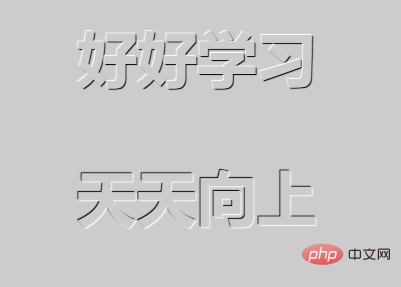
text-shadow: 1px 1px 1px #666, -1px -1px 1px #666; means there is a shadow offset by one pixel all around. Using the text-shadow attribute we can create exquisite embossed text effects.<!DOCTYPE html>
<html>
<head>
<meta charset="UTF-8">
<title>Title</title>
<style>
body{
background-color: #cccccc;
}
p{
text-align: center;
font-size: 60px;
margin-top: 50px;
font-weight: bold;
color: #cccccc;
}
.tu{
text-shadow: -1px -1px 1px #fff,1px 1px 1px #000;
}
.ao{
text-shadow: 1px 1px 1px #fff,-1px -1px 1px #000;
}
</style>
</head>
<body>
<p>好好学习</p>
<p>天天向上</p>
</body>
</html> Run as follows:

##2. box-shadowThe properties of box-shadow and text shadow are very similar. One is to add shadow to text, and the other is to add shadow to container.
The six values of box-shadow are as follows:
- h-shadow The position of the horizontal shadow, the value can be a negative number (cannot be omitted)
- blur The blur distance (optional)
- spread The distance of the shadow (optional)
- color The color of the shadow (optional)
- inset Inset the outer shadow (outset ) to inner shadow (optional)
- none Default value (box-shadow:none can cancel the shadow effect of the border)
Note: You can add a shadow to the box or multiple shades. This attribute is a comma-separated list of shadows. Each shadow is specified by (2~4) length values, an optional color value, and the optional inset keyword. The value for omitted length is 0.
Example: Add multiple shadow styles
<!DOCTYPE html>
<html>
<head>
    <meta charset="UTF-8">
    <title>css3边框阴影</title>
    <style>
    #box1{
                margin-top: 100px;
        margin-left:100px;
        background-color: #fff;
        width: 100px;
        height: 100px;
             box-shadow:
        2px 2px 10px red,
        5px 5px 20px blue;
        }
        </style>
</head>
 <body>
    <div id="box1"></div>
</body>
</html>
Running effect
 (Learning video sharing:
The above is the detailed content of There are several categories of shadows in css3. For more information, please follow other related articles on the PHP Chinese website!
Related articles
See more- What are the color representation methods supported by css3?
- What type of deformation function does css3 include?
- What attributes are used for css3 animation that only loops once?
- Does overflow belong to css3?
- How to achieve image disappearing animation effect in css3
- How to set animation to play after a few seconds in css3

