Home >Web Front-end >Front-end Q&A >What are the methods to implement multi-column layout in css3
What are the methods to implement multi-column layout in css3
- 青灯夜游Original
- 2022-02-28 13:52:071930browse
How to implement multi-column layout in css3: 1. Use float to implement multi-column layout; 2. Use the inline-block box model to implement multi-column layout; 3. Use "display: flex" elastic layout to implement multi-column layout ; 4. Use the "display: table" method to implement multi-column layout.

The operating environment of this tutorial: Windows 7 system, CSS3&&HTML5 version, Dell G3 computer.
Several ways to implement multi-column layout with css
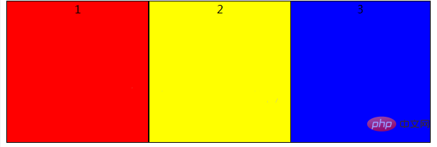
If The following three divs are displayed on the same line
<div id="parent">
    <div id="box1">1</div>
    <div id="box2">2</div>
    <div id="box3">3</div>
</div>
1: float implements multi-column layout
The float attribute controls whether and how the target HTML component floats. After setting this property, the object will be treated as a block component. There are four float values: left (floating to the left), Right (floating to the right), none (not floating), inherit (inheriting the value of the parent element). Set box1, box2, and box3 to float to the left. If the next sibling element of a floating element is also set to the same floating direction, it will be displayed immediately after the new element.
After setting float, the element will break away from the ordinary document flow. Their parent elements will not be stretched, so the height of #parent is 0 at this time.
    #parent>div{
        border:1px solid black;
        float:left;
        width:200px;
        height:200px;
        text-align: center;

    }
   #box1{
       background-color:red;
   }
   #box2{
       background-color:yellow;
   }
    #box3 {
        background-color:blue;
    }
We can also do this, set box1 and box2 to float to the left, and box3 not to float. Since box1 and box2 are set to float, they are separated from the ordinary document flow. For box3, it is as if box1 and box2 do not exist in front of it. Box3 will also be displayed on this line, but it will be blocked by box1. Setting box3's margin-left:400px; can make it look like it is displayed behind box1 and box2. At this time, #parent is opened by box3, and the height is now 202px.
    #parent>div{
        border:1px solid black;
        width:200px;
        height:200px;
        text-align: center;

    }
    #box1{
       float:left;
        background-color:red;
    }
    #box2{
        float:left;
        background-color:yellow;
    }
    #box3 {
        margin-left:400px;
        background-color:blue;
    }
2: inline-block box model
The elements of the inline-block box model will not occupy a line, but also support the use of width and height to specify the width and height. . display:inline-block renders the object as an inline object, but the object's contents are rendered as a block object. Subsequent inline objects will be arranged on the same line. Usually you need to set vertical-align:top to align the top.
    #parent>div{
        display:inline-block;
        border:1px solid black;
        width:200px;
        height:200px;
        text-align: center;
    }
    #box1{
        background-color:red;
    }
    #box2{
        background-color:yellow;
    }
    #box3 {
        background-color:blue;
    }
Inline-block horizontally rendered elements will have gaps when displayed in newlines or separated by spaces. If you remove the spaces, the gaps will naturally disappear, so that the gaps will not be displayed.
<div>
    <div>1</div>
<div>2</div>
<div>3</div>
</div>
3: display: flex Flexible layout
Set the #parent container's diaplay:flex; the parent container is equivalent to a flexible box. The divs inside will be arranged according to the pattern set by flex-direction. The function of Flex flexible layout is relatively powerful, which can provide the maximum flexibility for the box model to implement complex layout. Any container can be designated as Flex layout. The flex-direction attribute determines the direction of the main axis. flex-direction: row; means horizontal arrangement in the parent container, and flex-direction: column; means vertical arrangement in the parent container.
    #parent{
        display: flex;
        flex-direction: row;
    }
    #parent>div{
        border:1px solid black;
        width:200px;
        height:200px;
        text-align: center;
    }
    #box1{
        background-color:red;
    }
    #box2{
        background-color:yellow;
    }
    #box3 {
        background-color:blue;
    }
4: display: table
display:table The element with this attribute set is displayed as a block-level table, similar to
| and |
You can use this series of table-row-group, table-header- group, table-footer-group, table-row, etc. use other tags to implement a table-like layout. #parent{
display: table;
}
#parent>div{
display:table-cell;
border:1px solid black;
width:200px;
height:200px;
text-align: center;
}
#box1{
background-color:red;
}
#box2{
background-color:yellow;
}
#box3 {
background-color:blue;
}(Learning video sharing: css video tutorial, web front-end introductory tutorial) |
|---|
The above is the detailed content of What are the methods to implement multi-column layout in css3. For more information, please follow other related articles on the PHP Chinese website!
Related articles
See more- How to implement multi-column layout using CSS
- What is the attribute word for setting animation uniform speed in css3?
- CSS3 realizes the animation effect of scooping up glutinous rice balls with a spoon (super cute)!
- Is transform a new attribute in css3?
- What is used to define the time of transition animation in css3

