
Home >Web Front-end >CSS Tutorial >How to implement multi-column layout using CSS
How to implement multi-column layout using CSS
- 一个新手Original
- 2017-09-11 10:17:112463browse
Several ways to implement multi-column layout with css
If the following three p's are displayed on the same line
<p >
<p style="background-color:red">1</p>
<p style="background-color:yellow">2</p>
<p style="background-color:blue">3</p>
</p>
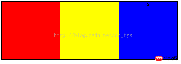
1: float implements multi-column layout
The float attribute controls whether and how the target HTML component floats. After setting this property, the object will be treated as a block component.
A floating HTML component will float and follow its predecessor until it encounters a border, inner patch, outer patch, or another block.
        p>p{
            border:1px solid black;
            float:left;
            width:200px;
            height: 200px;
            text-align: center;
        }
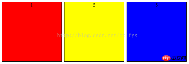
##2: inline-block box model
The elements of the inline-block box model will not occupy a single line, and also support specifying width and height using width and height. The inline-block box model will be bottom-aligned by default, and vertical-align:top can align its top.
        p>p{
            display:inline-block;
            border:1px solid black;
            text-align:center;
            width:200px;
            height: 200px;
            vertical-align: top;
        }
Inline-block There will be a gap between horizontally rendered elements when displayed in line breaks or separated by spaces. Remove the spaces and the gaps will disappear naturally.
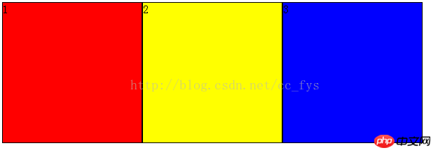
##3: display: flex Flexible Layout
FlexFlexibleThe layout function is relatively powerful and can provide the maximum flexibility for the box model to implement complex layouts. , any container can be designated as Flex layout.
flex-direction: column; Indicates vertical arrangement in the parent container. p{
display: flex;
flex-direction: row;
height:200px;
width: 600px;
}
p>p{
border:1px solid black;
}
The above is the detailed content of How to implement multi-column layout using CSS. For more information, please follow other related articles on the PHP Chinese website!