Home >Web Front-end >CSS Tutorial >How to achieve ring rotation effect in css3
How to achieve ring rotation effect in css3
- WBOYWBOYWBOYWBOYWBOYWBOYWBOYWBOYWBOYWBOYWBOYWBOYWBOriginal
- 2021-12-08 15:55:536310browse
Method: 1. Use the border and border-radius attributes to turn the square element into a ring; 2. Use "ring element {animation: name time} @keyframes name {100%{transform:rotate(rotation Angle)}}" statement can rotate the ring element.

The operating environment of this tutorial: Windows 10 system, CSS3&&HTML5 version, Dell G3 computer.
How to achieve the ring rotation effect in css3
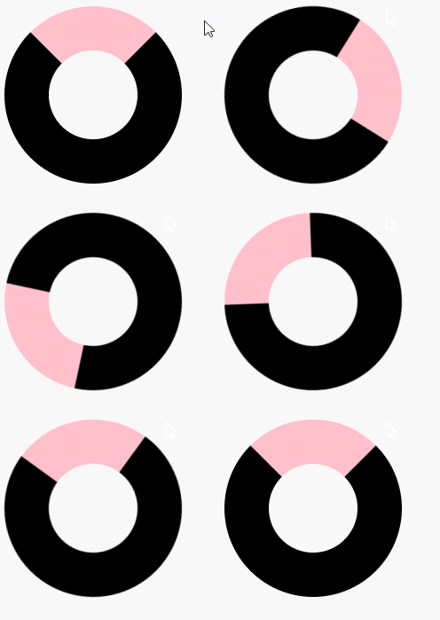
In css, you can first use the border attribute and border-radius attribute to set a square element Form a ring style, and then use the animation attribute, @keyframes rule and transform attribute to realize the ring rotation. The example is as follows:
<!DOCTYPE html>
<html lang="en">
<head>
    <meta charset="UTF-8">
    <meta name="viewport" content="width=device-width, initial-scale=1.0">
    <meta http-equiv="X-UA-Compatible" content="ie=edge">
    <title>Document</title>
    <style>
        div{
            width:200px;
            height:200px;
            border:100px solid black;
            border-top-color:pink;
            border-radius:50%;
            animation:fadenum 5s ;
        }
        @keyframes fadenum{
   100%{transform:rotate(360deg);}
}
    </style>
</head>
<body>
    <div></div>
</body>
</html>
Output result:

(Learning video sharing: css video tutorial)
The above is the detailed content of How to achieve ring rotation effect in css3. For more information, please follow other related articles on the PHP Chinese website!

