Home >Web Front-end >CSS Tutorial >How to set div beyond line wrap in css
How to set div beyond line wrap in css
- WBOYWBOYWBOYWBOYWBOYWBOYWBOYWBOYWBOYWBOYWBOYWBOYWBOriginal
- 2021-11-19 14:38:588266browse
In CSS, you can use the "word-break" attribute to achieve the div beyond line break effect. This attribute allows the div content to automatically wrap at the end. The syntax is "div{word-break:break-all;} ".

The operating environment of this tutorial: Windows 7 system, CSS3&&HTML5 version, Dell G3 computer.
How to set div beyond line wrapping in css
In css, you can use the word-break attribute to specify the processing method of automatic line wrapping.
By using the word-break attribute, the browser can achieve a line break at any position.
The syntax is:
word-break: normal|break-all|keep-all;
It should be noted that:
normal means using the browser’s default line wrapping rules.
#break-all indicates that line breaks are allowed within words.
#keep-all means line breaks can only be made at half-width spaces or hyphens.
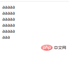
Let’s take an example to see how to set the div beyond the new line. The example is as follows:
<!DOCTYPE html>
<html lang="en">
<head>
    <meta charset="UTF-8">
    <meta name="viewport" content="width=device-width, initial-scale=1.0">
    <meta http-equiv="X-UA-Compatible" content="ie=edge">
    <title>Document</title>
</head>
<body>
    <style type="text/css">
    div{
        width:50px;
        word-break:break-all;
    }
    </style>
    <div>
        aaaaaaaaaaaaaaaaaaaaaaaaaaaa
    </div>
</body>
</html>
Output result:

For more programming-related knowledge, please visit: Programming Video! !
The above is the detailed content of How to set div beyond line wrap in css. For more information, please follow other related articles on the PHP Chinese website!

