Home >Web Front-end >CSS Tutorial >How to implement triangles in css
How to implement triangles in css
- 青灯夜游Original
- 2021-10-11 17:23:2625817browse
Implementation method: 1. Use a container with zero height and width and a transparent border; 2. Use linear gradient linear-gradient; 3. Use "transform:rotate" with "overflow:hidden"; 4. Use Characters such as "▼" and "▲" are drawn.

The operating environment of this tutorial: Windows 7 system, CSS3&&HTML5 version, Dell G3 computer.
Use border to draw triangles
Using border to realize triangles should be mastered by most people, and it is also often seen in various face scriptures. Using Container with zero height and width and transparent border implementation.
The simple code is as follows:
<div class='normal'></div>
html, body {
  width: 100%;
  height: 100%;
  display: flex;
}

div {
  width: 0px;
  height: 0px;
  margin: auto;
}

.normal {
  border-top: 50px solid yellowgreen;
  border-bottom: 50px solid deeppink;
  border-left: 50px solid bisque;
  border-right: 50px solid chocolate;
}
Container with zero height and width, set borders of different colors:

In this way, any If the color of the borders on the three sides is transparent, it is very easy to get triangles at various angles:
<div class='top'></div> <div class='bottom'></div> <div class='left'></div> <div class='right'></div>
.top {
  border: 50px solid transparent;
  border-bottom: 50px solid deeppink;
}

.left {
  border: 50px solid transparent;
  border-right: 50px solid deeppink;
}

.bottom {
  border: 50px solid transparent;
  border-top: 50px solid deeppink;
}

.right {
  border: 50px solid transparent;
  border-bottom: 50px solid deeppink;
}
##Use linear-gradient to draw triangles
Next, we use linear gradientlinear-gradient to implement the triangle.
45°:
div {
  width: 100px;
  height: 100px;
  background: linear-gradient(45deg, deeppink, yellowgreen);
}

div {
  width: 100px;
  height: 100px;
  background: linear-gradient(45deg, deeppink, deeppink 50%, yellowgreen 50%, yellowgreen 100%);
}

div {
  background: linear-gradient(45deg, deeppink, deeppink 50%, transparent 50%, transparent 100%);
}

transform: rotate with overflow: hidden to draw triangles
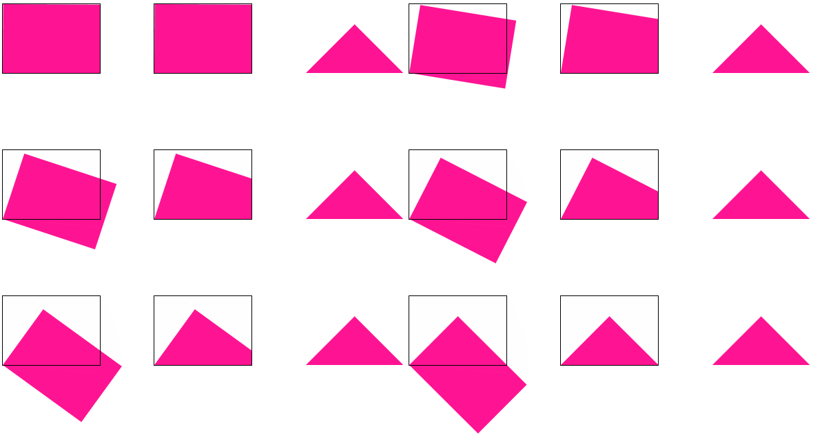
This method is relatively conventional, usetransform: rotate with overflow: hidden. You can understand it at a glance and learn it as soon as you learn it. The simple animation diagram is as follows:

left bottom to rotate , with overflow: hidden.
<div class="demo"></div>
<div class="demo-opacity"></div>
<div class="triangle"></div>
html, body {
    width: 100%;
    height: 100%;
    display: flex;
}

div {
    width: 141px;
    height: 100px;
    margin: auto;
}

.demo-opacity {
    overflow: hidden;
}

.demo,
.demo-opacity {
    position: relative;
    border: 1px solid #000;
    background: unset;

    &::before {
        content: "";
        position: absolute;
        top: 0;
        left: 0;
        right: 0;
        bottom: 0;
        animation: conicmove 3s infinite linear;
        background: deeppink;
        transform-origin: left bottom;
        z-index: -1;
    }
}

.triangle {
    position: relative;
    background: unset;
    overflow: hidden;

    &::before {
        content: "";
        position: absolute;
        top: 0;
        left: 0;
        right: 0;
        bottom: 0;
        background: deeppink;
        transform-origin: left bottom;
        transform: rotate(45deg);
        z-index: -1;
    }
}

@keyframes conicmove {
    100% {
        transform: rotate(45deg);
    }
}
Use characters to draw triangles
OK, the last one, somewhat unique, is to use characters to represent triangles. The following lists the decimal Unicode representation codes of some triangle-shaped characters.◄ : ◄ ► : ► ▼ : ▼ ▲ : ▲ ⊿ : ⊿ △ : △For example, we use
▼ to implement a triangle ▼, the code is as follows:
<div class="normal">▼ </div>
div {
    font-size: 100px;
    color: deeppink;
}
The effect is still good:
css video tutorial)
The above is the detailed content of How to implement triangles in css. For more information, please follow other related articles on the PHP Chinese website!


