Home >Web Front-end >CSS Tutorial >Make a fireworks bloom animation with pure CSS (code example)
Make a fireworks bloom animation with pure CSS (code example)
- 青灯夜游forward
- 2021-09-29 12:02:125214browse
This article will show you how to use pure CSS to create a fireworks blooming animation. I hope it will be helpful to you!

Recently, I need to make a firework animation for a project. The requirement is random size, appears in different places, check the effect first

1. Choose the appropriate animation
What kind of scene determines what kind of animation to use. For example, for some relatively lightweight and decorative animations, CSS animation is enough. For some operational activities that require higher animation requirements, such as creative games, JS animation is definitely the first choice. If necessary, you will also need to use some graphics libraries, such as Pixi.js.
Secondly, we also need to consider the cost of learning. Generally speaking, CSS is easier to use and the cost of getting started is lower. If you need slightly complex animations, you can directly refer to existing libraries, such as Animate.css. JS may be a little more complicated. Native JS is fine. If it is other graphics libraries, you need to face completely different APIs, which is a learning cost.
Finally, engineering also needs to be considered. For example, lottie-web itself is already very large (532k, 150k after compression, and 43k after gzip). In addition, the animation json file exported by the design will also be very large. The entire lottie is introduced just for an animation. It's not cost-effective and should be replaced by other methods.
Taking all things into consideration, fireworks animation can be implemented using CSS
2. Implementation of a single firework
Here we can implement it in the form of sequence frames. For example, I will ask the designer to export a set of sequence frame pictures, like this

, and then combine these pictures into one picture in order. You can use some online generation tools , for example sprite-generator, you will get such a picture

Next, you only need to use steps() in the CSS animation function Function code, frame-by-frame animation is completed
Assume that there is the following HTML structure
<div class="fireworks"></div>
CSS is implemented as
.fireworks {
    position: absolute;
    width: 150px;
    height: 150px;
    background: url('https://imgservices-1252317822.image.myqcloud.com/image/081320210201435/e9951400.png') right top no-repeat;
    background-size: auto 150px;
    animation: fireworks 1s steps(24) infinite;
}
@keyframes fireworks {
    to {
        background-position: 100%;
    }
}
The effect is as follows

3. Fireworks at Random Positions
Now the fireworks appear in the same position every time. It seems too regular and unnatural. So how to realize that it is here and there for a while? What about the effect? Here you can add another keyframe and change a few positions at will (it doesn’t have to be really random, it just needs to look irregular)
@keyframes random {
    25% {
        transform: translate(200%, 50%);
    }
    50% {
        transform: translate(80%, 80%);
    }
    75% {
        transform: translate(20%, 60%);
    }
}
Then combine the two animations
.fireworks {
    /* 其他 */
    animation: fireworks 1s steps(24) infinite, random 4s infinite;
}
The effect is as follows
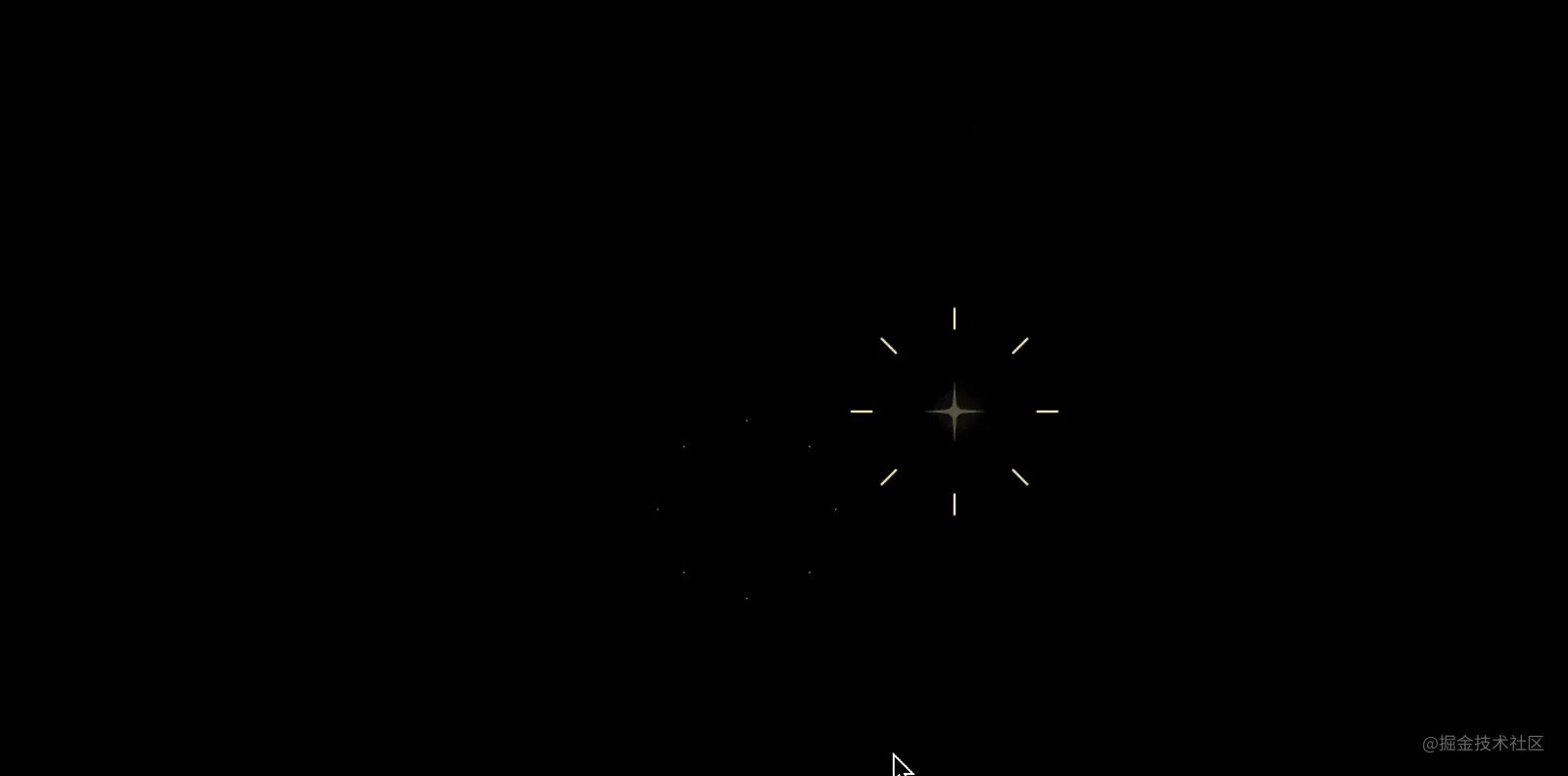
#Is it a strange animation? The reason is that there is a smooth transition when changing the position, so steps() also needs to be added here. Note that only steps(1) is needed here to represent this process. Jump directly to the specified key frame and it is over. Other frames will not be automatically created on the way.
.fireworks {
    /* 其他 */
    animation: fireworks 1s steps(24) infinite, random 4s steps(1) infinite;
}
The effect is as follows

Isn’t this more natural?
4. Randomly sized fireworks
Now that we have random positions, now we can add some size changes. We only need to add scale on the basis of the position changes
@keyframes random {
    25% {
        transform: translate(200%, 50%) scale(0.8);
    }
    50% {
        transform: translate(80%, 80%) scale(1.2);
    }
    75% {
        transform: translate(20%, 60%) scale(0.65);
    }
}
The effect is as follows

<div class="fireworks"   style="max-width:90%"></div>
<div class="fireworks" style="right: 30%; top: 13%;"></div>
<div class="fireworks" style="left: 5%; top: 23%;"></div>
<div class="fireworks" style="right: 45%; top: 8%;"></div>
The effect is as follows

4个一起出现,太整齐了,所以需要添加一些延时 animation-delay 错开出现的时间
<div class="fireworks" style="left: 15%; top: 5%;"></div>
<div class="fireworks" style="right: 30%; top: 13%; animation-delay: -0.4s;"></div>
<div class="fireworks" style="left: 5%; top: 23%; animation-delay: -1.7s;"></div>
<div class="fireworks" style="right: 45%; top: 8%; animation-delay: -3.1s;"></div>
这样就得到了文章开头的效果了

完整代码可访问 CSS fireworks (codepen.io)
六、绚丽多彩的烟花
设计同学觉得白色有些太单调,想换个颜色,比如黄色?由于我们已经做成了序列帧图片,不可能再生成一套黄色烟花的图片,那么问题来了,如何通过 CSS 更换颜色呢?
这里就又不得不借助一下 CSS Mask 了,关于 Mask 之前的文章介绍过很多实用的案例,这里就不多介绍了,如果还不熟悉 mask,可以参考这一篇 客栈说书:CSS遮罩CSS3 mask/masks详细介绍 « 张鑫旭-鑫空间-鑫生活 (zhangxinxu.com)
只需要一点点改动就行了,把原先的背景用作遮罩背景,如下
.fireworks {
    /*其他样式*/
  	background: #FFEFAD;
    -webkit-mask: url('https://imgservices-1252317822.image.myqcloud.com/image/081320210201435/e9951400.png') right top no-repeat;
    -webkit-mask-size: auto 150px;
}
@keyframes fireworks {
    to {
        -webkit-mask-position: 100%;
    }
}
效果如下

再进一步,可以加入颜色的变化动画,比如 黄 → 红 → 紫 → 青,再定义一个关键帧
}
.fireworks {
   	/*其他样式*/
    animation: fireworks 2s steps(24) infinite, random 8s steps(1) infinite, random_color 1s infinite;
}
@keyframes random_color {
    0% {
        background-color: #ffefad;
    }
    25% {
        background-color: #ffadad;
    }
    50% {
        background-color: #aeadff;
    }
    75% {
        background-color: #adffd9;
    }
}
可以得到如下的效果
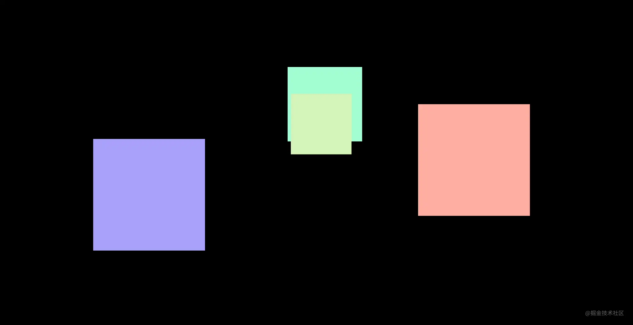
是不是变得绚丽多彩了起来?完整代码可以访问 CSS fireworks colors (codepen.io)
七、IE下的降级处理
现代浏览器基本都支持 mask 遮罩了,但是 IE 不支持,所以 IE下就变成了这样

因此,IE 下需要降级处理,不用绚丽多彩,只需要随机绽放
那么如何区分 IE 浏览器和现代浏览器呢?其实可以用 IE 不支持的一些选择器就可以了,比如 :default
.fireworks {
    background: url('https://imgservices-1252317822.image.myqcloud.com/image/081320210201435/e9951400.png') right top no-repeat;
    background-size: auto 150px;
}

/*以下现代浏览器支持*/
_:default, .fireworks {
    -webkit-mask: url('https://imgservices-1252317822.image.myqcloud.com/image/081320210201435/e9951400.png') right top no-repeat;
    -webkit-mask-size: auto 150px;
}
八、动画与用户体验
适当的动画可以提升用户体验,但不是所有用户都喜欢动画,尤其是一些装饰类动画,可能觉得花里胡哨的,可能觉得分散了注意力,可能为了省电,甚至部分动画还会对用户造成不良的反应。为此,选择权应该交给用户,用户觉得不需要可以在系统直接关闭动画。
目前大部分的操作系统都可以关闭不必要的动画
- 在 Windows 10 中:设置 > 轻松获取 > 显示 > 在 Windows 中显示动画。
- 在 Windows 7 中:控制面板 > 轻松获取 > 使计算机更易于查看 > 关闭不必要动画。
- 在 MacOS 中:系统偏好 > 辅助使用 > 显示 > 减弱动态效果。
- 在 iOS 上:设置 > 通用 > 辅助性 > 减弱动态效果。
- 在 Android 9+ 上:设置 > 辅助性 > 移除动画。
相对应的,CSS 中可以通过媒体查询 prefers-reduced-motion来检测系统是否开启动画减弱功能。
所以,可以再增加这样一段 CSS
@media screen and (prefers-reduced-motion) {
    /* 禁用不必要的动画 */
    .fireworks {
        animation: none;
    }
}
效果如下(这里以macOS为例)

You can see that when "Reduce dynamic effects" is checked, the fireworks animation disappears completely. Although there is no technical content, it takes care of the feelings of some people and improves the user experience unconsciously. Why not do it.
9. Summary and explanation
The above introduces the whole process of fireworks animation implementation, and also includes some user experience tips. Let’s briefly summarize
Choose the appropriate animation implementation method
The key to CSS sequence frame animation implementation is steps
You can combine multiple animations to form a new animation
Changing the color of graphics can be achieved using mask
IE and modern browsers can use:default to distinguish
-
It is necessary to follow the system settings to turn off the animation. You can use media query prefers-reduced-motion
CSS implementation is not complicated, and most students should be able to get started quickly, but it is Perfection is actually not easy. If you think it’s good and helpful to you!
For more programming-related knowledge, please visit: Programming Teaching! !
The above is the detailed content of Make a fireworks bloom animation with pure CSS (code example). For more information, please follow other related articles on the PHP Chinese website!
Related articles
See more- In-depth analysis of absolute positioning in CSS and a thorough understanding of it!
- How to use CSS background series properties to achieve some fancy text effects
- Teach you step by step how to draw a cute jade rabbit using pure CSS (with code)
- What does the css flex-direction property do?
- Learn more about :is() and :where() in CSS to make your style code more concise!

