Home >Web Front-end >Front-end Q&A >What does the css flex-direction property do?
What does the css flex-direction property do?
- 青灯夜游Original
- 2021-09-22 17:17:299025browse
flex-direction in css is a sub-property of the "flexible layout" module, used to establish the main axis and define the placement direction of flex items in the flex container; the syntax "flex-direction: row|row-reverse|column |column-reverse;".

The operating environment of this tutorial: Windows 7 system, CSS3&&HTML5 version, Dell G3 computer.
The flex-direction property is a sub-property of the Flexible Box (flexible layout) module. It establishes the main axis, which defines the direction in which flex items are placed within the flex container.
Syntax:
flex-direction: row|row-reverse|column|column-reverse;
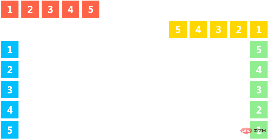
row Default value. Displays flex items horizontally as a row.
#row-reverse Wait for the same row, but in the opposite direction.
#column As a column, display flex items vertically.
column-reverse Same as column, but in opposite direction.
Note that row and row-reverse are affected by the directionality of the flex container. If its text direction is ltr, row represents the horizontal axis from left to right and row-reverse from right to left; if the direction is rtl, it is the opposite.
Example:
<ul class="flex-container row">
  <li class="flex-item">1</li>
  <li class="flex-item">2</li>
  <li class="flex-item">3</li>
  <li class="flex-item">4</li>
  <li class="flex-item">5</li>
</ul>

<ul class="flex-container row-reverse">
  <li class="flex-item">1</li>
  <li class="flex-item">2</li>
  <li class="flex-item">3</li>
  <li class="flex-item">4</li>
  <li class="flex-item">5</li>
</ul>

<ul class="flex-container column">
  <li class="flex-item">1</li>
  <li class="flex-item">2</li>
  <li class="flex-item">3</li>
  <li class="flex-item">4</li>
  <li class="flex-item">5</li>
</ul>

<ul class="flex-container column-reverse">
  <li class="flex-item">1</li>
  <li class="flex-item">2</li>
  <li class="flex-item">3</li>
  <li class="flex-item">4</li>
  <li class="flex-item">5</li>
</ul>
.flex-container {
  padding: 0;
  margin: 0;
  list-style: none;

  -ms-box-orient: horizontal;
  display: -webkit-box;
  display: -moz-box;
  display: -ms-flexbox;
  display: -moz-flex;
  display: -webkit-flex;
  display: flex;
}

.row            {
  -webkit-flex-direction: row;
  flex-direction: row;
}

.row-reverse    {
  -webkit-flex-direction: row-reverse;
  flex-direction: row-reverse;
}
.row-reverse li {
  background: gold;
}

.column {
  -webkit-flex-direction: column;
  flex-direction: column;
  float: left;
}
.column li {
  background: deepskyblue;
}

.column-reverse {
  -webkit-flex-direction: column-reverse;
  flex-direction: column-reverse;
  float: right;
}
.column-reverse li {
  background: lightgreen;
}

.flex-item {
  background: tomato;
  padding: 5px;
  width: 50px;
  height: 50px;
  margin: 5px;

  line-height: 50px;
  color: white;
  font-weight: bold;
  font-size: 2em;
  text-align: center;
}
For more programming-related knowledge, please visit: Programming Video! !
The above is the detailed content of What does the css flex-direction property do?. For more information, please follow other related articles on the PHP Chinese website!
Related articles
See more- CSS flex-direction property of Flexible flexible box model
- Elementary article: How to use CSS3 to create love loading (detailed code explanation)
- Beginner's article: How to use CSS to implement simple skeletal animation (code sharing)
- In-depth analysis of absolute positioning in CSS and a thorough understanding of it!
- How to use CSS background series properties to achieve some fancy text effects

