Home >Web Front-end >CSS Tutorial >How to add borders in css
How to add borders in css
- 醉折花枝作酒筹Original
- 2021-07-26 10:41:4911172browse
Methods to add a border are: 1. border attribute, one or more lines surrounding the element content and padding. This attribute allows you to specify the style, width and color of the element border; 2. border-image Attribute, the border-image attribute is used to set the image border.

The operating environment of this tutorial: Windows 7 system, CSS3&&HTML5 version, Dell G3 computer.
CSS border property
The border of an element is one or more lines that surround the element's content and padding.
Each border has 3 aspects: width, style, and color.
The CSS border property allows you to specify the style, width, and color of an element's border.
border shorthand property sets all border properties in one declaration.
You can set the following attributes in order:
border-width: Specifies the width of the border.
border-style: Specifies the style of the border.
border-color: Specifies the color of the border.
Example:
<html>
<head>
<style type="text/css">
div{border:1px solid #000}
</style>
</head>

<body>
<div>div添加边框</div>
</body>

</html>
Effect

CSS border-image property
border- The image attribute is used to set the image border. It is a shorthand attribute that sets all border-image-* attributes. If a value is omitted, its default value is set.
Syntax:
border-image: source slice width outset repeat|initial|inherit;
Attribute value:
border-image-source: used to specify the location of the image to be used to draw the border
border-image-slice: The image border is offset inward
border-image-width: The width of the image border
border-image-outset: used to specify the amount of border-image-area drawn outside the border
border-image-repeat: used to set whether the image border Should be repeated, stretched, or rounded.
The usefulness of border-image
Before I used border-image, I felt that the properties of css were basically enough. Border-image completely complicates simple work. After learning this attribute, I found that the use of this attribute can greatly save coding time and efficiency. To sum up, it is roughly applicable to the following two scenarios:
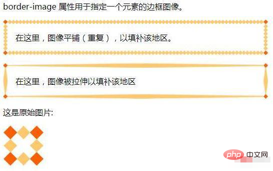
The border of the element is irregular. At this time, you need to use the design drawing as the border background. Compared with background-image, border-image has the advantage of being more flexible. You can use code to control the stretching and repetition of the border background, so it can create more diverse effects.
The button width and height are uncertain. Use border-image to make buttons. You can use the same background image to create buttons of various widths and heights.
Example:
<!DOCTYPE html>
<html>
<head>
<meta charset="utf-8">
<style>
#borderimg1 {
    border: 10px solid transparent;
    padding: 15px;
    -webkit-border-image: url(border.png) 30 round; /* Safari 3.1-5 */
    -o-border-image: url(border.png) 30 round; /* Opera 11-12.1 */
    border-image: url(border.png) 30 round;
}
#borderimg2 {
    border: 10px solid transparent;
    padding: 15px;
    -webkit-border-image: url(border.png) 30 stretch; /* Safari 3.1-5 */
    -o-border-image: url(border.png) 30 stretch; /* Opera 11-12.1 */
    border-image: url(border.png) 30 stretch;
}
</style>
</head>
<body>
<p>border-image 属性用于指定一个元素的边框图像。</p>
<p id="borderimg1">在这里,图像平铺(重复),以填补该地区。</p>
<p id="borderimg2">在这里,图像被拉伸以填补该地区</p>
<p>这是原始图片:</p><img  src="/static/imghwm/default1.png"  data-src="/images/border.png"  class="lazy"   alt="How to add borders in css" >
</body>
</html>
Effect

Recommended learning: css video tutorial
The above is the detailed content of How to add borders in css. For more information, please follow other related articles on the PHP Chinese website!

