Home >Web Front-end >CSS Tutorial >How to set css width to 100vw
How to set css width to 100vw
- 青灯夜游Original
- 2021-02-22 16:57:219197browse
In css, you can use the "width:100vw;" style to set the width to 100vw, and the width attribute can set the width of the element. vw is a viewport unit, which refers to the width relative to the viewport; 1vw is equal to 1% of the viewport width. For example, the width of the browser is 1920px, then "1vw=19.2px".

The operating environment of this tutorial: Windows 7 system, CSS3 version, Dell G3 computer.
In css, you can use the "width:100vw;" style to set the width to 100vw.
css width attribute
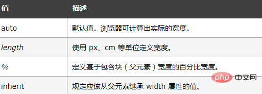
The width attribute sets the width of the element; it defines the width of the element's content area, and padding and borders can be added outside the content area and margins.
Note: Inline non-replaced elements will ignore this attribute.
Attribute value:

[Recommended tutorial: CSS video tutorial]
css Viewport units
On the PC side, the viewport refers to the visible area of the browser;
On the mobile side , it involves 3 viewports: Layout Viewport (layout viewport), Visual Viewport (visual viewport), Ideal Viewport (ideal viewport).
The "viewport" in the viewport unit refers to the visible area of the browser on the PC side; on the mobile side it refers to the Layout Viewport in Viewport.
According to the CSS3 specification, the viewport unit mainly includes the following 4 units:
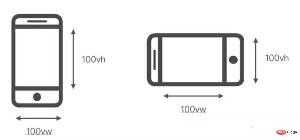
1.vw: Relative to the width of the viewport, the viewport is evenly divided into 100 units of vw, and 1vw is equal to the viewport. 1% of mouth width.
2.vh: Relative to the width of the viewport, the viewport is divided into 100 units of vh, and 1vh is equal to 1% of the viewport height.
3.vmin: Select the smallest one between vw and vh.
4.vmax: Select the largest one between vw and vh.
vw and vh
The full names are Viewport Width and Viewport Height. The width and height of the window are equivalent to 1% of the screen width and height.
vh and vw: height and width relative to the viewport, not the parent element (CSS percentages are relative to the height and width of the nearest parent element that contains it). 1vh is equal to 1/100 of the viewport height, and 1vw is equal to 1/100 of the viewport width.
For example: the browser height is 950px, the width is 1920px, 1 vh = 950px/100 = 9.5 px, 1vw = 1920px/100 =19.2 px.
The difference between vh/vw and %

For more programming related knowledge, please visit: Programming Video ! !
The above is the detailed content of How to set css width to 100vw. For more information, please follow other related articles on the PHP Chinese website!

