Home >Web Front-end >CSS Tutorial >Learn how to use flexbox through 14 interesting and vivid pictures (worth collecting)
Learn how to use flexbox through 14 interesting and vivid pictures (worth collecting)
- 青灯夜游forward
- 2021-02-05 07:26:042131browse

In 2021, we are going to review the usage of flexbox, and there are some less used attributes to facilitate everyone’s understanding. Here we use interesting pictures to explain.
FlexBox Architecture
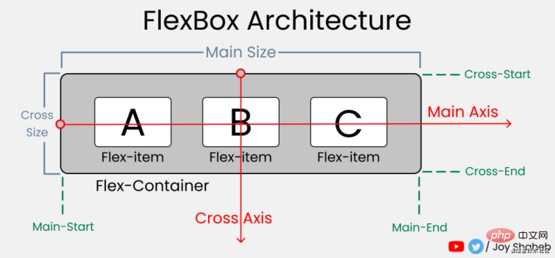
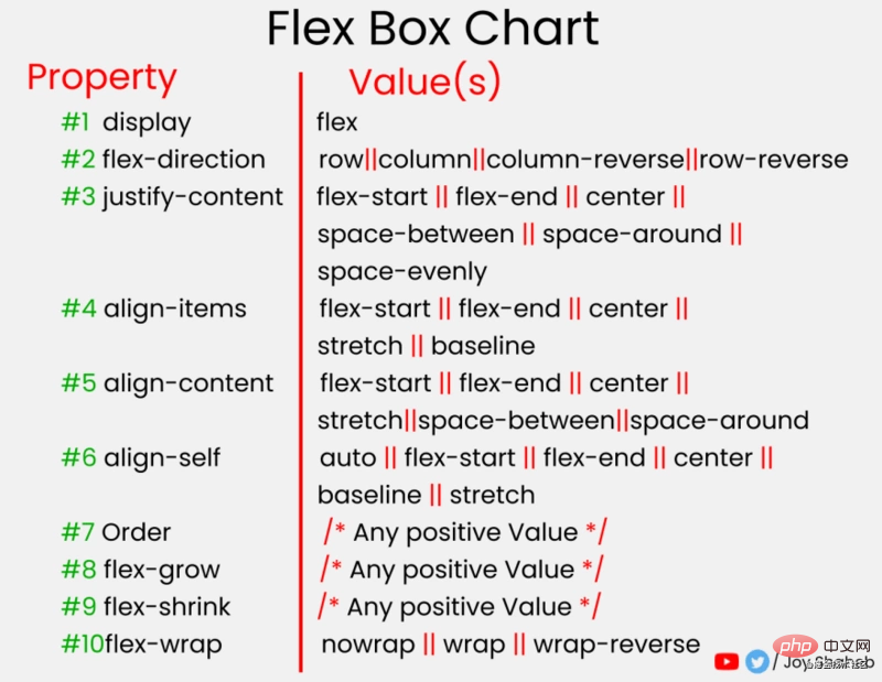
flex-itemThe row/column direction distributed inside flex-container.
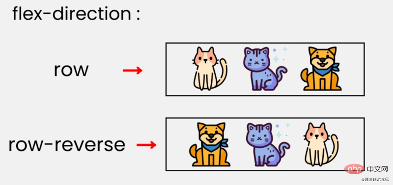
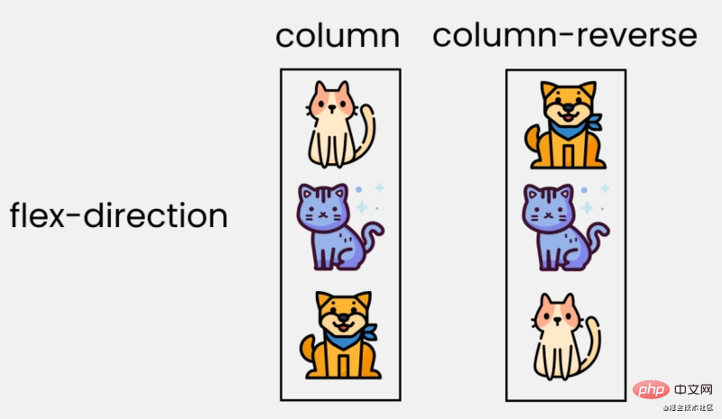 ##justify-content
is used to set or retrieve the flex box element Alignment in the main axis (horizontal axis) direction
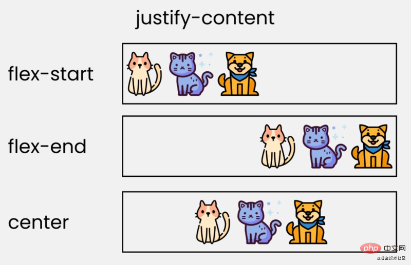
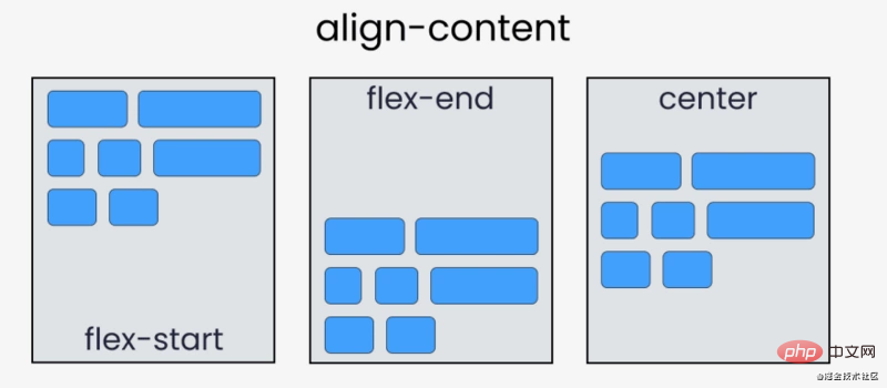
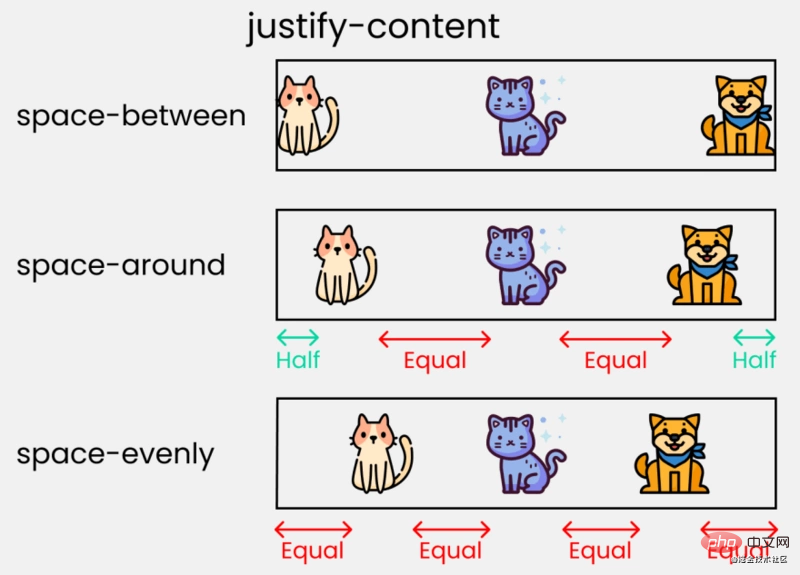 align-content
Properties set how the browser allocates space between and around content items along the vertical axis of flexbox layout and the main axis of grid layout.

##align-items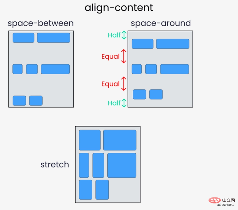
justify-content
The difference is thatalign-items is mainly vertical alignment. Property introduction: flex-start, flex-end, center , initial, inherit.
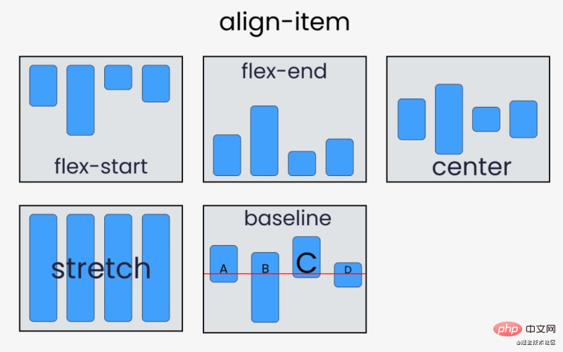 The difference between align-content and align-items:
align-items
- Applies to In the case of a single line, only top alignment, bottom alignment, centering and stretching
-
align-content are suitable for line breaks (multiple lines) (invalid in single line cases), and alignment can be set , bottom-aligned stretch and evenly distributed remaining space and other attribute values. -
The summary is to findalign-items in a single line and - align-content
in multiple lines.align-self
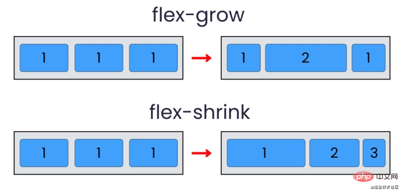
flex - grow | shrink | wrap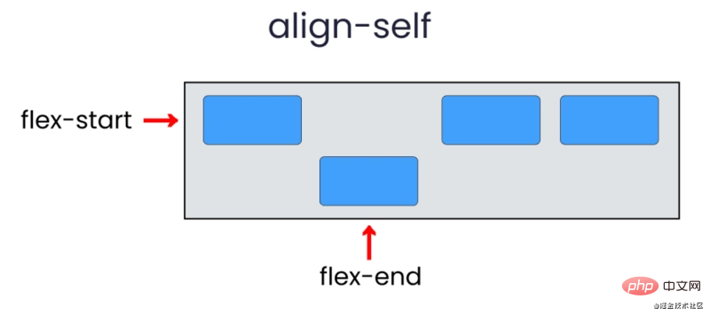
- flex -grow :
- Increase the size of
flex-item according to the width of the flex container.
flex-shrink - property specifies the shrinking rules for flex elements. The flex element will only shrink when the sum of the default widths is greater than the container, and the size of its shrinkage is based on the value of
flex-shrink.
flex-wrap - Specifies whether the flex element is displayed in a single line or in multiple lines. If line wrapping is allowed, this property allows you to control the stacking direction of lines.
[The external link image transfer failed. The source site may have an anti-leeching mechanism. It is recommended to save the image and upload it directly (img-Go640ub5-1611621233326)(/img/bVcNNly)]
Abbreviation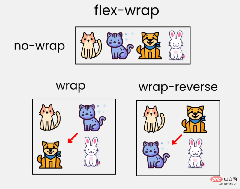
- flex
- : It is
flex-grow, Abbreviation for the combination of flex-shrink and flex-basis.
flex-basis - : This is similar to adding a width to
flex-item, only more flexible. flex-basis: 10em
It sets the initial size of the flex item to10em, its final size will depend on the available space,flex-growandflex-shrink.
 Original address: https://dev.to/joyshaheb/flexbox-sheets-in-2021-css-2021-3edl
Author: Joy ShahebTranslation address: https://segmentfault.com/a/1190000038998136! !For more computer programming related knowledge, please visit:
Programming Teaching
The above is the detailed content of Learn how to use flexbox through 14 interesting and vivid pictures (worth collecting). For more information, please follow other related articles on the PHP Chinese website!

