
 Web Front-enduni-appIntroducing uni-app's font library, custom components, packaging and news practice
Introducing uni-app's font library, custom components, packaging and news practice


Recommended (free): uni-app development tutorial
Article Contents
- Preface
- 1. Using the iconfont font library
- 2. Custom components and messaging between components
- 3 , Packaging
- 4. Practical cases--news list and details
- Summary
##Foreword
The main introduction of this article 4 aspects of content: Use the icon font library provided by iconfont in the uni-app project to beautify the page;
Implement custom components, and can customize attributes and implement message passing between parent and child components;
WeChat mini program preview and real device testing, APP cloud packaging and local packaging;
News list and detailed practical exercises.
1. Use the iconfont font library
iconfont (https://www.iconfont.cn/) can be used in uni-app icon font.
The general process is as follows: First select the required icon according to the keyword in iconfont and add it to the shopping cart; then create a project, add the previously selected icon to the project, and download the font. As follows: 
@font-face {font-family: "iconfont";
  src: url('data:application/x-font-woff2;charset=utf-8;base64,d09GMgABAAAAAAQAAAsAAAAACHwAAAOxAAEAAAAAAAAAAAAAAAAAAAAAAAAAAAAAHEIGVgCCcAqFCIQiATYCJAMICwYABCAFhG0HLxtHBxHVmxnJPhbT7QzKF5SRijPBQ9X5vZ7poDv8ENdklpxkdYVYd9AnKb65+dU1KkK1Bcl58H95xgvs9NL89T/HTBeJ9Tz/SueUUZS0N8DxgAbUjdsVUYAcmN8CO4cgrXzxPgSgSaUY0bBxy444kQTLBCBGDhvSD2fLjJwgCZw6u7BXItZgw2ksNS4Bq/PfFx8pL5xgYDMJGtoObjSQum9VWGDODc+lZ4pAcpwT0A6BCRQDEkRH0d0as0wXY6IdtyRzulki4K0Kh1Px1f7jgQBhJ1C7EZssfk6SWPpU1QZ/XwJ+4C4Ix6Yy8Pt9flbI5OJoqZS7k14WEo7ABpdreRD7XEsHNzQvCmm9zKKXdXtGcFeM3doZrUO7hybsieuil52Nt286N1d5oWM9P20tKc4VxFnUWG2hlwsPEiPChd5KyXHtuLCjCz2poxWKnR7aENdlQzBmWnDj9OVpxoruqC1BWBmtjZ5jm2u5e86OLYnTQ9u7dkno2L1Lp+YhvSy6OEfljsnv3KVjp+DyuArNkjUbYl+0WaweuZqrs2qpxg9tpi85x11WrdUZtULtUZW+VEhpYa5vdRF3ppuLva/hyfRwrVdK78RMFSoTUYjBSL+5/oBrdQt1Zu7SNY90c+clx7izqo06PXbl2NNATG2J8jCEp7dX8Hl7pfZek6FYQyI8O+PYz/tJ92fXCWQHfhR41xfHzQ7Mzwn8zKsuKEiY65vf1F7ZO78wqknZQJbZd2ByvqxYf0HDtm0D2V//thETtfp47PUa7yP/1PVOKKzZZ2b61RrTr9WI9PVMyJpZEGHYK14tvzSxx5N60jXMnT/VpczY9NzlMa6sbyNwNDKpC0DYMp+Zjf/+v2FfcutBfXw1vzldEoBH2aOOYDBsSZZ5wfkleQT82ZKFPdKVBRZD2hIxb3AX/5fYpNFAGPZH8mSrNwZqp8CpSxAMHKSAiZNspMQWgw0XFcGOkzqgKaLJYRdRjMdESAUUshBA4OcAGHi5ACZ+LiMl9jHYiOUz2PELEzRHZxF1potcsfoGit4w0fCndZSLI5v5ovaG+X302pTltBe0rDGqQurmOlzQIzaUz1ybMbHKSS08huMQyiobRguLWW5iZOmLwiin8zRAAT0GmCAG/hArI8IFp4MN3/v5G2DmzUGPTnR1BF8ApbCOTlQE0gJkp74Wdb2WyYUPMzWGwbyIUYQTokUnOMK0QGR51gYYMQLLhmSmIVI/XqoO59een+4QoAkMhginmNj6i+zFOQAAAA==') format('woff2');}.iconfont {
  font-family: "iconfont" !important;
  font-size: 16px;
  font-style: normal;
  -webkit-font-smoothing: antialiased;
  -moz-osx-font-smoothing: grayscale;}.iconbooks:before {
  content: "\e709";}
At this time, globally import the css style in App.vue, as follows:
<script>
export default {
onLaunch: function() {
console.log('App Launch')
},
onShow: function() {
console.log('App Show')
},
onHide: function() {
console.log('App Hide')
}
}
global.isLogin = function() {
try {
var suid = uni.getStorageSync('suid');
var srand = uni.getStorageSync('srand');
} catch (e) {
//TODO handle the exception
}
if (suid == '' || srand == '') {
return false;
} else {
return [suid, srand];
}
}</script><style>
/* 引入自定义图标库 */
@import url('/static/font/iconfont.css');
/*每个页面公共css */
.red {
color: #ff0000;
}</style> Need to pay attention to: When using
@import to import an external style file, it needs to be placed at the front of the of the style module, and plus a semicolon at the end, otherwise the import will fail. The font style used in
<template>
	<view>
		<view>
			书籍		</view>
	</view></template><script>
	export default {
		data() {
			return {
			}
		},
		onLoad() {
		},
		onShow() {
		},
		onHide() {
		},
		methods: {

		}
	}</script><style></style>
Display:  ##Obviously, it is displayed normally in both the mini program and the APP.
Components provide a lot of convenience for the development of uni-app and speed up the development.
Components can also be reused and customized, providing great flexibility
. Before customizing components, you need to create the
directory in the project directory. Right-click the components directory and select New Component. When creating a component, you can select a template or click in the upper right corner to customize it. Define template , create template name.txt in the pop-up directory, and write the template content in it. For example, create template.txt with attributes as follows: <pre class="brush:php;toolbar:false"><template>
<view>
...... </view></template><script>
export default {
name: "组件名称",
//属性
props: {
属性名称: {
type: String, //属性类型
value: "值"
},
......
},
//组件生命周期
created: function(e) {
},
methods: {
函数名称: function(obj) {
},
}
}</script><style>
**组件样式**</style></pre>When creating a component, select a custom template named myinput.vue and modify it as follows:
<template>
	<view>
		<input>
		<button>提交</button>
	</view></template><script>
	export default {
		name: "myinput",
		//属性
		// props: {
		// 	属性名称: {
		// 		type: String, //属性类型
		// 		value: "值"
		// 	},
		// 	......
		// },
		//组件生命周期
		created: function(e) {

		},
		methods: {},
	}</script><style>
	.myinput {
		padding: 20px;
		background: #76F32B;
	}</style>
In the page where you need to use the custom component, first
Import the custom component, as follows: import myinput from '../../components/myinput.vue';
Register the component on the current page
, as follows: components: {
myinput
}Finally use it, for example, index.vue is as follows:
<template>
<view>
<myinput>姓名</myinput>
</view></template><script>
import myinput from '../../components/myinput.vue';
export default {
data() {
return {
}
},
onLoad() {
},
onShow() {
},
onHide() {
},
methods: {
},
components: {
    myinput
}
}</script><style></style> Display:
 Obviously, the WeChat applet and APP use custom components.
You can also define
props attributes, and you can dynamically set attributes for components , as follows: <template>
<view>
<input>
<button>提交</button>
</view></template><script>
export default {
name: "myinput",
//属性
props: {
placeholder: {
type: String, //属性类型
value: "Please input your ..."
}
},
//组件生命周期
created: function(e) {
},
methods: {
submit: function() {
console.log('submit successfully')
}
},
}</script><style>
.myinput {
padding: 20px;
background: #76F32B;
}</style> Define the attributes in the props object, and at the same time When using this component, pass the value to the attribute, index.vue is as follows:
<template>
<view>
<myinput>姓名</myinput>
<myinput>年龄</myinput>
</view></template><script>
import myinput from '../../components/myinput.vue';
export default {
data() {
return {
}
},
onLoad() {
},
onShow() {
},
onHide() {
},
methods: {
},
components: {
myinput }
}</script><style></style>
Display:
 implements multi-terminal attribute definition.
You can also implement component clicks to trigger events or methods that change the parent element, that is, to activate the parent component. For example, the myinput component activates elements in index.vue and triggers events. You need to use
$emit, used to simulate execution events, the first parameter is the event, and the remaining parameters are the parameters of the event; at the same time, when using the component in the parent component, bind it through v-on Define events in parent components to implement communication between components. is as follows:
<template>
<view>
<input>
<button>提交</button>
</view></template><script>
export default {
name: "myinput",
//属性
props: {
placeholder: {
type: String, //属性类型
value: "Please input your ..."
}
},
//组件生命周期
created: function(e) {
},
methods: {
submit: function() {
this.$emit('change_parent', 'hi...');
console.log('submit successfully')
}
},
}</script><style>
.myinput {
padding: 20px;
background: #76F32B;
}</style>
index.vue is as follows:
<template>
<view>
<text>{{info}}</text>
<myinput>姓名</myinput>
<myinput>年龄</myinput>
</view></template><script>
import myinput from '../../components/myinput.vue';
export default {
data() {
return {
info: 'hello'
}
},
onLoad() {
},
onShow() {
},
onHide() {
},
methods: {
change_parent: function(text){
this.info = text }
},
components: {
myinput }
}</script><style></style>
Display:
 As you can see, communication and events are implemented Passed, the child component successfully called the event of the parent component.
At the same time, we can also use the GraceUI framework, whose full name is
Grace User Interface. It is a super front-end framework based on uni-app and small programs. The official website address is http://www.graceui.com/ provides richer components, layouts and interface libraries. It can realize multi-end release of a set of codes through uni-app, greatly improving the development speed. It can also be used as Custom components for secondary development.
3. Packaging对于小程序来说,可以申请测试号,方便开发者开发和体验小程序的各种能力,并使用此帐号在开发者工具创建项目进行开发测试,以及真机预览体验。 如下: 显然,实现了在真机预览小程序。 对于APP来说,需要打包,有云打包和本地打包两种方式可以选择,其中云打包的特点是DCloud官方配置好了原生的打包环境,可以把HTML等文件编译为原生安装包,通过菜单栏中的 选择之后,直接点击打包按钮等待获取公共测试证书、并成功打包即可。 四、实战案例–新闻列表和详情 uni-app实战实现新闻列表和详情,包括API交互、网络请求、列表循环和页面参数传递等。 先搭建列表页轮廓,index.vue如下: 其中,通过flex和其他布局样式来实现列表。 pages下新建info目录,下新建info.vue用于展示新闻详情,如下: 显示: 可以看到,实现了新闻图片和标题的布局展示。 现在进一步实现从接口获取数据,将新闻详情链接通过参数传递从新闻列表页传到新闻详情页,如下: info.vue如下: 演示如下: 显然,可以看到新闻列表,包括图片和标题,点击会将新闻链接传递给info页面。 此时再实现在info页面展示新闻详情,info.vue完善如下: 显示: 显然,现在进入info页面已经可以查看新闻详情。 总结 uni-app开发可以借助外部的资源和工具,比如iconfont提供的图标字体;组件加速了uni-app的开发,自定义组件提供了更大的灵活性,还可以实现组件间的通信;打包对于小程序和APP有所不同;新闻列表和详情页考察uni-app的样式设计、页面参数传递和第三方API的使用。 更多相关学习敬请关注uni-app教程栏目!
只需访问https://developers.weixin.qq.com/sandbox,并扫码登录后,即可查看到已为自己分配好的测试帐号信息,就可以使用提供的测试号的AppID和AppSecret进行开发和测试,还可以在PC端或手机端进行真机预览和调试。
发行->原生App-云打包,打开App云端打包对话框,选择所需选项并提交,以Android打包为例,如下: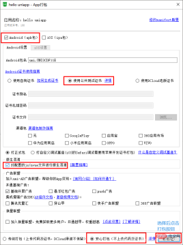
其中,新闻API可以使用聚合数据https://www.juhe.cn/、极速数据https://www.jisuapi.com/等API平台提供的新闻数据接口,每天都会有免费请求次数,足够进行学习和测试,只需要注册、认证获取到相应apikey并进行替换即可。<template>
<view>
<navigator>
<image></image>
<view>news...</view>
</navigator>
</view></template><script>
export default {
data() {
return {
}
},
onLoad() {
},
onShow() {
},
onHide() {
},
methods: {
},
}</script><style>
view{
width: 100%;
}
.news-list{
display: flex;
width: 94%;
padding: 10upx 3%;
flex-wrap: nowrap;
}
.news-list image{
width: 200upx;
margin-right: 12upx;
flex-shrink: 0;
}
.news-title{
width: 100%;
height: auto;
background: #900;
}</style>
<template>
	<view>
		info...	</view></template><script>
	export default {
		data() {
			return {

			}
		},
		methods: {

		}
	}</script><style></style>

<template>
<view>
<navigator>
<image></image>
<view>{{item.title}}</view>
</navigator>
</view></template><script>
var _self;
export default {
data() {
return {
news: []
}
},
onLoad() {
_self = this;
this.getNews()
},
onShow() {
},
onHide() {
},
methods: {
getNews: function(){
uni.request({
url: 'https://api.jisuapi.com/news/get?channel=头条&start=100&num=20&appkey=66487d31a1xxxxxx',
success:function(res){
console.log(res)
_self.news = res.data.result.list }
})
}
},
}</script><style>
view{
width: 100%;
}
.news-list{
display: flex;
width: 94%;
padding: 10upx 3%;
flex-wrap: nowrap;
margin: 12upx 0;
}
.news-list image{
width: 200upx;
margin-right: 12upx;
flex-shrink: 0;
}
.news-title{
width: 100%;
height: auto;
background: #F0AD4E;
font-size: 28upx;
}</style>
<template>
	<view>
		info...	</view></template><script>
	export default {
		data() {
			return {

			}
		},
		onLoad:function(e){
			console.log(e);
		},
		methods: {

		}
	}</script><style></style>

<template>
	<view>
		<web-view></web-view>
	</view></template><script>
	var _self;
	export default {
		data() {
			return {
				link: ""
			}
		},
		onLoad:function(e){
			_self = this;
			console.log(e);
			_self.link = e.link;
		},
		methods: {

		}
	}</script><style></style>

The above is the detailed content of Introducing uni-app's font library, custom components, packaging and news practice. For more information, please follow other related articles on the PHP Chinese website!

 How do you debug issues on different platforms (e.g., mobile, web)?Mar 27, 2025 pm 05:07 PM
The article discusses debugging strategies for mobile and web platforms, highlighting tools like Android Studio, Xcode, and Chrome DevTools, and techniques for consistent results across OS and performance optimization.
 What debugging tools are available for UniApp development?Mar 27, 2025 pm 05:05 PM
The article discusses debugging tools and best practices for UniApp development, focusing on tools like HBuilderX, WeChat Developer Tools, and Chrome DevTools.
 How do you perform end-to-end testing for UniApp applications?Mar 27, 2025 pm 05:04 PM
The article discusses end-to-end testing for UniApp applications across multiple platforms. It covers defining test scenarios, choosing tools like Appium and Cypress, setting up environments, writing and running tests, analyzing results, and integrat
 What are the different types of testing that you can perform in a UniApp application?Mar 27, 2025 pm 04:59 PM
The article discusses various testing types for UniApp applications, including unit, integration, functional, UI/UX, performance, cross-platform, and security testing. It also covers ensuring cross-platform compatibility and recommends tools like Jes
 What are some common performance anti-patterns in UniApp?Mar 27, 2025 pm 04:58 PM
The article discusses common performance anti-patterns in UniApp development, such as excessive global data use and inefficient data binding, and offers strategies to identify and mitigate these issues for better app performance.
 How can you use profiling tools to identify performance bottlenecks in UniApp?Mar 27, 2025 pm 04:57 PM
The article discusses using profiling tools to identify and resolve performance bottlenecks in UniApp, focusing on setup, data analysis, and optimization.
 How can you optimize network requests in UniApp?Mar 27, 2025 pm 04:52 PM
The article discusses strategies for optimizing network requests in UniApp, focusing on reducing latency, implementing caching, and using monitoring tools to enhance application performance.
 How can you optimize images for web performance in UniApp?Mar 27, 2025 pm 04:50 PM
The article discusses optimizing images in UniApp for better web performance through compression, responsive design, lazy loading, caching, and using WebP format.


Hot AI Tools

Undresser.AI Undress
AI-powered app for creating realistic nude photos

AI Clothes Remover
Online AI tool for removing clothes from photos.

Undress AI Tool
Undress images for free

Clothoff.io
AI clothes remover

AI Hentai Generator
Generate AI Hentai for free.

Hot Article
Hot Tools

SublimeText3 Mac version
God-level code editing software (SublimeText3)

Safe Exam Browser
Safe Exam Browser is a secure browser environment for taking online exams securely. This software turns any computer into a secure workstation. It controls access to any utility and prevents students from using unauthorized resources.

MantisBT
Mantis is an easy-to-deploy web-based defect tracking tool designed to aid in product defect tracking. It requires PHP, MySQL and a web server. Check out our demo and hosting services.

SecLists
SecLists is the ultimate security tester's companion. It is a collection of various types of lists that are frequently used during security assessments, all in one place. SecLists helps make security testing more efficient and productive by conveniently providing all the lists a security tester might need. List types include usernames, passwords, URLs, fuzzing payloads, sensitive data patterns, web shells, and more. The tester can simply pull this repository onto a new test machine and he will have access to every type of list he needs.

ZendStudio 13.5.1 Mac
Powerful PHP integrated development environment

