Home >Web Front-end >CSS Tutorial >Build website headers using CSS Flexbox
Build website headers using CSS Flexbox
- 青灯夜游forward
- 2021-01-15 11:04:572079browse

When CSS3 was not popular, creating a website header was a scary and difficult task?. At that time, Flexbox was still new and we had to use old methods, such as float and clearfix techniques. Today, the situation is completely different. Flexbox has received widespread support, which greatly reduces our development work and provides us with more possibilities.
Some people may say that now that CSS3 is so popular, isn’t it easy to create a website header? Not so, because there are some interesting challenges to solve, several of which we will introduce in this article.
Introduction
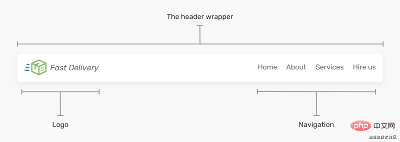
First of all, the website mentioned here Header is one of the first things that users see when they visit the website. Typically, it contains a logo or website name and navigation links, like this:

Regardless of the visual design of the header, the key elements are logo and navigation.
Flexbox
When flexbox is applied to the Header element, it will keep all child items in the same row. Then, all you need to do is apply justify-content to distribute the spacing between them.
html
<header class="site-header">
  <a href="#" class="brand">Brand</a>
  <nav class="nav"></nav>
</header>
css
.site-header {
  display: flex;
  justify-content: space-between;
  align-items: center;
}
Pretty simple, right? For a use case like this, yes, probably It's more complicated than that.
Header Wrapper
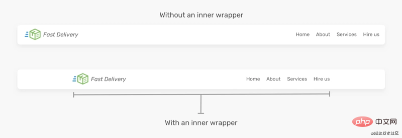
does not contain a layer of wrapper outside the above lago and nav, which is possible on a large screen Problems will arise.

You can see from above that the first Header is too wide because it has no inner wrapper compared to the first one , the second one looks much better. So, we can make the following adjustments to the HTML.
<header class="site-header">
  <div class="wrapper site-header__wrapper">
    <a href="#" class="brand"><img src="logo.svg" alt="brand" /></a>
    <nav class="nav"></nav>
  </div>
</header>
flexbox should be moved into the .site-header__wrapper element.
.site-header__wrapper {
  display: flex;
  justify-content: space-between;
  align-items: center;
}
Use flex-wrap
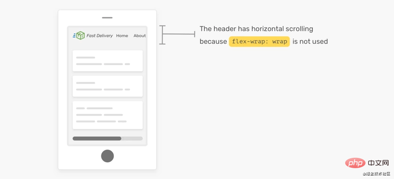
When the screen is small, you can scroll horizontally. See the picture below

If flex-wrap: wrap is not set, horizontal scrolling will occur when the screen is too small. If you don’t want this, you can Add flex-wrap: wrap`?.
Many forms of Header
The reason I like using flexbox is that it can easily handle many variations in header design. Based on the previous header design, I expanded the header element with some options, such as adding buttons, search inputs, and changing the order of sub-items.
Header Change 1

Suppose I want to add a button next to the navigation link. How should this be handled? Should we add it as a link in the navigation bar? Or should it be separate from the navigation? I prefer this.
<header class="site-header">
  <div class="wrapper site-header__wrapper">
    <a href="#" class="brand"><img src="logo.svg" alt="brand" /></a>
    <nav class="nav"></nav>
    <a href="/track-shipment" class="button">Track</a>
  </div>
</header>
In this case, we cannot use justify-content: space-between to handle the gap. Instead, I will use ## on the nav element #margin-left: auto,


flex property.
html
<header class="site-header">
  <div class="wrapper site-header__wrapper">
    <a href="#" class="brand"><img src="logo.svg" alt="brand" /></a>
    <div class="search"></div>
    <nav class="nav"></nav>
    <a href="/track-shipment" class="button">Track</a>
  </div>
</header>
css
.search {
  flex: 1;
}
Now the search input will be populated with brand and ## The free space between #nav. However, this has some limitations. On smaller viewports, the header will look like this:
 #Search input width should not be smaller than this as it makes it difficult to type and view the full text. There are two solutions below:
 # I prefer the second solution because it doesn't hide the navigation prematurely. Generally speaking, I try to avoid hiding an element if it doesn't affect the layout.
Header Change 3
对于这个示例,HTML标记是相同的,但是 header 里的元素顺序是不同的。我们如何才能做到这一点? 你可能想到用 order 属性来解决这个问题 ?
html
<header class="site-header">
  <div class="wrapper site-header__wrapper">
    <a href="#" class="brand"><img src="logo.svg" alt="brand" /></a>
    <nav class="nav"></nav>
    <a href="/track-shipment" class="button">Track</a>
  </div>
</header>
css
.site-header {
  display: flex;
  justify-content: space-between;
}

.nav {
  order: -1;
}

这样有个问题,间隔空间不会使 logo 居中,它只是分散项目之间的空间。
解决方案是给每个子项一个flex: 1,这将在它们之间分配可用空间。
.brand,
.nav,
.button {
  flex: 1;
}

这样,由于flex: 1,按钮元素变宽了, 解决此问题的唯一方法是将其包裹到另一个元素中。
HTML
<header class="site-header">
  <div class="wrapper site-header__wrapper">
    <a href="#" class="brand"><img src="logo.svg" alt="brand" /></a>
    <nav class="nav"></nav>
    <div class="button-wrapper">
      <a href="/track-shipment" class="button">Track</a>
    </div>
  </div>
</header>
这样,我们就可以将下面的logo和按钮居中。
.logo {
  text-align: center;
}

/* 不要介意这里的命名,这只是出于演示*/
.button-wrapper {
  text-align: end; /* end 等同于LTR语言中的right */
}

但是,如果添加了更多导航链接,这种方法很容易失败。我们需要确保导航链接的数量不会超过特定的限制。下面一个logo偏离中心的例子 ?:

正如在上图中看到的,logo没有居中。所以要记住这一点,以避免这种意想不到的问题 ?。
使用 Flexbox 构建 Header 的有用技巧
flex-basis
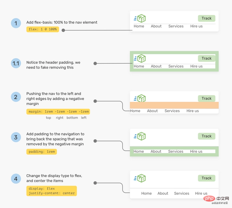
如果某个元素需要在移动设备上占据整个宽度(不能隐藏的重要导航),我会使用flex-basis: 100% ?。

从上面的模型看,做起来可能很简单。 实际上不是。 通常,header 可能有一个内部间距(padding),当我们强制某项占据全部宽度时,除非清除padding ,否则它不会生效。 但是,删除padding不切实际,因为它将影响设计中的其他元素 ?。
下面解决此问题的一种解决方法 ?:
将
flex: 1 0 100%添加到导航元素。如有需要,请更改其
order。 有时,可能还有其他元素,我们想确保导航是最后一个。加上一个等于宽度等于
padding的负margin,这也会让导航占据整个宽度。在导航中添加 padding,这会增加一些适当的空间。
最后,使用了
justify-content: center将导航项居中(不重要)
.nav {
  flex: 1 0 100%; /* [1] */
  order: 2; /* [2] */
  margin: 1rem -1rem -1rem -1rem; /* [3] */
  padding: 1rem; /* [4] */
  display: flex; /* [5] */
  justify-content: center; /* [5] */
}

间距
着 Chrome 和 Firefox 支持flex gap属性,现在在flex项目之间添加间距比以往任何时候都容易。考虑以下标题

要做到上图的高亮间距,只需将gap: 1rem添加到flex父节点。没有了gap,我们还是需要用旧的方式来间隔 ?。
/* 老的方式 */
.brand {
  margin-right: 1rem;
}

.sign-in {
  margin-right: 1rem;
}

/* 新的方式 */
.site-header {
  /* Other flexbox styles */
  gap: 1rem;
}
英文原文地址:https://ishadeed.com/article/website-headers-flexbox/
作者:Shadeed
更多编程相关知识,请访问:编程入门!!
The above is the detailed content of Build website headers using CSS Flexbox. For more information, please follow other related articles on the PHP Chinese website!

