
Home >Web Front-end >CSS Tutorial >How to achieve frosted glass effect using css?
How to achieve frosted glass effect using css?

- 青灯夜游forward
- 2021-01-11 18:34:114814browse
How to achieve frosted glass effect using css? The following article will introduce to you how to use CSS to achieve a frosted glass effect. It has certain reference value. Friends in need can refer to it. I hope it will be helpful to everyone.
In fact, the blur effect of frosted glass is technically relatively simple, just using the blur attribute in the css filter. But to achieve a good frosted glass effect, you need to pay attention to many details.
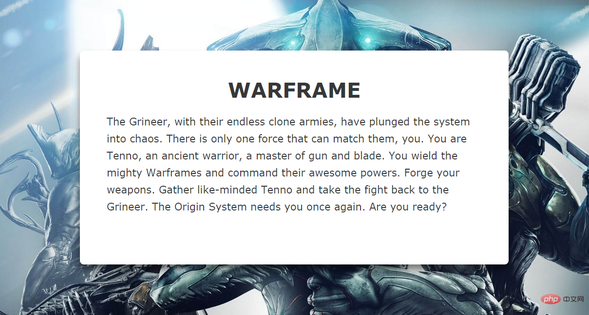
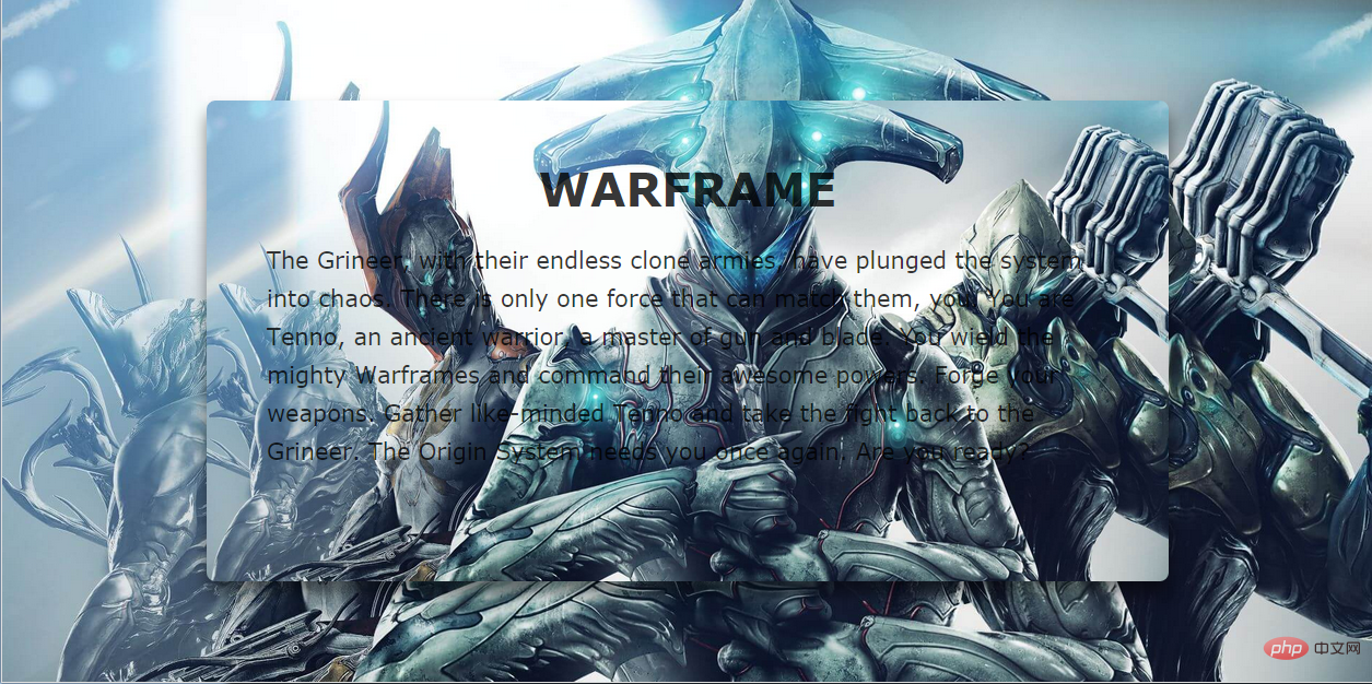
#For example, if we need to change the text area in the middle of the page in the picture above into a frosted glass effect, the first thing that comes to mind is Set a transparency to it and add a blur filter:
.content {
background-color: rgba(0,0,0,0.3);
-webkit-filter: blur(2px);
-moz-filter: blur(2px);
-ms-filter: blur(2px);
-o-filter: blur(2px);
filter: blur(2px);
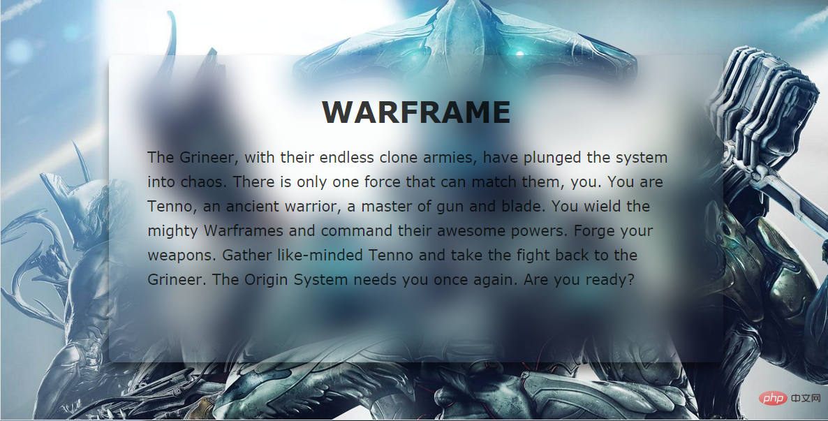
}But the generated effect is as follows:
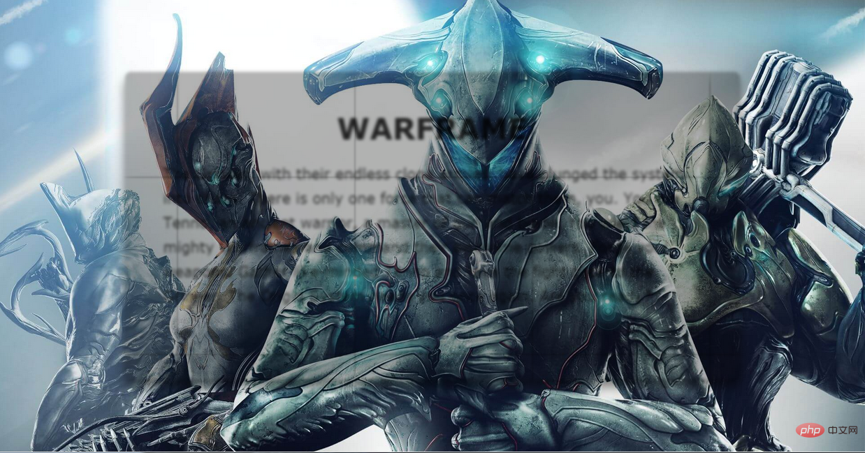
We draw two conclusions from this failed example:
1. Using blur directly on an element will blur all its contents. In order to ensure that the text will not be blurred Remove the need for an extra layer to apply the blur effect separately.
2. The blur effect will not be applied to the elements behind it, so you need to use the content area to have the same background image as the background and blur it.
Let’s solve the first problem first:
The method of adding one more level is not by adding elements, but by pseudo-elements.
.content {
    z-index: 1;
}
.content:after {
    content: '';
    position: absolute;
    top: 0;
    left: 0;
    right: 0;
    bottom: 0;
    background-color: rgba(255,255,255,0.8);
    z-index: -1;
}
There are two points to note here. Since the pseudo-element cannot inherit the size of the host element through width:100% and height:100%, the size of the content is inherited through the above method. ;In order to make the pseudo element located below the content, set z-index:-1 for it. To prevent it from being hidden behind the background image, set z-index:1 for content.
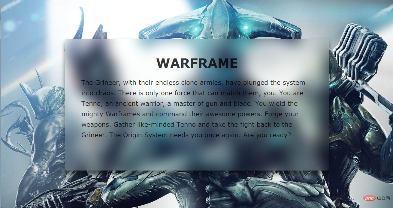
Effect:
##Next, set the same settings for content::after background image.
As shown in the picture above, even if we set the same background-postion and background-size, the middle part of the picture and the large background are still not spliced successfully.
The solution to this problem is very simple, just add the background-attachment: fixed attribute and then blur it.
.content {
    background-position: center top;
    background-size: cover;
}
.content::after {
    background-image: url(xxx.jpg);
    background-position: center top;
    background-size: cover;
    background-attachment: fixed;
    -webkit-filter: blur(20px);
    -moz-filter: blur(20px);
    -ms-filter: blur(20px);
    -o-filter: blur(20px);
    filter: blur(20px);
}
You can see that we basically got the effect we wanted. The only drawback is that the blurring effect at the edge of the element is weakened. In order to solve this problem, we will expand the scope of the pseudo-element, and at the same time, in order to ensure that the effect does not exceed the scope of content, set the overflow:hidden attribute to it.
.content {
  overflow: hidden;
}
.content::after {
  margin: -30px;
}
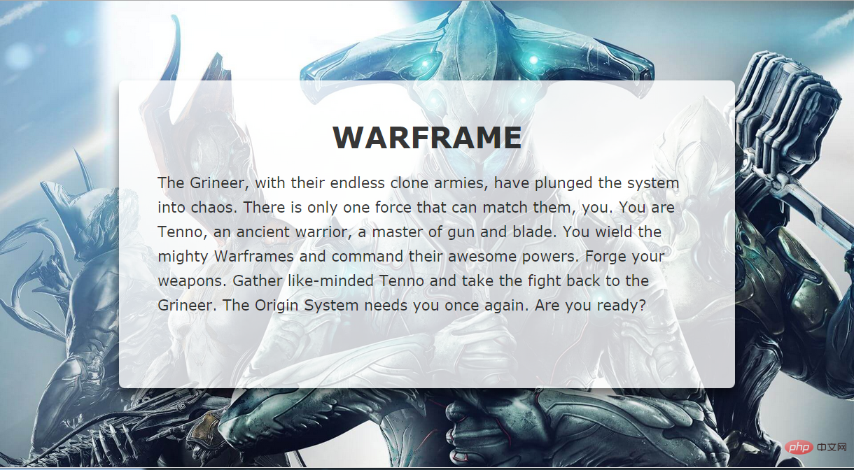
Such a perfect frosted glass effect is completed. No matter how you change the size of the browser window, the background image of the content part can be Very good splicing with the background, all thanks to the background-attachment attribute.
demo and source code address: https://darylxyx.github.io/Demo/blur/https://github.com /Darylxyx/css-collection/tree/master/blurFor more programming-related knowledge, please visit:
Programming Learning! !
The above is the detailed content of How to achieve frosted glass effect using css?. For more information, please follow other related articles on the PHP Chinese website!