Home >Web Front-end >uni-app >Detailed explanation of the use of uni-app components
Detailed explanation of the use of uni-app components
- coldplay.xixiforward
- 2020-12-04 16:16:309180browse
uni-app development tutorialThe column introduces the usage of components

Recommended (Free): uni-app development tutorial
1. Picker list data is not displayed
<!-- 选择分类 -->
        <view>
            <view>文章分类</view>
            <view>
                <picker>
                    <view>{{caties[currentCateIndex]}}</view>
                </picker>
            </view>
        </view>
range format error
<!-- 选择分类 -->
        <view>
            <view>文章分类</view>
            <view>
                <picker>
                    <view>{{caties[currentCateIndex]}}</view>
                </picker>
            </view>
        </view>
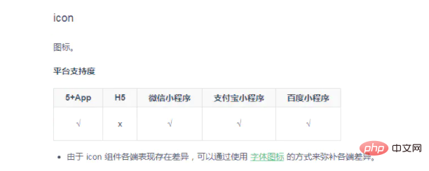
2. The h5 end of the icon icon does not support
<!-- 单独使用icon组件 -->
<icon></icon>
or
<!-- icon组件和字体图标配合使用 -->
<icon></icon>


## Remarks : Regardless of whether it is alone Use the icon component or use it in conjunction with the font icon. As long as there is an icon component h5, an error will be reported. You can use the following methods to solve the differences in the icon component on each end.
- Adaptation solution one: uni-app also supports fonts Icon
<text></text>or
<text></text>
Note: If you use the network path font icon, the network path must add the protocol header https .
Note: After the icon component is replaced with text, the size, margin and color of the font icon may not be consistent with expectations. You can adjust it appropriately. For example:
<icon></icon> >is changed to:
<text></text>
- Adaptation plan two: use the expansion component icon of uni-app
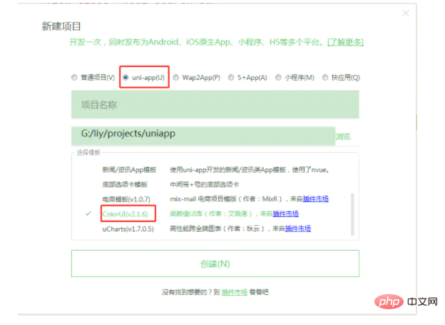
- Adaptation plan three: use ColorUI-UniApp The icon in
- (1)Download the source code and unzip
Remarks: You can also obtain the ColorUI-UniApp project source code by creating a new ColorUI template project in uni-app

(3) App.vue introduces the key Css main.css icon .css
<style>
    @import "colorui/main.css";
    @import "colorui/icon.css";
    @import "app.css"; /* 你的项目css */
    ....
</style>
(4) Use ColorUI icons
<text></text>
If you want to learn more about programming, please pay attention tophp training Column!
The above is the detailed content of Detailed explanation of the use of uni-app components. For more information, please follow other related articles on the PHP Chinese website!

