


bootstrap grid deletion system refers to a responsive, mobile device-first fluid grid system built into Bootstrap. As the screen device or viewport size increases, the system will automatically be divided into up to 12 columns. ;The implementation principle is to define the container size, divide it into 12 equal parts, then adjust the inner and outer margins, and finally combine the media query to implement the grid system.

Recommended: "bootstrap Basic Tutorial"
Bootstrap Grid System (Layout)
1. Grid system (layout)
Bootstrap has a built-in responsive, mobile device-first fluid grid system that changes with the screen device or viewport (viewport ) the size increases, the system will automatically divide it into up to 12 columns.
I call the grid system in Bootstrap a layout here. It creates a page layout through a series of combinations of rows and columns, and then your content can be placed into the layout you created. Here is a brief introduction to the working principle of the Bootstrap grid system:
The implementation principle of the grid system is very simple, just by defining the container size and dividing it into 12 equal parts (it can also be divided into 24 or 32 parts, but 12 is the most common), then adjust the inner and outer margins, and finally combine it with media queries to create a powerful responsive grid system. The grid system in the Bootstrap framework divides the container into 12 equal parts.
When using it, you can recompile the LESS (or Sass) source code according to the actual situation to modify the value of 12 (that is, change it to 24 or 32. Of course, you can also divide it into more, but it is not recommended to use it this way) ).
2. Usage rules
Bootstrap has a built-in set of responsive and mobile devices.
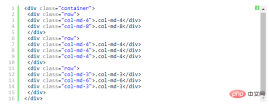
1. The data row (.row) must be contained in the container (.container) in order to give it appropriate alignment and padding. For example:

2. You can add columns (.column) in rows (.row), but the sum of the number of columns cannot exceed the total number of bisected columns, such as 12. For example:

3. The specific content should be placed within the column container (column), and only the column (column) can be used as a direct child of the row container (.row) Element
4. Create spacing between columns by setting padding. Then offset the effect of padding by setting negative margins for the first and last columns.
In order to better understand how the grid system of the Bootstrap framework works, let’s take a look A sketch:

A brief explanation of the diagram:
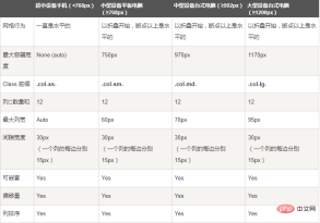
1. The outermost border, with a large white area, is equivalent to the browser's visible area. viewing area. There is a responsive effect in the grid system of the Bootstrap framework, which comes with four types of browsers (extra small screen, small screen, medium screen and large screen). Its breakpoints (pixel dividing points) are 768px, 992px and 1220px.
2. The second border (1) is equivalent to the container (.container). For different browser resolutions, the widths are different: automatic, 750px, 970px and 1170px. Set in lines 736 to 756 of bootstrap.css:

3. The No. 2 horizontal bar explains that the rows (.row) of the container are divided equally. 12 equal parts, that is, columns. Each column has a "padding-left:15px" (pink part in the picture) and a "padding-right:15px" (purple part in the picture). This also causes the padding-left of the first column and the padding-right of the last column to occupy 30px of the total width, making the page unsightly. Of course, this is a good approach if you need to leave a certain spacing. As shown in lines 767 to 772 of bootstrap.css:

4. The No. 3 horizontal bar is the row container (.row), which defines "margin- The values of "left" and "margin-right" are "-15px", which are used to offset the left padding of the first column and the right padding of the last column. You can see in lines 763~767 of bootstrap.css:

5. Put the rows and columns together to see the effect of horizontal bar 4 . That is what we expect to see, there is no space between the first column and the last column and the container (.container).
Horizontal 5 just wants to show everyone that you can arbitrarily combine columns according to your needs, but the sum of their combinations should not exceed the total number of columns.
3. Grid options
The following screenshots can clearly see how Bootstrap’s grid system works on a variety of different mobile devices.
As you can see from the screenshot above, Bootstrap has set up different style classes for different screen sizes (including mobile phones, tablets, PCs, etc.), so that developers can have more choices when developing. According to my understanding: If multiple different above style classes are used on an element, then the element will choose the most appropriate (best matched) style class according to different sizes. A simple example to illustrate: For example, we use two style classes on an element: .col-md- and .col-lg. You can compare it with the screenshot above to see
The first situation: Size》=1200px; then .col-lg will be selected.
Second case: Size》=992px and size》=1200px; then .col-md will be selected.
The third case: If the size is
4. Basic usage
The grid system is used for layout, which is actually a combination of columns. There are four basic uses of the grid system in the Bootstrap framework. Since the Bootstrap framework uses different grid styles for different screen sizes, the examples involved in this section are introduced using the medium screen (970px) as an example. The use of other screens is similar to this one.
1), column combination
The simple understanding of column combination is to change the numbers to merge the columns (principle: the total number of columns cannot exceed 12), which is somewhat similar to the colspan of the table Attributes, for example:
#Using the above structure, you will see the effect of the following picture:

5. Column offset
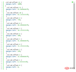
Sometimes, we don’t want two adjacent columns to be close together, but we don’t want to use margin or other technical means. At this time, you can use the column offset (offset) function to achieve this. Using column offset is also very simple. You only need to add the class name "col-md-offset-*" to the column element (where the asterisk represents the number of column combinations to be offset), then the column with this class name will be Offset right. For example, if you add "col-md-offset-4" to a column element, it means that the column is moved to the right by 4 column widths.

Like the sample code above, the effect is as follows
The implementation principle is very simple, that is, using twelve points One (1/12) margin-left. Then there are as many margin-lefts as there are offsets. As shown in lines 1205 to 1241 in bootstrap.css:
Note:
But there is one detail to pay attention to, use "col-md- offset-*" when shifting a column to the right, make sure that the total number of columns and offset columns does not exceed 12, otherwise the column will be displayed with broken rows, such as:
.col-md-3
col-md-offset-3
col-md-4
The total number of columns and offset columns in the above code is 3 3 3 4 = 13>12, so column breaks occur.
Like the above sample code, the effect is as follows

6. Column sorting
Column sorting is actually changing the columns The direction is to change the left and right floating and set the floating distance. In the grid system of the Bootstrap framework, this is done by adding the class names "col-md-push-*" and "col-md-pull-*" (where the asterisk represents the number of column combinations to move).
Let’s take a look at a simple example:

By default, the above code has the following effect:

"col-md-4" is on the left and "col-md-8" is on the right. If you want to swap positions, you need to move "col-md-4" 8 places to the right. The distance between columns is 8 offsets, that is, adding the class name "col-md-push-8" to "
" and calling its style.
Also move "col-md-8" 4 columns to the left, that is, 4 offsets, and add it on "
" Class name "col-md-pull-4":

7. Column nesting
The grid system of the Bootstrap framework also supports column nesting. You can add one or more row containers to a column, and then insert columns into the row containers (using columns as described previously). But in the row container (row) in the column container, when the width is 100%, it is the width of the current outer column. Let’s look at a simple example:

The effect is as follows:

Note: The total number of nested columns also needs to follow different More than 12 columns. Otherwise, the last column will be displayed in a new line.
The above is the detailed content of What is the bootstrap deletion system?. For more information, please follow other related articles on the PHP Chinese website!

 Bootstrap's Purpose: Building Consistent and Attractive WebsitesApr 19, 2025 am 12:07 AM
The main purpose of Bootstrap is to help developers quickly build responsive, mobile-first websites. Its core functions include: 1. Responsive design, which realizes layout adjustments of different devices through a grid system; 2. Predefined components, such as navigation bars and modal boxes, ensure aesthetics and cross-browser compatibility; 3. Support customization and extensions, and use Sass variables and mixins to adjust styles.
 Bootstrap vs. Other Frameworks: A Comparative OverviewApr 18, 2025 am 12:06 AM
Bootstrap is better than TailwindCSS, Foundation, and Bulma because it is easy to use and quickly develop responsive websites. 1.Bootstrap provides a rich library of predefined styles and components. 2. Its CSS and JavaScript libraries support responsive design and interactive functions. 3. Suitable for rapid development, but custom styles may be more complicated.
 Integrating Bootstrap Styles in React: Methods and TechniquesApr 17, 2025 am 12:04 AM
Integrating Bootstrap in React projects can be done in two ways: 1) introduced using CDN, suitable for small projects or rapid prototyping; 2) installation using npm package manager, suitable for scenarios that require deep customization. With these methods, you can quickly build beautiful and responsive user interfaces in React.
 Bootstrap in React: Advantages and Best PracticesApr 16, 2025 am 12:17 AM
Advantages of integrating Bootstrap into React projects include: 1) rapid development, 2) consistency and maintainability, and 3) responsive design. By directly introducing CSS files or using the React-Bootstrap library, you can use Bootstrap's components and styles efficiently in your React project.
 Bootstrap: A Quick Guide to Web FrameworksApr 15, 2025 am 12:10 AM
Bootstrap is a framework developed by Twitter to help quickly build responsive, mobile-first websites and applications. 1. Ease of use and rich component libraries make development faster. 2. The huge community provides support and solutions. 3. Introduce and use class names to control styles through CDN, such as creating responsive grids. 4. Customizable styles and extension components. 5. Advantages include rapid development and responsive design, while disadvantages are style consistency and learning curve.
 Breaking Down Bootstrap: What It Is and Why It MattersApr 14, 2025 am 12:05 AM
Bootstrapisafree,open-sourceCSSframeworkthatsimplifiesresponsiveandmobile-firstwebsitedevelopment.Itofferspre-styledcomponentsandagridsystem,streamliningthecreationofaestheticallypleasingandfunctionalwebdesigns.
 Bootstrap: Making Web Design EasierApr 13, 2025 am 12:10 AM
What makes web design easier is Bootstrap? Its preset components, responsive design and rich community support. 1) Preset component libraries and styles allow developers to avoid writing complex CSS code; 2) Built-in grid system simplifies the creation of responsive layouts; 3) Community support provides rich resources and solutions.
 Bootstrap's Impact: Accelerating Web DevelopmentApr 12, 2025 am 12:05 AM
Bootstrap accelerates web development, and by providing predefined styles and components, developers can quickly build responsive websites. 1) It shortens development time, such as completing the basic layout within a few days in the project. 2) Through Sass variables and mixins, Bootstrap allows custom styles to meet specific needs. 3) Using the CDN version can optimize performance and improve loading speed.


Hot AI Tools

Undresser.AI Undress
AI-powered app for creating realistic nude photos

AI Clothes Remover
Online AI tool for removing clothes from photos.

Undress AI Tool
Undress images for free

Clothoff.io
AI clothes remover

Video Face Swap
Swap faces in any video effortlessly with our completely free AI face swap tool!

Hot Article
Hot Tools

MinGW - Minimalist GNU for Windows
This project is in the process of being migrated to osdn.net/projects/mingw, you can continue to follow us there. MinGW: A native Windows port of the GNU Compiler Collection (GCC), freely distributable import libraries and header files for building native Windows applications; includes extensions to the MSVC runtime to support C99 functionality. All MinGW software can run on 64-bit Windows platforms.

WebStorm Mac version
Useful JavaScript development tools

mPDF
mPDF is a PHP library that can generate PDF files from UTF-8 encoded HTML. The original author, Ian Back, wrote mPDF to output PDF files "on the fly" from his website and handle different languages. It is slower than original scripts like HTML2FPDF and produces larger files when using Unicode fonts, but supports CSS styles etc. and has a lot of enhancements. Supports almost all languages, including RTL (Arabic and Hebrew) and CJK (Chinese, Japanese and Korean). Supports nested block-level elements (such as P, DIV),

DVWA
Damn Vulnerable Web App (DVWA) is a PHP/MySQL web application that is very vulnerable. Its main goals are to be an aid for security professionals to test their skills and tools in a legal environment, to help web developers better understand the process of securing web applications, and to help teachers/students teach/learn in a classroom environment Web application security. The goal of DVWA is to practice some of the most common web vulnerabilities through a simple and straightforward interface, with varying degrees of difficulty. Please note that this software

SecLists
SecLists is the ultimate security tester's companion. It is a collection of various types of lists that are frequently used during security assessments, all in one place. SecLists helps make security testing more efficient and productive by conveniently providing all the lists a security tester might need. List types include usernames, passwords, URLs, fuzzing payloads, sensitive data patterns, web shells, and more. The tester can simply pull this repository onto a new test machine and he will have access to every type of list he needs.

