Home >Web Front-end >CSS Tutorial >How to create a pie chart with css
How to create a pie chart with css
- 王林forward
- 2020-11-06 16:14:352617browse

Foreword:
At work, sometimes we have the need for pie charts, such as statistical charts, progress indicators, timers, etc., of course, the implementation method There are many, and there are even ready-made js libraries that can be used directly. Out of interest, I used pure CSS to implement the pie chart myself and see how it works.
(Video tutorial recommendation: css video tutorial)
<div class="pie"></div>
.pie {
    width: 100px;
    height: 100px;
    border-radius: 50%;
    background: yellowgreen;
    background-image: linear-gradient(to right, transparent 50%, #655 0);
}

.pie::before {
    content: '';
    display: block;
    margin-left: 50%;
    height: 100%;
    border-radius: 0 100% 100% 0/50%;
    background-color: inherit;
    transform-origin: left;
    transform: rotate(.2turn);
}
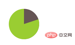
Effect:

Change rotate The angle of the pie chart can achieve the effect of pie charts of different sizes, but readers who have tried it themselves will find that rotating more than 50% will not show the ideal effect, but will show the following effect:

To solve this problem, change the background color of the pseudo element. When the area that needs to be displayed is more than half, changing the background color is OK.
The author below shows a simple example of a progress indicator. If readers try it with their own hands, they will find a constantly changing pie chart effect.
.pie {
    width: 100px;
    height: 100px;
    border-radius: 50%;
    background: yellowgreen;
    background-image: linear-gradient(to right, transparent 50%, #655 0);
}

.pie::before {
    content: '';
    display: block;
    margin-left: 50%;
    height: 100%;
    border-radius: 0 100% 100% 0/50%;
    background-color: inherit;
    transform-origin: left;
    animation: spin 3s linear infinite,bg 6s step-end infinite;
}
@keyframes spin{
    to{transform: rotate(.5turn);}
}
@keyframes bg{
    50%{background: #655;}
}
The effect is as follows:

#Readers are best to try it out with their own hands, try to modify the properties, and understand the meaning. Only when you understand can you do it. Come up with something more interesting. If readers are interested in svg, they can try to use svg to implement pie charts. The effect achieved by svg is more colorful.
Recommended tutorial: CSS tutorial
The above is the detailed content of How to create a pie chart with css. For more information, please follow other related articles on the PHP Chinese website!

