
Home >Web Front-end >CSS Tutorial >How to draw a five-pointed star using CSS? (with code)
How to draw a five-pointed star using CSS? (with code)

- 青灯夜游forward
- 2020-06-12 10:22:494551browse

The following article will introduce to you how to use pure CSS to draw five-pointed stars, hexagons, pentagons, hexagons, and hearts. It has certain reference value. Friends in need can refer to it. I hope it will be helpful to everyone.
1. Pentagon

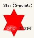
#star-five {
   margin: 50px 0;
   position: relative;
   display: block;
   color: red;
   width: 0px;
   height: 0px;
   border-right:  100px solid transparent;
   border-bottom: 70px  solid red;
   border-left:   100px solid transparent;
   -moz-transform:    rotate(35deg);
   -webkit-transform: rotate(35deg);
   -ms-transform:     rotate(35deg);
   -o-transform:      rotate(35deg);
}
#star-five:before {
   border-bottom: 80px solid red;
   border-left: 30px solid transparent;
   border-right: 30px solid transparent;
   position: absolute;
   height: 0;
   width: 0;
   top: -45px;
   left: -65px;
   display: block;
   content: '';
   -webkit-transform: rotate(-35deg);
   -moz-transform:    rotate(-35deg);
   -ms-transform:     rotate(-35deg);
   -o-transform:      rotate(-35deg);
}
#star-five:after {
   position: absolute;
   display: block;
   color: red;
   top: 3px;
   left: -105px;
   width: 0px;
   height: 0px;
   border-right: 100px solid transparent;
   border-bottom: 70px solid red;
   border-left: 100px solid transparent;
   -webkit-transform: rotate(-70deg);
   -moz-transform:    rotate(-70deg);
   -ms-transform:     rotate(-70deg);
   -o-transform:      rotate(-70deg);
   content: '';
}
2. Hexagon
#star-six {
    width: 0;
    height: 0;
    border-left: 50px solid transparent;
    border-right: 50px solid transparent;
    border-bottom: 100px solid red;
    position: relative;
}
#star-six:after {
    width: 0;
    height: 0;
    border-left: 50px solid transparent;
    border-right: 50px solid transparent;
    border-top: 100px solid red;
    position: absolute;
    content: "";
    top: 30px;
    left: -50px;
}
3. Pentagon
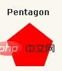
#pentagon {
    position: relative;
    width: 54px;
    border-width: 50px 18px 0;
    border-style: solid;
    border-color: red transparent;
}
#pentagon:before {
    content: "";
    position: absolute;
    height: 0;
    width: 0;
    top: -85px;
    left: -18px;
    border-width: 0 45px 35px;
    border-style: solid;
    border-color: transparent transparent red;
}
4.hexagon
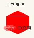
#hexagon {
    width: 100px;
    height: 55px;
    background: red;
    position: relative;
}
#hexagon:before {
    content: "";
    position: absolute;
    top: -25px;
    left: 0;
    width: 0;
    height: 0;
    border-left: 50px solid transparent;
    border-right: 50px solid transparent;
    border-bottom: 25px solid red;
}
#hexagon:after {
    content: "";
    position: absolute;
    bottom: -25px;
    left: 0;
    width: 0;
    height: 0;
    border-left: 50px solid transparent;
    border-right: 50px solid transparent;
    border-top: 25px solid red;
}
5. Polygon
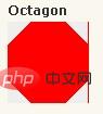
#octagon {
    width: 100px;
    height: 100px;
    background: red;
    position: relative;
}
#octagon:before {
    content: "";
    position: absolute;
    top: 0;
    left: 0;
    border-bottom: 29px solid red;
    border-left: 29px solid #eee;
    border-right: 29px solid #eee;
    width: 42px;
    height: 0;
}
#octagon:after {
    content: "";
    position: absolute;
    bottom: 0;
    left: 0;
    border-top: 29px solid red;
    border-left: 29px solid #eee;
    border-right: 29px solid #eee;
    width: 42px;
    height: 0;
}
6, Heart Shape
##
#heart {
    position: relative;
    width: 100px;
    height: 90px;
}
#heart:before,
#heart:after {
    position: absolute;
    content: "";
    left: 50px;
    top: 0;
    width: 50px;
    height: 80px;
    background: red;
    -moz-border-radius: 50px 50px 0 0;
    border-radius: 50px 50px 0 0;
    -webkit-transform: rotate(-45deg);
       -moz-transform: rotate(-45deg);
        -ms-transform: rotate(-45deg);
         -o-transform: rotate(-45deg);
            transform: rotate(-45deg);
    -webkit-transform-origin: 0 100%;
       -moz-transform-origin: 0 100%;
        -ms-transform-origin: 0 100%;
         -o-transform-origin: 0 100%;
            transform-origin: 0 100%;
}
#heart:after {
    left: 0;
    -webkit-transform: rotate(45deg);
       -moz-transform: rotate(45deg);
        -ms-transform: rotate(45deg);
         -o-transform: rotate(45deg);
            transform: rotate(45deg);
    -webkit-transform-origin: 100% 100%;
       -moz-transform-origin: 100% 100%;
        -ms-transform-origin: 100% 100%;
         -o-transform-origin: 100% 100%;
            transform-origin :100% 100%;
}
More cool CSS3, html5, javascript special effects codes, all in: For more related tutorials, please visit CSS3 latest version reference manual
The above is the detailed content of How to draw a five-pointed star using CSS? (with code). For more information, please follow other related articles on the PHP Chinese website!
Statement:
This article is reproduced at:jb51.net. If there is any infringement, please contact admin@php.cn delete
Previous article:Structural pseudo-class selector in CSS3—:first-of-type implements famous quote tags (code example)Next article:Structural pseudo-class selector in CSS3—:first-of-type implements famous quote tags (code example)
Related articles
See more- Text-overflow in CSS3 implements the display effect of article titles with ellipses (code example)
- Text-shadow in CSS3 implements text shadow effect (code example)
- Background-orgin in CSS3 implements photo display effect with photo frame - case analysis (code example)
- Background-clip in CSS3 implements three effects of image cropping (code example)
- Background-size in CSS3 implements several effects with customizable background image sizes (code examples)