
Home >Web Front-end >CSS Tutorial >Let's talk about how to make auto height support transition animation in CSS
Let's talk about how to make auto height support transition animation in CSS

- 青灯夜游forward
- 2023-02-06 20:10:352756browse
How can CSS make auto height perfectly support transition animation? The following article will talk about how to make auto height support transition animation in CSS. I hope it will be helpful to you!

As we all know, the transition transition animation will not be triggered when the height is set to the auto keyword. The following is the pseudo code
div{
  height: 0;
  transition: 1s
}
.wrap:hover div{
  height: auto
}
The effect is as follows

If you want to have a transition animation when expanding, for example like this
Usually It uses JS to dynamically obtain the height of the element (it's a bit troublesome, you need to render it to know the height). In fact, CSS also has a solution that cleverly uses max-height to adapt to dynamic height. The following is the pseudo code [Recommended learning: css video tutorial]
div{
  max-height: 0;
  transition: 1s
}
.wrap :hover div{
  max-height: 800px /*大概的值,需要超过元素高度*/
}
If you are interested You can refer to this article: CSS tricks: dynamic height transition animation, but there is a limitation. The greater the height difference, the worse the transition effect. Assume that the real height of the element is only 100px, if max-height is 800px, then only the first 1/8 will have animation, like this

So, is there a better way to solve this problem?
Of course there are some. This time I will introduce a new way to achieve dynamic height transition. Let’s take a look.
1. The fr unit in the grid layout
grid There is a new fr unit in the layout, which is used to define the elasticity factor of the grid track size. gridThe layout is relatively complicated and it is impossible to explain clearly in a few words. Those who are interested can refer to grid related tutorials, such as
- written by Teacher Zhang Xinxu to Display for yourself: grid layout tutorial
- Teacher Da Mo’s Modern Web layout
Here is a brief introduction to the fr unit For example, there is such a layout
<div class="grid">
  <span class="item">1fr</span>
  <span class="item">1fr</span>
  <span class="item">1fr</span>
</div>
The key style is as follows
.grid{
  display: grid;
  grid-template-columns: repeat(3, 1fr);
}
You can get such an effect
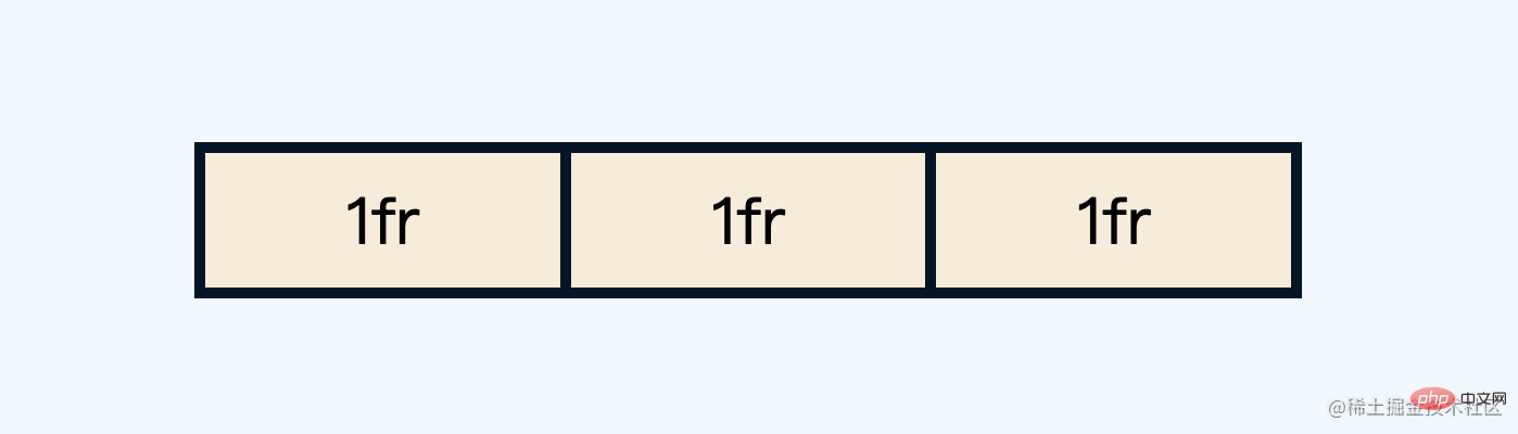
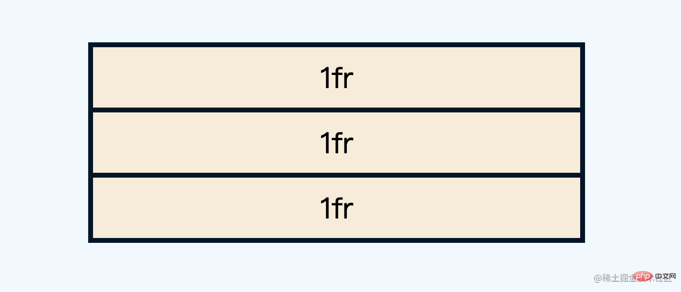
Here repeat(3, 1fr) is actually the abbreviation of 1fr 1fr 1fr, which means 3 equals the remaining space. You can also set it in the vertical direction
.grid{
  grid-template-rows: repeat(3, 1fr);
}
The effect is as follows
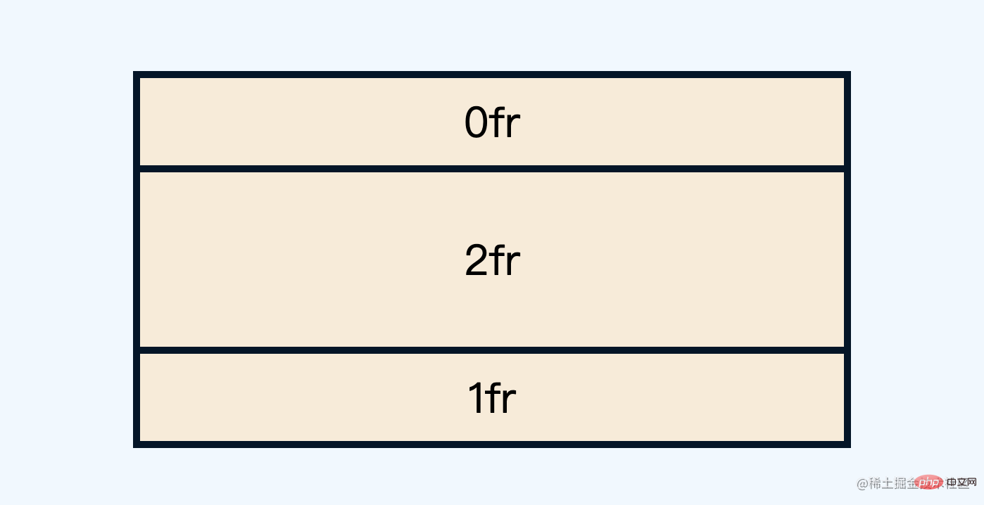
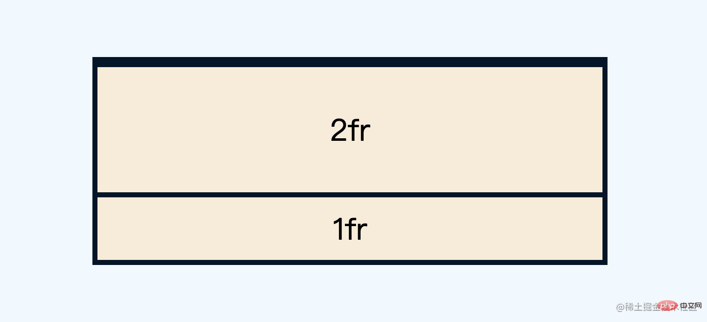
You can also change the respective distribution ratio
.grid{
  grid-template-rows: 1fr 2fr 1fr;
}
The effect is as follows

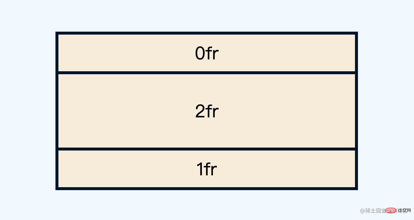
Now let’s look at a special case, you can also set the distribution ratio to0fr
.grid{
  grid-template-rows: 0fr 2fr 1fr;
}
The effect is as follows
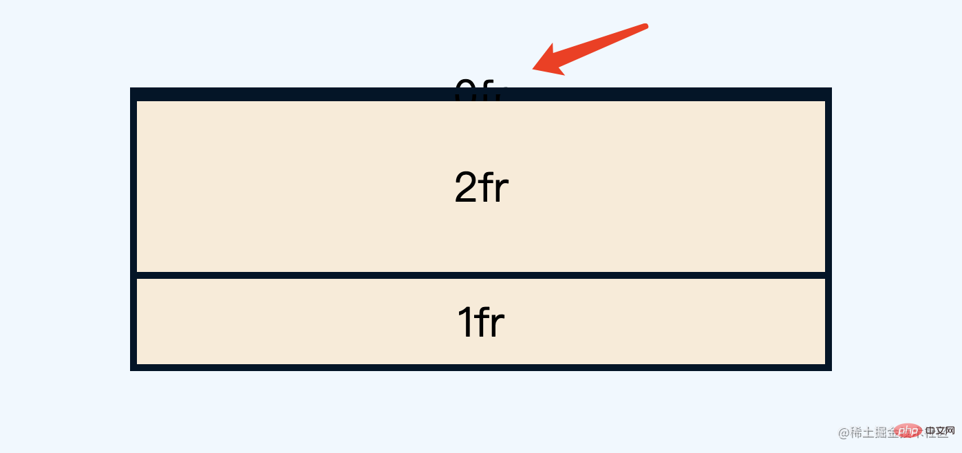
Isn’t it a bit strange, how come 0fr has the same proportion as 1fr?
In fact, this is determined by the minimum size rule of grid. The minimum height at this time is min-content, which is determined by the internal text. If there is no text, 0fr naturally does not take up space. The following is the effect after removing the text

If you want to keep the text and not take up space What to do with space? You can directly set the minimum size manually
span{
  min-height: 0
}
This way 0fr will not take up space
You can also use Beyond Hide to completely hide the child Content
.grid{
  overflow: hidden;
}
span{
  min-height: 0
}
The effect is as follows
应该还是比较容易理解吧,那么和动画有啥关系呢?接着往下看
二、grid 中的过渡动画
有同学可能纳闷了,为啥要折腾这个0fr呢?下面就来揭晓
如果重新设置1fr,子内容又会重新出现
.grid{
  grid-template-rows: 1fr 2fr 1fr;
}
下面重点来了,grid中的fr单位也是支持过渡动画的(0fr=>1fr )
.grid{
  grid-template-rows: 1fr 2fr 1fr;
  transition: .3s
}
效果如下

由于高度是由内部文本撑开的,也就是高度不确定,而0fr到1fr的过渡变化,相当于实现了 高度不固定的过渡动画
进一步精简一下,可以实现这样的效果

这就是高度不固定动画的雏形了,换个文本多一点也完美支持

完整 demo可以查看以下任意链接
三、自适应高度动画的两个实例
现在根据上面的原理来实现两个实例。
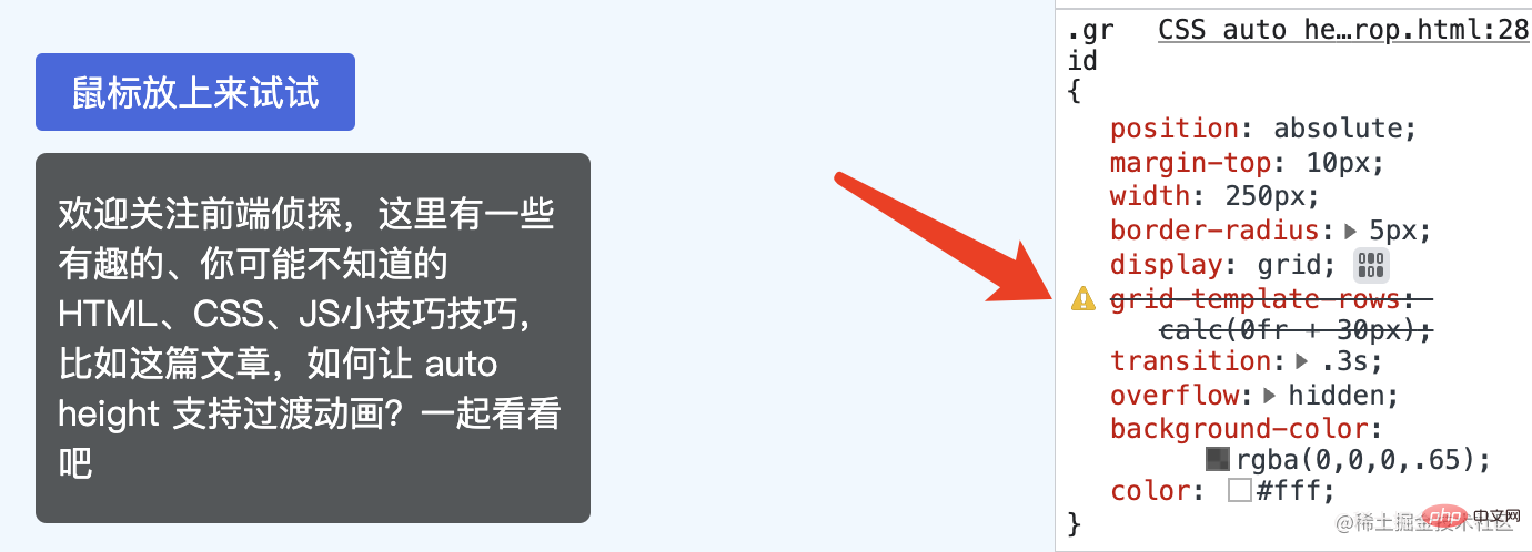
首先来看文章最开头的示例,HTML 结构是这样的
<div class="wrap">
  <button class="trigger">鼠标放上来试试</button>
  <div class="grid">
    <div><p>欢迎关注前端侦探,这里有一些有趣的、你可能不知道的HTML、CSS、JS小技巧技巧,比如这篇文章,如何让 auto height 支持过渡动画?一起看看吧</p></div>
  </div>
</div>
简单修饰一下,应该比较容易,可以得到这样的效果

然后通过上面的技巧将下拉内容隐藏起来,关键样式如下
.grid{
  display: grid;
  grid-template-rows: 0fr;
  transition: .3s;
  overflow: hidden;
}
.grid>div{
  min-height: 0;
}然后通过hover触发显示,也就是改变grid-template-rows
.wrap:hover .grid{
  grid-template-rows: 1fr;
}
这样就实现了不定高度的过渡动画

完整 demo可以查看以下任意链接
如果仅仅是悬浮窗口,由于是绝对定位,不会影响其他布局,其实是可以用transform scale 进行缩放的,再来看另外一个更加实用的例子,常见的菜单展开收起效果,就像这样

可以看到,在展开的同时,下方的元素也被挤压下去了,这样效果更加自然,也是transform实现不了的,这里的切换是通过:checked实现的,关键代码如下
<input hidden type="checkbox" id="s1" checked />
<label for="s1">工作台</label>
<div class="sub">
  <ul>
    <li>项目列表</li>
    <li>数据配置器</li>
  </ul>
</div>
ul{
min-height: 0;
}
.sub {
display: grid;
grid-template-rows: 0fr;
transition: 0.3s;
overflow: hidden;
}
:checked ~ .sub {
grid-template-rows: 1fr;
}完整 demo可以查看以下任意链接
四、注意事项和一些局限性
下面是一些注意事项。
这里的动画源于grid-template-rows的变化,也就是0fr到1fr
**注意,注意,注意,**这里的0fr必须是0fr,不能是0或者0px,必须是fr单位
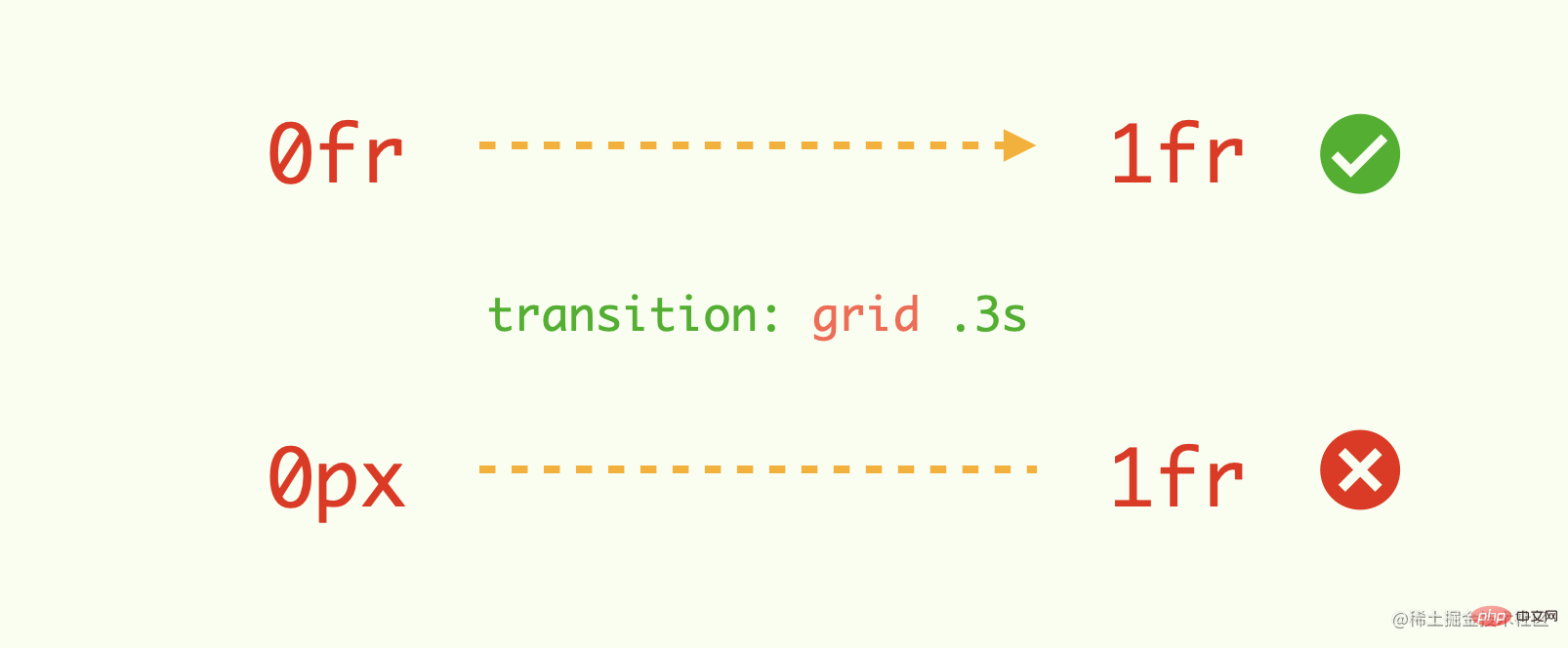
下面是改为40px的效果(动画丢失)

再者,0fr也不支持calc计算,直接被认为不合法
这意味着,例如你希望默认有一个固定高度(非0),然后展开到自适应高度,这种方法是无法实现过渡动画的,略遗憾?
五、最后总结一下
最后再来回顾一下实现关键过程
.grid{
  display: grid;
  grid-template-rows: 0fr;
  transition: .3s;
  overflow: hidden;
}
.grid>div{
  min-height: 0;
}
.wrap:hover .grid{
  grid-template-rows: 1fr;
}主要是利用了grid弹性布局可以实现过渡动画的特点,下面总结一些实现要点
高度在设置成
auto关键词时不会触发transition过渡动画grid布局中的fr单位,可以用于定义网格轨道大小的弹性系数grid布局的尺寸计算规则是由最小高度决定的,默认是min-content,也就是由内部文本决定的,可以通过手动设置min-height来实现0frgrid布局也支持过渡动画(0fr=>1fr),这样就实现高度不固定的过渡动画要使过渡动画生效,必须是
fr单位,其他单位不行,也不能通过calc计算这种方法只能实现初始高度为
0到自适应高度的过渡变化,略微遗憾
(学习视频分享:web前端)
The above is the detailed content of Let's talk about how to make auto height support transition animation in CSS. For more information, please follow other related articles on the PHP Chinese website!