Home >Web Front-end >HTML Tutorial >Web banner size 1920
Web banner size 1920
- (*-*)浩Original
- 2019-08-22 09:07:5921511browse
In the process of web design, the banner image is the area with the largest image area and the most conspicuous position in the entire web page. Even a good-looking website depends on the design of the banner .

The current mainstream banner sizes are mainly divided into these three types, (recommended learning: web front-end video tutorial)
1. The display position is a fixed size, such as 1200*560, 1200*360
2.The display position is centered , such as 1920 *560, in fact, the content displayed by the theme is 1200*560. As long as it is facing a large-screen monitor, the two sides will not look awkward with this size. It is also a commonly used size now
3. Display The position is the entire screen. For example, 1920*1000
banner design and poster design can be collectively referred to as the same. The design principles are still the same, but the banner must consider the overall website structure and whether it is coordinated, and the design is relatively flat. The design is much simpler.
My design method here is a good-looking background picture, reasonable elements, beautiful text effects, uniform colors, and reasonable matching. I think it will be enough.

The most troublesome part of banner is mainly the layout. Commonly used banner layouts include the following:
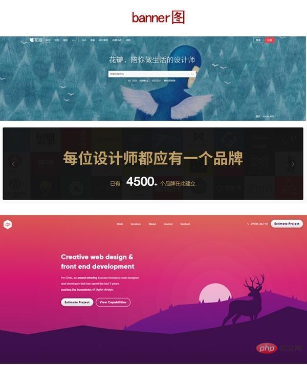
1 It is a centered type. It is not only text but also icons and graphics. It is displayed in the center of the content. This design is more suitable for posters that are not wide but a little tall. If it is a web banner, you must consider the integration of background images and elements. Because you can't have an element take up the entire space.
2 Symmetrical type at both ends, text and elements are opposite
3, Overlay type, mainly there is a cascading effect between the element background and text information, through shadows and shading, the whole The style shows a visual three-dimensional sense.
When we design, we should not occupy the entire space. Appropriate white space makes the work more comfortable to look at. The proportion of elements and text size is also very important. A beautiful background picture is also an indispensable component. When I make pictures, I always feel very rigid. The reasons can be divided into the following types:
One is the color of the back, The background image is not good, the font is too common, the elements are too monotonous, there are too many things for one thing, it feels too wasteful, etc. When designing fonts and elements, we can make the elements active through shadows, styles, deformations, and gradient colors. Background images can be used Blur, color brightness, to match, fonts can be made to move through shading, borders, deformation, and highlights;
Of course everyone will say these, but it mainly depends on us to practice and read more Good graphic design.
The above is the detailed content of Web banner size 1920. For more information, please follow other related articles on the PHP Chinese website!

