Microsoft Excel is one of the components of Microsoft Office software. It is a spreadsheet software written and run by Microsoft for computers with Windows and Apple Macintosh operating systems.

A large number of formula functions in Excel can be applied and selected. Use Microsoft Excel to perform calculations, analyze information and manage data information lists and data in spreadsheets or web pages. Data chart production can realize many convenient functions.
For example, it is used for report making, data processing, making data charts, etc. In terms of data processing, EXCEL can retrieve and calculate data by setting rows and columns. In terms of chart production, EXCEL can create simple static data charts, such as the most commonly used bar charts, linear charts, pie charts, etc.
But Excel is a static data structure mode and cannot display dynamic data. Therefore, most people will use excel and PPT to express richer expressions through ppt. And Excel, as a spreadsheet tool, is not suitable for large data sets.
Tableau data visualization analysis product can connect to the database, present dynamic data changes, and conduct data analysis and visual presentation more intuitively. Tableau realizes the perfect grafting of data and charts. It is an analysis tool that everyone can use, and it is simple and easy to use.
Tableau Desktop has powerful performance. It can not only complete basic statistical predictions and trend predictions, but also achieve dynamic updates of data sources. It can meet the data analysis and display needs of most enterprises and government agencies, as well as the requirements of visualization projects of some universities and research institutions, and is especially suitable for enterprises.
Tableau Server is a business intelligence application platform completely oriented to enterprises, based on For enterprise servers and web pages, users use browsers to analyze and operate. They can also publish data to Tableau Server to collaborate with colleagues, achieving visual data interaction.
For many people, Excel is the analytical tool of choice. While spreadsheets are useful, they still don't provide all the answers you're looking for to gain real insights from your big data.
Trying to use spreadsheets to do advanced, adaptive analysis, or to do analysis of large amounts of data, is tantamount to trying to catch fish in a tree. As a result, errors occur frequently, and the cost is efficiency, accuracy, and wasted time. In today's market, where basic built-in charts and graphs don't cut it, what really works is presenting your data with a variety of advanced visualizations
When you use Excel, you're in charge. But like driving a sports car when you only need an SUV, using Excel for analysis means you have too many features to use in some areas and not enough in others. Outdated data (which is also difficult to update), error-prone analyses, multiple versions of the same file circulating among colleagues, too much manual intervention - these are just a few of the common areas of frustration with Excel. What about time wasted developing analysis instead of actually analyzing it?
Tableau has its obvious advantages in making data charts. Regardless of the production process, the type of accessed data, the presentation effect of charts, etc., Tableau has demonstrated very superior functions and performance. However, Tableau's popularity is difficult to reach the level of office software.
Office software is a must-have, so any computer will have word\excel\PPT. The installed capacity of Tableau is obviously far from reaching this level, which requires that files produced with Tableau must be converted into graphic formats and pasted into the corresponding files. As a result, Tableau's unique data consistency advantage in the display process is completely lost. At the same time, because the image format generated is JPEG, the display accuracy is lower than the image pasted by excel to the ppt file. In addition, if the entire dashboard is pasted, there is no space between each graphic to label and explain the icons like in PPT. This shortcoming alone is enough to lose 1/3 of Tableau's advantages.
For more Excel-related technical articles, please visit the Excel Basic Tutorial column to learn!
The above is the detailed content of The difference between tableau and excel. For more information, please follow other related articles on the PHP Chinese website!
 MEDIAN formula in Excel - practical examplesApr 11, 2025 pm 12:08 PM
This tutorial explains how to calculate the median of numerical data in Excel using the MEDIAN function. The median, a key measure of central tendency, identifies the middle value in a dataset, offering a more robust representation of central tenden
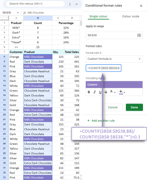 Google Spreadsheet COUNTIF function with formula examplesApr 11, 2025 pm 12:03 PM
Master Google Sheets COUNTIF: A Comprehensive Guide This guide explores the versatile COUNTIF function in Google Sheets, demonstrating its applications beyond simple cell counting. We'll cover various scenarios, from exact and partial matches to han
 Excel shared workbook: How to share Excel file for multiple usersApr 11, 2025 am 11:58 AM
This tutorial provides a comprehensive guide to sharing Excel workbooks, covering various methods, access control, and conflict resolution. Modern Excel versions (2010, 2013, 2016, and later) simplify collaborative editing, eliminating the need to m
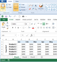 How to convert Excel to JPG - save .xls or .xlsx as image fileApr 11, 2025 am 11:31 AM
This tutorial explores various methods for converting .xls files to .jpg images, encompassing both built-in Windows tools and free online converters. Need to create a presentation, share spreadsheet data securely, or design a document? Converting yo
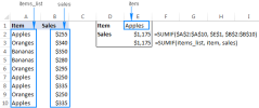 Excel names and named ranges: how to define and use in formulasApr 11, 2025 am 11:13 AM
This tutorial clarifies the function of Excel names and demonstrates how to define names for cells, ranges, constants, or formulas. It also covers editing, filtering, and deleting defined names. Excel names, while incredibly useful, are often overlo
 Standard deviation Excel: functions and formula examplesApr 11, 2025 am 11:01 AM
This tutorial clarifies the distinction between standard deviation and standard error of the mean, guiding you on the optimal Excel functions for standard deviation calculations. In descriptive statistics, the mean and standard deviation are intrinsi
 Square root in Excel: SQRT function and other waysApr 11, 2025 am 10:34 AM
This Excel tutorial demonstrates how to calculate square roots and nth roots. Finding the square root is a common mathematical operation, and Excel offers several methods. Methods for Calculating Square Roots in Excel: Using the SQRT Function: The
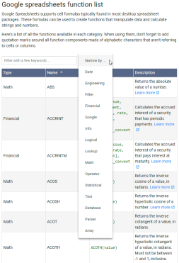 Google Sheets basics: Learn how to work with Google SpreadsheetsApr 11, 2025 am 10:23 AM
Unlock the Power of Google Sheets: A Beginner's Guide This tutorial introduces the fundamentals of Google Sheets, a powerful and versatile alternative to MS Excel. Learn how to effortlessly manage spreadsheets, leverage key features, and collaborate


Hot AI Tools

Undresser.AI Undress
AI-powered app for creating realistic nude photos

AI Clothes Remover
Online AI tool for removing clothes from photos.

Undress AI Tool
Undress images for free

Clothoff.io
AI clothes remover

Video Face Swap
Swap faces in any video effortlessly with our completely free AI face swap tool!

Hot Article

Hot Tools

SecLists
SecLists is the ultimate security tester's companion. It is a collection of various types of lists that are frequently used during security assessments, all in one place. SecLists helps make security testing more efficient and productive by conveniently providing all the lists a security tester might need. List types include usernames, passwords, URLs, fuzzing payloads, sensitive data patterns, web shells, and more. The tester can simply pull this repository onto a new test machine and he will have access to every type of list he needs.

WebStorm Mac version
Useful JavaScript development tools

Atom editor mac version download
The most popular open source editor

EditPlus Chinese cracked version
Small size, syntax highlighting, does not support code prompt function

DVWA
Damn Vulnerable Web App (DVWA) is a PHP/MySQL web application that is very vulnerable. Its main goals are to be an aid for security professionals to test their skills and tools in a legal environment, to help web developers better understand the process of securing web applications, and to help teachers/students teach/learn in a classroom environment Web application security. The goal of DVWA is to practice some of the most common web vulnerabilities through a simple and straightforward interface, with varying degrees of difficulty. Please note that this software


