


Matplotlib is a Python 2D plotting library that can generate publication-quality graphics in a variety of hardcopy formats and interactive environments on a variety of platforms.

In the previous Matplotlib data visualization tutorial, we will introducehow to create stacked charts and pie charts. What I bring to you today is the filling of graphic colors and lines.
Color
The first change we want to make is to change plt.title to stock variable.
plt.title(stock)
Now, let’s introduce how to change the label color. We can do this by modifying our axis object:
ax1.xaxis.label.set_color('c')
ax1.yaxis.label.set_color('r')
If we run this, we'll see that the labels change color, just like in the words.
Next, we can specify specific numbers for the axes to be displayed, rather than an automatic selection like this:
ax1.set_yticks([0,25,50,75])
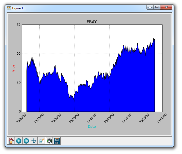
Next, I want to introduce padding. What fill does is fill the color between the variable and a value of your choice. For example, we can do this:
ax1.fill_between(date, 0, closep)
So here, our code is:
import matplotlib.pyplot as plt
import numpy as np
import urllib
import datetime as dt
import matplotlib.dates as mdates

def bytespdate2num(fmt, encoding='utf-8'):
    strconverter = mdates.strpdate2num(fmt)
    def bytesconverter(b):
        s = b.decode(encoding)
        return strconverter(s)
    return bytesconverter


def graph_data(stock):

    fig = plt.figure()
    ax1 = plt.subplot2grid((1,1), (0,0))

    stock_price_url = 'http://chartapi.finance.yahoo.com/instrument/1.0/'+stock+'/chartdata;type=quote;range=10y/csv'
    source_code = urllib.request.urlopen(stock_price_url).read().decode()
    stock_data = []
    split_source = source_code.split('\n')
    for line in split_source:
        split_line = line.split(',')
        if len(split_line) == 6:
            if 'values' not in line and 'labels' not in line:
                stock_data.append(line)


    date, closep, highp, lowp, openp, volume = np.loadtxt(stock_data,
                                                          delimiter=',',
                                                          unpack=True,
                                                          converters={0: bytespdate2num('%Y%m%d')})

    ax1.fill_between(date, 0, closep)

    for label in ax1.xaxis.get_ticklabels():
        label.set_rotation(45)
    ax1.grid(True)#, color='g', linestyle='-', linewidth=5)
    ax1.xaxis.label.set_color('c')
    ax1.yaxis.label.set_color('r')
    ax1.set_yticks([0,25,50,75])

    plt.xlabel('Date')
    plt.ylabel('Price')
    plt.title(stock)
    plt.legend()
    plt.subplots_adjust(left=0.09, bottom=0.20, right=0.94, top=0.90, wspace=0.2, hspace=0)
    plt.show()


graph_data('EBAY')
The result is:
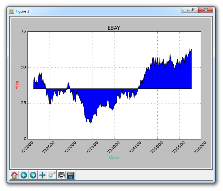
filled one The problem is, we might end up covering everything. We can solve it with transparency:
ax1.fill_between(date, 0, closep)
Now, let’s introduce conditional fill. Let's assume the starting position on the chart is where we start buying eBay. Here, if the price is below this price, we can pad up to the original price, and then if it exceeds the original price, we can pad down. We could do this:
ax1.fill_between(date, closep[0], closep)
would generate:
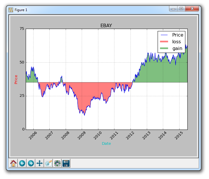
If we wanted to show the gains/losses with red and green fills compared to the original price , green filling is used for rising (note: the color of foreign stock markets is opposite to domestic), red filling is used for falling? no problem! We can add a where parameter like this:
ax1.fill_between(date, closep, closep[0],where=(closep > closep[0]), facecolor='g', alpha=0.5)
Here, we fill the area between the current price and the original price, where the current price is higher than the original price. We give it a green foreground color because this is a rise, and we use a slight transparency.
Lines
We still can't apply labels to polygonal data (like fills), but we can implement empty lines as before, so we can:
ax1.plot([],[],linewidth=5, label='loss', color='r',alpha=0.5)
ax1.plot([],[],linewidth=5, label='gain', color='g',alpha=0.5)
ax1.fill_between(date, closep, closep[0],where=(closep > closep[0]), facecolor='g', alpha=0.5)
ax1.fill_between(date, closep, closep[0],where=(closep < closep[0]), facecolor='r', alpha=0.5)
This gives us some padding, as well as empty lines for handling labels, which we intend to display in the legend. The complete code here is:
import matplotlib.pyplot as plt
import numpy as npimport urllib
import datetime as dt
import matplotlib.dates as mdates

def bytespdate2num(fmt, encoding='utf-8'):
    strconverter = mdates.strpdate2num(fmt)
    def bytesconverter(b):
        s = b.decode(encoding)
        return strconverter(s)

    return bytesconverter
def graph_data(stock):

    fig = plt.figure()
    ax1 = plt.subplot2grid((1,1), (0,0))

    stock_price_url = 'http://chartapi.finance.yahoo.com/instrument/1.0/'+stock+'/chartdata;type=quote;range=10y/csv'
    source_code = urllib.request.urlopen(stock_price_url).read().decode()
    stock_data = []
    split_source = source_code.split('\n')
    for line in split_source:
        split_line = line.split(',')
       if len(split_line) == 6:
           if 'values' not in line and 'labels' not in line:
              stock_data.append(line)
    date, closep, highp, lowp, openp, volume = np.loadtxt(stock_data,
                                        delimiter=',',
                                        unpack=True,
                                        converters={0: bytespdate2num('%Y%m%d')})
    ax1.plot_date(date, closep,'-', label='Price')
    ax1.plot([],[],linewidth=5, label='loss', color='r',alpha=0.5)
    ax1.plot([],[],linewidth=5, label='gain', color='g',alpha=0.5)
    ax1.fill_between(date, closep, closep[0],where=(closep > closep[0]), facecolor='g', alpha=0.5)
    ax1.fill_between(date, closep, closep[0],where=(closep < closep[0]), facecolor='r', alpha=0.5)
    for label in ax1.xaxis.get_ticklabels():
       label.set_rotation(45)
    ax1.grid(True)#, color='g', linestyle='-', linewidth=5)
    ax1.xaxis.label.set_color('c')
    ax1.yaxis.label.set_color('r')
    ax1.set_yticks([0,25,50,75])

    plt.xlabel('Date')
    plt.ylabel('Price')
    plt.title(stock)
    plt.legend()
    plt.subplots_adjust(left=0.09, bottom=0.20, right=0.94, top=0.90, wspace=0.2, hspace=0)
    plt.show()
graph_data('EBAY')
Now our result is:
The above is the detailed content of Filling of graphic colors and lines in Matplotlib. For more information, please follow other related articles on the PHP Chinese website!

 How does the choice between lists and arrays impact the overall performance of a Python application dealing with large datasets?May 03, 2025 am 12:11 AM
ForhandlinglargedatasetsinPython,useNumPyarraysforbetterperformance.1)NumPyarraysarememory-efficientandfasterfornumericaloperations.2)Avoidunnecessarytypeconversions.3)Leveragevectorizationforreducedtimecomplexity.4)Managememoryusagewithefficientdata
 Explain how memory is allocated for lists versus arrays in Python.May 03, 2025 am 12:10 AM
InPython,listsusedynamicmemoryallocationwithover-allocation,whileNumPyarraysallocatefixedmemory.1)Listsallocatemorememorythanneededinitially,resizingwhennecessary.2)NumPyarraysallocateexactmemoryforelements,offeringpredictableusagebutlessflexibility.
 How do you specify the data type of elements in a Python array?May 03, 2025 am 12:06 AM
InPython, YouCansSpectHedatatYPeyFeLeMeReModelerErnSpAnT.1) UsenPyNeRnRump.1) UsenPyNeRp.DLOATP.PLOATM64, Formor PrecisconTrolatatypes.
 What is NumPy, and why is it important for numerical computing in Python?May 03, 2025 am 12:03 AM
NumPyisessentialfornumericalcomputinginPythonduetoitsspeed,memoryefficiency,andcomprehensivemathematicalfunctions.1)It'sfastbecauseitperformsoperationsinC.2)NumPyarraysaremorememory-efficientthanPythonlists.3)Itoffersawiderangeofmathematicaloperation
 Discuss the concept of 'contiguous memory allocation' and its importance for arrays.May 03, 2025 am 12:01 AM
Contiguousmemoryallocationiscrucialforarraysbecauseitallowsforefficientandfastelementaccess.1)Itenablesconstanttimeaccess,O(1),duetodirectaddresscalculation.2)Itimprovescacheefficiencybyallowingmultipleelementfetchespercacheline.3)Itsimplifiesmemorym
 How do you slice a Python list?May 02, 2025 am 12:14 AM
SlicingaPythonlistisdoneusingthesyntaxlist[start:stop:step].Here'showitworks:1)Startistheindexofthefirstelementtoinclude.2)Stopistheindexofthefirstelementtoexclude.3)Stepistheincrementbetweenelements.It'susefulforextractingportionsoflistsandcanuseneg
 What are some common operations that can be performed on NumPy arrays?May 02, 2025 am 12:09 AM
NumPyallowsforvariousoperationsonarrays:1)Basicarithmeticlikeaddition,subtraction,multiplication,anddivision;2)Advancedoperationssuchasmatrixmultiplication;3)Element-wiseoperationswithoutexplicitloops;4)Arrayindexingandslicingfordatamanipulation;5)Ag
 How are arrays used in data analysis with Python?May 02, 2025 am 12:09 AM
ArraysinPython,particularlythroughNumPyandPandas,areessentialfordataanalysis,offeringspeedandefficiency.1)NumPyarraysenableefficienthandlingoflargedatasetsandcomplexoperationslikemovingaverages.2)PandasextendsNumPy'scapabilitieswithDataFramesforstruc


Hot AI Tools

Undresser.AI Undress
AI-powered app for creating realistic nude photos

AI Clothes Remover
Online AI tool for removing clothes from photos.

Undress AI Tool
Undress images for free

Clothoff.io
AI clothes remover

Video Face Swap
Swap faces in any video effortlessly with our completely free AI face swap tool!

Hot Article
Hot Tools

Notepad++7.3.1
Easy-to-use and free code editor

MantisBT
Mantis is an easy-to-deploy web-based defect tracking tool designed to aid in product defect tracking. It requires PHP, MySQL and a web server. Check out our demo and hosting services.

VSCode Windows 64-bit Download
A free and powerful IDE editor launched by Microsoft

EditPlus Chinese cracked version
Small size, syntax highlighting, does not support code prompt function

SublimeText3 Mac version
God-level code editing software (SublimeText3)

