Home >Web Front-end >Front-end Q&A >How to use css perspective-origin attribute
How to use css perspective-origin attribute
- 青灯夜游Original
- 2019-05-29 15:07:173696browse
Theperspective-origin attribute defines the X-axis and Y-axis on which the 3D element is based. This property allows you to change the bottom position of a 3D element. When you define the perspective-origin attribute for an element, its child elements get the perspective effect, not the element itself.

How to use the css perspective-origin attribute?
The perspective-origin attribute defines the X and Y axes on which the 3D element is based. This property allows you to change the bottom position of a 3D element.
Syntax:
perspective-origin: x-axis y-axis
Attribute value:
● x-axis Defines the position of the view on the x-axis. Default value: 50%. Possible values: left, center, right, length, %
● y-axis Defines the position of the view on the y-axis. Default value: 50%. Possible values: top, center, bottom, length, %
Description: When the perspective-origin attribute is defined for an element, its child elements will get the perspective effect, not the element itself.
Note: This attribute must be used together with the perspective attribute, and only affects 3D transformation elements.
css perspective-origin attribute example
<!DOCTYPE html>
<html>
<head>
<meta charset="utf-8">
<style>
#div1
{
position: relative;
height: 150px;
width: 150px;
margin: 50px;
padding:10px;
border: 1px solid black;
perspective:150;
perspective-origin: 10% 10%;
-webkit-perspective:150; /* Safari and Chrome */
-webkit-perspective-origin: 10% 10%; /* Safari and Chrome */
}
#div2
{
padding:50px;
position: absolute;
border: 1px solid black;
background-color: red;
transform: rotateX(45deg);
-webkit-transform: rotateX(45deg); /* Safari and Chrome */
}
</style>
</head>
<body>
<div id="div1">
  <div id="div2">HELLO</div>
</div>

</body>
</html>
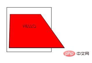
Rendering:

The above is the detailed content of How to use css perspective-origin attribute. For more information, please follow other related articles on the PHP Chinese website!

