Home >Web Front-end >CSS Tutorial >How to use css justify-content property
How to use css justify-content property
- 青灯夜游Original
- 2019-05-28 16:22:417341browse
css justify-content is used to set or retrieve the alignment of the flexible box element in the main axis (horizontal axis) direction. The alignment methods are: at the beginning of the container, at the end of the container, in the center of the container, evenly distributed, etc. .

How to use the css justify-content attribute?
justify-content is used to set or retrieve the alignment of the flexbox element in the main axis (horizontal axis) direction. Items on the cross axis can be aligned (vertically) using the align-content property.
Syntax:
justify-content: flex-start|flex-end|center|space-between|space-around|initial|inherit;
Attribute value:
●flex-start: Default value. The item is at the beginning of the container.

● flex-end: The item is located at the end of the container.

#●center: The item is located in the center of the container.

●space-between: The items are located in a container with blank space between the rows, that is, evenly distributed on the line; the first item is in the starting row, and the last item is at the end line.

● space-around: The item is located in a container with white space before, between, and after each line.

● initial: Set this property to its default value.
● Inherit: Inherit this attribute from the parent element.
css justify-content attribute example
<!DOCTYPE html>
<html>
<head>
<meta charset="utf-8">
<style>
.flex-container {
  padding: 0;
  margin: 0;
  list-style: none;
  display: flex;
}
.flex-start {
  justify-content: flex-start;
}
.flex-end {
  justify-content: flex-end;
}
.flex-end li {
  background: gold;
}
.center {
  justify-content: center;
}
.center li {
  background: deepskyblue;
}
.space-between {
  justify-content: space-between;
}
.space-between li {
  background: lightgreen;
}
.space-around {
  justify-content: space-around;
}
.space-around li {
  background: hotpink;
}
.space-evenly {
  justify-content: space-evenly;
}
.space-evenly li {
  background: #bada55;
}
.flex-item {
  background: tomato;
  padding: 5px;
  width: 60px;
  height: 50px;
  margin: 5px;
  line-height: 50px;
  color: white;
  font-weight: bold;
  font-size: 2em;
  text-align: center;
}
</style>
</head>
<body>
<ul class="flex-container flex-start">
  <li class="flex-item">1</li>
  <li class="flex-item">2</li>
  <li class="flex-item">3</li>
  <li class="flex-item">4</li>
  <li class="flex-item">5</li>
</ul>
<ul class="flex-container flex-end">
  <li class="flex-item">1</li>
  <li class="flex-item">2</li>
  <li class="flex-item">3</li>
  <li class="flex-item">4</li>
  <li class="flex-item">5</li>
</ul>
<ul class="flex-container center">
  <li class="flex-item">1</li>
  <li class="flex-item">2</li>
  <li class="flex-item">3</li>
  <li class="flex-item">4</li>
  <li class="flex-item">5</li>
</ul>
<ul class="flex-container space-between">
  <li class="flex-item">1</li>
  <li class="flex-item">2</li>
  <li class="flex-item">3</li>
  <li class="flex-item">4</li>
  <li class="flex-item">5</li>
</ul>
<ul class="flex-container space-around">
  <li class="flex-item">1</li>
  <li class="flex-item">2</li>
  <li class="flex-item">3</li>
  <li class="flex-item">4</li>
  <li class="flex-item">5</li>
</ul>
<ul class="flex-container space-evenly">
  <li class="flex-item">1</li>
  <li class="flex-item">2</li>
  <li class="flex-item">3</li>
  <li class="flex-item">4</li>
  <li class="flex-item">5</li>
</ul>
</body>
</html>
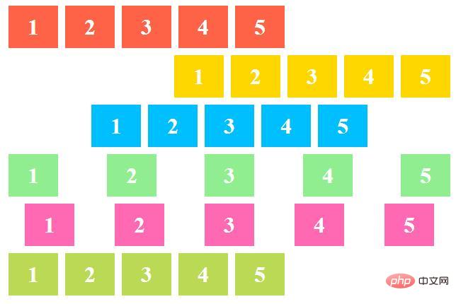
Rendering:

Description:
The red list is the justify-content attribute set to flex-start
The yellow list is the justify-content attribute set to flex-end
The blue list is the justify-content attribute set For center
Green is the justify-content attribute set to space-between
Pink is the justify-content attribute set to space-around
Light green is the justify-content attribute Set to space-evenly
The above is the detailed content of How to use css justify-content property. For more information, please follow other related articles on the PHP Chinese website!

