
Home >Web Front-end >CSS Tutorial >What are the ways to add shadows in CSS
What are the ways to add shadows in CSS

- 不言Original
- 2019-01-15 16:42:2010480browse
There are three ways to add shadows in What are the ways to add shadows in What are the ways to add shadows in CSS, box-shadow, drop-shadow and text-shadow. Box-shadow is the easiest to add shadows, drop- Shadow can add a shadow according to the size of the image, and text-shadow can add a shadow to the text. Let's take a look at these three methods of adding shadows.

Add shadow using box-shadow
When adding a shadow using What are the ways to add shadows in What are the ways to add shadows in CSS, box-shadow is the most common method.
box-shadow: 水平阴影 垂直阴影 模糊距离 阴影的大小 阴影的颜色;
The horizontal position and vertical position specify the position of the shadow display
According to positive and negative values, the position will change as follows.
Horizontal position: Positive value: right, negative value: left
Vertical position: Positive value: bottom, negative value: top
The blur distance of the shadow and the range of the shadow are what determine the shadow Appearance value.
All numerical units are px.
Let’s look at a specific example
The code is as follows
HTML
<!DOCTYPE html>
<html>
  <head>
    <meta charset="UTF-8" />
    <title></title>

    <link rel="stylesheet" href="sample.css" />
  </head>

  <body>

    <img  class="sample-box-shadow lazy"  src="/static/imghwm/default1.png"  data-src="img/girl.jpg"     alt="What are the ways to add shadows in CSS" >

  </body>
</html>
What are the ways to add shadows in What are the ways to add shadows in CSS
.sample-box-shadow{
   box-shadow: 10px 10px 15px -10px;
}
The running effect is as follows

Through the above method, you can easily add shadows to the image.
How to use drop-shadow to add shadow based on image size?
filter: drop-shadow(左右的阴影 上下的阴影 模糊距离 阴影颜色);
The left and right positions and the up and down positions are numbers that specify the shadow position of the original image.
The blur condition specifies the blurring degree of the shadow of the outline. All units are px
The biggest difference between drop-shadow and box-shadow is that you can set the shadow according to the size of the image.
Showing the difference between box-shadow and drop-shadow:

This is a very useful way to emphasize the image itself, as it can Add shadow to image like above image
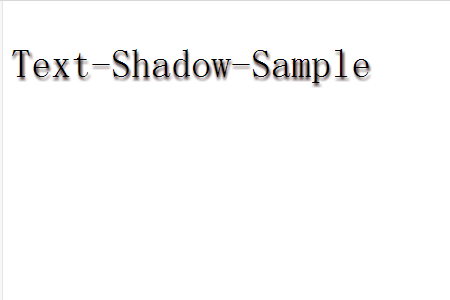
How to add shadow to text using text-shadow?
This is a method of adding shadow to text
The usage is as follows
text-shadow:水平阴影 垂直阴影 模糊程度 阴影颜色;
Let’s look at a specific example
The code is as follows
HTML
<!DOCTYPE html>
<html>
  <head>
    <meta charset="UTF-8" />
    <title></title>

    <link rel="stylesheet" href="sample.css" />
  </head>

  <body>

   <p class="sample-text-shadow" style="font-size: 40px">Text-Shadow-Sample</p>

  </body>
</html>
What are the ways to add shadows in What are the ways to add shadows in CSS
.sample-text-shadow{
   text-shadow:1px 3px 3px #513c3c;
}
The running effect is as follows
The above is the detailed content of What are the ways to add shadows in CSS. For more information, please follow other related articles on the PHP Chinese website!