Home >Web Front-end >CSS Tutorial >How to use box-shadow to create a border effect
How to use box-shadow to create a border effect
- 清浅Original
- 2018-12-08 14:34:556101browse
In CSS3, you can create a border effect by setting each value in the box-shadow attribute. For example, if you want to make a 1px pink border, you can set it to box-shadow:0 0 0 1px pink
What I will share today is how to use the box-shadow property in CSS to build a border. It has a certain reference effect and I hope it will be helpful to everyone.
【Recommended course: CSS3 course】
##border attribute creates border
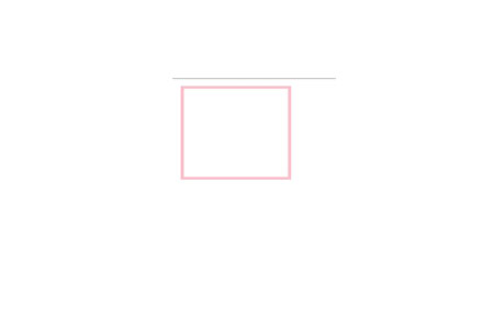
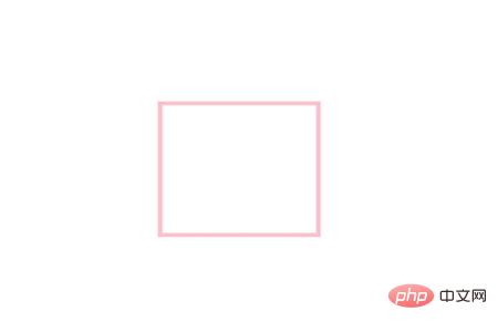
# #In the process of writing code, it is very simple to use the border attribute to add a border. For example, add a pink border to a divdiv{
width:100px;
height: 100px;
border:3px solid pink;
}
The effect is as follows:
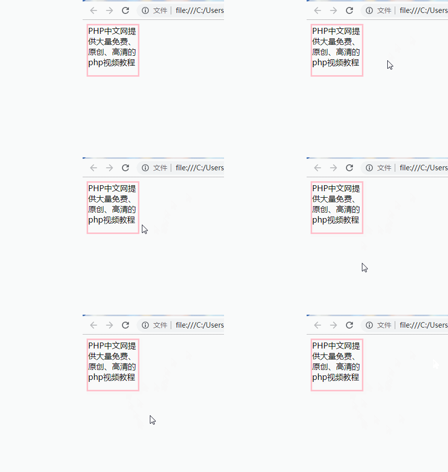
 For example, when we move the mouse over the border, the visual effect of enhanced border effect will occur
div:hover{
border:6px solid pink;
 }
effect As follows:
box-shadow making border
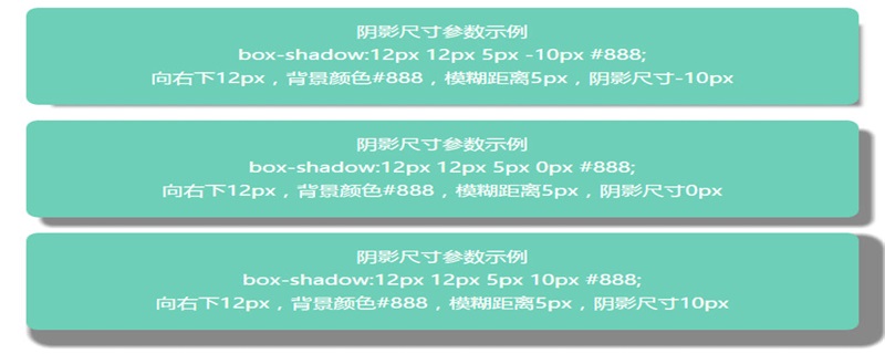
##box-shadow attributeAdd one or more shadows to the box
It has 6 attribute values, which are:
h-shadow: refers to the position of the horizontal shadow, negative values are allowed, and must be filled in v-shadow: refers to the position of the vertical shadow, which is allowed It is a negative value and must be written.
blur: refers to the blur distance, which can be written or not.
spread: the size of the shadow, which can be written or not.
color: The color of the shadow can be written or not.
inset: Change the outer shadow (outset) to the inner shadow. It can be written or not.
Example:
div{
width:100px;
height: 100px;
border:3px solid pink;
box-shadow:2px 2px 6px 6px #ccc;
		}
The effect is as follows:
Next, I will introduce to you how to use box-shadow to make borders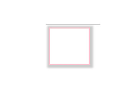
div{
box-shadow:0 0 0 3px pink;
}
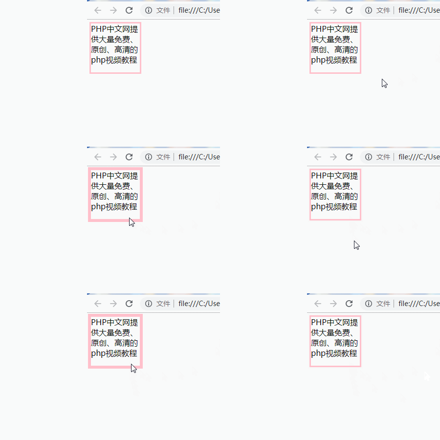
Rendering: div:hover{
box-shadow:0 0 0 6px pink;
} The rendering is as follows
#It can be seen that when the border implemented with box-shadow adds the hover attribute to the element, the text content does not move, but When using borders, the text content has the effect of moving forward.
  Summary: The above is the content of this article. I hope it will be helpful to everyone's learning.
The above is the detailed content of How to use box-shadow to create a border effect. For more information, please follow other related articles on the PHP Chinese website!

