Home >Web Front-end >CSS Tutorial >Give you an in-depth understanding of css positioning
Give you an in-depth understanding of css positioning
- 不言Original
- 2018-11-05 16:08:402269browse
When people are unfamiliar with CSS layout, they tend to gravitate towards positioning. Positioning seems like an easy concept to understand. On the surface you can specify exactly where and where the blocks are. Although positioning is a bit more complex than first appears. There are a few things that newbies need to know before positioning becomes a good choice. Once you have a deeper understanding of how CSS positioning works, you can achieve some great effects with positioning.
CSS Box Model and Position Type
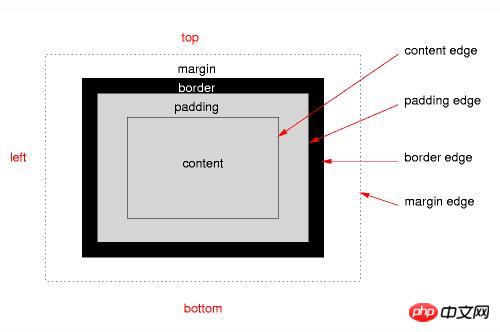
In order to understand positioning, you first need to understand the css box model. Every element in css is contained within a rectangular box, each box has an area defined for the content, padding around that content, a border surrounds both, and the outer edge of the border separates one box from the next The box separates and you can see it in the image below. (Course recommendation: css video tutorial)

The positioning scheme defines the position of the boxes in the overall layout and how each box affects the others around it frame. Positioning schemes include normal document streams, floating point numbers, and several types of positioned elements.
The five values required for the CSS position property:
position: absolute
position: relative
position: fixed
position: static
position: inherit
Let me briefly introduce the last two propertiesposition: static and position: inherit
Static positioning is the default setting . Any element with position:static is in normal document flow. The box model defines the rules for where it sits and how it affects other boxes.
Static positioned elements will ignore any values for the attributes top, right, bottom and left as well as any z-index declaration. In order to use any of these properties, the element must have absolute, relative or fixed positioning applied.
Inheritance like all css properties just the current element receives the same value as its parent element.
Let’s take a detailed look at the previous three attributes position: absolute, position: relative, position: fixed
Absolute positioning (position : absolute)
Absolutely positioned elements are completely removed from the normal document flow. Absolutely positioned elements do not exist as far as the elements around them are concerned. It's as if the element's display property is set to none. If you want to preserve space so that other elements don't move to fill it, you need to describe it in another way.
You can set the position of absolutely positioned elements through the top, right, bottom and left properties. You usually only define two of them, top or bottom, left or right. By default, each has an automatically set value.
The key to understanding absolute positioning is to understand the location of origin. If top is set to 20px, then the question you should be asking is 20px.
Absolutely positioned elements are positioned relative to the first parent element that has a static position applied to it. If no parent element in the chain meets this condition, an absolutely positioned element is positioned relative to the document window. Huh?
All this talk of relatives can be confusing, especially when we haven't talked about relative positioning yet.
When you set position:absolute on an element, css says to look at the parent element, and if it also has positioning applied (non-static), the origin of an absolutely positioned element is the upper left corner of the parent element.
If the parent does not have targeting applied, then go to the parent's parent and check if targeting has been applied. If it does, then the top left corner of the element is the origin of our absolutely positioned element. If not, then continue up the DOM until you reach the positioned element or the outermost edge of the browser window cannot be reached.
Relative positioning (position: relative)
Relatively positioned elements are positioned based on the same top, right, bottom and left attributes, but only from where they normally sit position shift. In a sense, adding relative positioning is similar to adding a very important difference. Elements surrounding a relatively positioned element behave as if this transition does not exist. They ignored it.
Think of it as a ghost image moved a little bit away from the actual image. A relatively positioned element behaves like a ghost, while all other elements behave as if it were the original, non-ghosted image. This allows elements to overlap each other, as relatively positioned elements can move into the space occupied by their neighboring elements.
Relatively positioned elements are taken out of the normal document flow, but still affect their surrounding elements. These elements behave as if the positioned elements were still in the normal document flow.
We don’t need to ask where the relative positioning is. The answer is always normal documentation flow. In terms of elements, it's a bit like adding margins, in terms of adjacent elements, it's a bit like doing nothing.
Fixed positioning
The function of fixed positioning is similar to absolute positioning, but there are some differences.
First, fixed-positioned elements are always positioned relative to the browser window, and assume the now-familiar top, right, bottom, and left attributes. This positioning rebels against ignoring its parent element.
The second difference is inherent in the name. Fixed positioned elements are fixed. They don't move when the page is scrolled. You tell the element where it should be and it never moves. Maybe not so rebellious after all.
In a sense, a fixed positioned element may be similar to a fixed background image, where the containing block is always the browser window. If you set a background image on a body, it behaves roughly like a fixed positioned element, with less precision in its position.
Background images also cannot change their position in the third dimension, which brings us to z-index.
Z-Index, breakthrough plane
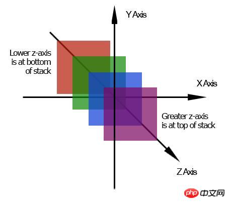
This page is a two-dimensional plane. It has width and height. We live in a three-dimensional world, which also includes depth and z-index, which is that depth. Extra dimensions move in and out of the page.

The higher z-index is above the lower z-index and moves towards the front of the page. Instead, a lower z-index sits behind a higher z-index and recedes toward the back of the page.
Without z-index, positioning elements is a bit boring. They don't have an extra dimension using them, but if z-index is applied you can do some creative things and allow one element to be on top or behind another element. By default, all elements have a z-index of 0, and negative numbers are allowed to be assigned.
Z-Index is actually a lot more complicated than what I've described here. Now remember the basic concept of extra dimensions and stacking order, and remember that the z-index attribute is only available for positioned elements.
Positioning questions
You can see some common questions through the positioning element, each of which requires a sentence or two.
1. You cannot apply the position attribute and float attribute to the same element at the same time. Both are conflicting instructions on what positioning scheme to use. If you add both to the same element, the element that appears last in the css code is expected to be the element used.
2. Margins will not collapse on absolutely positioned elements. Let's say you have a paragraph app with 20px margins. Directly below the paragraph is the image on top with a 30px margin applied. The space between the paragraph and the image is not 50px (20px 30px) but 30px (30px > 20px). This is called collapsing margins. Two margins are merged (or collapsed) into a single margin.
Absolutely positioned elements don't have collapsed margins, which may make them behave differently than expected
IE has z-index going a little wrong. In IE6, the select element always appears at the top of the stack, regardless of its z-index and the z-index of other elements around it.
Another z-index issue with IE6 and IE7 with stacked contexts. IE looks at the outermost parent that has positioning applied to determine which group of elements is at the top of the stack, rather than looking at each individual element.
<div style = “ z-index :0 ” >
  <p style = “ z-index :10 ” > </ p>
</ DIV>
<img  style = “ z-index :5 ” / alt="Give you an in-depth understanding of css positioning" >
You would expect the paragraph to be at the top of the stack because it has the highest z-index. But IE6 and IE7 will put the image on top of the paragraph because it will see two different stacks. One for the div and one for the image. The image has a higher z-index than the div, so will be on top of everything inside the div.
Summary
The position property sets an element to operate according to one of the css positioning schemes. You can set absolute, relative, fixed, static (default) and inherited values on positioned elements.
Positioning schemes (including CSS positioned elements) define the rules for where the box is placed in the layout and how adjacent elements are affected by the positioned element.
z-index can only be applied to positioned elements. It adds a third dimension to the page and sets the stacking order of elements. The
position property seems easy to grasp, but the way it works is a little different than it looks on the surface. You might think that relative positioning is more likely to be absolute positioning. When developing layouts, you often need to use floats and positioning on specific elements that you want to break out of the layout.
The above is the detailed content of Give you an in-depth understanding of css positioning. For more information, please follow other related articles on the PHP Chinese website!

