Home >Web Front-end >CSS Tutorial >What is block-level formatting (BFC) context? what's the effect? How to create?
What is block-level formatting (BFC) context? what's the effect? How to create?
- 不言Original
- 2018-10-31 17:20:403502browse
You've probably never heard the phrase "block formatting context", but if you've used CSS for layout, you probably already know its purpose. In this article, I'll cover existing ways of creating block formatting context and why it's important in CSS layout, and show you new ways of creating block formatting.
This article is about block formatting context (BFC). You may have never heard of this term, but if you have ever done layout with CSS, you probably already know what it is. Understanding what BFC is, what it does, and how to create it can be useful to help you understand the usage of CSS layout.
Next we will explain the content of BFC through some familiar examples.
Let’s first take a look at what is BFC?
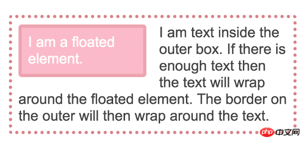
It is easiest to understand the behavior of a block-level formatting context (BFC) using a simple float example. In the example below, a box is set up with an image floating on the left and some text. If we have a lot of text, it goes around the floating image, and then the border encloses the text and the image inside.
<div class="outer">
      <div class="float">I am a floated element.</div>
      I am text inside the outer box.
    </div>
.outer {
border: 5px dotted rgb(214,129,137);
border-radius: 5px;
width: 450px;
padding: 10px;
margin-bottom: 40px;
}
.float {
padding: 10px;
border: 5px solid rgba(214,129,137,.4);
border-radius: 5px;
background-color: rgba(233,78,119,.4);
color: #fff;
float: left;
width: 200px;
margin: 0 20px 0 0;
}The effect is as follows:

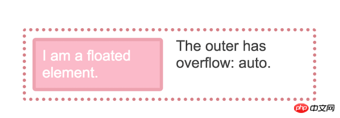
If you delete some text so that the text does not wrap around the image, because the float is taken out of the document flow, the border will rise and overlap the image The bottom runs to the height of the text. The effect is as follows:

#The above happens because when we let the element float, the box where the text is located remains the same width, and what is shortened to make room for the floating element is the text. line box. This is why the background and border appear to be running behind our float.
We usually have two ways to solve this layout problem. One way is to use the clearfix hack, which has the effect of inserting an element below the text and image and setting it to clear both. Another way is to use the overflow attribute instead of the default value of visible.
.outer {
      overflow: auto;
    }
The reason overflow works this way is because using any value other than the initial value visible creates a block-level formatting context, and a characteristic of BFC is that it Contains floating point numbers.
BFC can be seen as a small layout in a larger layout
You can think of BFC as a mini layout within the page. After the element creates the BFC, it contains all the content, as we can see, including the element that no longer overflows from the bottom of the box. BFC also implements some other useful behaviors.
BFC Prevents Margin Collapse
Understanding margin collapse is another underrated CSS skill. In the next example, I will set a div with a background color of gray.
There are two paragraphs in this div. The bottom edge of the outer div element is 40 pixels; the top and bottom margins of the paragraph are 20 pixels.
.outer {
       background-color: #ccc;
      margin: 0 0 40px 0;
    }
    p {
      padding: 0;
      margin: 20px 0 20px 0;
      background-color: rgb(233,78,119);
      color: #fff;
    }
Since there is nothing between the edge of the p element and the margin on the outer div, the two parts will collapse so the paragraph ends up flush with the top and bottom of the box. We don't see any gray color above and below the paragraph as shown below

# However, if we utilize BFC then it will include the paragraph and its margins so they are not will collapse, and we can see the gray background of the container behind the edge, as shown below

BFC once again completes the work of containing the internal things, preventing the margin from collapsing.
BFC stops content packaging floating.
You should be familiar with this behavior of BFC, as it is the way any column type layout that uses floating point numbers works. If a project creates a BFC, the project does not wrap any floats. In the following example, I have a markup like this:
<div class="outer">
      <div class="float">I am a floated element.</div>
      <div class="text">I am text</div>
    </div>
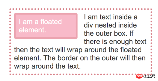
The item with the float floats to the left, so the text in the div appears after it surrounds the float.

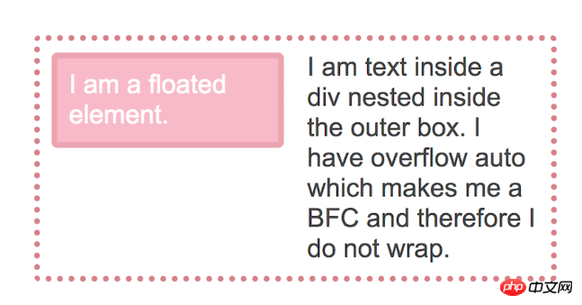
# You can also prevent wrapping behavior by making the div wrapping the text a BFC.
.text {
      overflow: auto;
    }
The effect is as follows:

This is basically how we can create a floating layout with multiple columns. Floating an item also creates a BFC for that item, so if the column on the right is higher than the column on the left, our columns don't try to wrap around each other.
What else can be done to create a BFC?
除了用于overflow创建BFC之外,其他一些CSS属性还会创建BFC。正如我们所看到的,浮动元素会创建一个BFC。因此,您的浮动项目将包含其中的任何内容。
使用position: absolute或position: fixed在元素上。
使用display: inline-block,display: table-cell或display: table-caption。该table-cell和table-captions为这些HTML元素的默认,所以如果你有一个数据表,例如,每个单元将创建一个BFC。
使用column-span: all,用于跨越多列布局的列。Flex和Grid项也会创建类似BFC的内容,除了它们分别被描述为Flex格式上下文和网格格式上下文。这反映了每个参与的布局类型。块格式化上下文表示该项目正在参与块布局,Flex格式上下文表示该项目正在参与Flex布局。在实践中,结果是相同的,包含浮点数并且边距不会坍塌。
创建BFC的新方法
使用溢出或其他一些方法来创建BFC有两个问题。首先,这些方法具有基于它们真正设计的副作用。overflow方法创建一个BFC并包含浮点数,但在某些情况下,您可能会发现有一个不需要的滚动条,或者剪切了阴影。这是因为溢出属性旨在让您告诉浏览器在溢出情况下要做什么 - 导致滚动条或剪辑内容。浏览器完全按照你的要求做了!
即使在没有任何不必要的副作用的情况下,使用溢出也可能让另一个开发人员感到困惑。为什么溢出设置为自动或滚动?原始开发者的意图是什么?他们想要这个组件上的滚动条吗?
什么是有用的将是一种创建BFC的方法,该BFC在其他方面是惰性的,不会产生其他行为,只能创建迷你布局,以及安全地在其中发生事情的能力。该方法不会引起任何意外问题,也可以明确开发人员的意图。CSS工作组认为这可能非常方便,因此我们有一个新的display属性值- flow-root。
您可以display: flow-root在本文的任何情况下使用,其中创建新的BFC将是有利的 - 包含浮动,防止边缘折叠,或防止物品包裹浮动。
如果您的浏览器支持display: flow-root最新的Firefox或Chrome,您可以在下面的代码中看到所有这些内容。
<h2>Containing floats</h2>

<div class="ex1">
  <div class="ex1-float">I am a floated element.</div>
  I am text inside the outer box.
</div>
<h2>Prevent margin collapsing</h2>

<div class="ex2">
  <p>I am paragraph one and I have a margin top and bottom of 20px;</p>
  <p>I am paragraph two and I have a margin top and bottom of 20px;</p>
</div>
<h2>Prevent float wrapping</h2>
<div class="ex3">
  <div class="ex3-float">I am a floated element.</div>
  <div class="ex3-text">
  I am text inside a div nested inside the outer box. I have overflow auto which makes me a BFC and therefore I do not wrap.
  </div>
</div>
* { box-sizing: border-box; }

body {
  margin: 40px;
  background-color: #fff;
  color: #444;
  font: 1.4em Arial, sans-serif;
}
/** example 1*/
.ex1 {
  border: 5px dotted rgb(214,129,137);
  border-radius: 5px;
  width: 450px;
  padding: 10px;
  margin-bottom: 40px;
  display: flow-root;
}
.ex1-float {
  padding: 10px;
  border: 5px solid rgba(214,129,137,.4);
  border-radius: 5px;
  background-color: rgba(233,78,119,.4);
  color: #fff;
  float: left;
  width: 200px;
  margin: 0 20px 0 0;
}
/* example 2*/
.ex2 {
  background-color: #ccc;
  margin: 0 0 40px 0;
  display: flow-root;
}
.ex2 p {
  padding: 0;
  margin: 20px 0 20px 0;
  background-color: rgb(233,78,119);
  color: #fff;
}
/* example 3 */
.ex3 {
  border: 5px dotted rgb(214,129,137);
  border-radius: 5px;
  width: 450px;
  padding: 10px;
  margin-bottom: 40px;
}
.ex3-float {
  padding: 10px;
  border: 5px solid rgba(214,129,137,.4);
  border-radius: 5px;
  background-color: rgba(233,78,119,.4);
  color: #fff;
  float: left;
  width: 200px;
  margin: 0 20px 0 0;
}
.ex3-text {
  display: flow-root;
}
浏览器对此值的支持是有限的,但是如果您认为它会很方便,那么请继续在Edge中投票。但是,即使您现在无法在代码中使用方便的流根功能,您现在也可以了解BFC是什么,以及当您使用溢出或其他方法来包含浮点数时您正在做什么。例如,如果要在非支持的浏览器中为flex或网格布局创建回退,那么理解BFC将停止包装浮动项的事实非常有用。
您还可以理解在浏览器如何布局网页方面非常重要的内容。虽然它们本身似乎无关紧要,但正是这些小知识可以加快创建和调试CSS布局所需的时间。
The above is the detailed content of What is block-level formatting (BFC) context? what's the effect? How to create?. For more information, please follow other related articles on the PHP Chinese website!
Related articles
See more- css block level formatting context BFC
- How to create block-level formatting context? The role of block-level formatting context
- What is block-level formatting context? The role of creating a block-level formatting context (code attached)
- Introduction to the role of BFC (block-level formatting context) in CSS

