Home >Web Front-end >CSS Tutorial >Pure CSS3 realizes page circle loading animation special effects
Pure CSS3 realizes page circle loading animation special effects
- yuliaOriginal
- 2018-10-27 16:48:2211383browse
When opening a website or watching a video when the Internet speed is not good, the page will load very slowly. At this time, the user will usually be prompted "the page is loading, please wait", and there will be a circle that keeps rotating. Friends who are learning html and CSS, can you use CSS3 to achieve the circle loading animation effect? This article will share with you a circle (loading) loading animation special effect implemented in pure CSS3. Interested friends can refer to it.
Using CSS3 to create a circle loading effect requires the use of many attributes in CSS3, such as animation, keyframes, border-radius fillets, etc. If you are not sure about these attributes, you can refer to the PHP Chinese website Related articles, or visit CSS3 video tutorial.
Next, I will give you a detailed introduction on how to use HTML and CSS to create a page circle loading animation
HTML part:
Create a div in the page for Place the circle to load the animation, and give the div a class name to facilitate setting CSS styles for it. The specific code is as follows:
<body>
  <h3>CSS圆圈加载样式</h3>
  <div class="loading"></div>
</body>
CSS part:
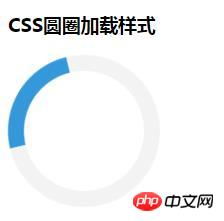
First set the length and height of the div to 120px, Then set border-radius: to 50% to make it circular, use border: 16px solid #f3f3f3 to set the width and color of the circle, and finally set a scrollable part through the border-top attribute. After the basic style is completed, the animation animation in CSS3 is used to make it rotate in an infinite loop. The specific code is as follows:
.loading {
    border: 16px solid #f3f3f3;
    border-radius: 50%;
    border-top: 16px solid #3498db;
    width: 120px;
    height: 120px;
    -webkit-animation: spin 2s linear infinite;
    animation: spin 2s linear infinite;
   }
   @-webkit-keyframes spin {
    0% {
     -webkit-transform: rotate(0deg);
    }
    100% {
     -webkit-transform: rotate(360deg);
    }
   }
   @keyframes spin {
    0% {
     transform: rotate(0deg);
    }
    100% {
     transform: rotate(360deg);
    }
   }
Note: -webkit- and -ms- prefixes are used for those that do not support animation and transform attributes. Browser, in order to ensure browser compatibility, it needs to be added.
Rendering:

The above has shared with you the special effects of pure CSS3 to realize the circle (loading) loading animation. The steps are explained in more detail. I didn’t know it before. Friends, you must try it yourself to see if your code can achieve the page loading effect. I hope this article will be helpful to you!
More cool CSS3, html5, javascript special effects codes, all in: js special effects collection
For more related tutorials, please visit the latest version of CSS3 Reference Manual
The above is the detailed content of Pure CSS3 realizes page circle loading animation special effects. For more information, please follow other related articles on the PHP Chinese website!

