Home >Web Front-end >CSS Tutorial >How to use box-shadow in CSS3 to create border shadow? (code tutorial)
How to use box-shadow in CSS3 to create border shadow? (code tutorial)
- 云罗郡主forward
- 2018-10-23 16:59:352671browse
This article brings you how to use box-shadow in CSS3 to create border shadows? (Code tutorial) has certain reference value. Friends in need can refer to it. I hope it will be helpful to you.
Introduction to box-shadow property
Border shadow is a very common special effect.
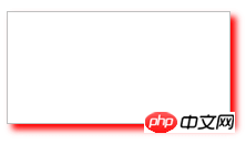
Previously in CSS2.1, if you wanted to add a border shadow to an element (like the picture above), you could only do it through a background image.
In CSS3, we can easily add a shadow effect to an element using the box-shadow property.
Syntax:
box-shadow:x-shadow y-shadow blur spread color inset;
Description:
(1) x-shadow: Set the position of the horizontal shadow (X axis), you can use negative values;
(2)y-shadow: Set the position of the vertical shadow (y-axis), you can use negative values;
(3)blur: Set the shadow blur radius;
(4)spread: Expand the radius and set the size of the shadow;
(5) color: Set the color of the shadow;
(6) inset: This parameter is not set by default. The default is outer shadow, inset means inner shadow.
Example:
<!DOCTYPE html>
<html xmlns="http://www.w3.org/1999/xhtml">
<head>
    <title>CSS3 box-shadow属性</title>
    <style type="text/css">
    #div1
    {
        width:200px;
        height:100px;
        border:1px solid silver;
        box-shadow:5px 5px 8px red;
    }
    </style>
</head>
<body>
    <div id="div1">
    </div>
</body>
</html>
The preview effect in the browser is as follows:

##Horizontal shadow position x-shadow and vertical shadow position y-shadow
The attribute value of horizontal shadow position x-shadow and vertical shadow position y-shadow, the unit can be px, em or percentage, etc., negative values are allowed. Example:<!DOCTYPE html>
<html xmlns="http://www.w3.org/1999/xhtml">
<head>
<title>CSS3 box-shadow属性</title>
<style type="text/css">
#div1
{
width:200px;
height:100px;
border:1px solid silver;
box-shadow:-5px -5px 8px red;
}
</style>
</head>
<body>
<div id="div1">
</div>
</body>
</html>The preview effect in the browser is as follows: 
CSS3 video tutorial, please pay attention to the PHP Chinese website.
The above is the detailed content of How to use box-shadow in CSS3 to create border shadow? (code tutorial). For more information, please follow other related articles on the PHP Chinese website!

