Home >Web Front-end >CSS Tutorial >Margin border overlay problems and solutions in CSS
Margin border overlay problems and solutions in CSS
- 青灯夜游forward
- 2018-10-15 17:34:492839browse
This article will introduce to you the problem and solution of margin boundary overlay in CSS. It has certain reference value. Friends in need can refer to it. I hope it will be helpful to you.
Do you understand the concept of CSS margin border overlay? Let me share with you. When an element appears on top of another element, the bottom border of the first element and the top border of the second element Overlay occurs.
In-depth analysis of CSS margin border overlay
Introduction to border overlay
Border overlay is a fairly simple concept. However, it can cause a lot of confusion when laying out web pages in practice. Simply put, when two vertical boundaries meet, they form a boundary. The height of this boundary is equal to the greater of the heights of the two superimposed boundaries.
When an element appears on top of another element, the bottom border of the first element overlaps the top border of the second element, see the picture:

◆The top border of an element overlaps the bottom border of the preceding element
When an element is contained within another element (assuming no padding or border separates the border), their top and / Or the bottom border also overlaps, as shown in the picture:

◆The top border of the element overlaps the top border of the parent element
Although at first glance It looks a little weird, but the border can even overlap itself. Suppose you have an empty element, it has a border, but no border or padding. In this case, the top border and the bottom border touch together, and they will overlap, as shown in the figure:

◆The top and bottom borders of the element overlap
If this boundary touches the boundary of another element, it will also overlap. See the picture:

◆The superimposed boundary of the empty element is different from the boundary of another element. The borders of an empty element overlap
This is why a series of empty paragraph elements take up very little space, because all their borders overlap together to form a small border.
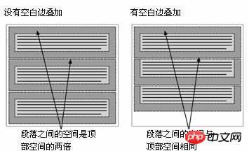
Boundary overlay may seem a little strange at first, but it actually makes sense. Take, for example, a typical text page consisting of several paragraphs (see Figure 2-8). The space above the first paragraph is equal to the top margin of the paragraph. Without border overlay, the border between all subsequent paragraphs would be the sum of the adjacent top and bottom borders. This means the space between paragraphs is twice as large as the top of the page. If border overlapping occurs, the top and bottom borders between paragraphs overlap so that the distance is consistent everywhere.

◆Border overlay maintains a consistent distance between elements
Border overlay only occurs at the vertical boundaries of block boxes in normal document flow. The boundaries between inline boxes, floated boxes, or absolutely positioned boxes do not overlap.
The problem of border overlay
Border overlay is a CSS feature that can cause a lot of trouble if misunderstood. Please refer to the simple example of a nested paragraph within a p element:
<div id="box">
<p>Thisparagraphhasa20pxmargin.</p>
<div>
The p box is set with a 10 pixel border and the paragraph is set with a 20 pixel border:
#box{
   margin:10px;
   background-color:#d5d5d5;
}
p{
   margin:20px;
   background-color:#6699ff;
}
You will naturally think that the resulting style It will look like Figure 1-1, with a 20-pixel distance between the paragraph and the p, and a 10-pixel border around the outside of the p.
Figure 1-1

However, the resulting style actually looks like Figure 1-2.
Figure 1-2

Two situations happened here. First, the paragraph’s 20-pixel top and bottom borders overlap with the p’s 10-pixel border to form a single 20-pixel vertical border. Second, these boundaries are not surrounded by p, but protrude beyond the top and bottom of p. This occurs due to the way elements that have block-level children calculate their height.
如果元素没有垂直边框和填充,那么它的高度就是它包含的子元素的顶部和底部边框边缘之间的距离。因此,包含的子元素的顶部和底部空白边就突出到容器元素的外边。但是,有一个简单的解决方案。通过添加一个垂直边框或填充,空白边就不再叠了,而且元素的高度就是它包含的子元素的顶部和底部空白边边缘之间的距离。
为了让前面的示例看起来像图1-1这样,只需在p周围添加补白或边框:
#box{
   margin:10px;
   padding:1px;/*或者border:1pxsolidcolor;*/
   background-color:#d5d5d5;
}
p{
   margin:20px;
   background-color:#6699ff;
}
边l界叠加的大多数问题可以通过添加透明边框或1px的补白来修复。
补充解决方案:
1.外层padding
2.透明边框border:1pxsolidtransparent;
3.绝对定位postion:absolute:
4.外层poverflow:hidden;
5.内层p 加float:left;display:inline;
6.外层p有时会用到zoom:1;
以上就是本篇的全部内容,更多相关教程请访问 CSS基础视频教程, CSS3视频教程,bootstrap视频教程!
The above is the detailed content of Margin border overlay problems and solutions in CSS. For more information, please follow other related articles on the PHP Chinese website!

