Home >Web Front-end >CSS Tutorial >How to use pure CSS to achieve the dot illusion effect (source code attached)
How to use pure CSS to achieve the dot illusion effect (source code attached)
- 不言forward
- 2018-10-09 14:54:222254browse
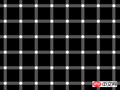
The content of this article is about how to use pure CSS to achieve the effect of dot illusion (source code attached). It has certain reference value. Friends in need can refer to it. I hope it will be helpful to you. helped.
Effect preview

Source code download
https://github.com/comehope/front-end-daily -challenges
Code Interpretation
This project has no user-defined dom elements and uses the system default element as a container.
Define the page size and set the background to black:
body {
    margin: 0;
    width: 100vw;
    height: 100vh;
    background-color: black;
}
Use a linear gradient to draw two thin gray lines, one horizontal and one vertical:
body {
    margin: 0;
    width: 100vw;
    height: 100vh;
    background-color: black;
    background-image:
        linear-gradient(
            to bottom,
            #555 2vmin,
            transparent 2vmin
        ),
        linear-gradient(
            to right,
            #555 2vmin,
            transparent 2vmin
        );
}
Use a radial gradient on the upper left Draw a white dot in the corner:
body {
    margin: 0;
    width: 100vw;
    height: 100vh;
    background-color: black;
    background-image:
        radial-gradient(
            circle at 1vmin 1vmin,
            white 1vmin,
            transparent 1vmin
        ),
        linear-gradient(
            to bottom,
            #555 2vmin,
            transparent 2vmin
        ),
        linear-gradient(
            to right,
            #555 2vmin,
            transparent 2vmin
        );
}
Tile the background:
body {
    margin: 0;
    width: 100vw;
    height: 100vh;
    background-color: black;
    background-image:
        radial-gradient(
            circle at 1vmin 1vmin,
            white 1vmin,
            transparent 1vmin
        ),
        linear-gradient(
            to bottom,
            #555 2vmin,
            transparent 2vmin
        ),
        linear-gradient(
            to right,
            #555 2vmin,
            transparent 2vmin
        );
    background-size: 10vmin 10vmin;
}
To avoid the dots being stuck to the left and top, add a little offset to the background:
body {
    margin: 0;
    width: 100vw;
    height: 100vh;
    background-color: black;
    background-image:
        radial-gradient(
            circle at 1vmin 1vmin,
            white 1vmin,
            transparent 1vmin
        ),
        linear-gradient(
            to bottom,
            #555 2vmin,
            transparent 2vmin
        ),
        linear-gradient(
            to right,
            #555 2vmin,
            transparent 2vmin
        );
    background-size: 10vmin 10vmin;
    background-position: 5vmin 5vmin;
}
Now, if you move your eyes across the page, you will see small black dots, which is actually an illusion.
The above is the detailed content of How to use pure CSS to achieve the dot illusion effect (source code attached). For more information, please follow other related articles on the PHP Chinese website!
Related articles
See more- How to use pure CSS to achieve the effect of a coffee machine
- How to use pure CSS to achieve the effect of a Saturn
- How to use pure CSS to achieve the hover effect of sliding elements from both sides of the button (source code attached)
- How to use pure CSS to animate Baolo Mints (source code attached)
- How to use pure CSS to achieve the image of Dabai (source code attached)

