Home >Web Front-end >CSS Tutorial >How to use CSS Grid layout to achieve the effect of a squirrel stamp (source code attached)
How to use CSS Grid layout to achieve the effect of a squirrel stamp (source code attached)
- 不言Original
- 2018-09-25 17:33:263468browse
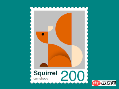
The content of this article is about how to use CSS Grid layout to achieve the effect of little squirrel stamps (source code attached). It has certain reference value. Friends in need can refer to it. I hope it will be helpful to you. You helped.
Effect preview

<div>
</div>
Centered display:
body {
    margin: 0;
    height: 100vh;
    display: flex;
    align-items: center;
    justify-content: center;
    background-color: teal;
}
Set the container size:
.stamp {
    position: relative;
    width: 45em;
    height: 63em;
    font-size: 6px;
    padding: 5em;
    background-color: white;
}
Draw the perforations of the stamp with a repeating background:
.stamp {
    display: flex;
    flex-direction: column;
    align-items: center;
    justify-content: center;
}

.stamp::after,
.stamp::before {
    content: '';
    width: 100%;
    height: 100%;
    position: absolute;
    background:
        radial-gradient(circle, teal 50%, transparent 50%),
        radial-gradient(circle, teal 50%, transparent 50%);
    background-size: 3.5em 3.5em;
}

.stamp::before {
    top: 1.5em;
    background-repeat: repeat-y;
    background-position: -4% 0, 104% 0;
}

.stamp::after {
    left: 1.5em;
    background-repeat: repeat-x;
    background-position: 0 -3%, 0 103%;
}
Add the chicken's dom element to the html file, sub The elements respectively represent ears, head, body, lower part of tail, upper part of tail, legs, and paws:
<p>
    </p><p>
        </p><p></p>
        <p></p>
        <p></p>
        <p></p>
        <p></p>
        <p></p>
        <p></p>
Set the row and column dimensions of the grid layout:
.squirrel {
    display: grid;
    grid-template-columns: 11.5em 7em 15.5em 10.5em;
    grid-template-rows: 13em 5em 11.5em 22.5em;
    background-color: silver;
    padding: 2em;
    margin-top: -2em;
}
Draw a fan-shaped head:
.head {
    grid-column: 1;
    grid-row: 3;
    background-color: chocolate;
    border-bottom-left-radius: 100%;
}
Use radial gradient to draw eyes:
.head {
    background-image: radial-gradient(
        circle at 58% 22%,
        black 1.4em,
        transparent 1.4em
    );
}
Draw fan-shaped ears:
.ear {
    grid-column: 2;
    grid-row: 2;
    width: 5em;
    background-color: bisque;
    border-bottom-right-radius: 100%;
}
Draw fan-shaped body:
.body {
    grid-column: 2 / 4;
    grid-row: 4;
    background-color: chocolate;
    border-top-right-radius: 100%;
    position: relative;
    overflow: hidden;
}
Use pseudo elements, Draw the curled legs through shading:
.body::before {
    content: '';
    position: absolute;
    width: 100%;
    height: 50%;
    box-shadow: 2em -2em 4em rgba(0, 0, 0, 0.3);
    bottom: 0;
    --w: calc((7em + 15.5em) / 2);
    border-top-left-radius: var(--w);
    border-top-right-radius: var(--w);
}
Draw the semicircular small paws:
.foot {
    grid-column: 1;
    grid-row: 4;
    height: 4em;
    width: 8em;
    background-color: saddlebrown;
    justify-self: end;
    align-self: end;
    border-radius: 4em 4em 0 0;
    filter: brightness(0.8);
}
Draw the semicircular lower part of the tail:
.tail-start {
    grid-column: 4;
    grid-row: 4;
    --h: calc(22.5em - 1.5em);
    height: var(--h);
    background-color: bisque;
    align-self: end;
    border-radius: 0 var(--h) var(--h) 0;
}
Draw the semicircular The upper part of the round tail:
.tail-end {
    grid-column: 3;
    grid-row: 1 / 5;
    --h: calc(13em + 5em + 11.5em + 1.5em);
    height: var(--h);
    background-color: chocolate;
    border-radius: var(--h) 0 0 var(--h);
}
Add some more text in the dom, including title, author and face value:
<p>
    </p><p>
        <!-- 略 -->
    </p>
    <p>
        <span>Squirrel</span>
        <span>comehope</span>
        <span>200</span>
    </p>
Set the text style of the title:
.text {
    position: relative;
    width: calc(100% + 2em * 2);
    height: 6em;
    font-family: sans-serif;
}

.text .title {
    position: absolute;
    font-size: 6em;
    font-weight: bold;
    color: darkslategray;
}
Set the author Text style:
.text .author {
    position: absolute;
    font-size: 3em;
    bottom: -1.2em;
    color: dimgray;
}
Set the text style of the face value:
.text .face-value {
    position: absolute;
    font-size: 14em;
    right: 0;
    line-height: 0.9em;
    color: darkcyan;
}
You’re done! The above is the detailed content of How to use CSS Grid layout to achieve the effect of a squirrel stamp (source code attached). For more information, please follow other related articles on the PHP Chinese website!
Statement:
The content of this article is voluntarily contributed by netizens, and the copyright belongs to the original author. This site does not assume corresponding legal responsibility. If you find any content suspected of plagiarism or infringement, please contact admin@php.cn
Previous article:How to use CSS Grid layout to implement chicken stamps (with code)Next article:How to use CSS Grid layout to implement chicken stamps (with code)
Related articles
See more- How to use CSS to implement a duck head (with code)
- How to use CSS to achieve the effect of gradient animated borders (code attached)
- How to use css to implement a page that monitors network connection status
- How to use css to achieve the effect of Chinese knot (code)
- How to use CSS Grid layout to implement puppy stamps (source code attached)
- How to use CSS Grid layout to implement chicken stamps (with code)

