
Home >Web Front-end >CSS Tutorial >Use css3 and js to implement a clock code process
Use css3 and js to implement a clock code process

- 不言Original
- 2018-09-20 16:43:523188browse
The content of this article is about using css3 and js to implement a clock code process. It has certain reference value. Friends in need can refer to it. I hope it will be helpful to you.
One day I saw the css3 rotation attribute, and I wrote a clock on a whim (without browser compatibility). Let’s take a look at how it is written!
First of all The finished picture, the final result is what it looks like (dynamic). Picture, and then the remaining three layers are the hour hand, minute hand, and second hand layers.
The html code is as follows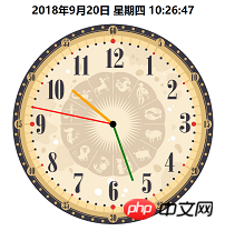
<div class="dial">
</div>
<div class="bigdiv bigdiv1" id="secondHand">
    <div class="secondHand"></div>
</div>
<div class="bigdiv bigdiv2" id="minuteHand">
    <div class="minuteHand"></div>
</div>
<div class="bigdiv bigdiv3" id="hourHand">
    <div class="center"></div>
    <div class="hourHand"></div>
</div>
The variable names are randomly chosen, don’t mind; class=center This p is the small black dot in the center of the watch.
The hour hand rotates once in 60*60*60s, the minute hand rotates in 60*60s, and the second hand rotates in 60s, so the css code is as follows↓
.dial{
    width:600px;
    height:600px;
    margin:0 auto;
    position: absolute;
    border-radius: 50%;
    overflow: hidden;
    background-color: rgba(153,50,204,0.2);
    background-image: url(img/表盘.jpg);
    background-size: 100% 100%;
}
.bigdiv{
    width:600px;
    height:600px;
    margin:0 auto;
    position: absolute;
    border-radius: 50%;
    overflow: hidden;
}
.bigdiv>div{
    position: absolute;
    left:298px;
    border-radius: 100px;
}
.bigdiv1{
    animation: moves 60s steps(60) infinite;
}
.bigdiv1 .secondHand{
    width:4px;
    height:250px;
    background-color: red;
    top:50px;
    left:298px;
}
.bigdiv2{
    animation: moves 3600s steps(3600) infinite;
}
.bigdiv2 .minuteHand{
    width:6px;
    height:180px;
    background-color: green;
    top:120px;
    left:297px;
}
.bigdiv3{
    animation: moves 216000s steps(216000) infinite;
}
.bigdiv3 .hourHand{
    width:8px;
    height:160px;
    background-color: orange;
    top:140px;
    left:296px;
    border-radius: 100px;
}
.bigdiv .center{
    top:290px;
    left:290px;
    width:20px;
    height:20px;
    background-color: black;
    z-index: 2;
}
@keyframes moves{
    from{ transform: rotateZ(0deg); }
    to{ transform: rotateZ(360deg); }
}
After this step is completed, the rendering will look like this:
Then use js to calculate the current time,
var date = new Date();
var hours = date.getHours();
var minutes = date.getMinutes();
var seconds = date.getSeconds();
Then calculate the current time The rotation angle of each needle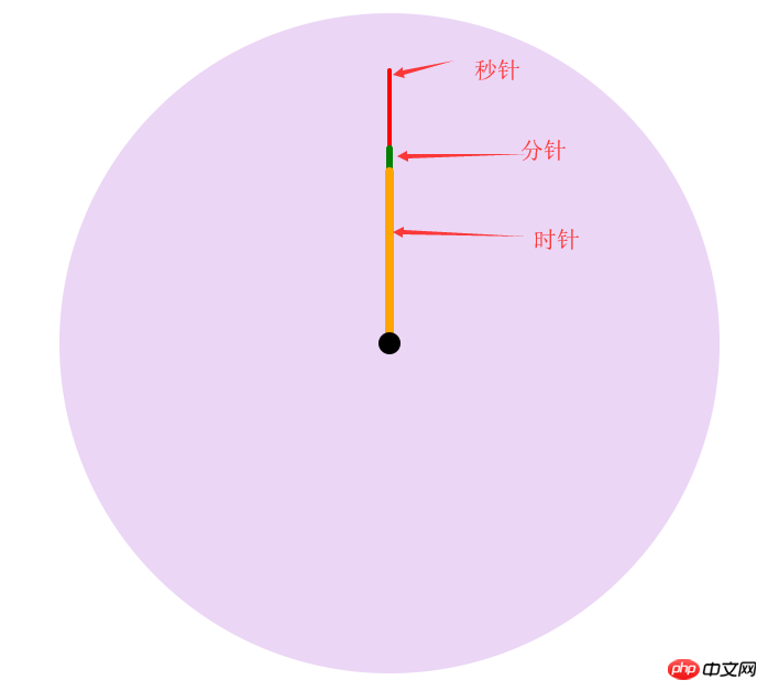
var secondAngle = seconds;
var minuteAngle = minutes * 60 + seconds;
var hourAngle = (60/12) * ((hours%12) * 3600 + minuteAngle);
The current idea is: each needle will rotate once according to its own time, and the initial angle can also be known. How to form a dynamic clock that displays the current time?
The initial idea was to let the three layers of p rotate at the corresponding angle, and then start again. Later, I couldn’t think of it, because it still rotates once in a fixed time, and the pointer pointing will be deviated. Now we need The first rotation of the page when it comes in is a fixed angle, and the rest can be rotated by the original fixed time. There is an animation-delay attribute in css3, which means animation delay, and a negative number means Start early (for example, -5s means the animation starts from the 5th time), can be used just in time to let these pointers start the corresponding angles in advance. js code is as follows
hourHand.style.cssText = "animation-delay: -"+ hourAngle +"s";
minuteHand.style.cssText = "animation-delay: -"+ minuteAngle +"s";
secondHand.style.cssText = "animation-delay: -"+ secondAngle +"s";
Finally, I added a dynamic time to display on the clockThe following is the complete code after sorting, copy and paste it to use
CSS
body,html{
    margin:0;
}
.location{
    position: relative;
    width:600px;
    height:600px;
    left: calc(50% - 300px);
}
.dial{
    width:600px;
    height:600px;
    margin:0 auto;
    position: absolute;
    border-radius: 50%;
    overflow: hidden;
    background-color: rgba(153,50,204,0.2);
    background-image: url(img/表盘.jpg);
    background-size: 100% 100%;
}
.bigdiv{
    width:600px;
    height:600px;
    margin:0 auto;
    position: absolute;
    border-radius: 50%;
    overflow: hidden;
}
.bigdiv>div{
    position: absolute;
    left:298px;
    border-radius: 100px;
}
.bigdiv1{
    animation: moves 60s steps(60) infinite;
}
.bigdiv1 .secondHand{
    width:4px;
    height:250px;
    background-color: red;
    top:50px;
    left:298px;
}
.bigdiv2{
    animation: moves 3600s steps(3600) infinite;
}
.bigdiv2 .minuteHand{
    width:6px;
    height:180px;
    background-color: green;
    top:120px;
    left:297px;
}
.bigdiv3{
    animation: moves 216000s steps(216000) infinite;
}
.bigdiv3 .hourHand{
    width:8px;
    height:160px;
    background-color: orange;
    top:140px;
    left:296px;
    border-radius: 100px;
}
.bigdiv .center{
    top:290px;
    left:290px;
    width:20px;
    height:20px;
    background-color: black;
    z-index: 2;
}
@keyframes moves{
    from{ transform: rotateZ(0deg); }
    to{ transform: rotateZ(360deg); }
}
#dateshow{
    text-align: center;
}
html code
js code<div class="dial"> </div> <div class="bigdiv bigdiv1" id="secondHand"> <div class="secondHand"></div> </div> <div class="bigdiv bigdiv2" id="minuteHand"> <div class="minuteHand"></div> </div> <div class="bigdiv bigdiv3" id="hourHand"> <div class="center"></div> <div class="hourHand"></div> </div>
var dateshow = document.getElementById("dateshow");
var clock = {
    weeks : ["一","二","三","四","五","六","日"],
    getDate:function(){
        date = new Date();
        year = date.getFullYear();
        month = date.getMonth()+1;
        day = date.getDate();
        hours = date.getHours();
        minutes = date.getMinutes();
        seconds = date.getSeconds();
        week = date.getDay();    // 星期
        dateText = year+"年"+month+"月"+clock.format(day)+"日 星期"+clock.formatnum(week)+" "+
            clock.format(hours)+":"+clock.format(minutes)+":"+clock.format(seconds);
        return dateText;
    },
    format:function (data){
        if(data.toString().length == 1){
            data = "0" + data;
        };
        return data;
    },
    formatnum:function (num){
        return clock.weeks[num-1];
    },
    showdate:function (){
        dateshow.innerText = clock.getDate();
    },
    go:function (){
        var secondHand = document.getElementById("secondHand");
        var minuteHand = document.getElementById("minuteHand");
        var hourHand = document.getElementById("hourHand");
        date = new Date();
        hours = date.getHours();
        minutes = date.getMinutes();
        seconds = date.getSeconds();
        var secondAngle = seconds;
        var minuteAngle = minutes * 60 + seconds;
        var hourAngle = (60/12) * ((hours%12) * 3600 + minuteAngle);
        hourHand.style.cssText = "animation-delay: -"+ hourAngle +"s";
        minuteHand.style.cssText = "animation-delay: -"+ minuteAngle +"s";
        secondHand.style.cssText = "animation-delay: -"+ secondAngle +"s";
    }

}
clock.go();
clock.showdate();
setInterval("clock.showdate()",1000);
The above is the detailed content of Use css3 and js to implement a clock code process. For more information, please follow other related articles on the PHP Chinese website!
Statement:
The content of this article is voluntarily contributed by netizens, and the copyright belongs to the original author. This site does not assume corresponding legal responsibility. If you find any content suspected of plagiarism or infringement, please contact admin@php.cn