
Home >Web Front-end >CSS Tutorial >Code for making a clock using Css3 and Js
Code for making a clock using Css3 and Js

- 不言Original
- 2018-06-22 13:09:252069browse
This article mainly introduces the code about using Css3 and Js to make a clock. It has certain reference value. Now I share it with you. Friends in need can refer to it.
Css3 Js to realize a beautiful clock, browse The browser supports IE9/GoogleChrome/FireFox/Safari, etc. Interested friends can download and test it. I hope it will be helpful for you to learn css3
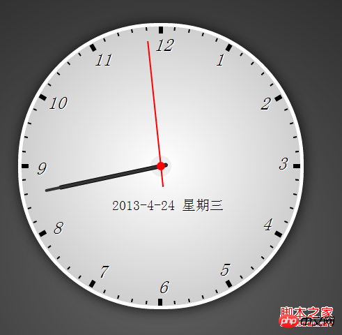
Css3 Js Beautiful Clock
The browser supports IE9/GoogleChrome/FireFox/ Safari
Rendering:
HTML code
<!DOCTYPE html>
<html>
<head>
<meta >
<title>css3+js打造漂亮时钟</title>
<style>
body{background: -webkit-radial-gradient(center center,circle,#666,#000); margin: 0;}
p{margin: 0; padding: 0;}
.box{padding-top: 50px; width:410px; margin: 0 auto;}
.clock{position: relative; width:400px; height: 400px; border: 5px solid #fff; border-radius: 200px; background:-webkit-radial-gradient(center center,circle,#fff,#bbb); box-shadow: 1px 1px 30px rgba(0, 0, 0, 0.8); }
.clock .clock-xin{position: absolute; top: 50%; left: 50%; width:30px; height: 30px; border-radius: 15px; background: #eee;margin:-15px 0 0 -15px;}
.clock .clock-xin2{position: absolute; top: 50%; left: 50%; width:12px; height: 12px; border-radius: 6px; background: #f00; z-index: 100; margin:-6px 0 0 -6px;}
.clock .date{position: absolute; z-index: 3; top: 245px; left: 130px; font-size: 20px; color: #000; text-shadow: 1px 1px white; }
.clock .hour{position: absolute; z-index: 3; top: 50%; left: 50%; width:160px; height: 6px; border-radius:5px; background: #000; -webkit-transform-origin: 10px 50%; margin:-3px 0 0 -10px;}
.clock .min{position: absolute; z-index: 4;top: 50%; left: 50%; width:180px; height: 4px; border-radius:5px; background: #333; -webkit-transform-origin: 10px 50%; margin:-2px 0 0 -10px;}
.clock .sec{position: absolute; z-index: 5; top: 50%; left: 50%; width:210px; height: 2px; background: #f00; -webkit-transform-origin: 30px 50%; margin:-1px 0 0 -30px;}
.clock em{display: block; width: 2px; height: 5px; background: #000; position: absolute; top: 0; left: 0; -webkit-transform-origin: 50% 0; margin-left: -1px;}
.clock em.ishour{width: 6px; height: 10px; margin-left: -3px;}
.clock em.ishour i{font-size: 25px; color: #000; position: absolute; top: 12px; left: -7px;text-shadow: 1px 1px white; }
</style>
</head>
<body>
<p style="color:white;">浏览器支持:GoogleChrome</p>
<p class="box">
<p class="clock" id="clock">
<p class="clock-xin"></p>
<p class="clock-xin2"></p>
<p id="date" class="date"></p>
<p id="hour" class="hour"></p>
<p id="min" class="min"></p>
<p id="sec" class="sec"></p>
</p>
</p>
<script>
window.onload = function() {
var winHeight = document.documentElement.clientHeight;
document.getElementsByTagName('body')[0].style.height = winHeight+'px';
var $clock = document.getElementById('clock'),
$date = document.getElementById('date'),
$hour = document.getElementById('hour'),
$min = document.getElementById('min'),
$sec = document.getElementById('sec'),
oSecs = document.createElement('em');
for (var i = 1; i < 61; i++) {
var tempSecs = oSecs.cloneNode(),
pos = getSecPos(i);
if(i%5==0){
tempSecs.className = 'ishour';
tempSecs.innerHTML = '<i style="-webkit-transform:rotate('+(-i*6)+'deg);">'+(i/5)+'</i>';
}
tempSecs.style.cssText='left:'+pos.x+'px; top:'+pos.y+'px; -webkit-transform:rotate('+i*6+'deg);';
$clock.appendChild(tempSecs);
}
// 圆弧上的坐标换算
function getSecPos(dep) {
var hudu = (2*Math.PI/360)*6*dep,
r = 200; //半径大小
return {
x: Math.floor(r + Math.sin(hudu)*r),
y: Math.floor(r - Math.cos(hudu)*r),
}
}
;(function() {
// 当前时间
var _now = new Date(),
_h = _now.getHours(),
_m = _now.getMinutes(),
_s = _now.getSeconds();
var _day = _now.getDay();
_day = (_day==0)?7:_day;
if(_day==1){
_day = "一";
}else if(_day==2){
_day = "二";
}else if(_day==3){
_day = "三";
}else if(_day==4){
_day = "四";
}else if(_day==5){
_day = "五";
}else if(_day==6){
_day = "六";
}else if(_day==7){
_day = "日";
}
$date.innerHTML = _now.getFullYear()+'-'+(_now.getMonth()+1)+'-'+_now.getDate()+' 星期'+_day;
//绘制时钟
var gotime = function(){
var _h_dep = 0;
_s++;
if(_s>59){
_s=0;
_m++;
}
if(_m>59){
_m=0;
_h++;
}
if(_h>12){
_h = _h-12;
}
//时针偏移距离
_h_dep = Math.floor(_m/12)*6;
$hour.style.cssText = '-webkit-transform:rotate('+(_h*30-90+_h_dep)+'deg);';
$min.style.cssText = '-webkit-transform:rotate('+(_m*6-90)+'deg);';
$sec.style.cssText = '-webkit-transform:rotate('+(_s*6-90)+'deg);';
};
gotime();
setInterval(gotime, 1000);
})();
};
</script>
</body>
</html>The above is the entire content of this article, I hope it will be helpful to everyone’s learning, more related Please pay attention to the PHP Chinese website for content!
Related recommendations:
Use css3 to achieve the revolving lantern effect
Beautiful buttons made using css styles
The above is the detailed content of Code for making a clock using Css3 and Js. For more information, please follow other related articles on the PHP Chinese website!