Home >Web Front-end >CSS Tutorial >Code example for implementing circle and border rotation animation using css
Code example for implementing circle and border rotation animation using css
- 不言Original
- 2018-09-18 14:54:133116browse
The content of this article is about code examples for realizing circles and borders in CSS. It has certain reference value. Friends in need can refer to it. I hope it will be helpful to you.
Achievement effect:

<div>
    <div>
        <div> </div>
    </div>
    <div>
    </div>
    <div>
    </div>
</div>
css: #box {
height:200px;
width:200px;
}
.circle-out{
height: inherit;
width: inherit;
display: inline-block;
text-align: center;
border: 20px solid blue;
border-radius: 50%;
}
/* 绘制弧形 */
.circle-part{
display: inline-block;
position: relative;
width:0px;
height: 0px;
border-radius: 50%;
border: 100px solid #0000ff05;
border-top: 100px solid blue;
top: -220px;
left: 20px;
transform: rotate(0deg);
animation: run-part 5s infinite;
}
.part1{
height: 0px;
width: 0px;
border-radius: 50%;
border:100px solid #fafafa;
border-top: 100px solid #ff000000;
position: relative;
top: -420px;
left: 20px;
transform: rotate(45deg);
animation: run-part1 5s infinite;
}
.circle-inner{
height: 0px;
width: 0px;
display: inline-block;
border-radius: 50%;
border: 20px solid blue;
top: 80px;
position: relative;
z-index: 1000;
}
@-webkit-keyframes run-part1{
0%{
transform: rotate(45deg);
}
100% {
transform: rotate(405deg);
}
}
@-webkit-keyframes run-part{
0%{
transform: rotate(0deg);
}
100% {
transform: rotate(360deg);
}
}
Implementation ideas1 Graphic compositionFrom the appearance, the graphic is roughly composed of: outer circle, inner circle and sector shape.
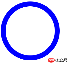
1.1 Outer circle
In this example, ap is mainly used to set the height and width, and the background is not set or white. Set border-radius to 50% of the outer circle, and use border composition to form the outer circle.
.circle-out{
    height: inherit;
    width: inherit;
    border: 20px solid blue;
    display: inline-block;
    border-radius: 50%;
    text-align: center;
}
Rendering:

The inner circle is very simple. It is also a circle completed using border. Setting
boder-radius:50% achieves the circle effect. Finally, it is a matter of positioning. 1.3 Sector
Sector, in this example, the idea of implementation is also to piece together, add rotation, and use the border
border to achieve it. <pre class="brush:php;toolbar:false"> .circle-part{
//(1)
display: inline-block;
width:0px;
height: 0px;
//(2)
border-radius: 50%;
border: 100px solid #0000ff05;
border-top: 100px solid blue;
//(3)
position: relative;
top: -220px;
left: 20px;
//(4)
transform: rotate(0deg);
animation: run-part 5s infinite;
}</pre>The above code:
First draw the circle (border) of
. Other sectors of 3/4 are drawn transparently. The same, use another circle for the same processing, so that the two circles can overlap together, the only difference is: the second circle sets the
circle As white, 1/4 is set to transparent color. At this time, a fan shape of
is presented, with the background being blue, and 1/4 is completely exposed due to transparency. Finally, since the last circle is the top-level element, when the top-level element is rotated, the blue fan-shaped part will be obscured by the
fan-shaped area of the top-level element. To achieve the final effect. Add your own animation at the end of the code to achieve the final effect.
The above is the detailed content of Code example for implementing circle and border rotation animation using css. For more information, please follow other related articles on the PHP Chinese website!

