Home >Web Front-end >JS Tutorial >BootStrap drop-down box plug-in
BootStrap drop-down box plug-in
- PHPzOriginal
- 2018-09-13 18:01:102804browse
The Bootstrap FileInput plug-in is so powerful that there is no reason not to use it. However, it is rare to find the complete usage method of this plug-in in China, so I went to its official website to translate the English documentation and put it here for students who are not good at English. I reluctantly checked
Recently, a new project of the company happened to use BootStrap. After some research, I found that many plug-ins were not available, so I searched online and found a list plug-in. In desperation, I decided to develop it myself, so I started with the simplest drop-down plug-in, and after two days of hard work in my spare time, I finally completed it. It has complete functions and can meet most needs. It also supports fuzzy matching. Without further ado, let’s talk about the usage of this plug-in.
If you have used easyui or ext, you will find that their usage is very similar, and the configuration parameters are basically the same.
1. Dependency file introduction
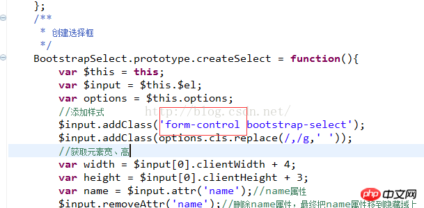
In fact, the entire plug-in uses the form-control style of bootstrap. Many styles are just empty and reserved. The shorter styles are placed directly on the element. Up, if you don’t want to use it with bootstrap,
You can define the style yourself. Just replace form-control with your own defined style in the source code, as shown in the picture below (that bootstrap-select, It is currently empty, reserved for use, and can be removed)
 The files that need to be introduced are jquery.min.js, bootstrap.min.css, bootstrap.min.js and others One is this plugin.
Download address: http://download.csdn.net/detail/lzxadsl/9164287 Click to open the link
If the small inverted triangle icon in the drop-down box is not loaded successfully, See the picture below to see if the location of your picture is correct. The new version no longer uses pictures. There is a download address at the bottom.
 2. Create a drop-down box
The HTML tag can be input or select. I usually use input
 JS creation method
$('#order_status1').bootstrapSelect({
	url:'user/getUser.htm',
	//data:[{user_id:1,username:'lzx'},{user_id:2,username:'lsl'}],
	valueField:'user_id',
	textField:'username',
	emptyText:'',
	enabled:true,
	//multiple:true,开启多选
	formatter:function(rec){
		rec['username'] = rec.username+'_';//格式化选择项
		return rec;
	},
	unSelect:function(val,rec){
		console.log($('#order_status1').bootstrapSelect('getValue'));
	},
	onSelect:function(val,rec){
		console.log('comb2:'+$('#order_status2').bootstrapSelect('getValue'));//获取选中值
		console.log($('#order_status1').bootstrapSelect('getValue'));
		$('#order_status2').bootstrapSelect('setValue','2');
	},
	onBeforeLoad:function(params){
		params['username'] = 'lzx';//加载前改变参数username的值
	}
});
The drop-down item loading priority, url > data > option option node is the drop-down item option when using the select tag
3. Plug-in parameter description
3.1 Configuration items
You can configure the corresponding parameters according to your own needs.
	 /**
	 * 定义默认配置信息
	 * data:格式{data:[{title:null,result:{}},{title:null,result:{}}]}
	 * url和data参数只有一个生效,url优先
	 * 如果有option选项,则它的优先级低于data
	 */
	$.fn.bootstrapSelect.defaults = {
			url    : null, //请求路径
			params : {},   //请求参数
			paramsType : '',//参数默认是以表单形势传递,为json时是以json格式传递到后台
			data   : [],   //数据[{key:value},{key:value}]
	        method : 'get',//请求方法
	        textField  : 'text',//显示文本字段
	        valueField : 'id',//隐藏文本字段
	        relationId : null,//级联id
	        emptyText  : null,//空选项文本,该属性为null或undefined时不创建空选项,默认不创建
	        emptyValue : '',//空选项值
	        separator  : ',',//多选时返回值的分割符
	        editable	 : true,//是否可编辑
	        multiple : false,//多选
	        disabled : false,//禁用
	        downBorder : false,//下拉按钮是否带边框
	        cls:'',//自定义样式,多个样式用逗号隔开 class1,class2
	        formatter:function(rec){},//格式化节点
	        onSelect : function(val,rec){},
	        unSelect : function(val,rec){},//反选
	        onBeforeLoad: function(param){},//param 请求参数
			onLoadSuccess: function(data){},//data加载成功后返回的数据
			onLoadError: function(){}
	};
3.2 Method description:
//获取下拉框选中值
		$('#order_status1').bootstrapSelect('getValue')

		//获取下拉框选中文本
		$('#order_status1').bootstrapSelect('getText')

		//设置选中,如果是多选 value 格式:2,3,4
		$('#order_status1').bootstrapSelect('setValue','1');
		$('#order_status1').bootstrapSelect('setValue','1,2,3');多选时设置选中

		//获取所有下拉节点的数据集,返回值是数组类型
		$('#order_status1').bootstrapSelect('getData');

		//重新加载,可重定向url和params
		$('#order_status1').bootstrapSelect('reload');
		//带参数
		$('#order_status1').bootstrapSelect('reload',{
			params:{id:'lzx'}
		});
		//重置url
		$('#order_status1').bootstrapSelect('reload',{
			url:'test/test.htm',
			params:{id:'lzx'}
		});


		//刷新
		$('#order_status1').bootstrapSelect('refresh');
		//清空下拉节点
		$('#order_status1').bootstrapSelect('clear');
		//隐藏下拉框
		$('#order_status1').bootstrapSelect('hide');
		// 显示下拉框
		$('#order_status1').bootstrapSelect('show');
		//根据id获取文本值
		$('#order_status1').bootstrapSelect('getTextForVal',2);
		//销毁
		$('#order_status1').bootstrapSelect('destroy');
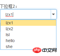
<span style="font-family: Arial, Helvetica, sans-serif; background-color: rgb(255, 255, 255);">默认下拉框如下图:</span>
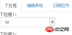
 Set downBorder:true, and the style will become as shown in the figure below
 Related recommendations:
The above is the detailed content of BootStrap drop-down box plug-in. For more information, please follow other related articles on the PHP Chinese website!
Related articles
See more- An in-depth analysis of the Bootstrap list group component
- Detailed explanation of JavaScript function currying
- Complete example of JS password generation and strength detection (with demo source code download)
- Angularjs integrates WeChat UI (weui)
- How to quickly switch between Traditional Chinese and Simplified Chinese with JavaScript and the trick for websites to support switching between Simplified and Traditional Chinese_javascript skills

