Home >Web Front-end >JS Tutorial >Comprehensive analysis of how to use Bootstrap forms (form control status)_javascript skills
Comprehensive analysis of how to use Bootstrap forms (form control status)_javascript skills
- PHP中文网Original
- 2016-05-16 15:30:201587browse
This article comprehensively analyzes how to use Bootstrap forms. This article focuses on the three situations of Bootstrap form control states. Interested friends can refer to
1. Focus state
The focus state is achieved through the pseudo-class ":focus". The focus state of the form control in the Bootstrap framework deletes the default style of outline and re-adds the shadow effect.
<form role="form" class="form-horizontal">
 <p class="form-group">
 <p class="col-xs-6">
 <input class="form-control input-lg" type="text" placeholder="不是焦点状态下效果">
 </p>
 <p class="col-xs-6">
 <input class="form-control input-lg" type="text" placeholder="焦点点状态下效果">
 </p>
 </p>
</form>

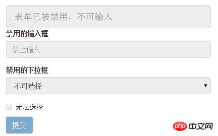
2. Disabled state
The disabled state of the form control in the Bootstrap framework is implemented in the same way as the ordinary form disabled state. Add the attribute "disabled" to the corresponding form control.
<form role="form">
 <input class="form-control input-lg" id="disabledInput" type="text" placeholder="表单已被禁用,不可输入" disabled>
 <fieldset disabled>
 <p class="form-group">
 <label for="disabledTextInput">禁用的输入框</label>
 <input type="text" id="disabledTextInput" class="form-control" placeholder="禁止输入">
 </p>
 <p class="form-group">
 <label for="disabledSelect">禁用的下拉框</label>
 <select id="disabledSelect" class="form-control">
 <option>不可选择</option>
 </select>
 </p>
 <p class="checkbox">
 <label>
 <input type="checkbox"> 无法选择
 </label>
 </p>
 <button type="submit" class="btn btn-primary">提交</button>
 </fieldset>
</form>

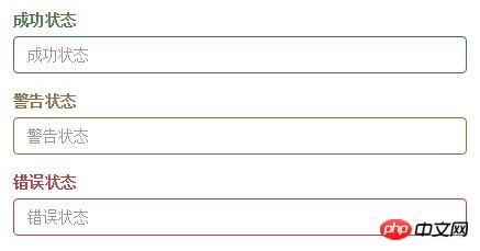
3. Verification status
When making a form , it is inevitable to do form verification. It is also necessary to provide verification status styles, and these effects are also provided in the Bootstrap framework.
1. .has-warning: Warning status (yellow)
2. .has-error: Error status (red)
3. .has-success: Success status (green)
Used You only need to add the status class name
<form role="form">
 <p class="form-group has-success">
 <label class="control-label" for="inputSuccess1">成功状态</label>
 <input type="text" class="form-control" id="inputSuccess1" placeholder="成功状态" >
 </p>
 <p class="form-group has-warning">
 <label class="control-label" for="inputWarning1">警告状态</label>
 <input type="text" class="form-control" id="inputWarning1" placeholder="警告状态">
 </p>
 <p class="form-group has-error">
 <label class="control-label" for="inputError1">错误状态</label>
 <input type="text" class="form-control" id="inputError1" placeholder="错误状态">
 </p>
</form>

to the form-group container. If you still If you want to learn in depth, you can click here to learn, and here are two exciting topics for you: Bootstrap learning tutorial Bootstrap practical tutorial
The above is a detailed introduction to the status of Bootstrap form controls, and there will be more content later Continuously updated, I hope everyone will continue to pay attention.
Related articles
See more- An in-depth analysis of the Bootstrap list group component
- Detailed explanation of JavaScript function currying
- Complete example of JS password generation and strength detection (with demo source code download)
- Angularjs integrates WeChat UI (weui)
- How to quickly switch between Traditional Chinese and Simplified Chinese with JavaScript and the trick for websites to support switching between Simplified and Traditional Chinese_javascript skills

