Home >Web Front-end >CSS Tutorial >Code example for realizing embossed shape using css
Code example for realizing embossed shape using css
- 不言Original
- 2018-08-18 17:02:283031browse
The content of this article is about code examples for realizing embossed character shapes in CSS. It has certain reference value. Friends in need can refer to it. I hope it will be helpful to you.
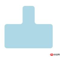
Yesterday I saw someone wanting to make a embossed frame. I made it in a few minutes today and found it to be quite ingenious. I would like to share it
The final effect is as follows

The code is here:
   <div class="box">
        <span class="big"></span>
        <span class="top"></span>
        <span class="topR"></span>
    </div>
body {
display: flex;
justify-content: center;
align-items: center;
.box {
position: relative;
width: 400px;
height: 400px;
top: 200px;
color: lightblue;
.big {
position: absolute;
width: 400px;
height: 200px;
border-radius: 20px;
background-color: currentColor;
bottom: 0;
}
.top {
position: absolute;
width: 100px;
left: calc((400px - 100px)/2);
height: 150px;
border-radius: 20px 20px 0 0;
background-color: currentColor;
top: 50px;
}
.top::before {
content: "";
position: absolute;
background-color: lightblue;
height: 48px;
width: 100px;
left: -100px;
top: 102px;
}
.top::before {
content: "";
position: absolute;
background-color: lightblue;
height: 48px;
width: 100px;
left: -100px;
top: 102px;
}
.top::after {
content: "";
position: absolute;
background-color: #fff;
border-radius: 0 0 20px 0;
height: 48px;
width: 100px;
left: -100px;
top: 102px;
}
.topR {
position: absolute;
background-color: lightblue;
height: 48px;
width: 100px;
right: 50px;
top: 152px;
}
.topR::after {
content: "";
position: absolute;
background-color: #fff;
border-radius: 0 0 0 20px;
height: 48px;
width: 100px;
left: 0;
top: 0;
}
}
}At first I thought there were just two circles up and down Just join the corner rectangles together, NO NO NO. In fact, there are rounded corners at the intersection of the two rounded corners. Just look at this rounded corner and you will know that it can be covered with a white rounded rectangle. Then the question is:
White rounded corners After the rectangle is covered, a gap will be formed in the middle, which needs to be filled with blue. So the idea is this:
1. First create the upper and lower rounded rectangles:
HTML:
 <span></span>
 <span></span>
2: The circle on top Add a blue rounded rectangle to the left and right of the corner rectangle, which is tangent to the upper and lower rectangles, but the length and width cannot exceed the two large rectangles

3: On the small blue rectangular blocks added later, add a white rectangle of the same size to cover each, and set the lower right rounded corner and the lower left rounded corner respectively. The code is as follows:
border-radius: 0 0 20px 0;
border-radius: 0 0 0 20px;
OK, you’re done! A convex frame is ready.
Related recommendations:
How to use CSS to achieve the effect of truck loader
How to control the random rounded corner style of images with css? (Example)
The above is the detailed content of Code example for realizing embossed shape using css. For more information, please follow other related articles on the PHP Chinese website!

